-
-
A sensory regulation system to help us manipulate our perception of time.
-

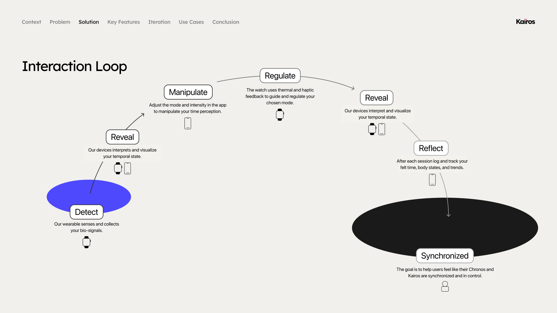
The core interaction loop illustrates how users interact with our system.
-
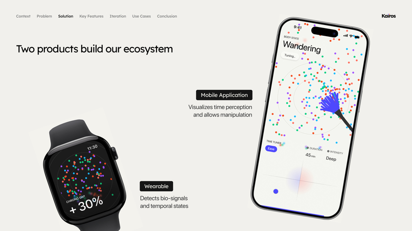
Watch helps with detecting and regulation. The app provides visualisation and enables
-

Our main feature
-
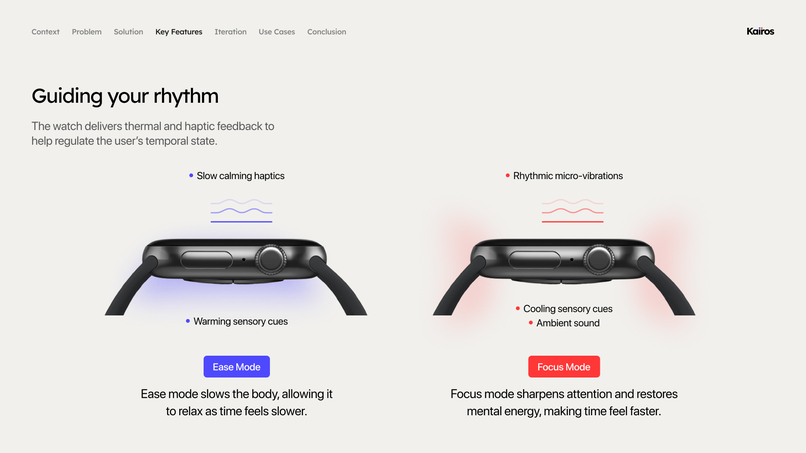
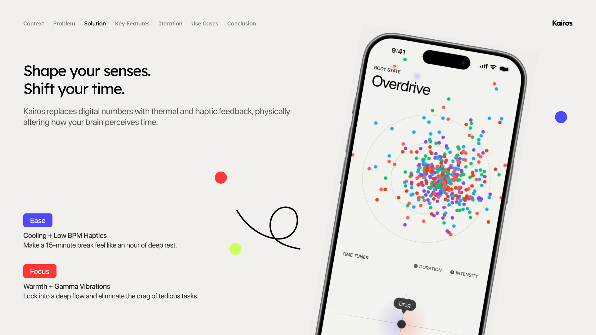
Our watch has thermal and haptic feedback.
-
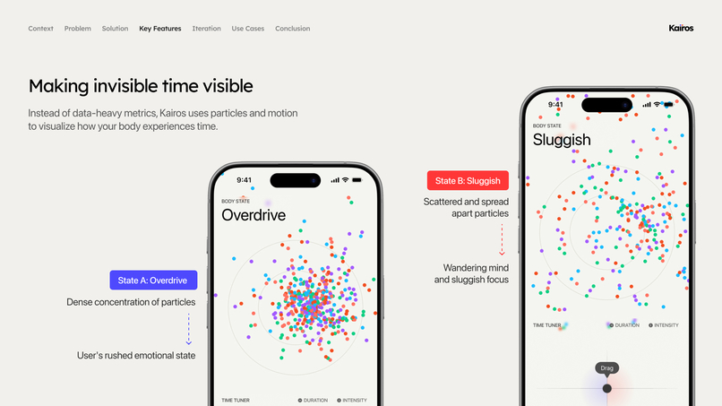
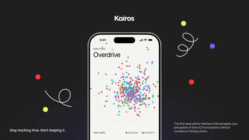
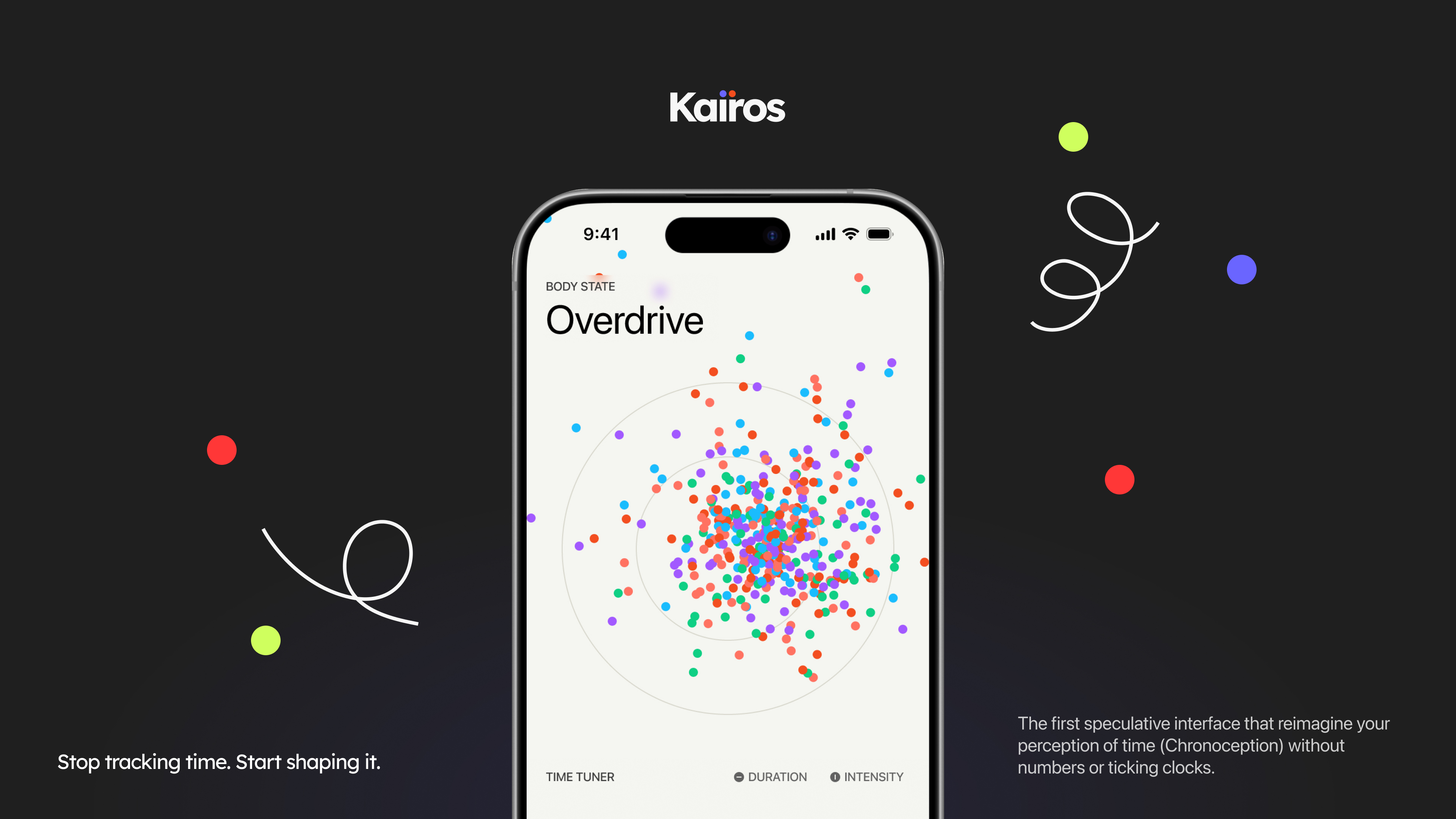
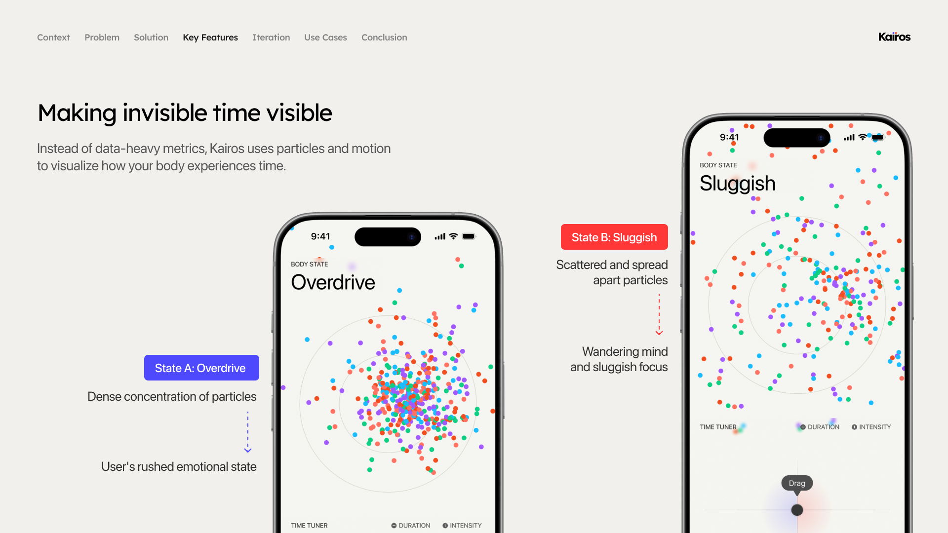
the app uses particle movemement instead of numbers to reflect the users perception of time.


Inspiration
As Interaction Design students, we live our days constantly chasing deadlines, drowning in endless assignments and screen time. We regularly experience "time distortion"—a sweet 15-minute break vanishes in a minute when we are anxious (Time Anxiety), while 3 hours of complex wireframing or coding drag on painfully like 30 minutes (Temporal Drag). Traditional timers and Pomodoro apps only amplified this anxiety by pressuring us with ticking numbers. We asked ourselves a fundamental question: "Instead of managing the numbers on a physical clock, what if we could directly design our subjective sense of time (Chronoception)?" KAIROS was born from this exact question.
Research
When we first established this topic, we had strong doubts within the team: "Is it actually possible to manipulate time perception?", "Isn't this just a baseless sci-fi concept?" However, as we dove into cognitive science and sensory interaction research to validate our idea, we found our conviction. Studies show that the human brain perceives the length of time differently based on internal biological rhythms, like heart rate, and external temperature changes. In other words, by slowing down the body's rhythm through haptic pacing synchronized with the heart rate, or by applying localized thermal and cooling feedback, we could actually stretch or compress the brain's perceived speed of time. This thrilling realization became the strong foundation that turned KAIROS from a mere imagination into a viable speculative interface.
How we built it
Armed with scientific evidence, we began translating these sensory interventions into a system that users could actually control. First, we completely eliminated the anxiety-inducing "numbers" from the screen. Instead, we visualized the user's current cognitive state through the organic movement of scattering and converging particles (Fluid Time Dashboard). For the controls, we focused purely on intuitiveness. We designed a 2D controller that manipulates the X-axis (duration) and Y-axis (intensity) simultaneously, building an interaction where the simple act of dragging a dial allows users to delicately tune cooling haptics (Focus) or thermal feedback (Ease).
Challenges we faced
Our most painful hurdle was the very fact that we had to design a completely unprecedented system. Because there were absolutely no references for translating sensory interventions into a UI without using numbers, we had to define an intuitive yet aesthetic control method completely from scratch. In particular, we faced unexpected issues during user testing with our initial prototype. While users found the numberless dashboard refreshing, they were also hesitant to start a session because they couldn't tell what physical changes this unfamiliar device would cause to their bodies, or if it was even working properly. To resolve this anxiety, we went through rigorous iterations. We added a modal window (Sensory Sync Brief) that accurately briefs the exact temperature and vibration levels before intervention, and introduced an organic wave (Breathing UI) synchronized with the user's heart rate during the session, ensuring users felt a complete sense of control over the system.
What we learned
Through this project, we deeply learned that no matter how solid the scientific research or how innovative the speculative concept is, it will never be persuasive if the vessel holding it (UI/UX) does not thoroughly consider the user's cognitive model. When replacing a familiar indicator (a digital clock) with an entirely new set of sensory rules, the system requires far more transparent and friendly guidance than the designer initially intends. Through continuous user testing, we realized that for novel technologies and interactions to succeed, the very first thing we must design is not flashy graphics, but "Trust" between the user and the system.
Built With
- figma


Log in or sign up for Devpost to join the conversation.