Inspiration
Soccer juggling looks simple — until you try to improve it.
Most beginners (and even intermediate players) struggle with invisible problems: inconsistent rhythm, weak or overpowering touches, lateral drift, and stiff leg technique. Real coaching for these micro-corrections is hard to access, and practicing alone gives almost no feedback beyond “the ball dropped.”
At Hacklytics, we wanted to bridge that gap using computer vision.
Our inspiration for JuggleIQ came from a simple question:
What if your phone camera could act like a personal juggling coach?
We combined our interests in sports analytics, pose estimation, and UX storytelling to build a system that doesn’t just count touches — it explains how you’re juggling and what to improve. The Figma Make integration came from wanting users to present their results in a visually engaging, personalized way instead of static charts.
What it does
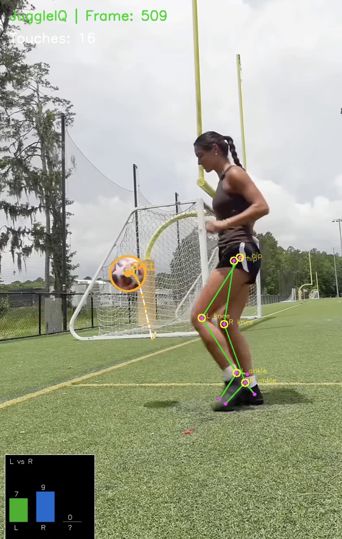
JuggleIQ is a CV-powered soccer juggling coach.
Users upload a short juggling video, and the system automatically:
- Detects the soccer ball and tracks its trajectory
- Estimates body pose (hips, knees, ankles, feet)
- Identifies every touch and which foot made contact
- Measures rhythm, peak height, lateral drift, and knee stiffness
- Computes a skill score and best streak
- Generates actionable coaching tips
The app returns:
- Structured session JSON
- Optional annotated replay video
- Metric cards (touch count, rhythm, skill score, drift, stiffness)
- Charts (foot usage, rhythm intervals, score breakdown)
- Coaching feedback
With one click, users can export their session JSON into Figma Make to build animated dashboards (gauges, timelines, donuts, charts, tips) from their own data.
How we built it
Backend
- Python + FastAPI
- Ultralytics YOLO for ball detection
- MediaPipe Pose for body landmarks
- Kalman filtering for smooth ball tracking
- Custom touch detection logic (velocity flip + foot proximity + rise confirmation)
The backend:
- Accepts a video upload
- Runs the full CV pipeline
- Produces annotated video + metrics JSON
- Exposes everything via REST endpoints
It’s hosted on Kaggle and publicly accessible through ngrok during the hackathon.
Frontend
- React + Vite
- Recharts for visualizations
The frontend handles:
- Video upload
- Analysis progress
- Result presentation
- Session JSON export
- Figma Make dashboard CTA
Users can immediately explore their stats or take the JSON into Figma Make for custom animated storytelling.
Figma Make
We designed the JSON specifically to be Make-friendly:
- Small (<5MB)
- Flat numeric fields + short arrays
- Easy binding to gauges, charts, and timelines
This allows users to create personalized animated dashboards from their own juggling sessions.
Challenges we ran into
- Reliable touch detection: differentiating real touches from near-misses required combining motion direction, proximity, and trajectory rise.
- Pose + ball synchronization: aligning MediaPipe pose frames with YOLO detections took careful timestamp handling.
- Noise and jitter: raw detections were unstable — Kalman filtering and smoothing were critical.
- Video serving: making annotated videos streamable directly from the API (instead of just downloadable).
- Figma Make learning curve: importing JSON datasets and designing animation flows under hackathon time pressure.
Accomplishments that we're proud of
- Built a full end-to-end pipeline: video → CV → metrics → frontend → Figma dashboard
- Implemented real biomechanical feedback (knee stiffness, drift, rhythm)
- Designed a compact session JSON that works cleanly with Figma Make
- Delivered both analytics and coaching — not just raw numbers
- Created a unique sports analytics experience blending AI, design, and storytelling
What we learned
- Combining multiple CV signals (ball + pose + motion) produces much stronger insights than any single model.
- UX matters even in analytics — animated dashboards dramatically improve interpretability.
- Small, well-structured datasets are powerful when paired with creative visualization tools.
- Real-time sports feedback requires careful smoothing and validation logic.
- Figma Make works surprisingly well as a presentation layer for ML outputs.
What's next for JuggleIQ
- Real-time mobile analysis (live juggling feedback)
- More advanced coaching metrics (contact angle, consistency zones)
- Drill-specific modes (right-foot only, alternating, low-height control)
- Historical session tracking and progress graphs
- Multi-player comparisons
- Packaging as a mobile app for casual players and youth academies
- Expanding beyond juggling into passing, trapping, and shooting analytics
TL;DR
JuggleIQ turns any juggling video into actionable coaching using computer vision — then lets users visualize their results through animated Figma Make dashboards. It’s a blend of AI, sports analytics, and interactive design to help players improve faster.


Log in or sign up for Devpost to join the conversation.