-
-

landing page 2
-

landing page 3
-

survey message
-

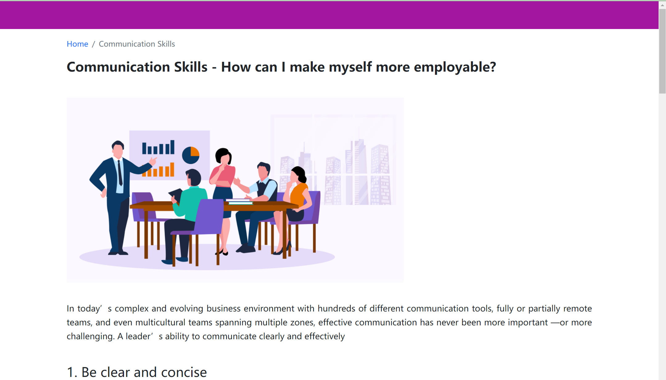
detail page
-

landing page 1


Inspiration
We are inspried by the UI design on dribble.
What it does
It provides a survey function, a chart as data visualization for unemployment information. It also provides tip and updates for job security
How we built it
We built it using css3, html5, javascript, highchart and bootstrap
Challenges we ran into
Debugging for highcharts, customize the render time of chart, etc To complete a project within short time limit is challenging.
Accomplishments that we're proud of
CSS animations interated with scroll listener event Using data visualization tool Survey message generater based on user's answer
What we learned
We learned a lot on team coding and how to use data visualization tool.
What's next for Jobsafe
Get the most relevant information and data updates to help users.


Log in or sign up for Devpost to join the conversation.