-
general view
-
interactive component
-
interactive component

Inspiration
We were inspired by our current internship/job search situation.
What it does
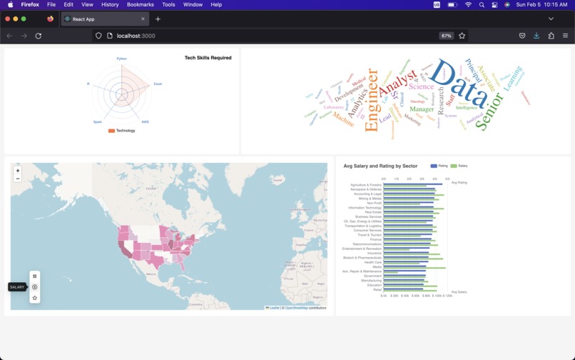
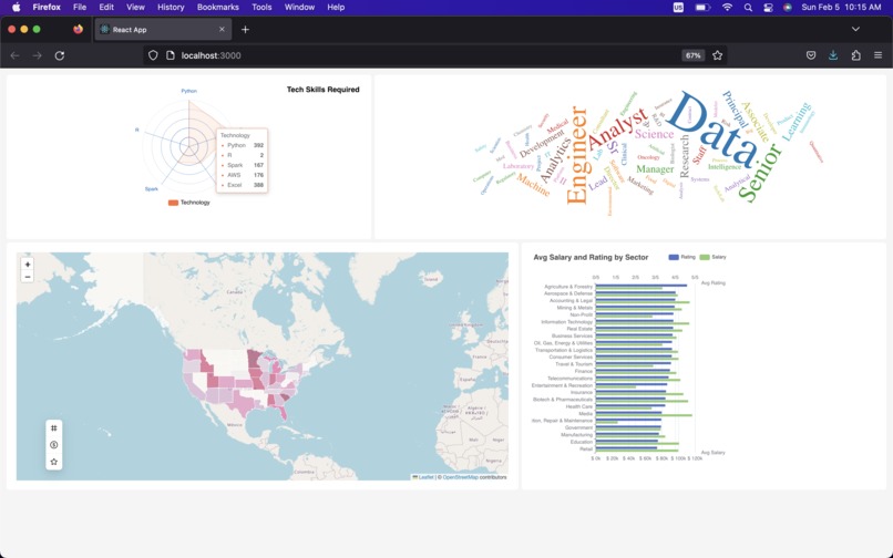
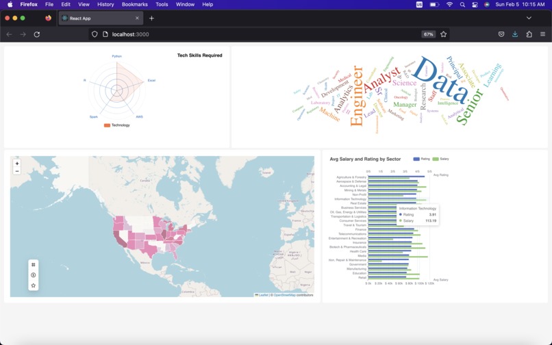
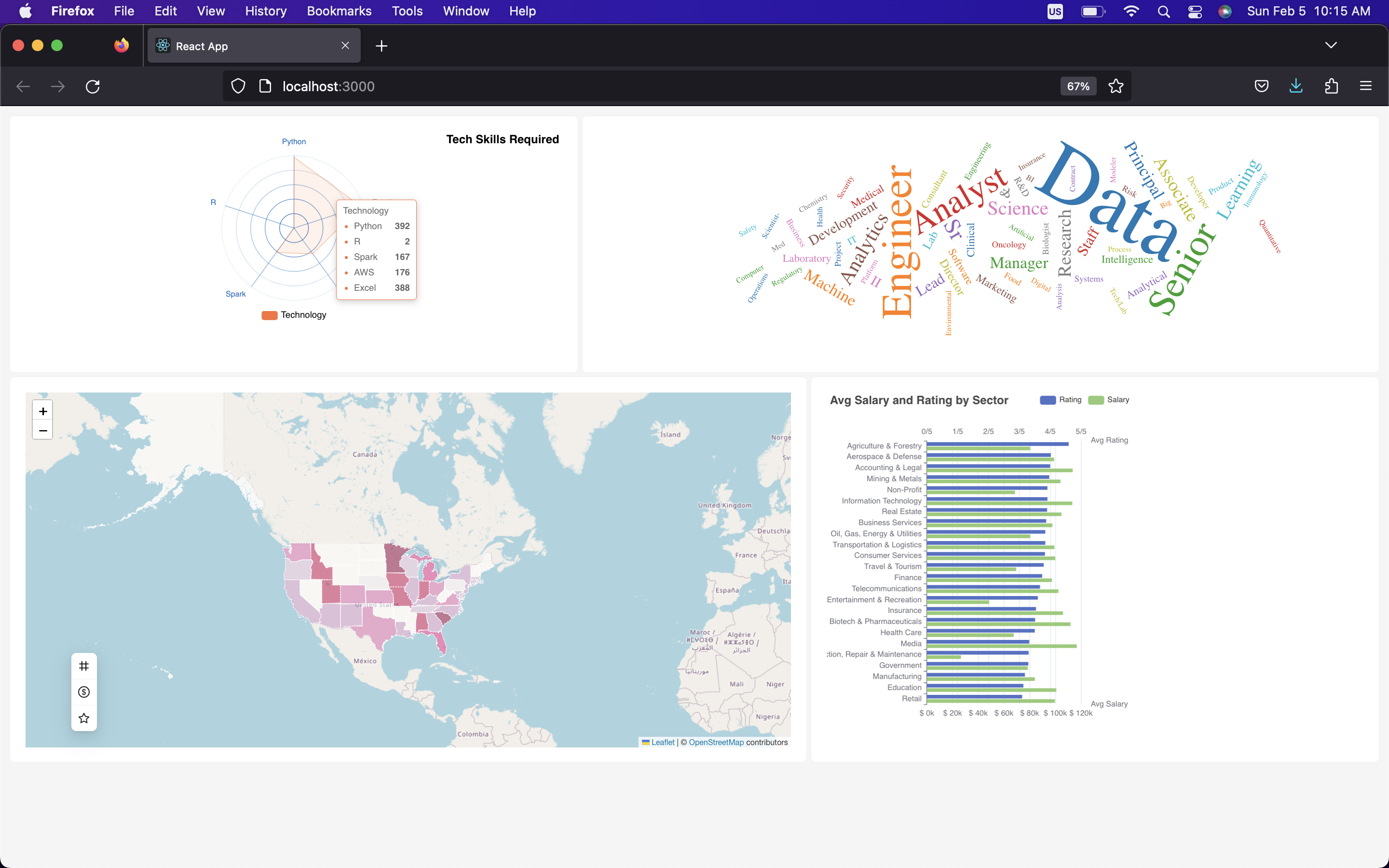
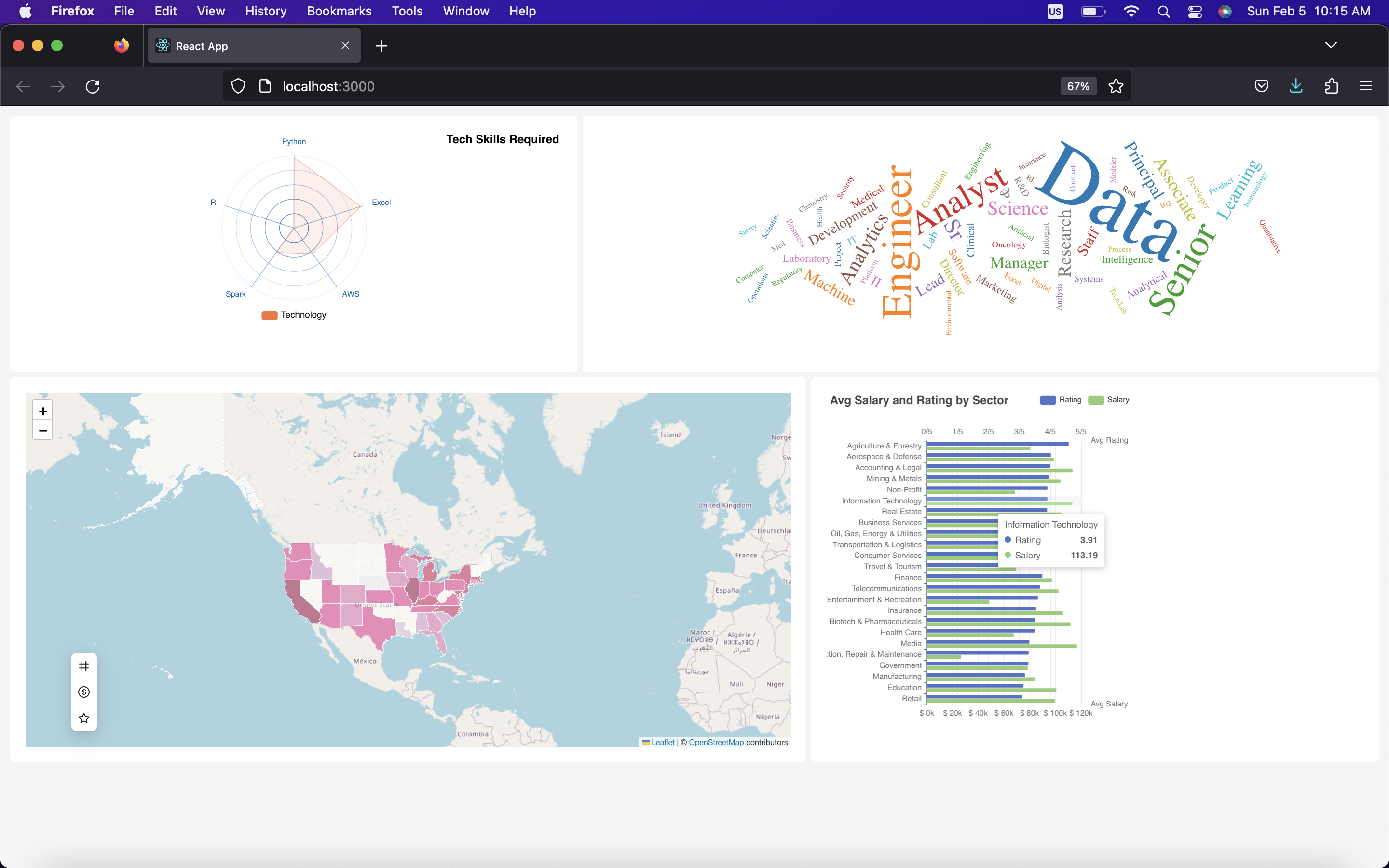
This dashboard presents information in 4 different ways; the most sough-after technology skillset. The current buzzwords in online job posts' titles. The geographical (state-wise) distribution of jobs by average salary, number of jobs, and general rating out of 5. And lastly, the distribution of jobs by economical sector, again by rating and average salary.
How we built it
We built it using NodeJS and React. The data visualizations were created with echarts-apache and D3.
Challenges we ran into
The first challenge was time management. The short deadline made us cut short on some implementations and we had to make choices on what was bringing the most value to a potential reader. Most of our team was also challenged by the first-time use of this stack and the placement of some front-end elements took a little more time than we anticipated.
Accomplishments that we're proud of
We're definitely proud of what we are delivering today, especially in such a short time, but most importantly it was the first time for all members that we actually delivered something polished at a hackathon event.
What we learned
We learned a lot during these past 24 hours, first on our subject (data science job in NA), on new technologies and development, but also about ourselves, our resilience and our capacity to collaborate and deliver on short notice while having fun!
What's next for Job Search Visualization Dashboard
We're already looking forward to our next hackathon!


Log in or sign up for Devpost to join the conversation.