
Inspiration
A rent increase sounds like a simple number—until you ask what changed.
For Collection Équinoxe, adding higher-end buildings made the median rent look as though it had jumped 10.8% in 2023. Comparing the same apartments over time told a very different story: roughly 2.2% growth. Free months created another complication: the rent written on a lease could rise much faster than the effective rent after concessions.
That became our starting point. If a property team is going to make decisions from a forecast, they should be able to understand where the number comes from and what could make it wrong.
What it does
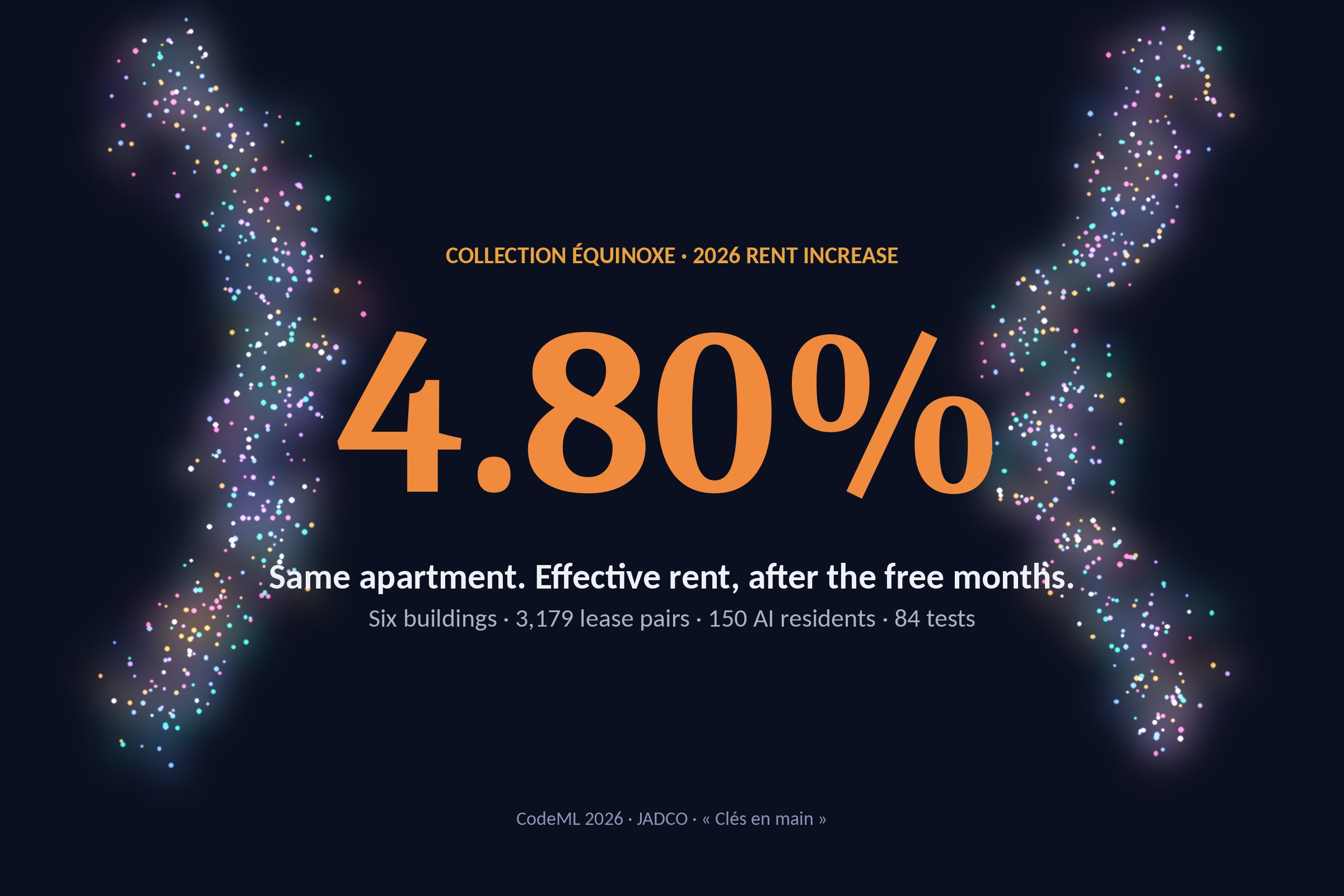
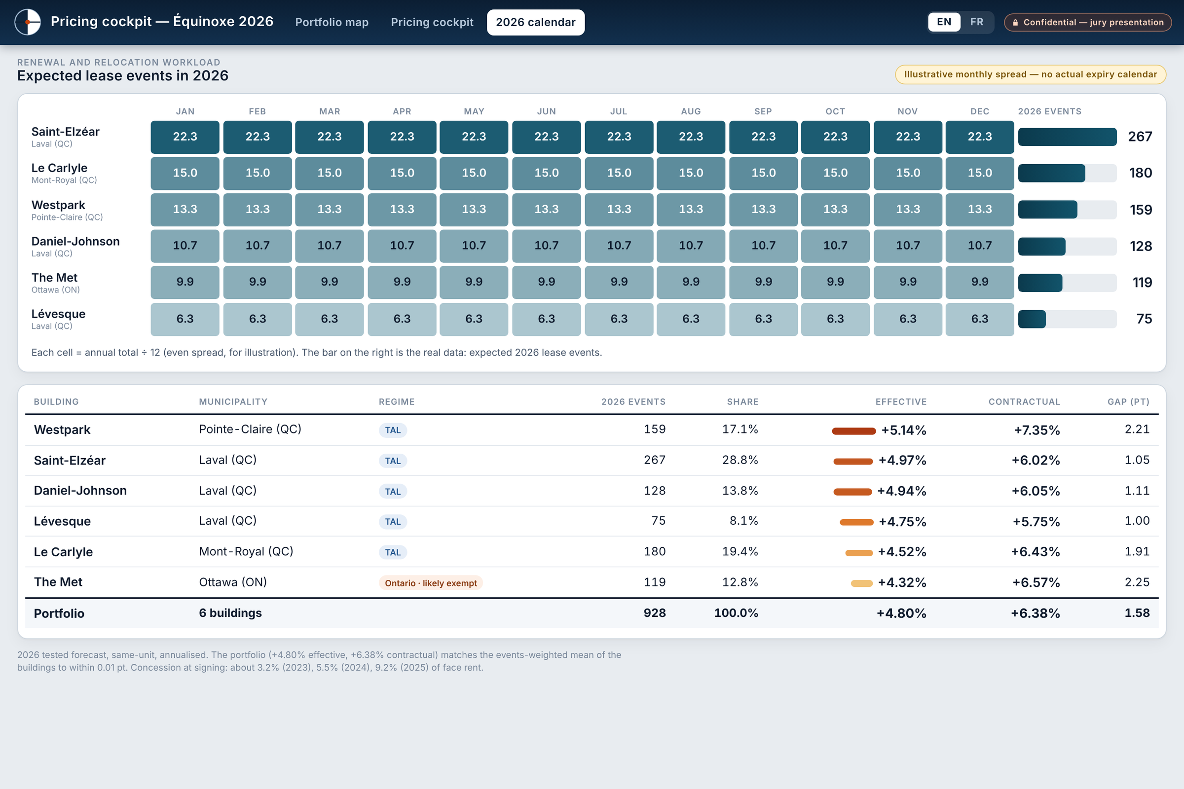
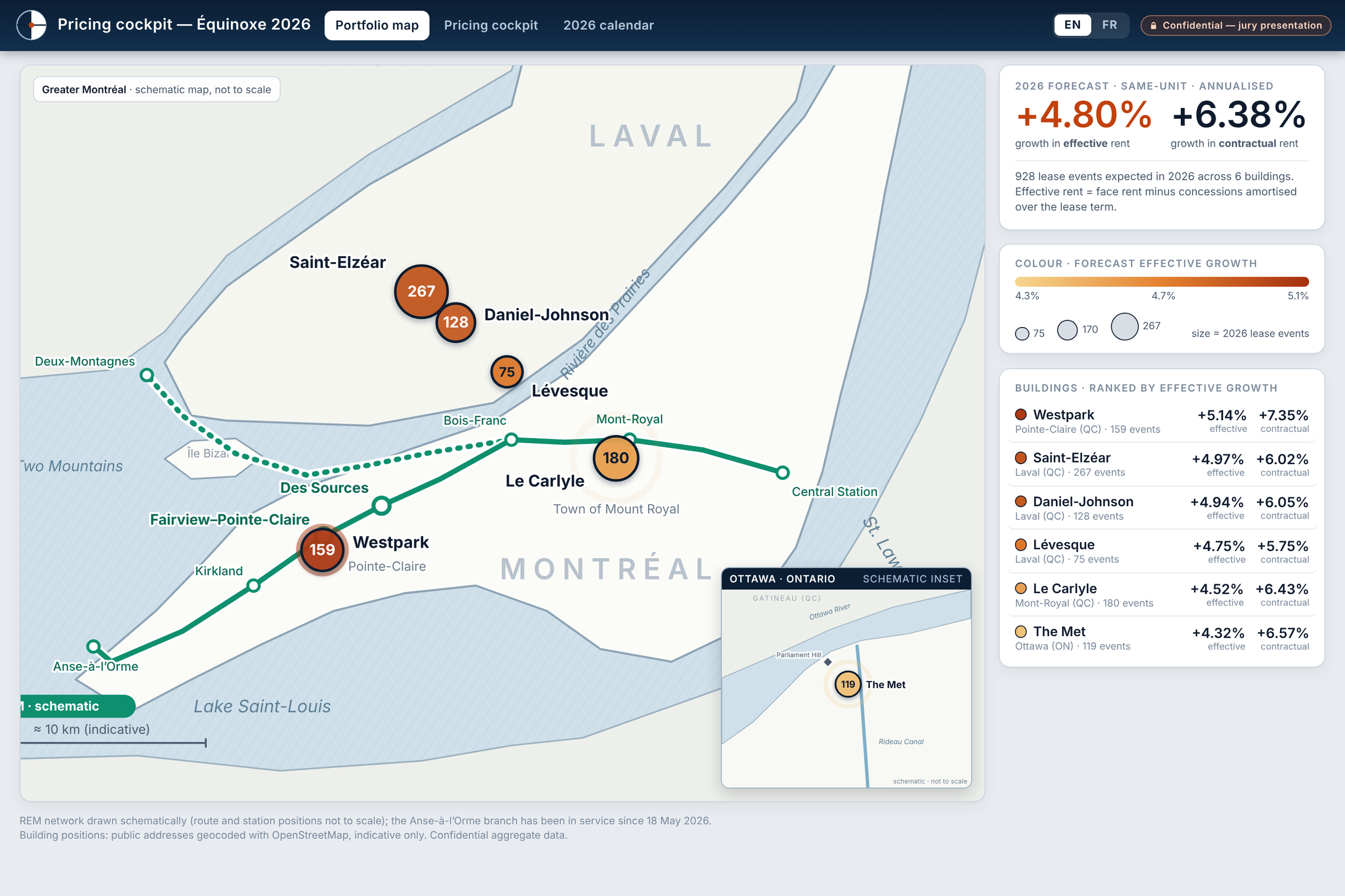
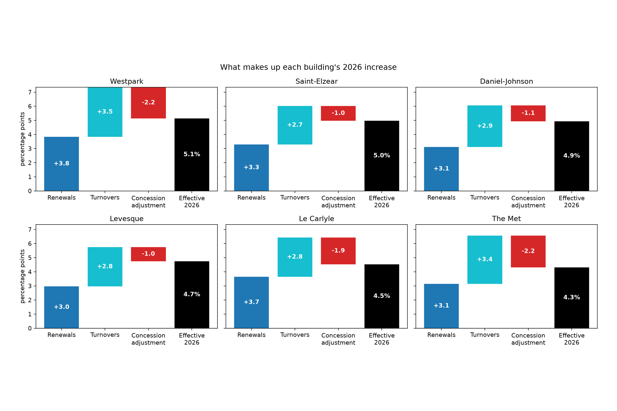
Équinoxe forecasts 2026 rent growth across six buildings in Quebec and Ontario. Our central estimate is 4.80% effective same-unit growth, after recorded concessions, compared with 6.38% contractual growth.
Behind those numbers, the project compares each apartment with its own previous lease, separates renewals from tenant turnovers, and accounts for differences between buildings and provincial contexts.
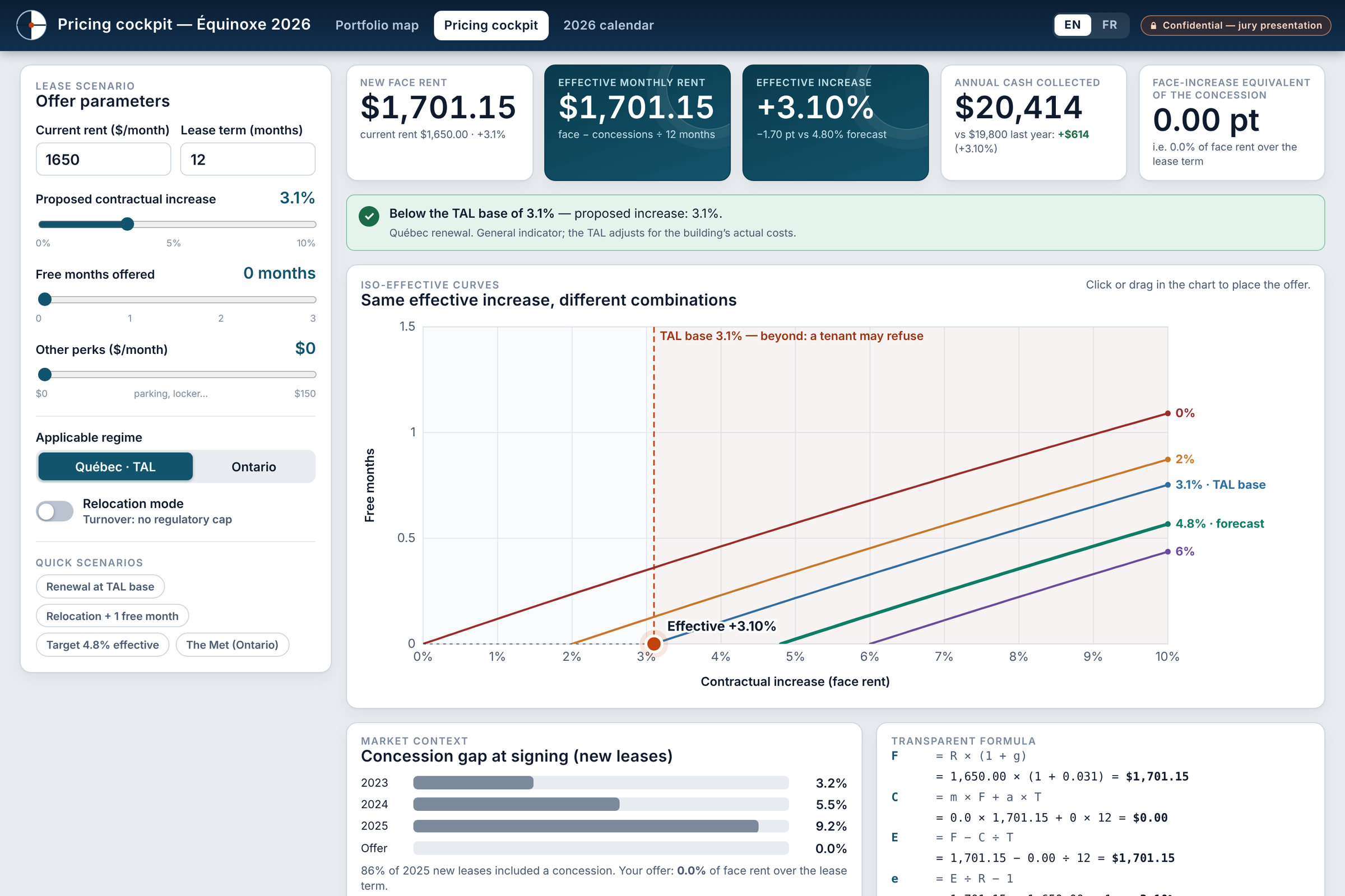
The results come with bilingual notebooks, visual explanations, and an interactive pricing cockpit. An optional AI Swarm Lab adds 150 fictional residents who respond to imagined market shocks, making it easier to explore different perspectives. These reactions are illustrative; they do not determine or validate the core forecast.
How we built it
Most of the work sits underneath the interface.
We built a Python pipeline that checks what the source fields actually mean, identifies apartments consistently, and constructs 3,179 consecutive lease pairs. It filters unsuitable comparisons, puts rent changes on an annual basis, and preserves the distinction between contractual and effective rent.
The forecast combines three perspectives: recent momentum, a conversion from contractual to effective rent, and a longer-term trend. We calculate these by building and lease type, then bring them together into an explainable portfolio estimate. Public housing-market data and provincial context help us interpret the result and challenge its assumptions.
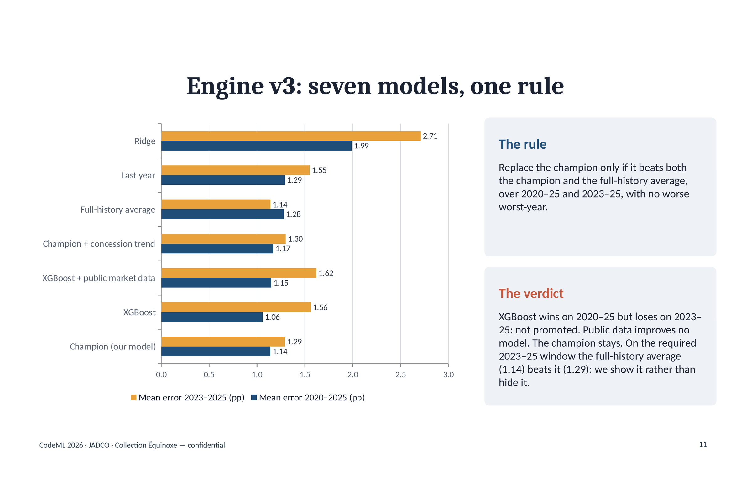
We evaluated the method against historical years and simple baselines, and tested Ridge and XGBoost as alternatives. The final approach uses a fixed statistical ensemble whose parameters can be inspected and reproduced.
The presentation layer uses interactive web visualizations. The live AI demo uses the Anthropic API to generate fictional resident reactions and answer questions about the project. The analytical forecast can be reproduced without an AI API call.
Challenges we ran into
The hardest part was deciding which comparisons were trustworthy. Some identifiers could collide across buildings. New buildings changed the apparent portfolio trend. Concessions complicated the relationship between a signed rent and its effective value. Treating all of that as one clean table would have produced a convincing-looking answer to the wrong question.
We also had to keep historical validation honest: respect forecast dates, distinguish later public information, and report when a simpler method performed better. On the required 2023–2025 window, our average forecast error was about 1.29 percentage points, and a historical-average baseline did slightly better. That comparison belongs beside the result.
Accomplishments we're proud of
We built a forecast that can be traced from its headline number back to its assumptions and calculations. All 84 automated tests passed, and both official notebooks were independently executed with matching headline results.
We also made room for different readers: a judge can follow the visual story, a property team can explore scenarios, and a technical reviewer can inspect the notebooks, parameters, and tests. The live AI experience has been verified locally with a complete set of 150 distinct resident responses.
What we learned
Choosing the right comparison matters as much as choosing the model. Comparing each apartment with itself changed the story more than adding a more complicated algorithm.
We also learned that explaining uncertainty is part of making a tool useful. A forecast becomes more credible when people can see its assumptions, its historical errors, and the cases where a simpler approach wins.
What's next
We want to make the judge and user experience easier to navigate, refine the scenario controls, and track performance as actual 2026 outcomes become available. With appropriately authorized additional data, we could also test how well the approach transfers to other portfolios.
Built With
- anthropic
- api
- css3
- html5
- javascript
- jupyter
- matplotlib
- notebook
- numpy
- pandas
- plotly
- python
- scikit-learn
- streamlit
- xgboost


Log in or sign up for Devpost to join the conversation.