-
-
iVoted Sticker icon
-
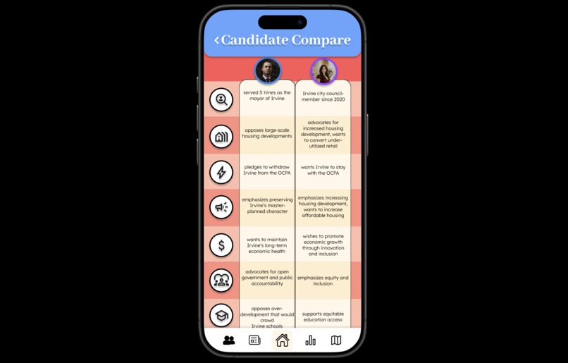
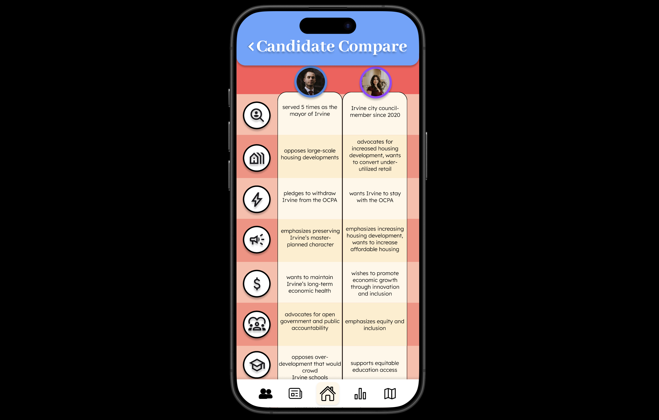
Candidate Comparison Screen
-
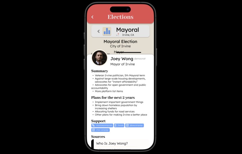
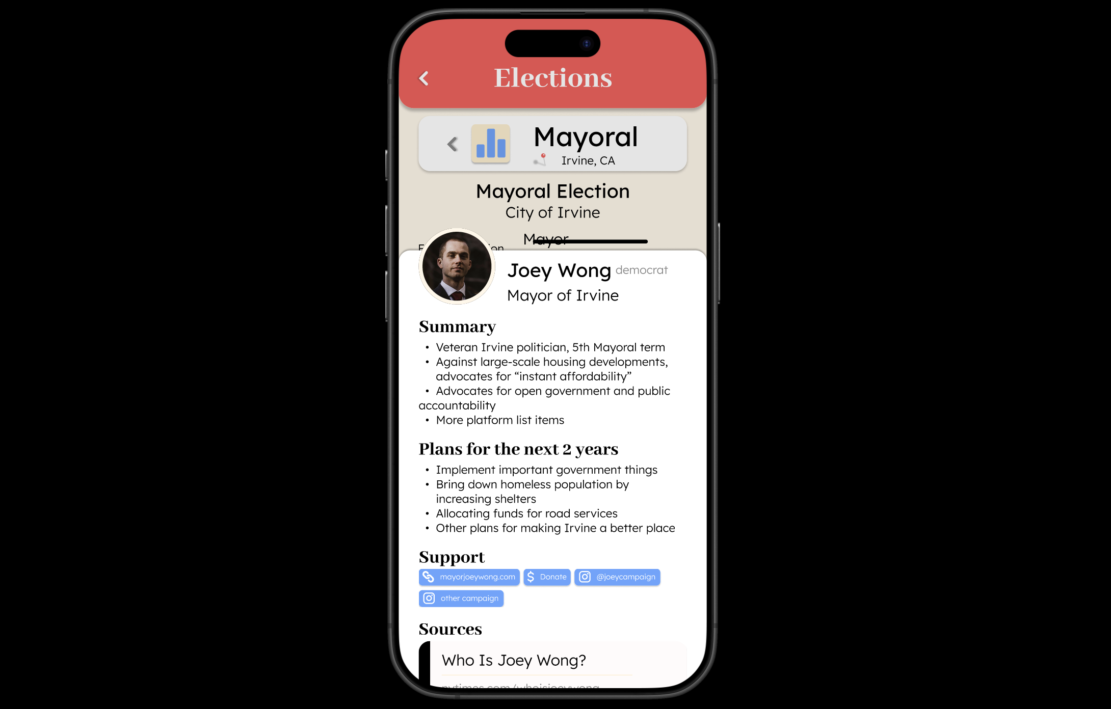
Candidate Profile Modal
-

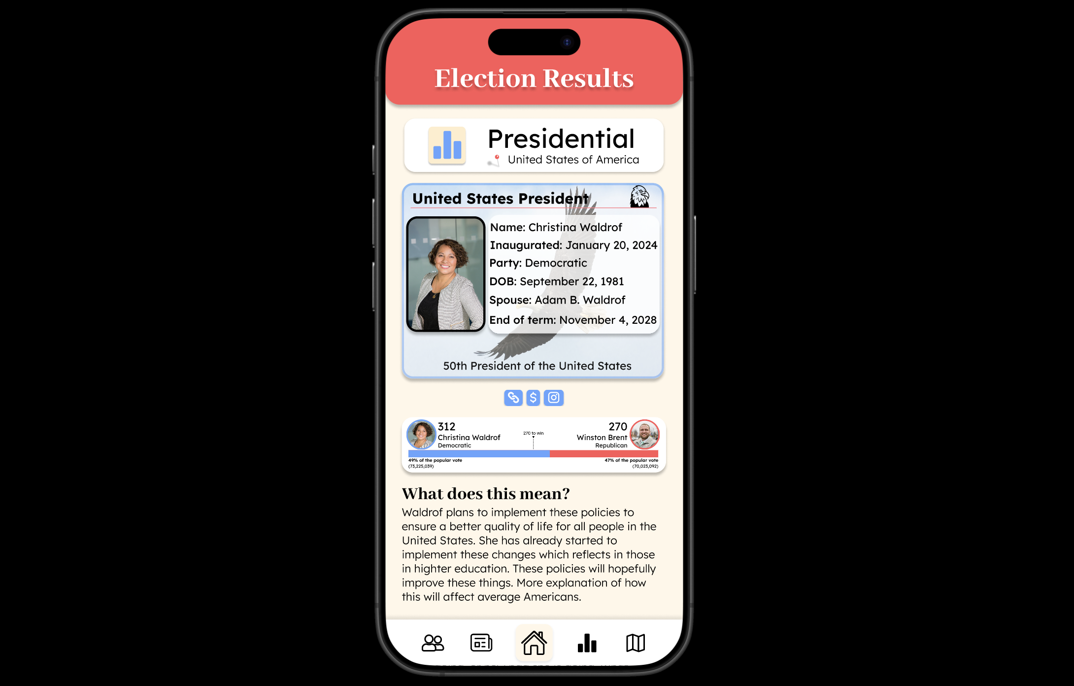
Past Election Result Screen
-
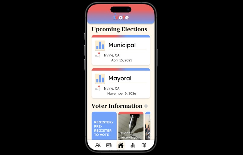
Homepage

Inspiration
After finding difficulties personally with the pressure of having to vote but not knowing who to vote for, I realized that this is a common problem for others as well. In our research, we discovered that of the 84.6% of the participants who were eligible to vote, 60% find it to be too much work to research candidates and as a result, choose not to vote. Further, we asked our participants if they were interested in a platform that made finding information about candidates easier; a total of 76.9% stated that they were interested. We also asked our participants what they would like to see on this platform and received a couple of key insights:
- “I want to see the candidate's proposition and goals, personal backgrounds.”
- “Credible and unbiased sources and explanation/definitions of proposals”
- “How will they affect me, those around me?”
- “Information on where to vote”
- “Comparisons between candidates”
- “Quick and easy to read info as well as links to sources used”
What it does
Although there has been a handful of legislation passed that attempt to increase the accessibility of voting, many people find the task of researching candidates and sourcing information tedious, causing missed opportunities for their voices to be heard. We wanted to create an app that would make researching more convenient, so users can find locations for voting booths, research/compare political candidates, upcoming election information, past election results, and incorporate news articles that inform the user of their level of media bias. This app allows its users to save time as it synthesizes various news articles in an attempt to produce unbiased research, something that is missing in the current voting process.
How we built it
First, we created a Google form asking users for their opinion in regards to voting and researching candidates to vote for based on the prompt "Reimagining Local Government Access." After analyzing the responses we received from our User Survey, we started with ideation on a FigJam file and organized our Highest-Lowest priority features. Once we finalized our idea, we followed up by creating an overall flowchart on what screens we wanted to include within it. We regularly referred back to those survey responses as more people were filling them out to ensure we covered the most prominent problems that voters faced and updated our flow chart accordingly. Once the flow chart was completed, we sketched some Lo-Fis of all the screens we hoped to include within our app.
Our next step was branding and style, which we did not spend much time on because we thought a memorable, catchy logo and interface were not the main goals of this app, but rather the information and content within it. With this in mind, we created widgets, modals and used various symbols to enhance simplicity and readability and help users quickly receive the information they're looking for. The Lo-Fis and a general style guide helped tremendously when we began to create our Hi-Fis because we could hop directly to creating components and putting them together rather than figuring out where to start. To save time, we prototyped some features along the way, like the Navigation bar and different component variants. We finished up our app with some minor prototype fixes and overall polish.
Challenges we ran into
Our most important screen, candidate compare, was the most difficult to design. Both my partner and I are still beginners when it comes to utilizing Figma, and what we had initially imagined was to create a side-by-side scroll bar that would allow the user to see all information about a candidate while keeping the information side by side for easy comparison. However, after user-testing, we realized that users did not like to scroll on their phone; it was the biggest critique that we received, which is why we decided to change it.
We made the text smaller to fit on the screen; however, now it seemed to be hard to read, and the logos just didn’t make sense. This brings us to our current design. Each logo has been created to be a button so that when the user clicks it, the information will pop up with a bigger font as well as a definition for what the logo stands for.
We also received criticism for our election results page, where one user indicated that they found it too “overwhelming”. This is why we decided to make the text in the president’s "ID" appear all black instead of red and blue, and made sure that the links didn’t include any text and were simply icons.
Accomplishments that we're proud of
We’re proud of having completed so much in the short time span that was provided to us during this design-a-thon. We finished designing and prototyping 13 screens, 4 modals/pop-ups, an app logo, and 15+ components, all with a cohesive design plan.
What we learned
We learned about the importance of user input and usability testing when making design decisions (especially for the candidate comparison page) and also how to implement masks, scrollable screens, and auto-layout to make working with several components easier. This journey has helped us kick-start our Figma design journey.
What's next for iVote
A couple of additional features that we would love to add to the app include:
- Phone notifications that pop up when an election is coming up (along with notification settings like how much time before an election they want to be notified).
- An option that allows people to post about various Voter Drives in the area (to look for volunteers and/or help voters; based on a user response we received about voting volunteer sign-up sheets).
- AI implementation that runs the candidate compare screen by analyzing articles and condensing data into the table.
Built With
- figma


Log in or sign up for Devpost to join the conversation.