Project Story: Defining "Rational Courage" for Altrovia
Inspiration
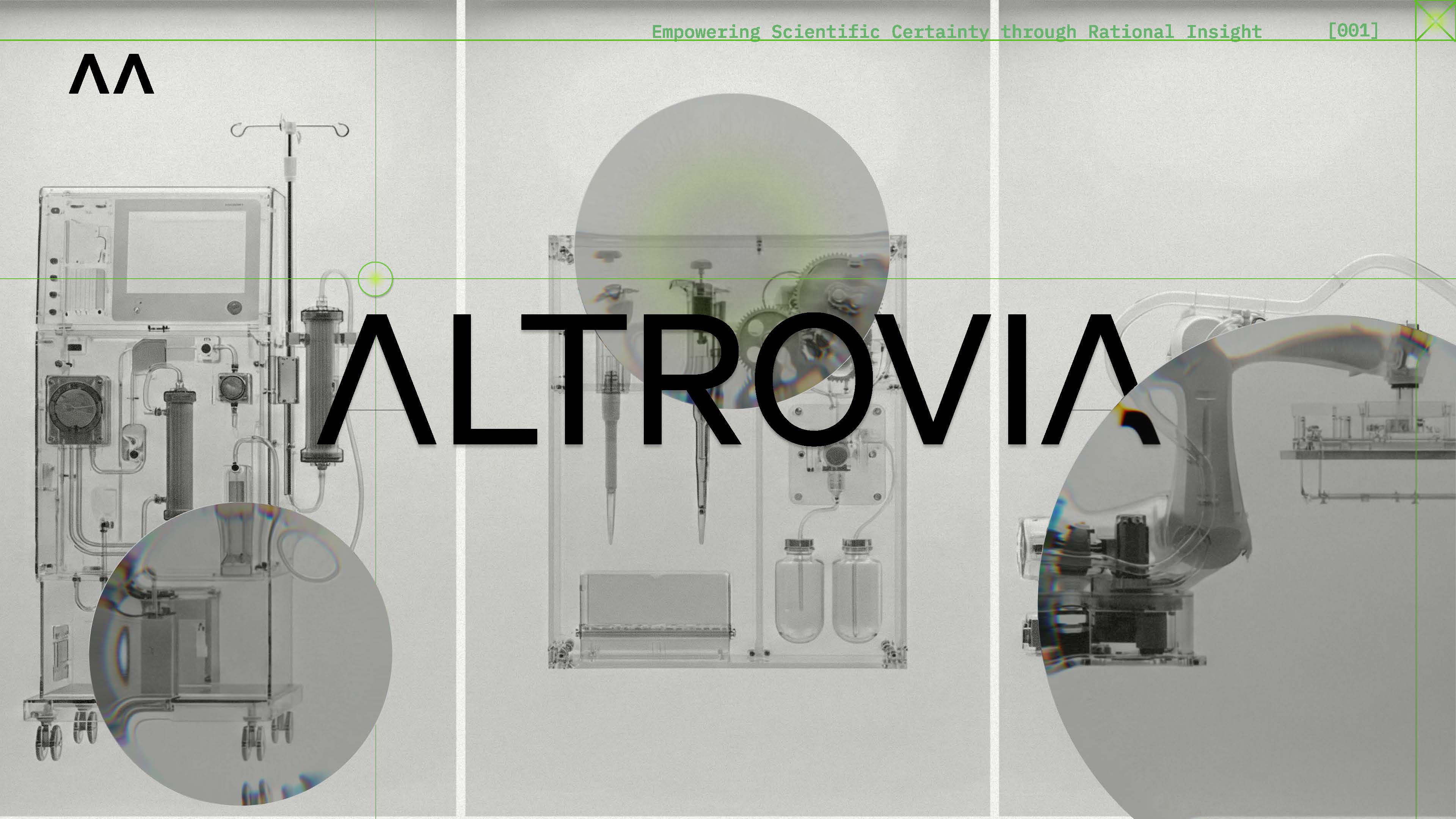
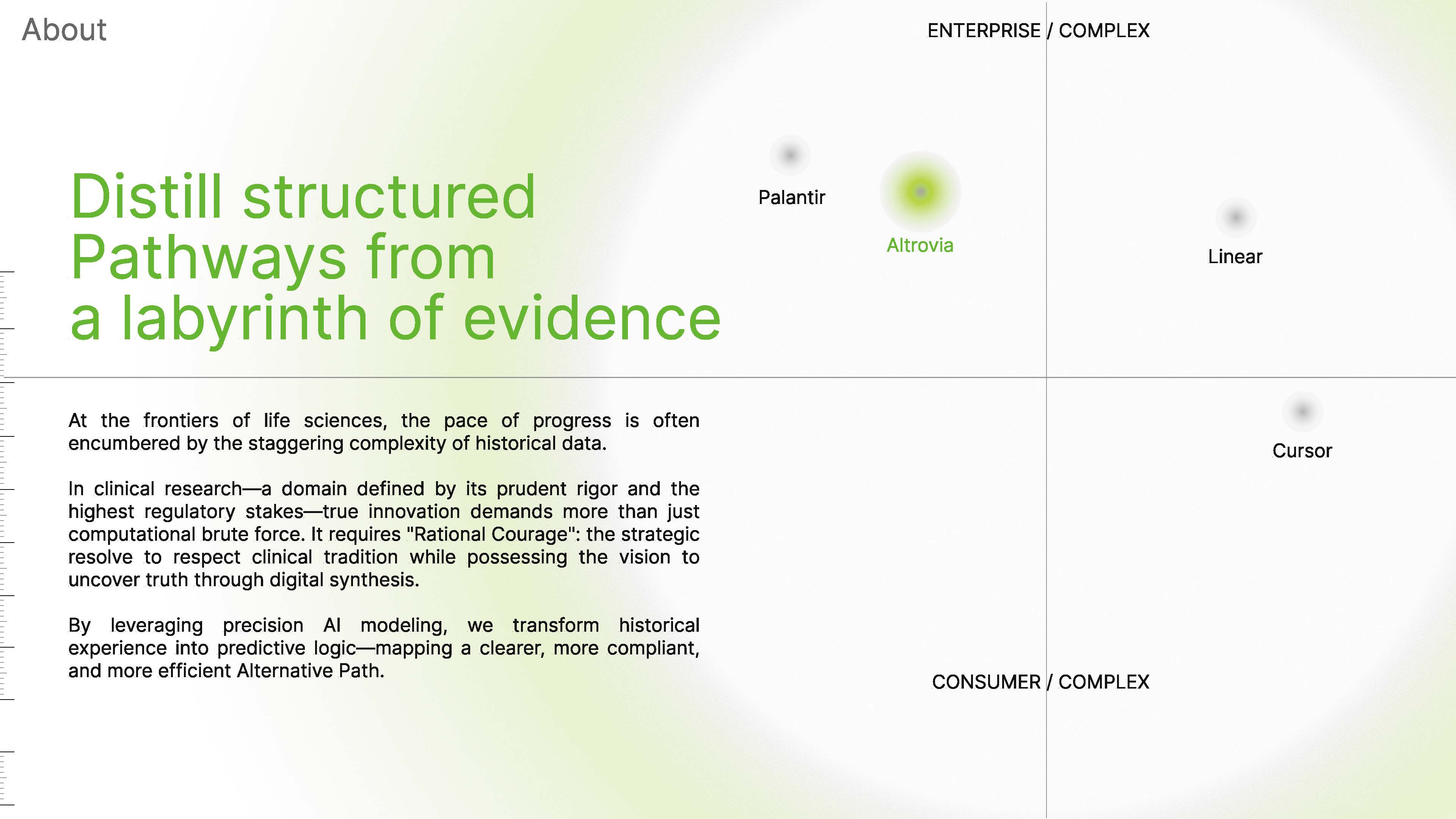
We were captivated by the intersection of institutional authority and computational intelligence. Our inspiration stemmed from the Mil-Gov aesthetic—a design category defined by structural rigor and command-system visual language. We sought to bridge the gap between Altrovia’s role as a trusted medical authority and its identity as a cutting-edge AI engine.
What it does
Our branding system, "The Distilled Pathway," transforms the overwhelming complexity of clinical evidence into a clear, actionable visual language. We developed a symbolic framework that represents "Rational Courage": the ability to respect rigorous clinical standards while leveraging precision AI modeling to extract predictive logic.
How we built it: The Technical System
We moved beyond a static logo to create a holistic, tech-forward ecosystem:
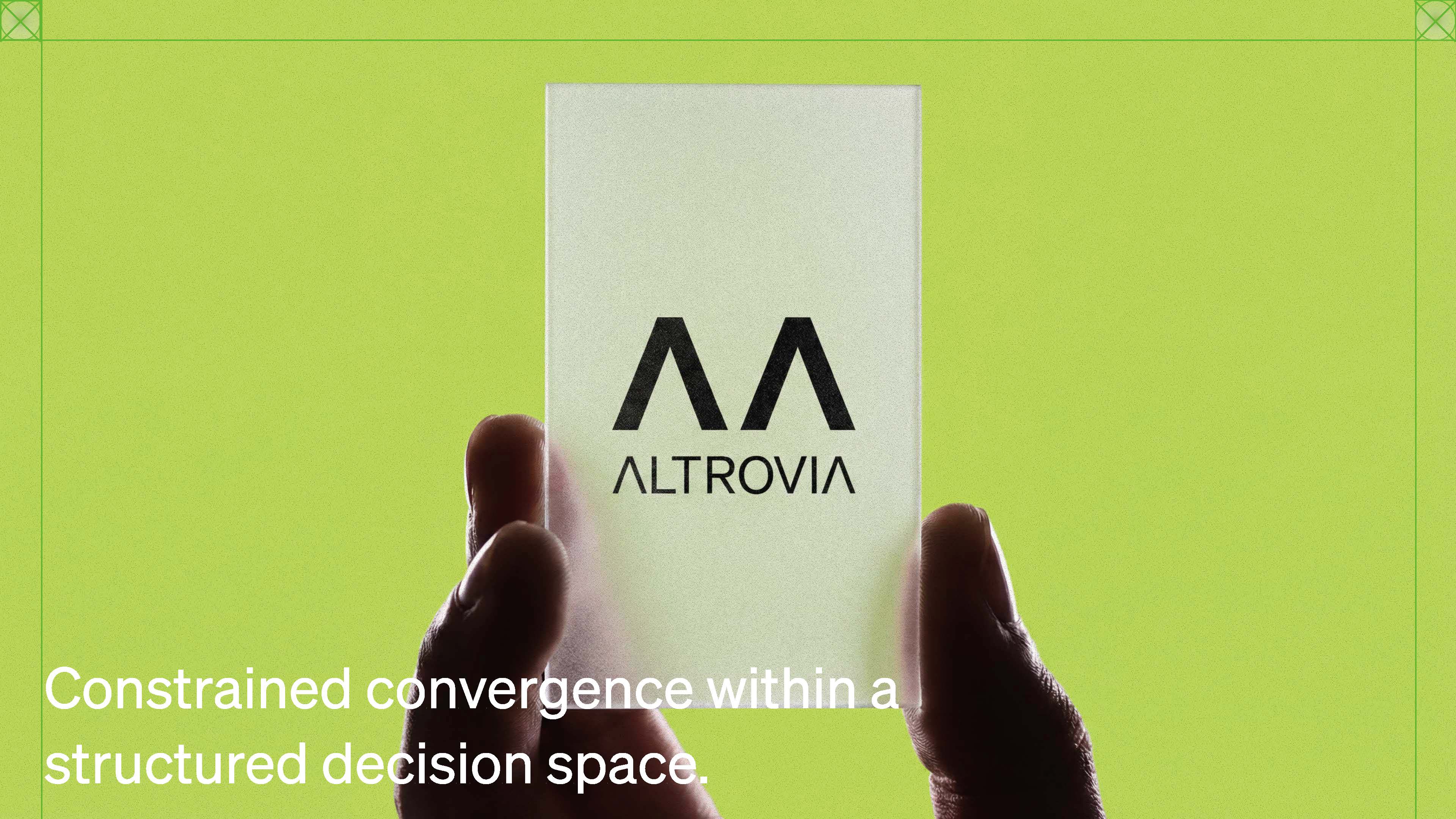
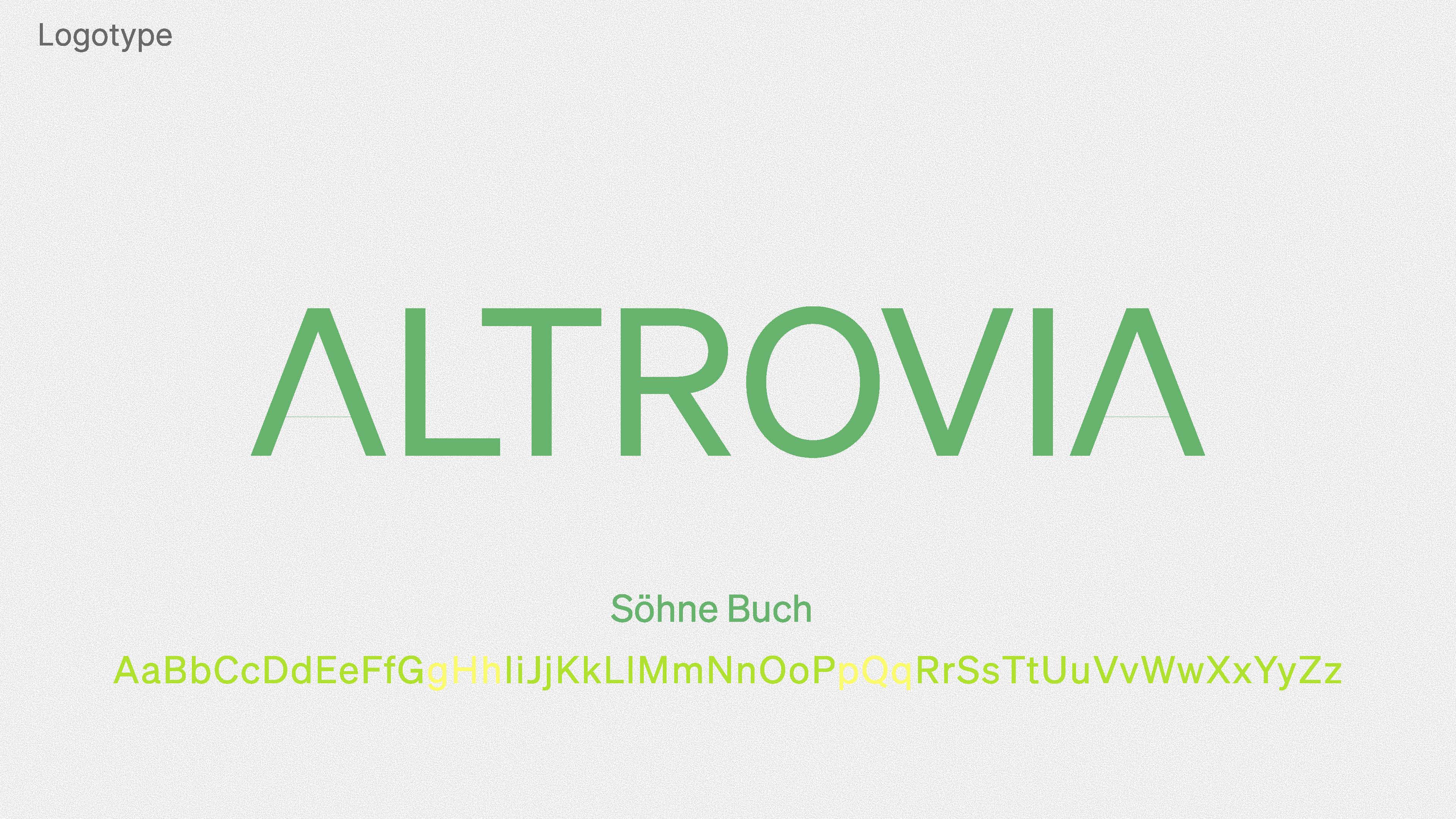
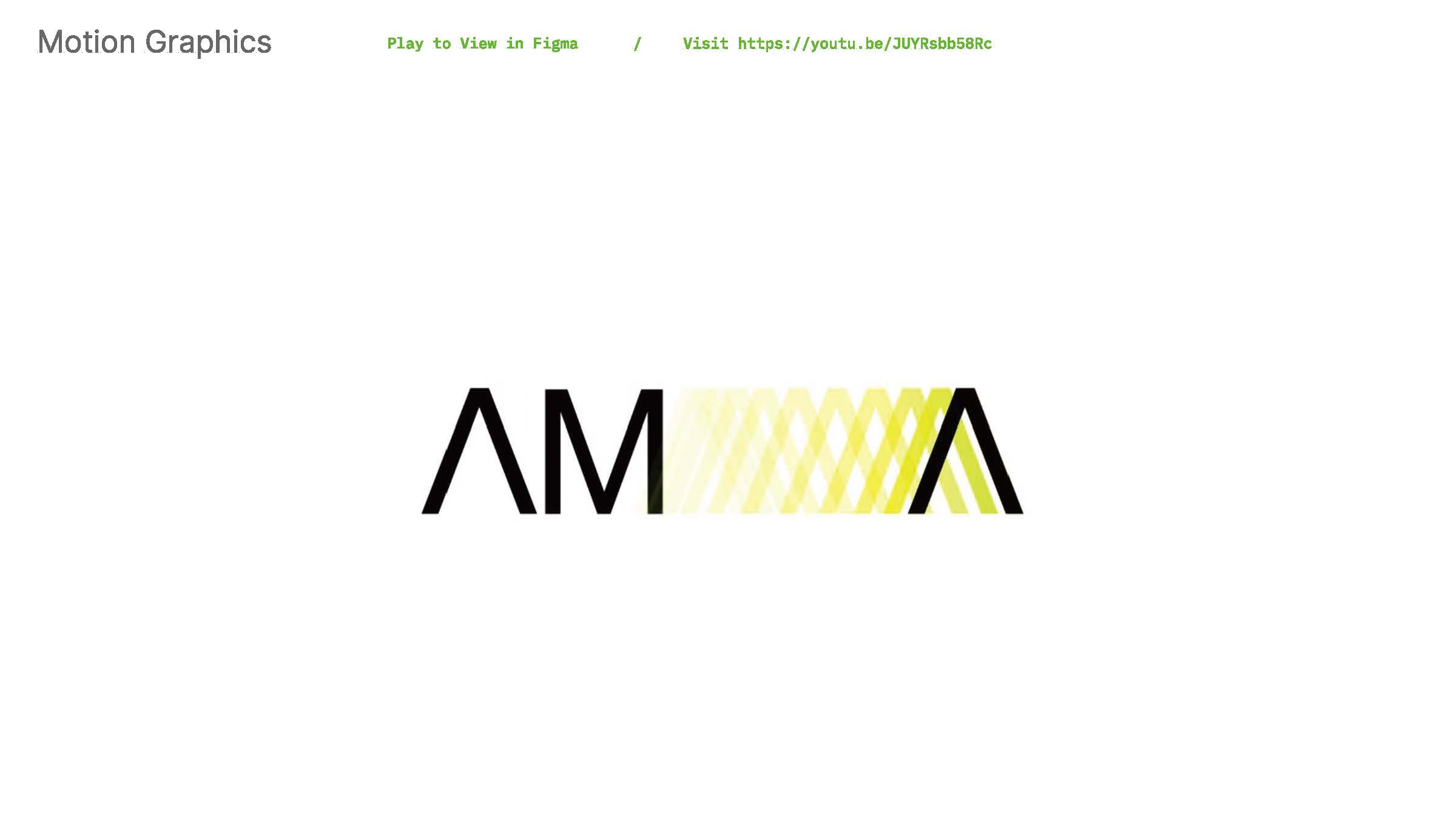
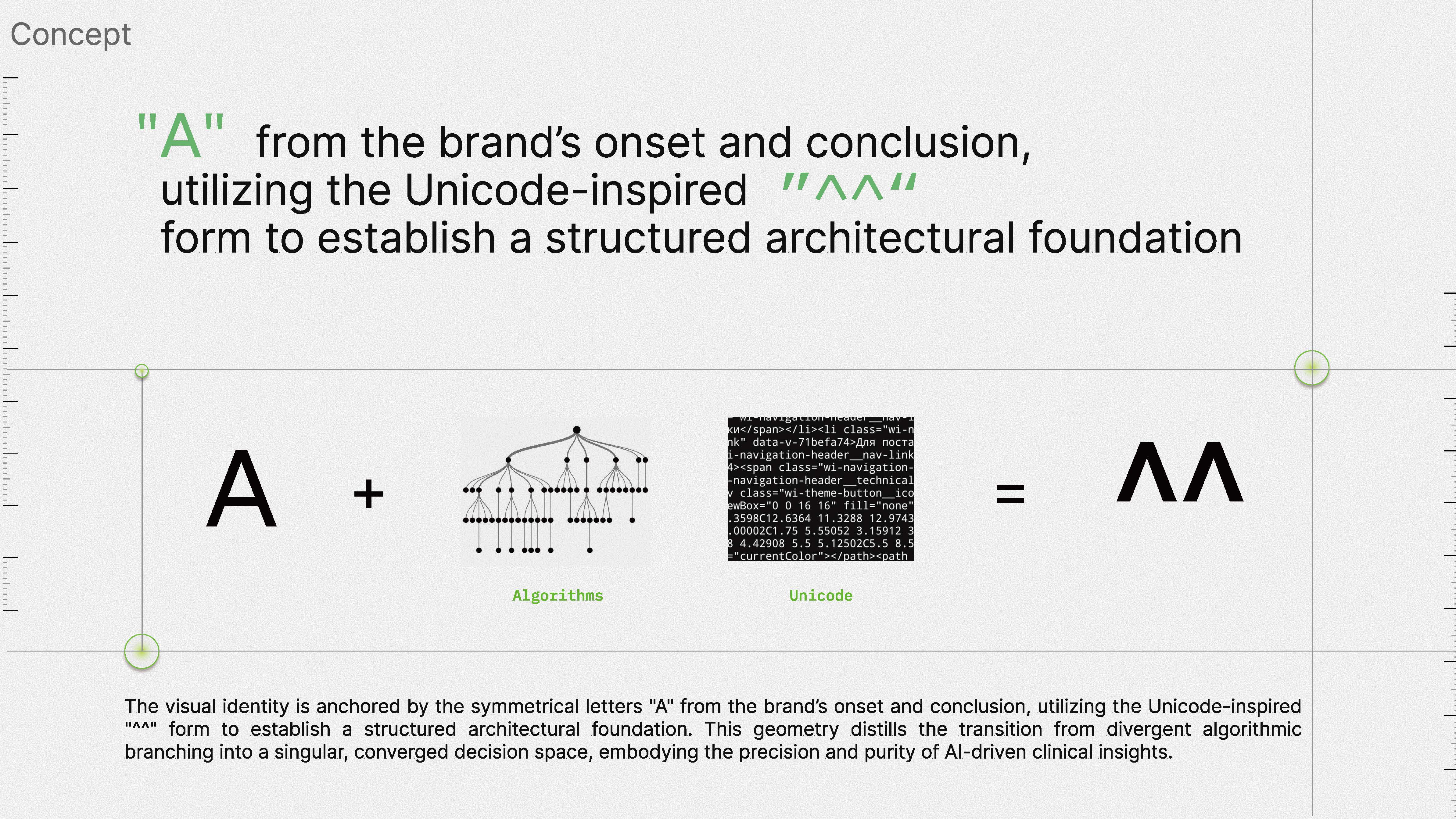
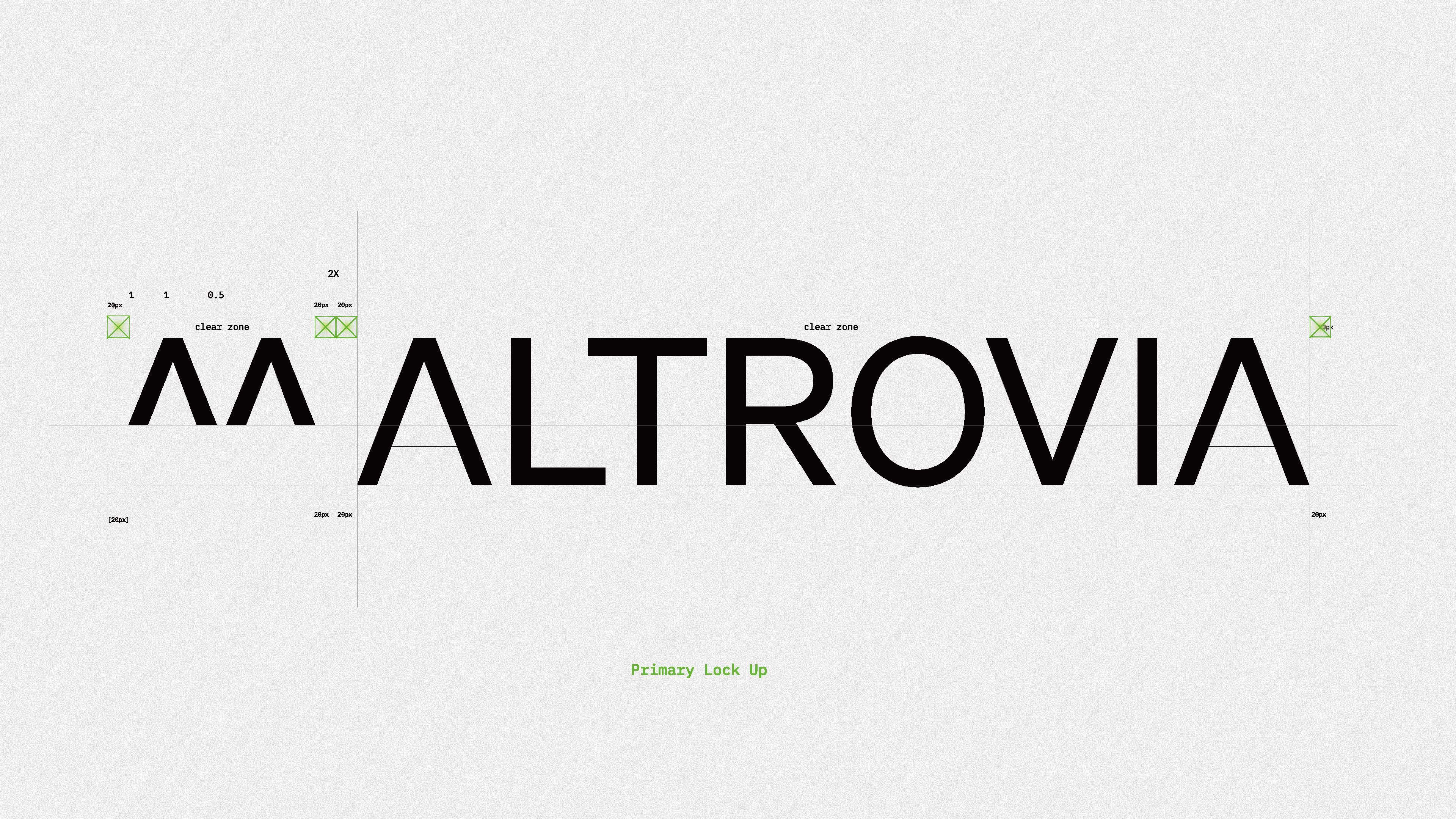
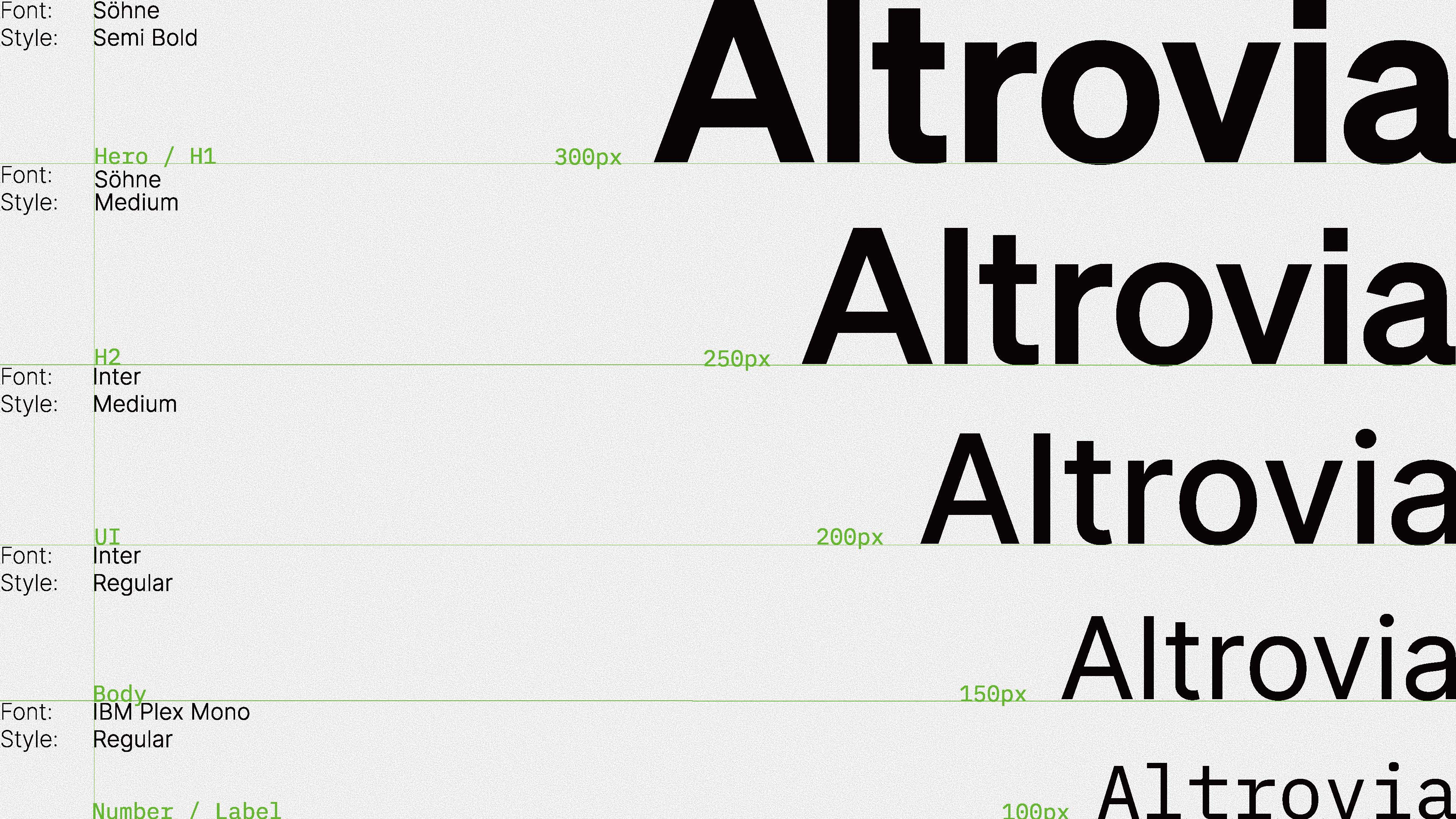
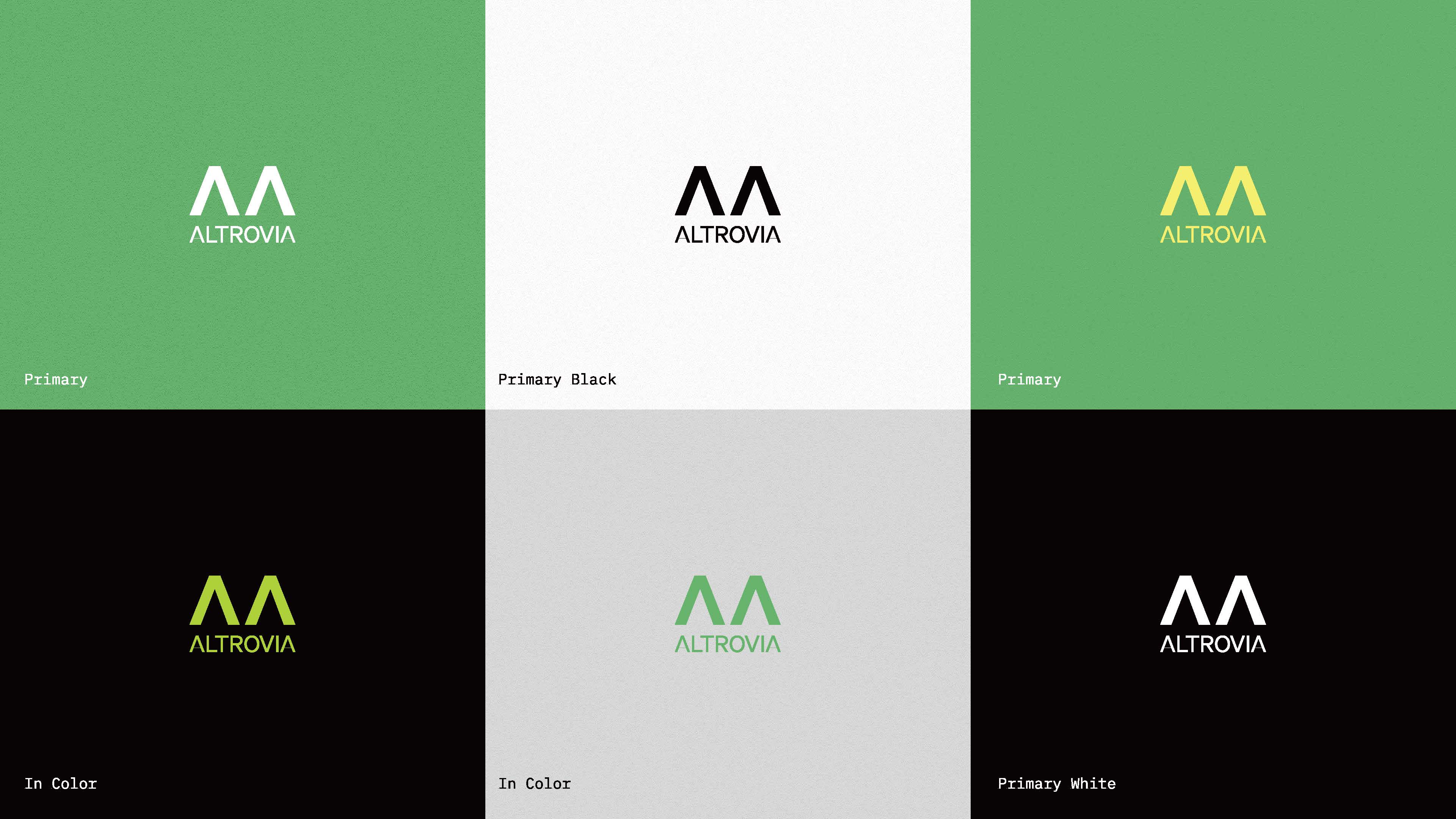
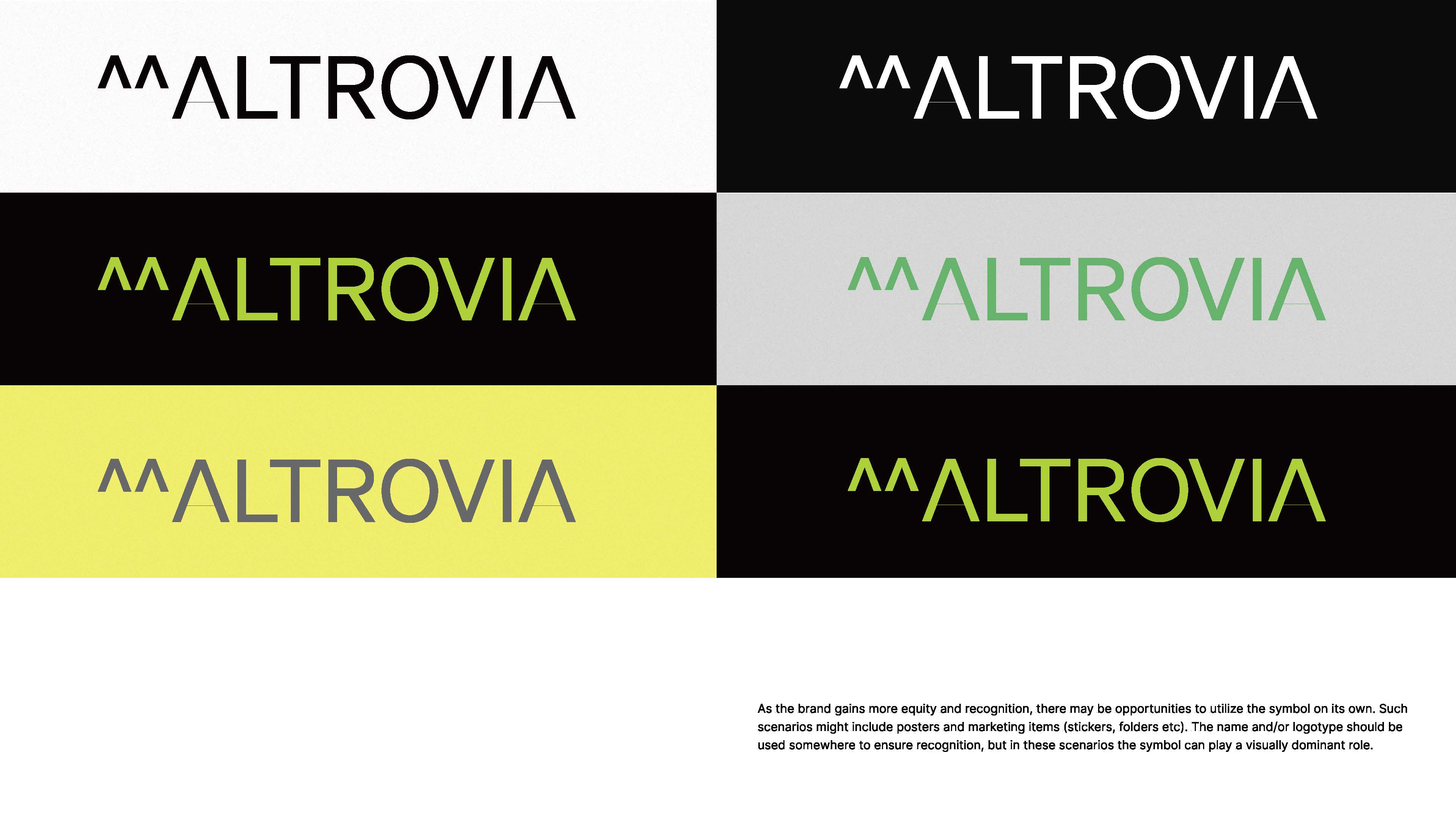
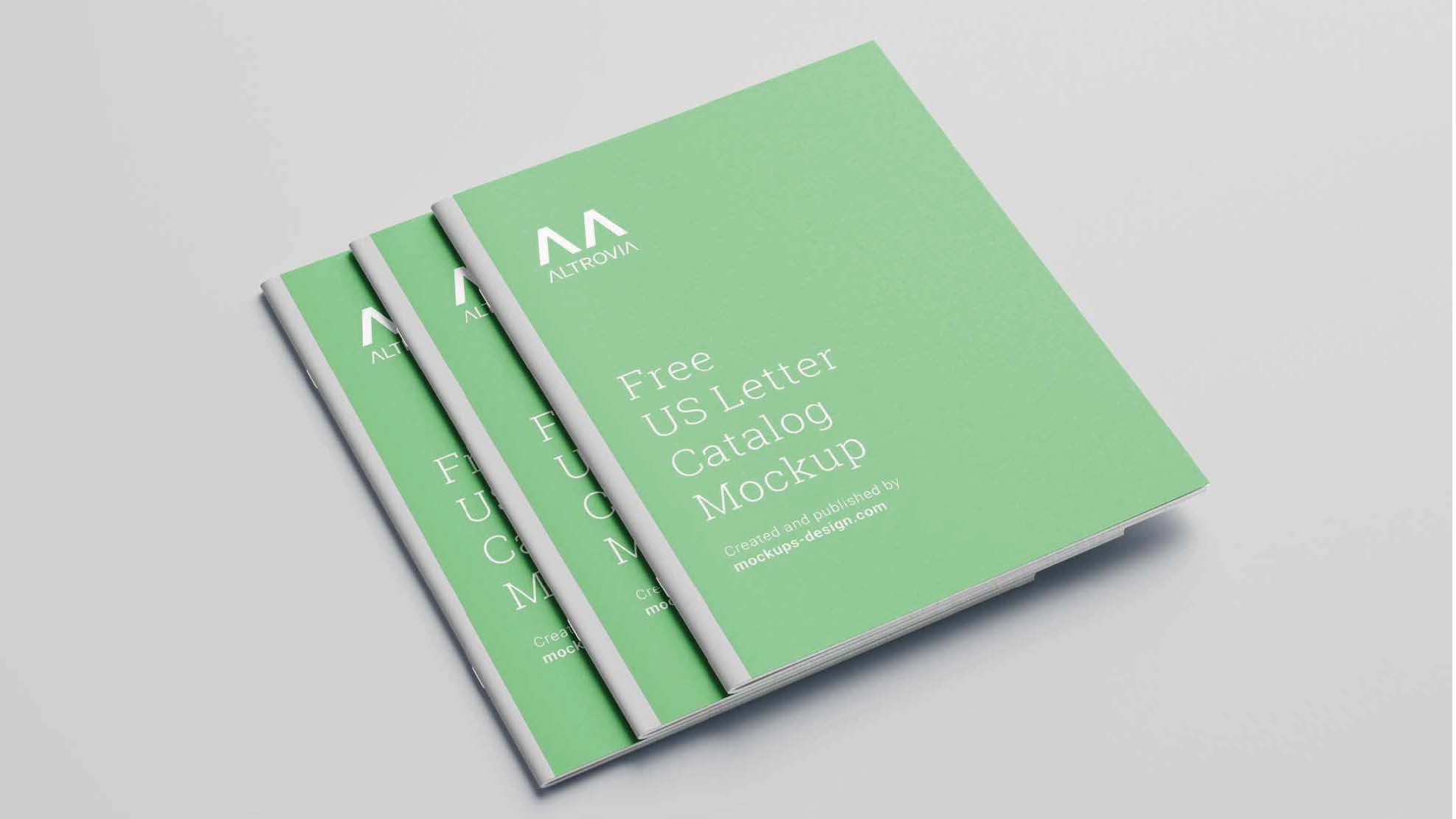
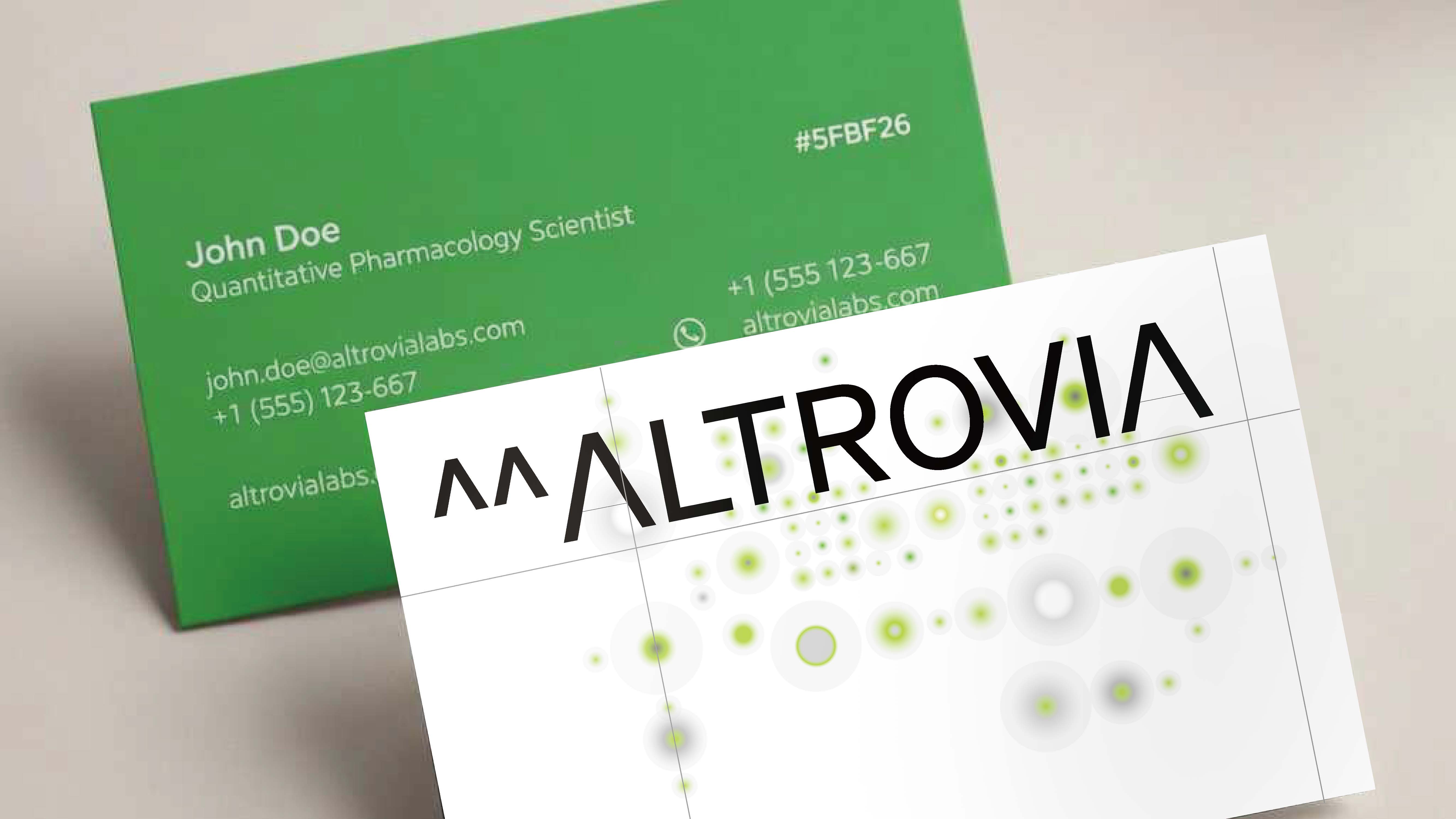
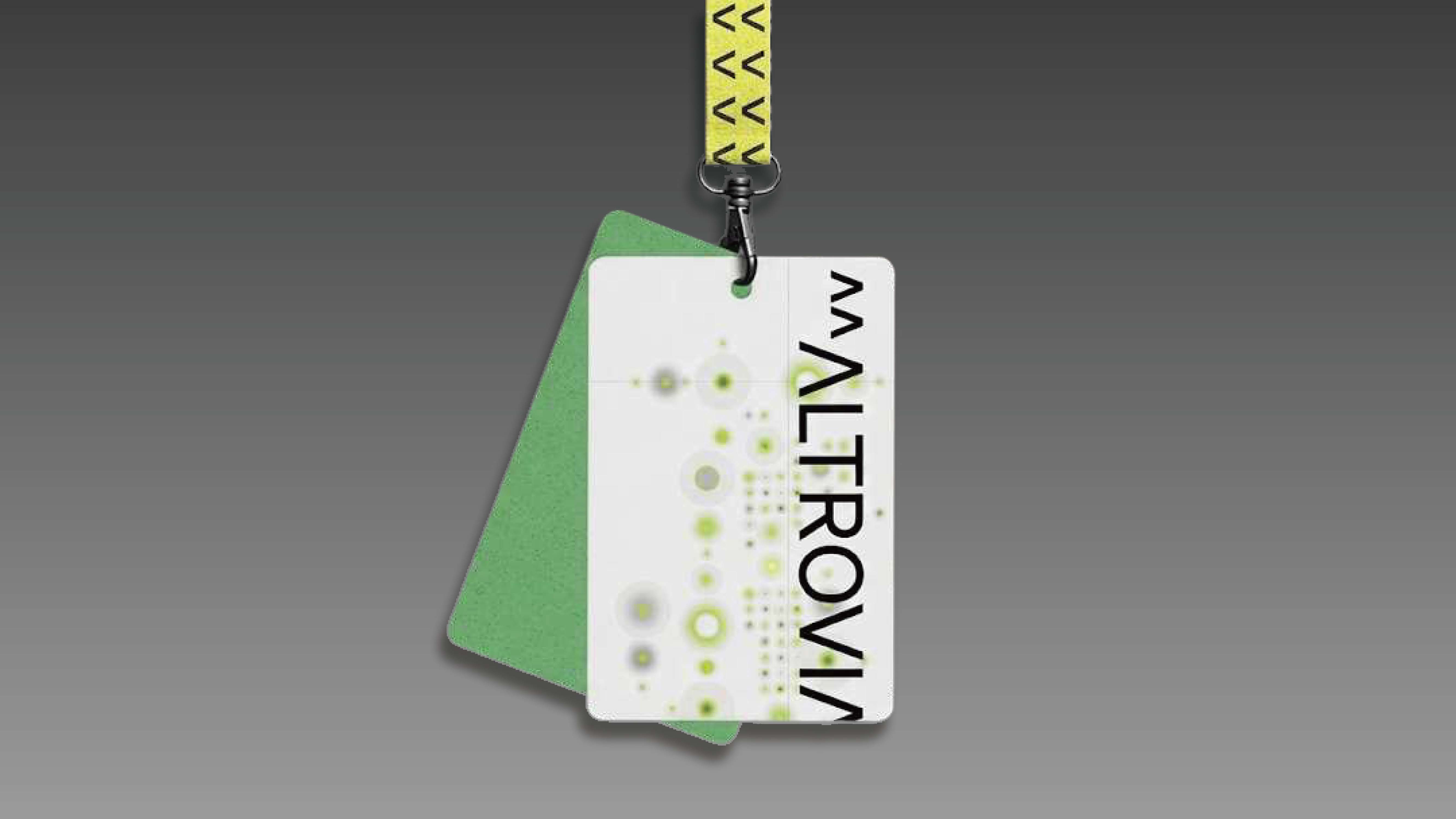
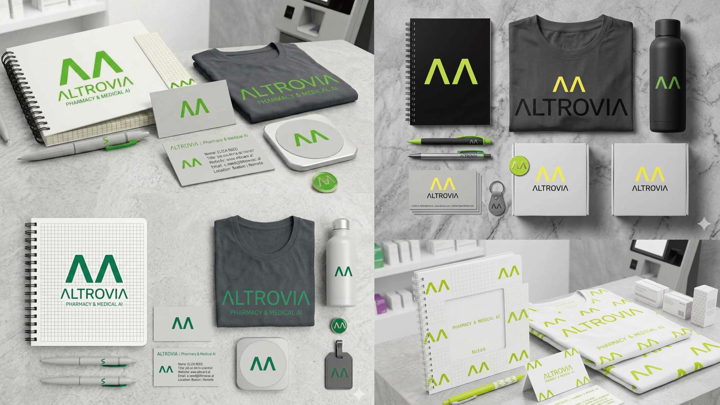
- Type & Logo Strategy: We abstracted the "A" in Altrovia through an algorithmic lens, evolving it into the "^^" symbol. This represents iterative data processing. The typography utilizes high-legibility, monospaced-influenced sans-serifs to mirror terminal coding environments.
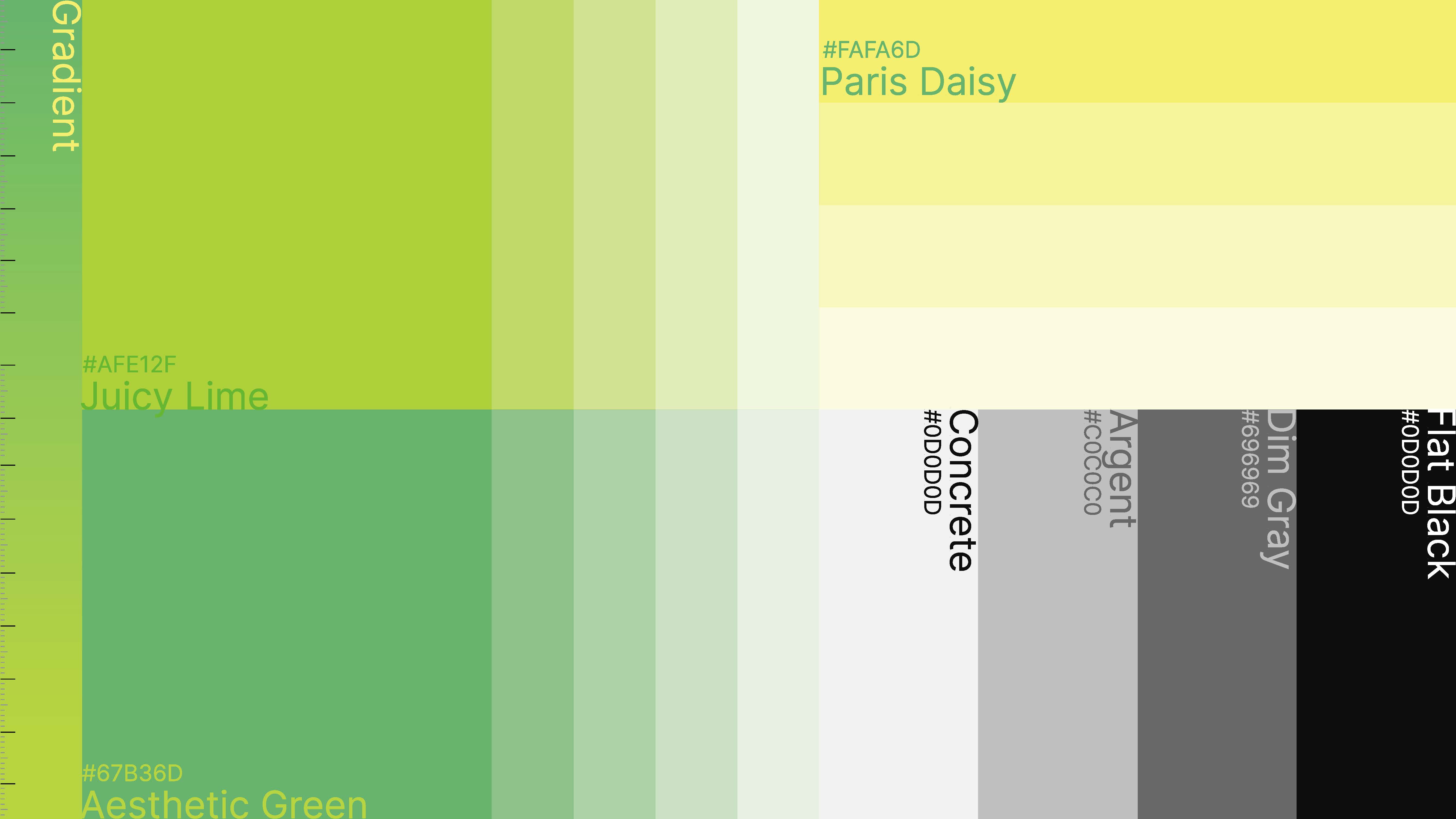
- Color Scheme: A "High-Stakes" palette featuring Command Navy, Clinical White, and Data-Stream Teal, creating a high-contrast environment that feels both sterile and high-tech.
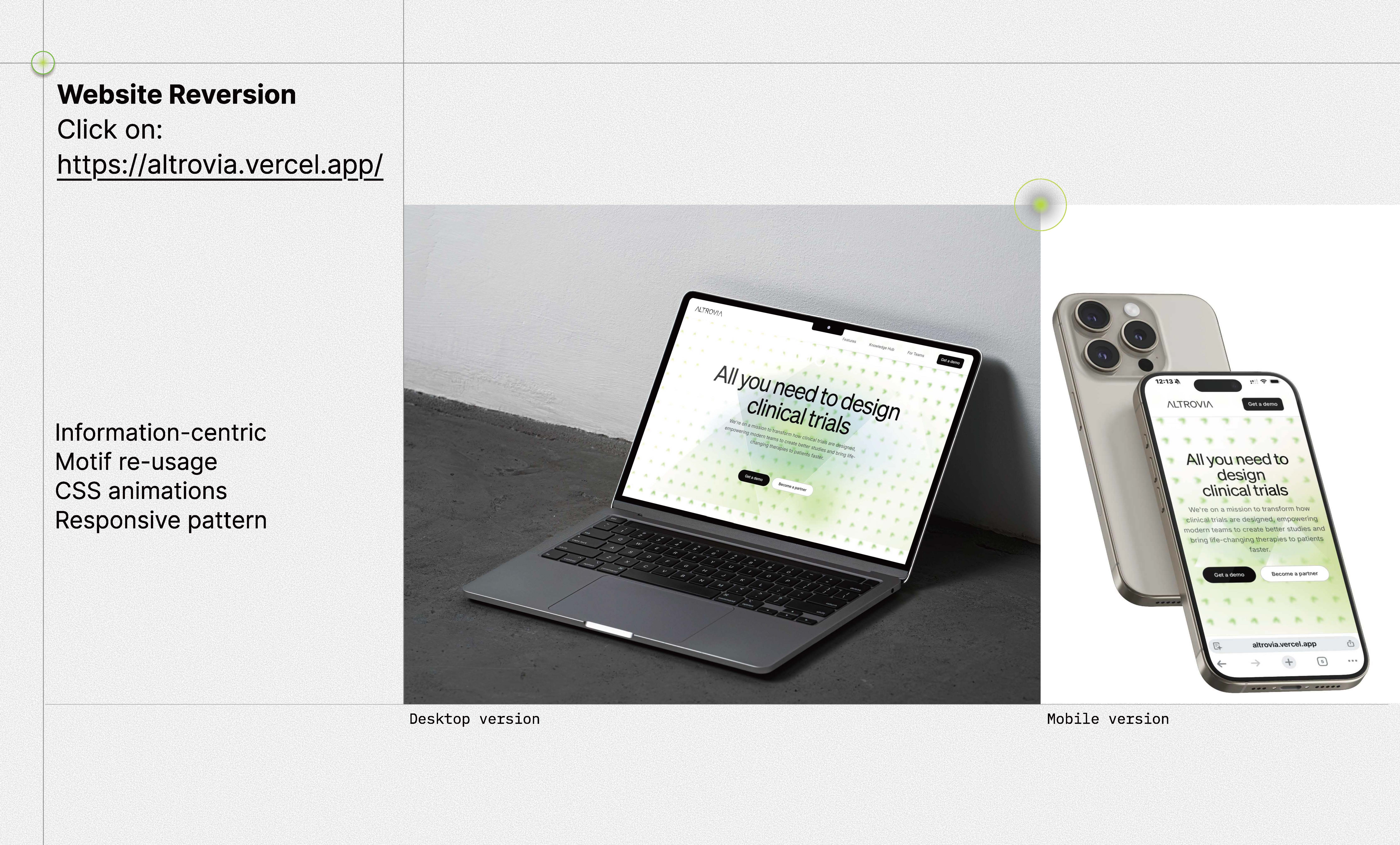
- Website Full Re-versioning: We redesigned the digital experience at https://altrovia.vercel.app/ to be information-centric. The UI utilizes the "^^" motif as a functional element—guiding the eye through complex data hierarchies.
- Dynamic Web Engineering: * CSS Animations: Implemented subtle "pulse" and "scan" transitions that mimic data being processed in real-time.
- Information-Centric Motif: Re-usage of the "^^" symbol as a decorative background element and a functional data-pointer.
- Responsive Patterns: A modular grid system that scales from mobile devices to wide-screen command centers without losing structural integrity.
Challenges we ran into
The primary challenge was the Information-centric Motif re-usage. We had to ensure the "^^" symbol worked as a decorative motif, a functional bullet point, and a loading state without becoming repetitive. Achieving a visual balance where the "Mil-Gov" rigor didn't feel "heavy" required precise CSS easing and generous whitespace.
Accomplishments that we're proud of
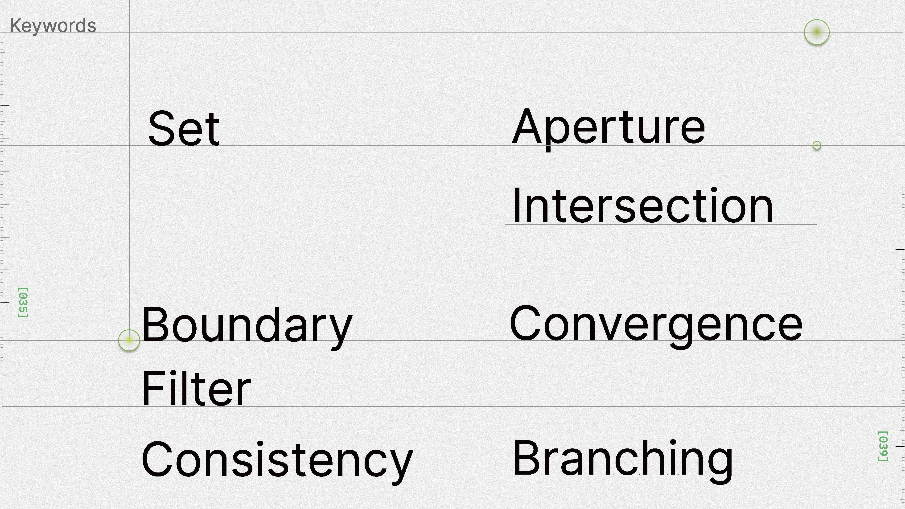
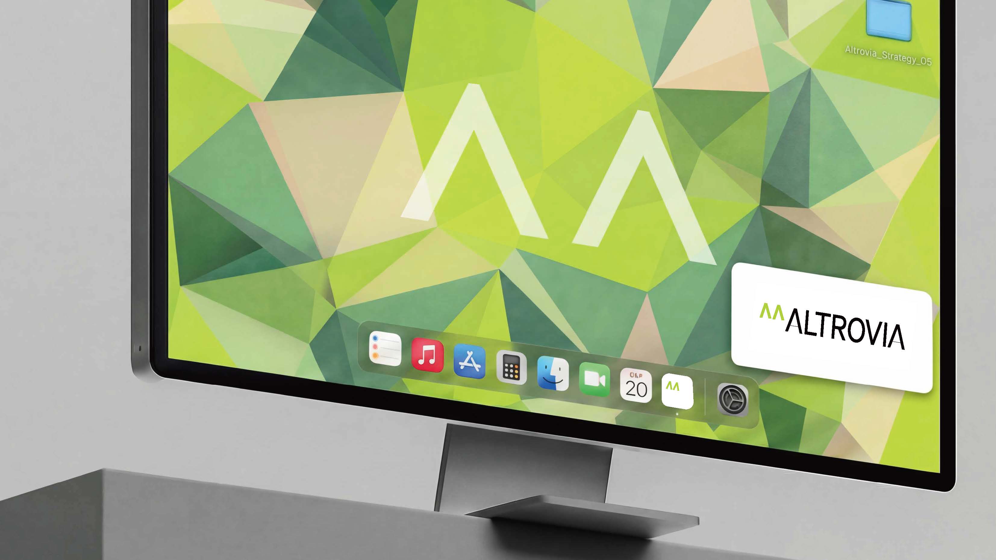
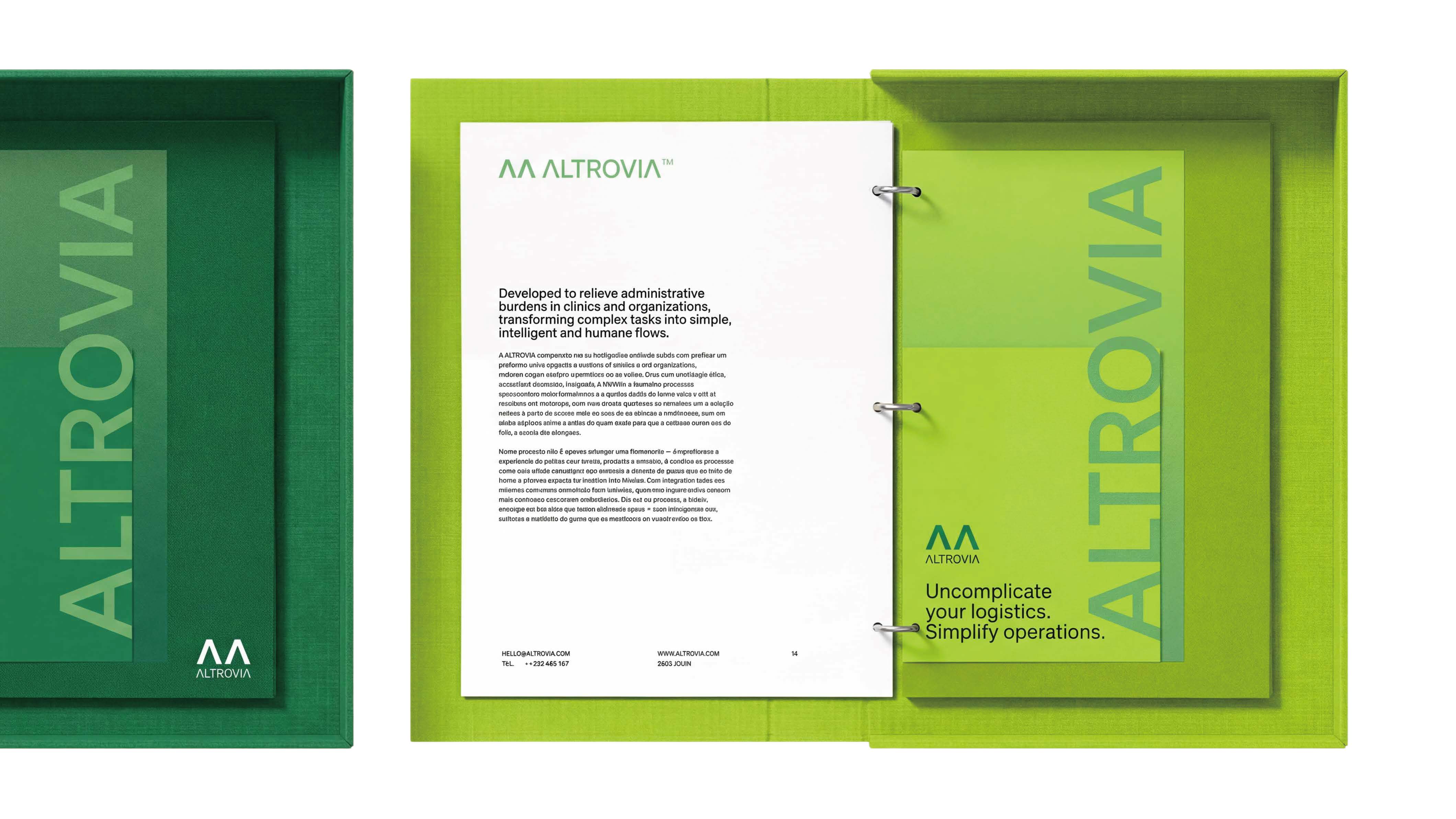
We successfully translated abstract concepts like "Aperture" and "Convergence" into a tangible Peripheral Mockup suite. Seeing the brand live on hardware, tablet interfaces, and clinical documentation proved that our "Rational Courage" concept was physically viable in a professional medical environment.
What we learned
This project taught us that Dynamic Web Design is the ultimate test of a brand's logic. Developing responsive patterns forced us to define exactly how "authority" scales across different devices, reinforcing the need for a "system-first" rather than "image-first" design approach.
What's next for ITPTeam_Branding_OnAltrovia
Next, we aim to refine the generative aspects of the motif—developing a script that allows the "^^" pattern to procedurally generate based on real-time clinical data inputs, making the brand's visual identity as live and reactive as the AI itself.
Team & Contributions
- VI, Branding & Visual Design: Minglu Zhong, Tiffany Ziyi Yuan, Richard Qian Li
- Branding Strategy: Minglu Zhong, Richard Qian Li, Tiffany Ziyi Yuan, Kurt Qian
- Web Design & Development: Richard Qian Li
- Motion Image Design: Kurt Qian
- Graphics Design: Minglu Zhong, Tiffany Ziyi Yuan
Built With
- adobeexpress
- css
- figma
- github
- html
- javascript
- vercel
- videoediting


")
")
Log in or sign up for Devpost to join the conversation.