-
-
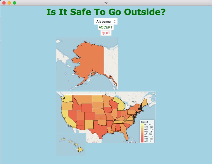
Default output that is shown when code is run
-
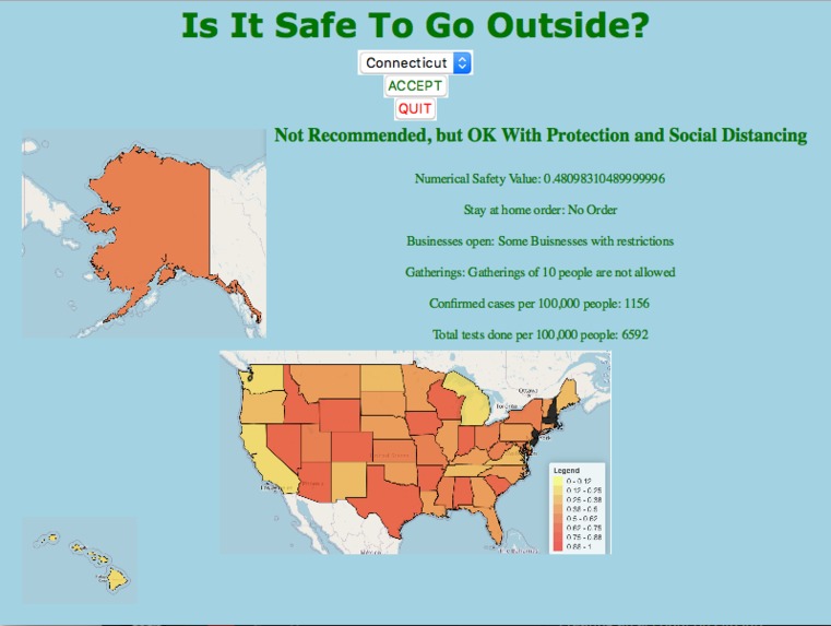
Details are shown when you select a state. Connecticut is chosen here.
-
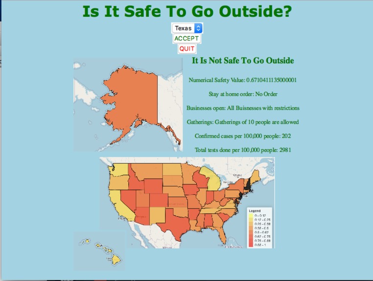
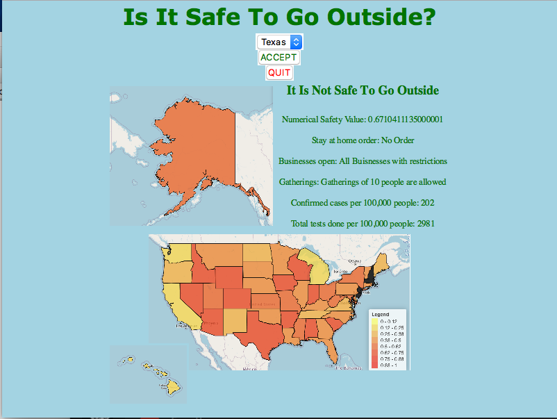
Texas is chosen here.


Inspiration
This idea was inspired by the uncertainty and restlessness in the United States and each state's approach to handling COVID-19 as of May 29th. Some states are still on lockdown while others have almost entirely resumed daily life. Whether it is safe or not to go outside is variable from state to state, depending on how many cases there are and if a state's government eased restrictions too early. Our team decided to focus on a quick way to take in multiple statistics and current events for each state and determine whether it would be safe to go outside for residents in that state.
What it does
This interface allows users to select any of the 50 states in the U.S and it will tell them whether it is safe to go outside, what conditions make it safe or not safe to go outside, and any related data for that state, It also provides a heat map of all the states that visually represents to what degree its safe to go outside. The interface determines if a state is safe or not by taking data such as the number of confirmed cases and tests, whether the state is staying at home, what businesses are open, and if social gatherings are allowed and for each of these categories, scores the state on a scale from 0 to 1, 0 being safe and 1 is not safe. each score is then multiplied by an arbitrary weight we gave each category depending on how significant that data plays into the safety of a state. The weighted scores are then added all together and if the final scores are less than a certain value, the state is considered safe.
How we built it
We first started with a tkinter canvas, then we added a drop-down list with all 50 states and an acceptable and quit button, using tkinter's button and option menu objects. When the accept button is clicked, statistics from the selected state are shown along with how safe it is for the user to go outside using tkinter's label object. We calculated the safety value by taking the value for each category for the selected state from the DataFrame and multiplying that value by the weight values. Then we added the weighted values to get the final score. Next, we used if-else statements to reason out how risky or unsafe it is to go outside. Finally, these results are displayed. We also included a heat map image, which uses the data we collected to show which areas of the United States are most unsafe or safe.
Challenges we ran into
The first challenge we faced was formatting the drop-down menu properly. When we first wrote the code for it, the drop-down menu would display one large list of all the states, we wanted it so that you could choose between each state. Another challenge we faced was making sure the label was updated dynamically, it wouldn’t work at first, every time we would select a new state, both the new state and the previously selected state would be displayed. We also tried to get as much data as we can from a single source, this helped increase the validity of our data. Only one column in our table was found from a different data source. The sources are linked on our GitHub.
Accomplishments that we're proud of
We were able to accomplish a lot over the past 24 hours. We successfully found a multitude of data from each state and were able to make it into a CSV file so that we could get it to interact with python. We are especially proud that this worked well, as collecting and organizing the data was tedious. We are also quite proud of our heat map, it shows which states are the safest and which are not. It is a good way to understand our data and how it can be useful. All in all, we are proud of everything we accomplished together as a team, and how we were only able to accomplish it because of our teamwork and coordination. The tool we have created can be very useful, as it is easy to use and gives a direct answer, with the data and facts to back it up, we're proud that there is the potential for this to help many people.
What we learned
From our research and gathering data for our interface, we have observed patterns of effective strategies states have developed for handling this pandemic which is exhibited in our interface as well. We learned that by evaluating each state and using one method to compare them, states not handling the pandemic well can evaluate where they need to be and change their state's rules accordingly.
What's Next?
The data and categories we used are what we felt like as important factors in determining if a state is safe or not, however, this model could be more accurate if more data points were taken into account. For example, what percentage of people actually follow their state's rules and the rate at which cases or tests are increasing or decreasing. Similarly, the weights we used for each category were based on reasoning and common sense, not grounded in any studies on the actual significance of the data points we used. With more consideration and time, the model we made could be more accurate.


Log in or sign up for Devpost to join the conversation.