Inspiration
I was inspired by the need to practice and apply my data visualization skills on real-world datasets to better understand patterns and insights.
What it does
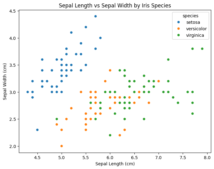
The project creates a simple scatter plot that visualizes the relationship between sepal length and width for three different species of iris flowers.
How we built it
I used Python, along with the Seaborn and Matplotlib libraries, to load the Iris dataset and create the visualization in a Jupyter notebook.
Challenges we ran into
One challenge was deciding which specific features of the dataset to visualize in a way that made the differences between the species clear.
Accomplishments that we're proud of
I'm proud of how the final visualization effectively showcases the differences between species in a clean, easy-to-understand format.
What we learned
I learned how small design choices in data visualization can have a big impact on clarity and how to effectively use Seaborn for such tasks.
What's next for Iris Flower Data Visualization
Next, I plan to explore more advanced visualizations and possibly add interactivity to make the project more engaging.
Built With
- google-colab
- python
- seaborn

Log in or sign up for Devpost to join the conversation.