

We wanted to make a better stock Reminders app for iOS 8. But we didn't do this by simply adding more features.
Anyone who uses the stock Reminders app for iOS 8 can see that it has a very unorthodox UI, a UI that is not seen anywhere else in the ecosystem outside of Passbook. Not only is it unorthodox, but it is frustrating to use due to poor affordances and cues.
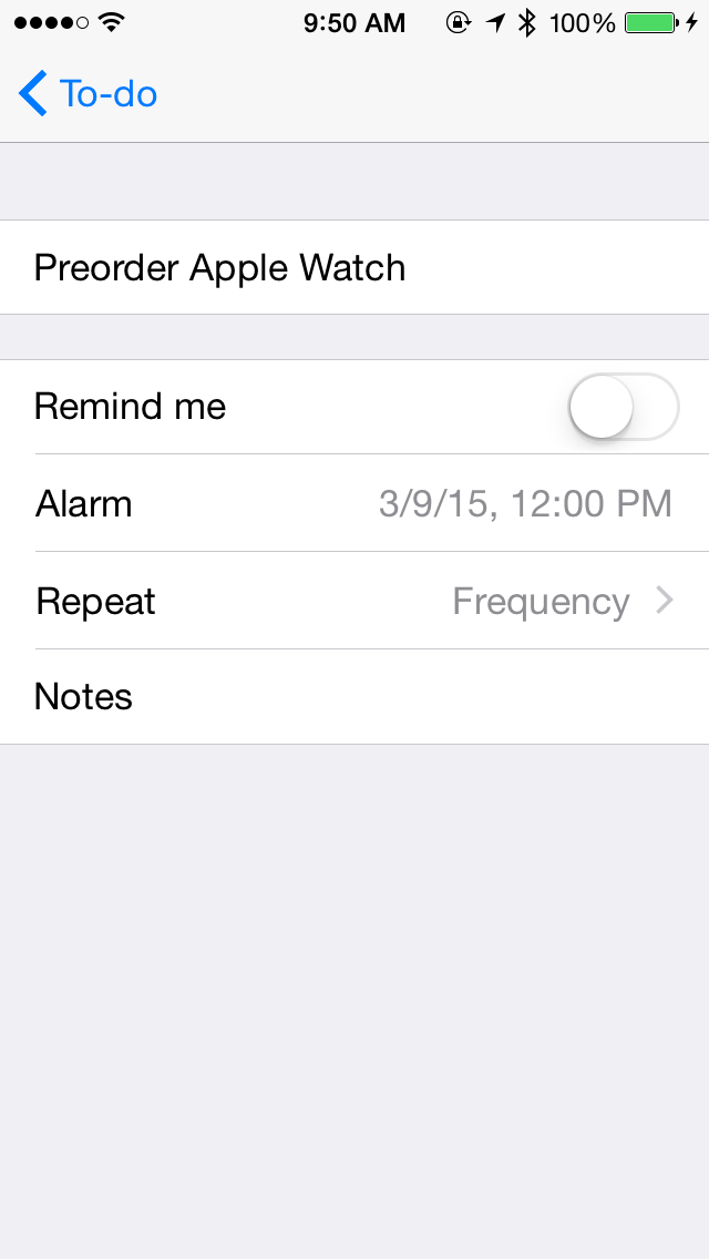
We chose to redesign the Reminders app to match the aesthetic of iOS 8. Using standard table views, we designed a reminders app that feels more in line with iOS than Apple's own. And we feel like that's something to be proud of.

Log in or sign up for Devpost to join the conversation.