-
-
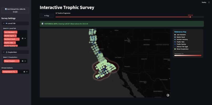
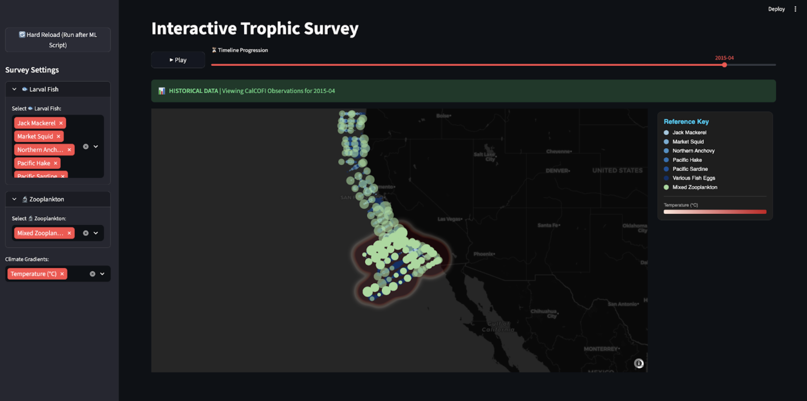
Interactive Trophic Survey: Toggle species & environmental layers like temperature while navigating 75 years of data via a timeline slider.
Inspiration
We wanted to answer one critical question: How is our changing ocean climate reshaping the food web of the California Current? The health of the California Current is determined by its smallest residents. Larval fish and zooplankton are the biological "engine" of our coast, yet their data is often buried in massive, unformatted datasets spanning decades. We built the Interactive Trophic Survey to bridge this gap. Our project synthesizes 70 years of CalCOFI biological records with physical oceanography to visualize how environmental shifts are changing the very foundation of the marine food web.
What it does
The Interactive Trophic Survey is a "Prognostic Dashboard" that transforms raw oceanic data into a high-fidelity visual narrative. Unified Exploration: Users can toggle between 75 years of historical observations across multiple trophic levels (larval fish and zooplankton). AI-Standardized Taxonomy: It automatically resolves decades of messy species naming conventions using Large Language Models. Predictive Habitat Mapping: Instead of just looking at the past, the tool features a "Forecast Mode" that uses Machine Learning to predict species density for 2024–2026 based on cumulative climate-warming scenarios (+0.05°C/month). Environmental Correlation: It visually links biological population shifts to physical gradients like temperature and salinity, making complex data actionable for conservationists.
How we built it
Our development followed a rigorous ETL (Extract, Transform, Load) pipeline designed to handle over 450,000 records. The Backend: We used Python and Pandas to fuse disparate biological streams into a unified SQLite architecture. The AI Layer: We implemented the Google Gemini API as a semantic layer. This solved a major historical hurdle by standardizing inconsistent species labels into a single taxonomic structure. The ML Engine: We trained a HistGradientBoosting Classifier using engineered lagged features to identify high-suitability habitats. The Interface: We utilized Streamlit (leveraging the 2026 Fragment API for high-speed updates) and Plotly WebGL to render hundreds of thousands of data points without browser lag.
Challenges we ran into
Our greatest challenge was data heterogeneity. Working with data spanning seven decades meant dealing with shifting collection methods and naming conventions. We built a robust fuzzy-matching logic to ensure an entry from 1951 was scientifically comparable to one from 2024. Additionally, we faced a spatial over-density problem. Visualizing 450k points can quickly become "visual noise." We solved this by implementing an Aggressive Spatial Filter in our ML pipeline—thresholding predictions at a 0.75probability and using spatial thinning to ensure the map remains a clear, actionable tool for decision-makers.
Accomplishments that we're proud of
- Semantic Data Healing: Successfully using Generative AI to "fix" 70 years of inconsistent human record-keeping.
- Zero-Lag Visualization: Achieving fluid, real-time animation of nearly half a million data points on a web-based dashboard.
- Predictive Accuracy: Building a model that doesn't just show points on a map, but understands the "environmental memory" of the ocean through lagged features.
What we learned
We learned that data analytics is about driving action, not just drawing charts. We discovered how to translate complex biological relationships—like the correlation between a 1°C shift in temperature and the northern migration of anchovy eggs—into a visual story that a stakeholder can understand in seconds. We also gained deep experience in scaling Python-based ETL pipelines for massive, "noisy" environmental datasets.
What's next for Interactive Trophic Survey
We are focused on scaling our "Digital Twin" of the California Current: Multi-Factor Forecasting: Integrating dissolved oxygen and pH levels to account for the impact of ocean acidification and hypoxia. Expanded Trophic Cascades: Incorporating mammal and benthic datasets to map how changes in the zooplankton "engine" ripple up to top-tier predators. 2026 Live Forecasting: Updating the model to ingest real-time 2026 physical data for a true future-look prediction engine. On-the-Fly Analytics: Introducing a drag-and-drop "Graph Studio" for instant statistical regressions directly within the dashboard.
Conclusion
Data analytics is about more than just drawing charts; it’s about driving action. By providing a unified, high-fidelity view of the California Current, we’ve created a tool that allows scientists to communicate findings to stakeholders with speed and clarity. We’ve turned CalCOFI's 'Big Data' into a Big Picture for ocean conservation.

Log in or sign up for Devpost to join the conversation.