-
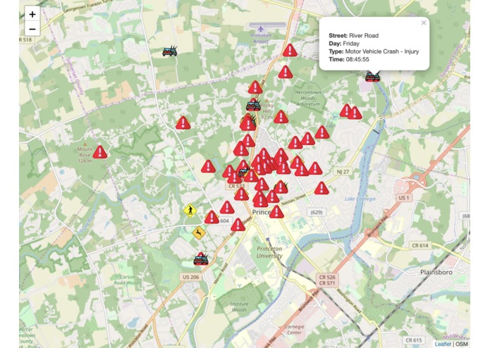
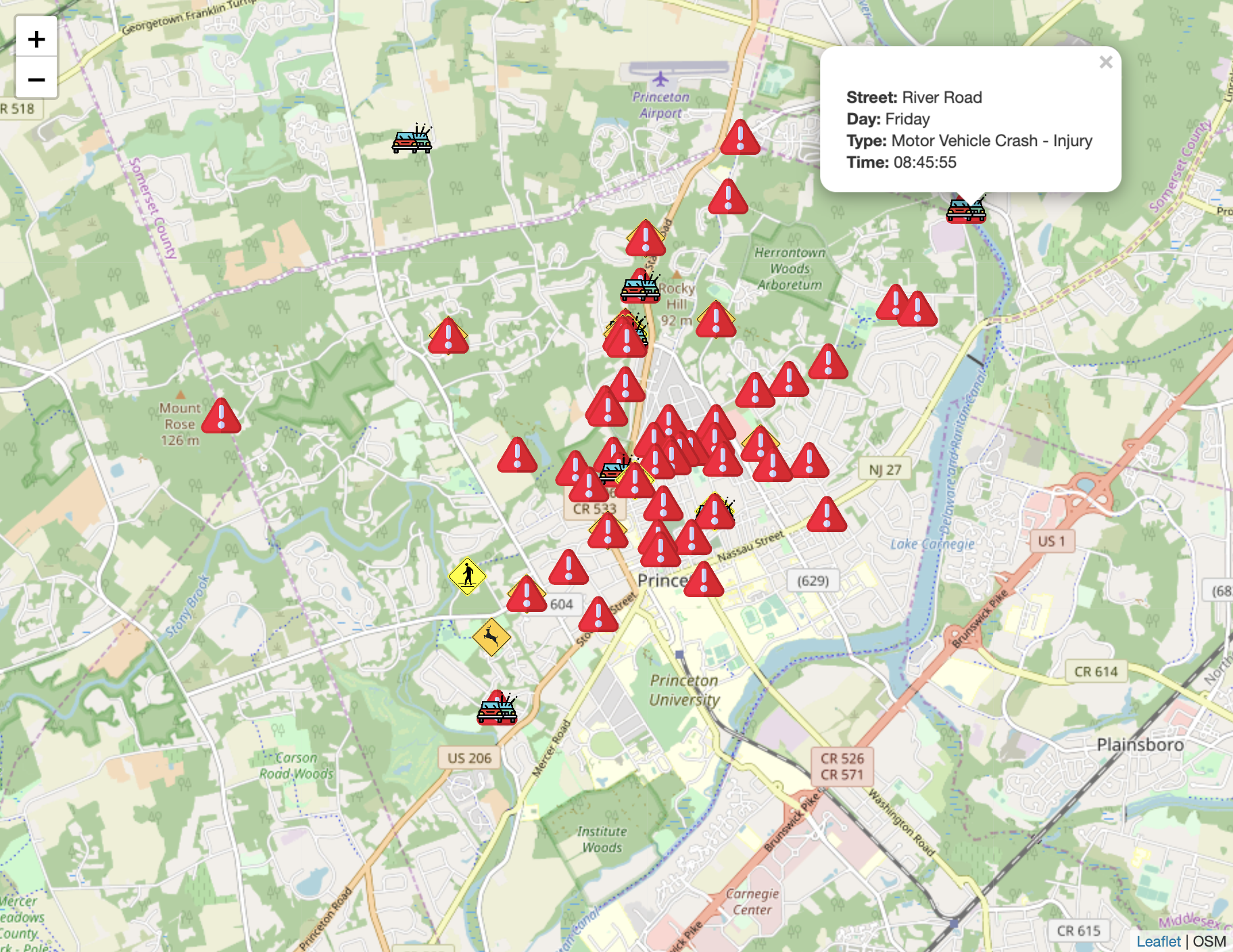
Traffic incidents between 6 am and 12 pm
Inspiration
The night before I drove to school for the first time, I went online to find the safest route to school. To my shock, there was nowhere to find what types of accidents are most common, and when and where? That's what we decided to find out.
What it does
An interactive traffic incidents map for the Princeton area, with over 1,000 datapoints from 2018. Users can toggle by the type of accident, day of the week, and time of crash to see the icons pop up on the map. The type of accident toggle buttons work, but you have to refresh the page to clear the day of week and time buttons.
How we built it
lots of javascript, html, css, bootstrap, and a mighty openmaps api called Leaflet.js
Challenges we ran into
The data was NOT easy to find, and it was hard using Leaflet for some stuff, like point clustering.
Accomplishments that we're proud of
We got the data straight from the Princeton Police Department, which is pretty cool.
What we learned
How to work with map APIs, which is something both of us were interested in doing. Also the traffic patterns of Princeton.
What's next for Interactive Traffic Incidents Map For New Drivers
There is a lot of overlap on the points, so some points are actually five points, but they stacked on top of each other. and we couldn't figure out how to cluster the points, so this is definitely an area of improvement. Another thing could be a live excel file that feeds into our project for the most current data.


Log in or sign up for Devpost to join the conversation.