-
-
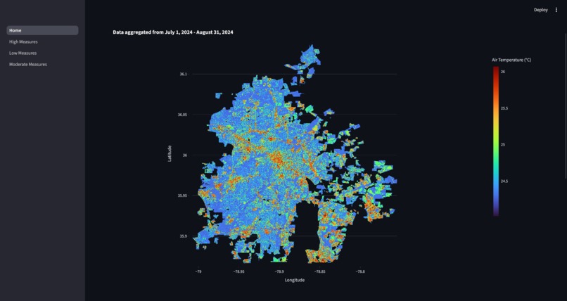
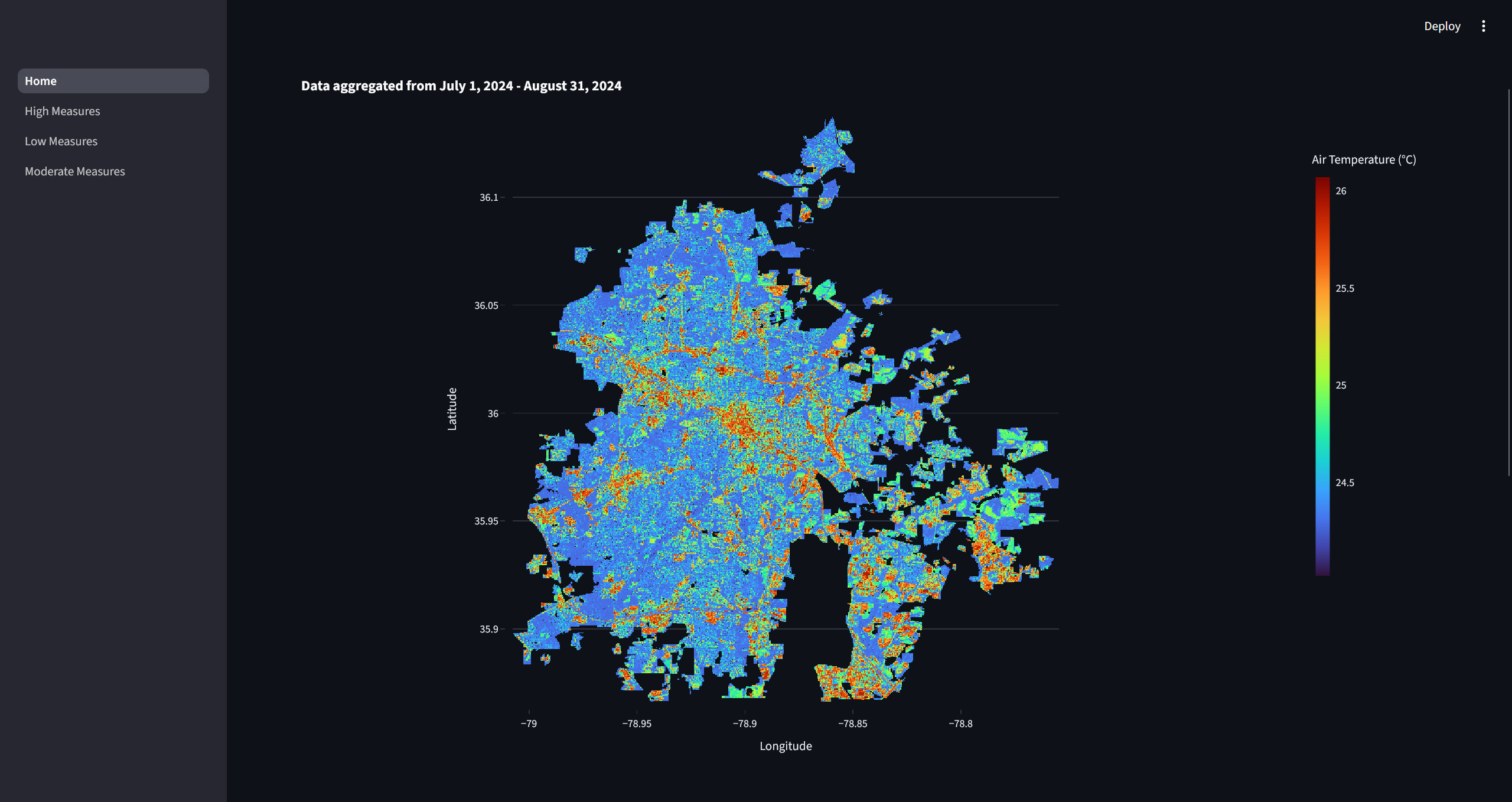
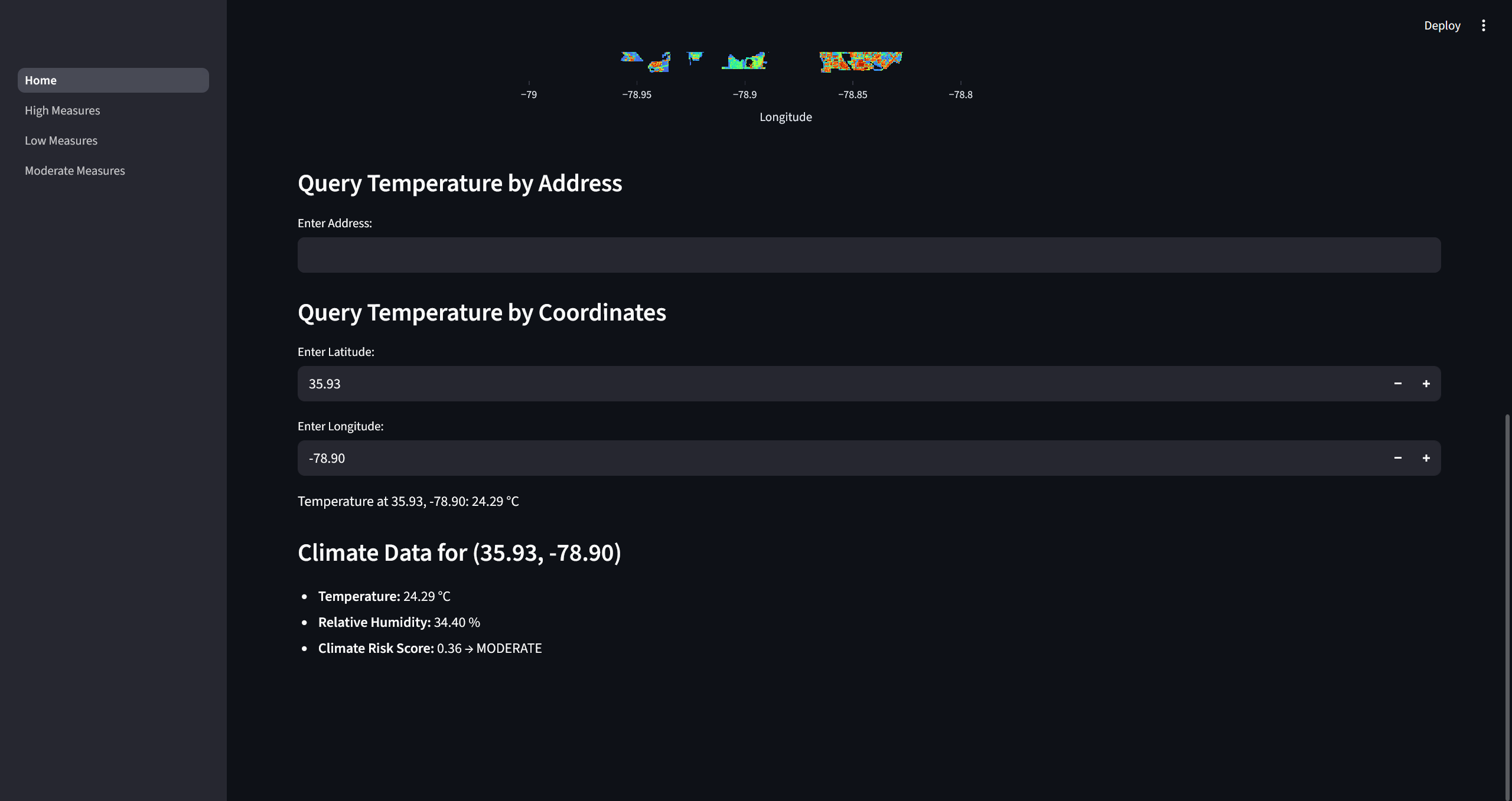
Heatmap
-
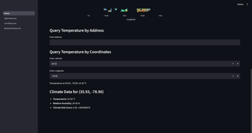
Coordinates Query
-
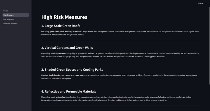
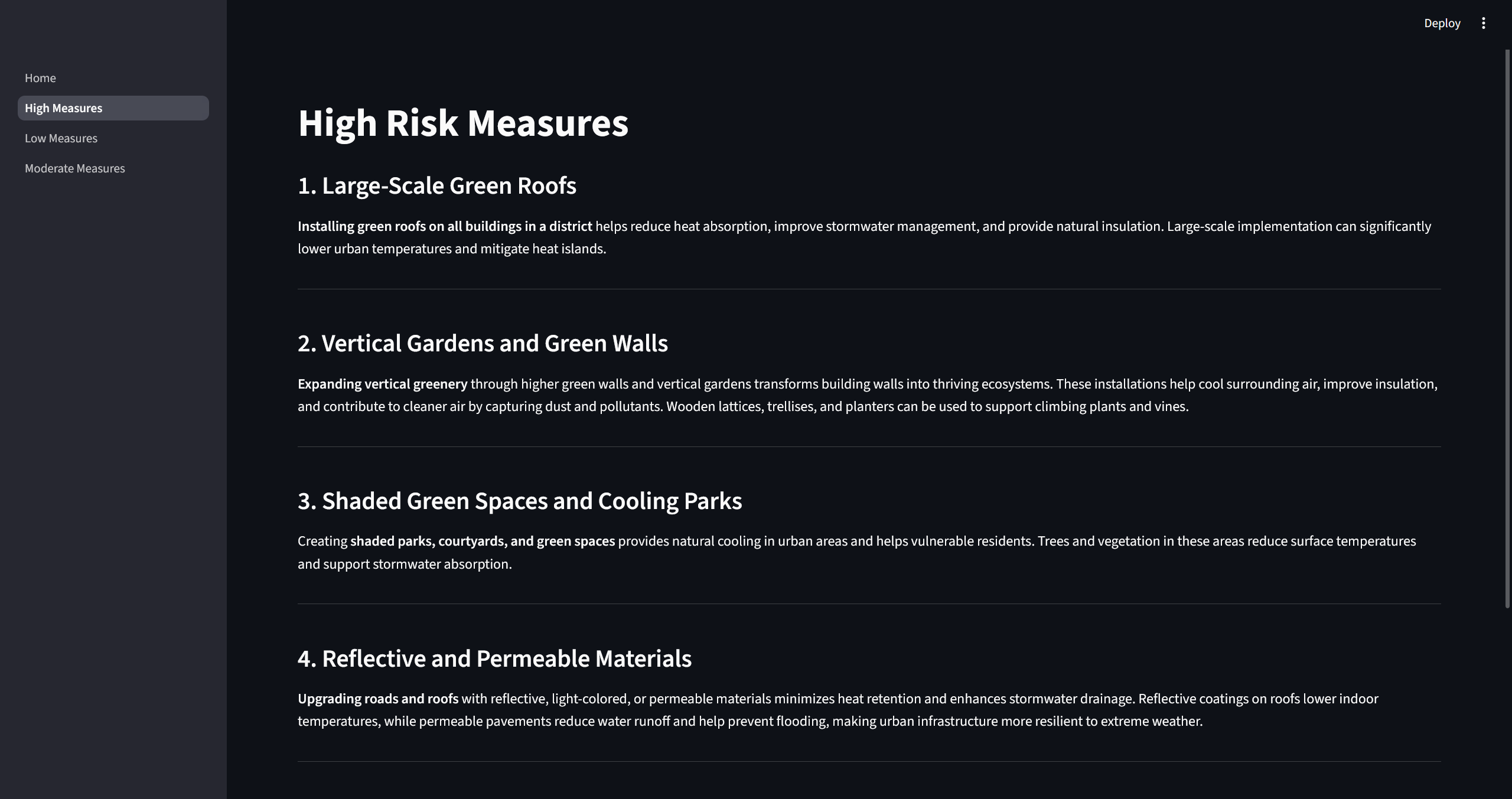
Recommendations
Inspiration
We were inspired to build this project as a team of Computer and Data Science students who are passionate about the environment, and interested in solving real-world issues using tech.
What it does
Our site allows users to interact with maps of Durham that display air temperature and humidity. Users can enter the address of their homes, schools, or workplaces in Durham to find out their climate risk score, which is calculated by analyzing the temperature and humidity of each area. Additionally, users can use their score to see what solutions they can implement and what products they can use to effectively lower the heat stress on their home and reduce their climate risk score.
How we built it
We built this project in Python, using Streamlit and Plotly to make an interactive dashboard to explore and display climate information and offer sustainable home improvement options.
Challenges we ran into
We were challenged right from the start, as it was our first time coming across a NetCDF file. It took a lot of time to open the file, and decide how we could integrate it into our project. Additionally, we struggled to find a way to make our project more user-friendly. Rather than relying on coordinate information the NetCDF file uses, we worked on finding a way to connect an address to coordinates, seamlessly providing information for users.
Accomplishments that we're proud of
Through this project, we were able to successfully collaborate as a team and create a product we are proud of! Our project is able to display the Data-Driven EnviroLab’s Durham Heat Stress and humidity Data as an interactive heatmap, which users can hover over to see coordinates. It also allows users to enter either their home address (which our program converts into coordinates) or their coordinates, and outputs the temperature, humidity, and climate risk score based on the data provided to us and the heat map. We were able to learn how to combine our knowledge of Python with new programs like Streamlit and Matplotlib to do this. We also researched the best solutions and products from Lowe’s that homeowners could easily find and effectively use to decrease heat stress in their area.
What we learned
We learned how to use programs/libraries like Streamlit, Plotly, Xarray and Geopy to create this project, as well as how to apply and use the data given to us by Data-Driven EnviroLab practically. We also learned more about heat stress in Durham, its effects, and how to effectively combat it using local solutions and products. Additionally, we learned a lot about collaborating as a team using GitHub, evolving the project based on challenges, and how to best combine our strengths for the best product in the amount of time we have.
What's next for Interactive Temperature & Humidity Map - Durham 2024
We hope to continue to evolve this webpage to be more professional, and more useful to those in Durham by continuing to update the heatmap data with time. We would like to implement other versions of the map that display average data over time, rather than the most recent data. Also, we would be interested in potentially including a chat bot that could help users understand the implications of heat stress more in-depth, and learn what else they can do to take action.


Log in or sign up for Devpost to join the conversation.