-
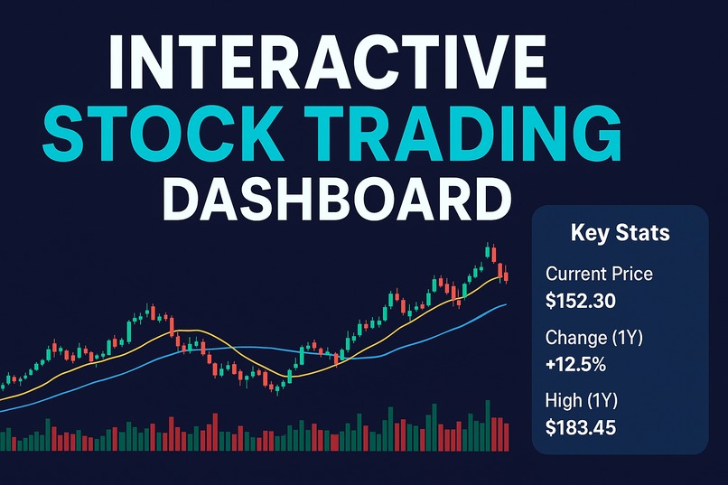
Explore Apple’s stock with my interactive dashboard — candlesticks, RSI, and volume insights with filters for trends and momentum.
Inspiration
I built this project because most trading dashboards feel either too complex or too basic. I wanted to create something clean, interactive, and approachable that helps make sense of Apple’s (AAPL) stock trends without overwhelming the user.
What it does
The app shows Apple’s stock through candlestick charts, moving averages, RSI momentum, and trading volume. With filters for date, price, and indicators, it lets users explore data dynamically and spot key trends.
How I built it
I collected AAPL daily stock data from Alpha Vantage as a CSV and loaded it into Plotly Studio. I then created interactive charts with a professional theme and organized them into a clear dashboard layout.
Challenges I ran into
One challenge was limited access to free stock data. Another was that I couldn’t add my planned W/M pattern detection due to time constraints.
Accomplishments that I'm proud of
I’m proud of how polished and user-friendly the dashboard feels. It balances clarity with depth—helpful for both beginners learning indicators and traders wanting quick insights.
What I learned
I learned that designing an effective data app is as much about storytelling and user experience as it is about charts. Technical indicators only become valuable when they are framed in context and combined in ways that encourage curiosity.I also realized how important it is to think ahead: even if I couldn’t build the W/M pattern detector today, planning for it gave me a roadmap for what the dashboard can become.
What's next for Interactive Stock Trading Dashboard
The next steps are to extend the app beyond visualisation and toward decision support. Future iterations could include automatic detection of W/M patterns, alerts when RSI thresholds are breached, or even multi-stock comparisons. The vision is to make the dashboard not just an analysis tool but a companion for traders, combining interactivity, education, and intelligence.

Log in or sign up for Devpost to join the conversation.