-
Interactive-heatmap-treemap-dashboard
Inspiration The ever-growing flood of data in business and society calls for tools that not only visualize numbers, but also reveal patterns and relationships at a glance. Many dashboards focus on either detail or hierarchy, but rarely both. Inspired by the simplicity and power of proportional visualizations, this project aims to make complex datasets both accessible and interactive, helping users explore "the big picture" and specific breakdowns simultaneously. The possibilities of Plotly.js and the vibrancy of recent design trends inspired us to build a dashboard that is both beautiful and deeply insightful.
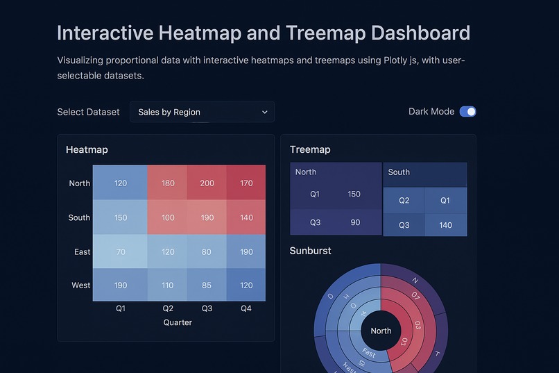
What it does Interactive-Heatmap-Treemap Dashboard lets users upload or select from curated datasets, instantly visualizing key proportions and relationships with an interactive heatmap, treemap, and one additional chart. Users can filter data, export their insights, and toggle between light and dark modes for the best experience on any device. Whether comparing regional sales, exploring resource allocation, or analyzing new custom data, the dashboard reveals hidden patterns, makes exploration effortless, and generates AI-based summary insights.
How we built it Frontend: Built with modular HTML, modern CSS (glassmorphism), and JavaScript ES6.
Visualization: We used Plotly.js for all charts to ensure seamless interactivity and responsive rendering.
Data: Two sample datasets were prepared in Excel and converted for easy import, with the structure detailed for user modification.
Features:
Chart types: Heatmap, Treemap, and Bar chart.
Dataset selector, data filtering, export chart/data, and mode toggle.
All code is split into multiple files (index.html, style.css, main.js, and sample data.xlsx) for clarity.
Development Tools: Visual Studio Code, Plotly.js documentation, and sample public datasets for inspiration.
Challenges we ran into Data structure harmonization: Designing example datasets that work seamlessly with both heatmaps (matrix-focused) and treemaps (hierarchy-focused) required careful planning and normalization.
Responsive, stylish UI: Achieving a modern, glassmorphic look that remains fully accessible and responsive on all devices took several iterations and design system adjustments.
Interactive CSV/Excel import: Handling user-uploaded spreadsheets of varying schema and structure involved data validation logic and robust error handling.
Export features: Integrating direct chart exporting and data download for both images and filtered data required creative use of Plotly's and browser APIs.
Accomplishments that we're proud of Created a dashboard that feels sleek and professional on any screen, blending accessibility with next-gen aesthetics.
Enabled true multi-chart, multi-dataset interactivity with zero backend—everything runs client-side.
Built a reusable Excel data model, so anyone can swap their own data in effortlessly.
Added advanced features (like dark/light mode, chart exporting, and auto insights) with intuitive UX.
What we learned How to harmonize multiple charting needs with a unified data structure.
The limits and strengths of Plotly.js for multi-type charting and export features.
New CSS techniques in glassmorphism and deepening our understanding of responsive web design.
The value of clear documentation and onboarding in open data-driven tools.
What's next for Interactive-heatmap-treemap-dashboard Expanded data source support: Adding direct connections to public APIs and cloud storage for real, live data updates.
More chart options: Integrate sunburst, animated timelines, and network graphs to further broaden insights.
Deeper AI: Build-in generative AI summaries for detected correlations or anomalies, improving guidance for non-expert users.
Collaboration features: Let users annotate and share their dashboards with a click.
Accessibility upgrades: Add keyboard navigation, high contrast mode, and descriptive ARIA labels for complete inclusivity.
Mobile app version: Port the dashboard to a cross-platform native app for professionals and students on the go.
Built With
- .xlsx)
- and-additional-charts-**excel-(.xlsx)**-?-as-the-user-selectable-dataset-source-**openpyxl-/-pandas-(python
- and-aesthetic-ui/ux-**javascript-(es6+)**-?-for-interactivity
- and-dataset-handling-**plotly.js-(latest)**-?-for-interactive-heatmap
- css3
- es6+)
- excel
- html5
- javascript
- modular-logic
- plotly.js
- responsive
- treemap

Log in or sign up for Devpost to join the conversation.