Inspiration
I just wanted to turn static insurance data into interactive visuals using Plotly Studio and Dash. The goal is to how non-coders design and explore data easily.
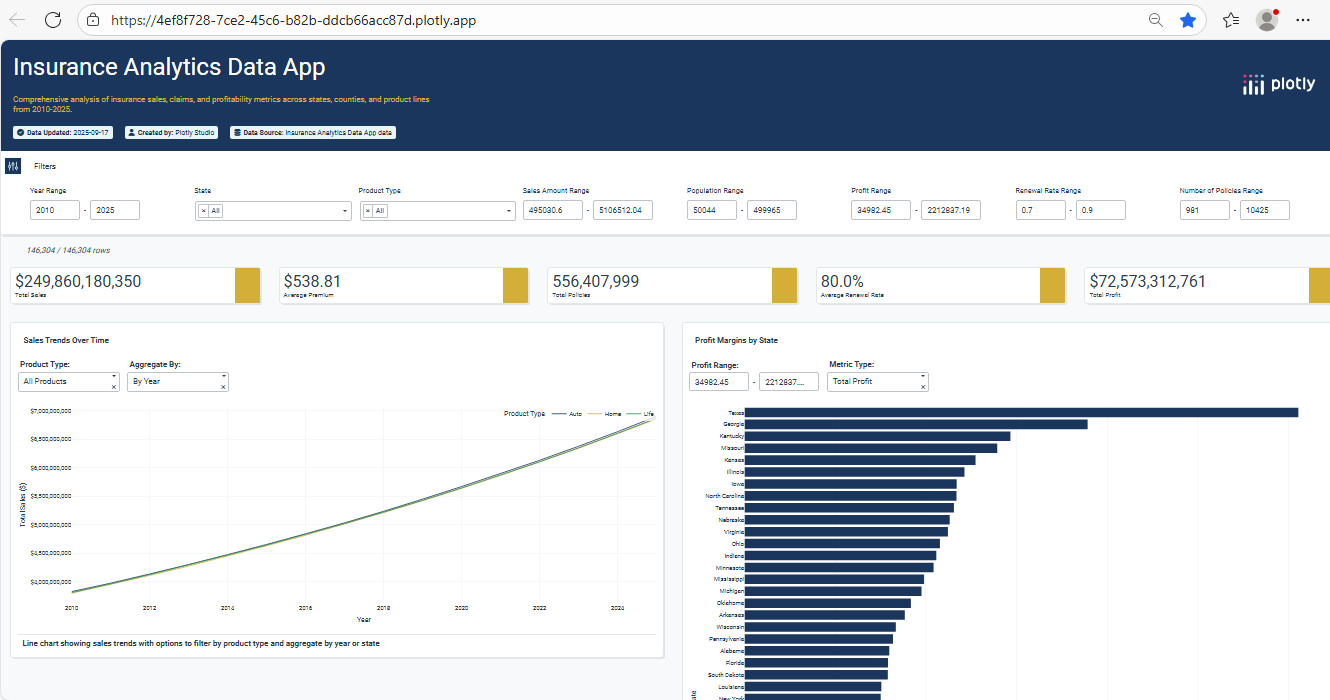
What it does
It visualizes insurance sales, claims, and profit across states and products. Users interact via dropdowns to filter charts by year, metric, and product.
How we built it
Synthetic data was created and exported to Plotly Studio for creating insightful dashboard, all based on user prompts, that features interactive UI and backend data filtering
Challenges we ran into
Nothing much, Just worked at surface level.
Accomplishments that we're proud of
Successfully combined Plotly Studio visuals with a functional Dash app. The dashboard is clean, interactive, and easily expandable.
What we learned
Plotly Studio is great for visual design without code. Dash callbacks make those visuals dynamic and app-ready.
What's next for Insurance Dashboard with Plotly Studio & Dash
Will apply the solution as required by the business needs
Log in or sign up for Devpost to join the conversation.