Inspiration
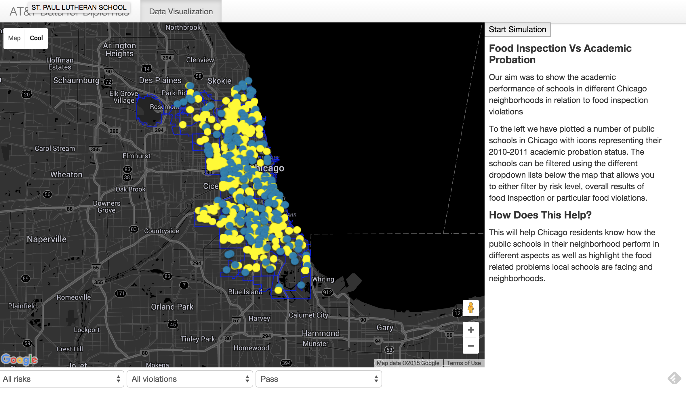
Using Crime Data from the Chicago Data Portal we generated a heatmap of crime occurrences across the city. We then plotted high schools that were both on probation and not on probation. The blue dots are schools not on probation while the yellow is for schools on probation.
What it does
The data visualization tool allows you to filter the schools depending on what they were put on probation for
How I built it
It was built using the Google Maps API, javascript for the page interactions and buttons, css to style the map and fonts and lastly HTML.
Challenges I ran into
There was only one high school in the data for Chicago so we had to include middle schools in our analysis to find any meaningful correlation
Accomplishments that I'm proud of
Plotting high school data across the country in relation to crime occurrences.
What I learned
Data visualization requires a high attention to detail. Also I became familiar with the google Maps API and getting and putting requests in real time. I also learnt how to host websites on the MIT network.
What's next for Insights into Crime Data and High School Grad Rate
Include data for the entire United States and look at graduation rates instead of probation Factor in more variables such as bullying, after school programs, and household income.

Log in or sign up for Devpost to join the conversation.