
Inspiration
**The importance of Data visualization is – analyzing complex data, identifying patterns, and extracting valuable insights. Simplifying complex information and presenting it visually enables decision-makers to make informed and effective decisions quickly and accurately. Data visualization means drawing graphic displays to show data. Sometimes every data point is drawn, as in a scatterplot, and sometimes statistical summaries may be shown, as in a histogram. The displays are mainly descriptive, concentrating on 'raw' data and simple summaries. They can include displays of transformed data, sometimes based on complicated transformations. One person's statistics may be another person's raw data. As with other aspects of working with graphics, it would be useful to have an agreed base of concepts and terminology to build on. The main goal is to visualize data and statistics, interpreting the displays to gain information.This overview concentrates on static graphics. Dynamic graphics and, more especially, interactive graphics are in an exciting stage of development and have much to add. They require an article of their own. Superb examples include Human Terrain, a dynamic graphic showing the world's population in 3-D, and the interactive NameVoyager.
‘A Picture Is Worth a Thousand Words’
Famous sayings have a way of developing a life of their own. A picture is not a substitute for a thousand words; it needs a thousand words (or more). For data visualization you need to know the context, the source of the data, how and why they were collected, whether more could be collected, the reasons for drawing the displays, and how people with the necessary background knowledge advise they might be interpreted. There is a story that M. G. Kendall reviewed a book of R.A. Fisher's with the words: "No one should read this book who has not read it already." It is like that with graphics. If you have read all the supporting text, the display is often memorable and readily understandable. If you have not, it is not. Graphics on their own are insufficient, they are part of a whole. They complement text and are complemented by text. Student's reanalysis of the Lanarkshire Milk Experiment (Student, 1931) is an excellent example (and is also interesting as an early analysis of a large data set).
The potential synergy of text and graphics can be appreciated by talking through your own graphics, explaining them to others. Why have you drawn those graphics? How have you drawn them? What can be seen? Are there interesting patterns? What could be changed and improved? Which other graphics might be drawn? How can conclusions be checked? There should be more talking about graphics and less relying on the graphics to speak for themselves.
**
What it does
The main goal of data visualization is to make it easier to identify patterns, trends, and outliers in large data sets. The term is often used interchangeably with others, including information graphics, information visualization, and statistical graphics.
How we built it
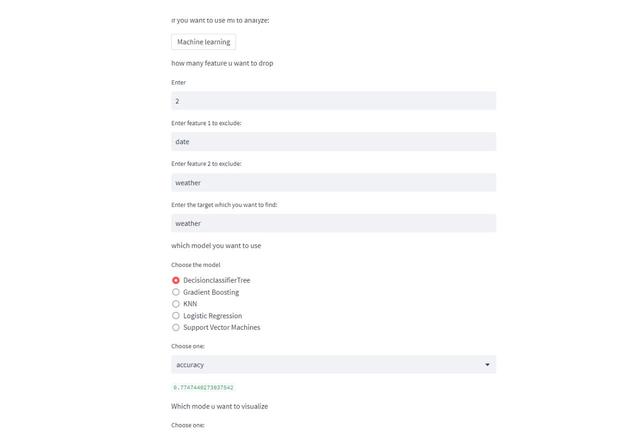
*We built it using Python and a Python framework for machine learning data analysis,and we used some matplotlib and Plotly and pandas and machine learning algorithms to build this *
Challenges we ran into
** Finding the number of inputs that user wants to do and give them** ** Finding the accuracy according to the user input
Accomplishments that we're proud of
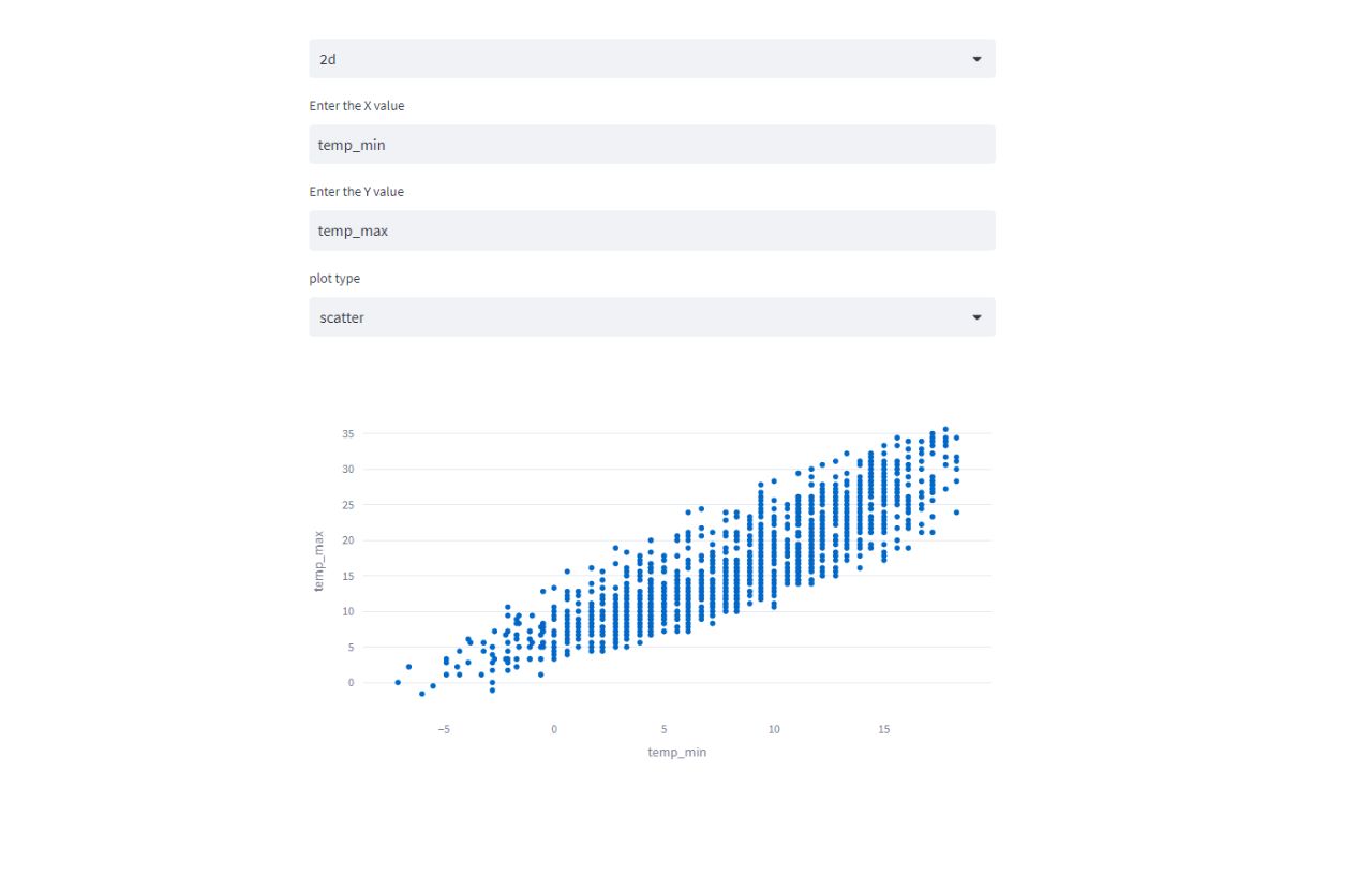
any file with csv format can visualized ** **we can use machine learning to do the accuracy and prediction analysis we can visualize the file in 3d visulaization
What we learned
This framework is a free and open source streamlit can be used as a prediction serving tool streamlit can be used as a monitoring tool Its a simply convinient
What's next for Information visualization and Machine learning visualization
*We aspire to make this efficient enough to meet all the visualization that a user wants*
Built With
- python
- streamlit
")
Log in or sign up for Devpost to join the conversation.