-

WebApp FrontEnd
Inspiration
Leveraging geographic information systems (GIS) to assist with understanding some of the worlds most complex problems is a strong passion of mine. So much so, I was inspired from the Covid-19 Dashboard, produced from Johns Hopkins University, that I wanted to challenge myself by visualizing and predicting a virus that infects millions. With the influenza virus coming in many shapes and sizes, predicting its global rate can help further determine potential pandemic and assist countries in times of need.
What it does
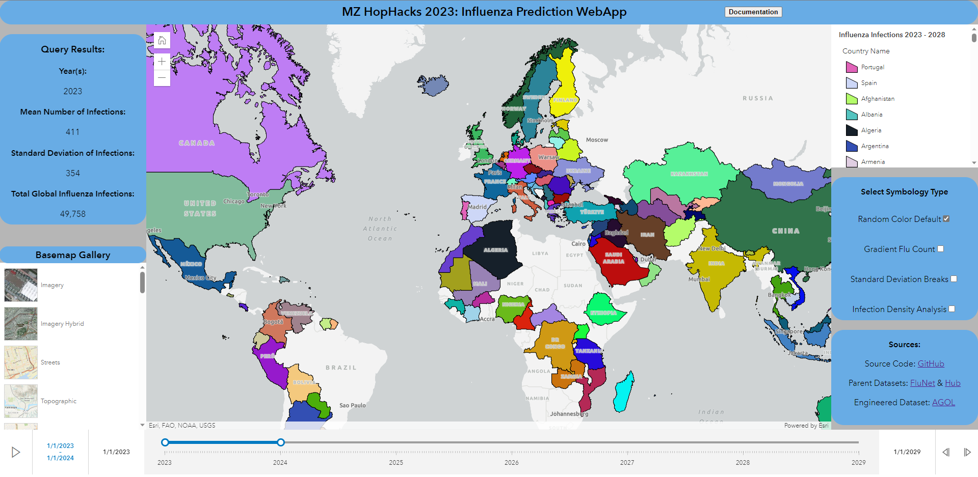
The Influenza Predictions 2023 - 2028 project is centered around a centralized web application that utilizes the ArcGIS Online (AGOL) platform to render geometric datasets and allows secure, and public access to important information. In particular, the project visualizes results from a supervised regressor ensemble that successfully predicted influenza infections for 180 countries from 2023 - 2028. The supervised regressor ensemble can be ran in the background at any desired interval and automatically update the dataset that helps the centralized web application render the predicted results; this will ensure that any user utilizing the web application can be rest assured that the most up-to-date predictions are being rendered at any given time. The ultimate goal of this project is to help countries all across the world (for people with little to no coding experience) with better understanding influenza patters within their borders and potentially help prevent pandemics from happening again!
How I built it
In order for the Influenza Predictions 2023 - 2028 webapp to render the predicted results, there first needs to be a model in which properly predicts the number of influenza infections for each country. As a result, a supervised ensemble regressor model was created. Using the XGBoost API, I was able to produce a model that has a root mean squared error (RMSE) that is less than 1 and an R-Squared (R2) that is 0.999; indicating very favorable results that supports the likelihood of properly predicting influenza infections for a total of 180 countries in the next five years. To accomplish this, scikit-learn, NumPy, and Pandas were used extensively to compute several transformations to ensure the input dataset is adequate for a machine learning model. Sin transformations for date values, log transformations for numerical values, and label encoding transformations were the most important factors in ensuring the input dataset is machine-learning-ready.
Now that the predicted residuals are successfully created, it is now time to generate geometric properties for each of the rows. Since this is a prediction on a country-level, retrieving GIS data would be the most straightforward approach to accomplish this. As a result, GeoPandas was used to read a GIS dataset that contains the geopolitical boundaries of all 180 predicted countries. Then Pandas was used again to apply a field join, in order to retrieve the geometric properties from the boundaries dataset and apply it to the predicted residuals dataframe.
The finalized dataset is now ready to publish! The ArcGIS API for Python was used to publish the finalized dataset to AGOL and update the published dataset; a simple updater script was built to autonomously update the published dataset to ensure it is always up-to-date, whenever the initial parent dataset was to change.
The primary dataset that was used to generate the influenza predictions for each of the 180 countries is from the World Health Organization's FluNet Dataset (found here) that contains record of viral infections across all 180 countries from 1997 to 2023. The geopolitical boundaries GIS dataset is from Esri's ArcGIS Hub found here.
With the finalized data published and autonomously updating, it is now time to render the information! The ArcGIS Maps SDK for JavaScript and jQuery were the primary modules used to construct the prediction web application. To start, the ArcGIS Maps SDK for JavaScript was integrated into the web application development to communicate with the AGOL REST endpoint; loading symbology and execute temporal queries. jQuery was then used to develop the 'glue' for each of the working components (such as render toggling and text outputs from query results), generate essential DIV objects, as well as creating the splash page that details the documentation on how to utilize the prediction webapp.
Challenges I ran into
The primary challenge I ran into was decision making; do I start with working on the renderer widget, focus on the time slider, or start on the documentation? Since participating in a Hackathon requires original code, I was faced with leveraging intuitive practices with interpreting online documentation and modules I havent used in the past; to ensure I was able to produce a robust product for anyone to use. In more technical terms, I primarily came across rendering limitations with popups (ie if a given user were to click on a rendered country, a popup will show with additional information about the countries respected influenza predictions) and with the time slider widget.
Accomplishments that I'm proud of
Perhaps the component to my project that I am most proud of is that I did this all by myself in a matter of hours! I normally work with many teams on developer initiatives, however, I wanted to challenge myself by doing a full-stack endeavor; developing the backend machine learning model and data publishing/hosting/updating and developing a font end for users to interact with the final results. I can confidently say I was able to accomplish this!
What I learned
I was able to learn a lot about myself and countless modules/packages that I havent utilized before. With regards to personal development, I was able to prove to myself I can demonstrate my full-stack developer capabilities by implementing a practical application that can potentially help visualize a globally challenging problem. With regards to development, I have learned around 5 new packages that I can certainly see myself using in the future!
What's next for Influenza Predictions 2023 - 2028
Next semester is my last semester of school (very bittersweet!). I would like to utilize the work I developed for this hackathon and integrate it with my capstone project; where Ill be taking an unsupervised approach to a similar topic (instead of a supervised approach). My end goal for my career is to start my own GIS/predictive analytics company where I will focus on helping local governments, institutions, and businesses leverage their geometric capabilities in their data to make more informed decisions; ultimately help society in a way that is automated and sustainable!
Built With
- agol
- esri
- javascript
- jquery
- python
- xgboost


Log in or sign up for Devpost to join the conversation.