-
-

Inferno Atlas Dashboard
Inspiration
We were inspired by the raw, untamable power of our planet. Volcanoes are Earth's storytellers, capable of shaping civilizations and altering climates. We wanted to move beyond static charts and build a time machine, an interactive tool that would allow anyone to journey through millennia of Earth's fiery history, watch the "Ring of Fire" come to life, and understand the narrative of our planet's most dramatic events.
What it does
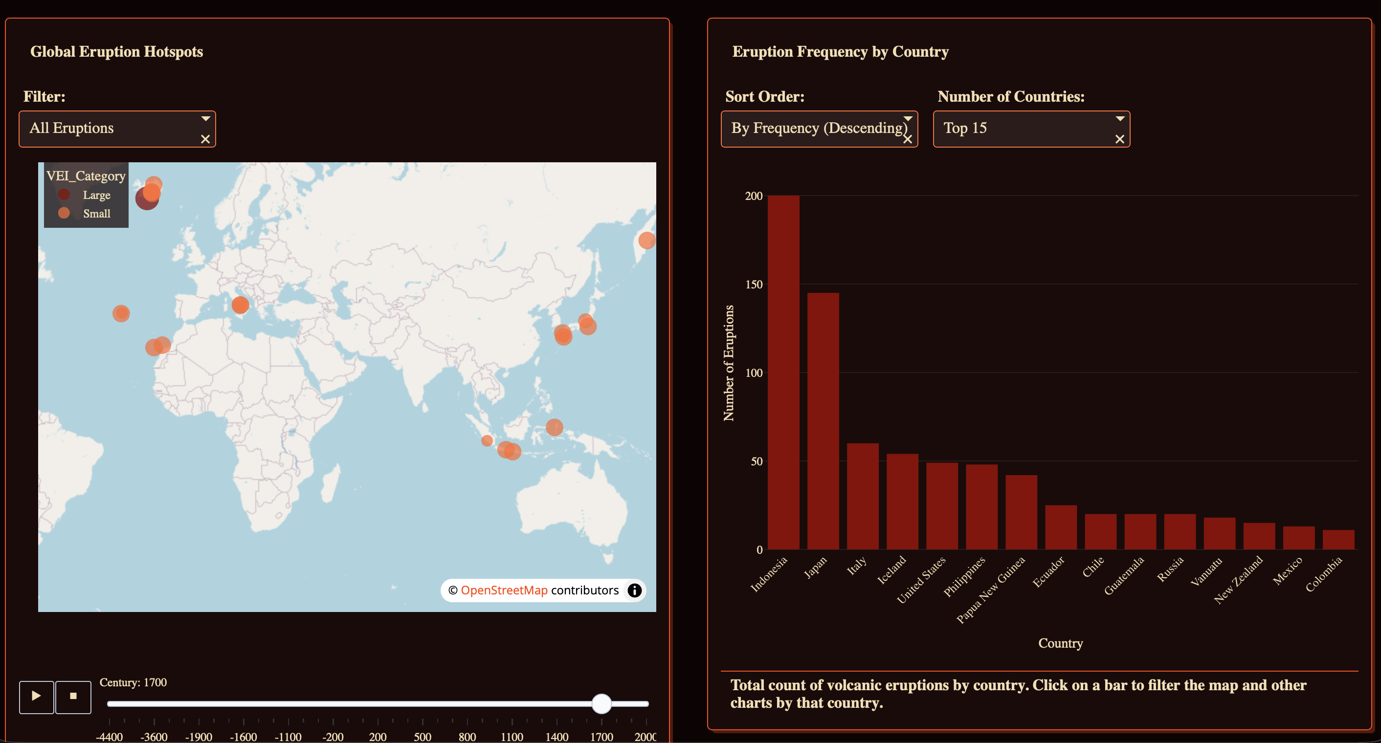
Inferno Atlas is an interactive, narrative-driven data app that visualizes over 12,000 years of global volcanic eruptions. It allows users to:
- Explore a global, animated map showing every significant eruption, with the size and color of each point representing its power (Volcanic Explosivity Index).
- Watch history unfold using a timeline slider that animates the eruptions from 4400 BCE to the present day.
- Discover geographic hotspots by seeing which countries have the most volcanic activity and filtering the map by selecting them.
- Analyze historical trends by viewing a breakdown of eruption power (from "Small" to "Cataclysmic") for each century.
- Identify the most powerful volcanoes in recorded history and locate them on the map with a single click. ## How we built it Our development was a rapid, two-day sprint focused on strategy and design, with Plotly Studio as our core engine.
- AI as a Creative Partner: We began by giving Plotly Studio's AI a clear, narrative-driven prompt, asking it to help us build an app that answered our key questions about the location, time, and power of eruptions.
- Refining the Blueprint: The AI generated a comprehensive and ambitious outline. Our role then became that of a project manager, editing its plan into a focused, achievable, and compelling four-chart narrative that we could realistically build and polish within the hackathon's timeframe.
- Data Pre-processing: To enable the animation, we engineered a
Centurycolumn from the rawYeardata, converting BCE years to negative numbers (e.g., 450 BCE -> -400) to create a clean, numerical sequence. We also created aVEI_Categorycolumn to make the data more intuitive for color-coding. - Component-Based Design: We built the app around four interconnected components: the main animated map, a bar chart for country rankings, a stacked bar chart for historical trends, and a horizontal bar chart to identify the top 10 most powerful volcanoes.
- Iterative Debugging: We used the generated code and visual editor to fine-tune the app, removing non-functional UI elements and resolving code conflicts to create a seamless user experience.
## Challenges we ran into
Our biggest challenge was a technical conflict between a global
Centuryfilter and the map's built-in animation component. When a user selected a single century from the global filter, the app would crash because the animation code expected a time series, not a single data point. We solved this by making a crucial design decision: we removed the global filter entirely, making the map's own timeline slider the single, intuitive control for time. This fixed the bug and significantly improved the app's usability.
We also faced the challenge of telling a clear story with a complex dataset. The initial data for eruption "style" was incomplete, so we pivoted to use our VEI_Category as a more reliable and visually impactful proxy for an eruption's power.
Accomplishments that we're proud of
We are incredibly proud of successfully animating a dataset that spans over 12,000 years, from BCE to the present day. Creating the Century column and making the animation smooth and intuitive was a major accomplishment. We are also proud of the app's narrative flow; it's not just a collection of charts, but a guided story that takes the user from a high-level global view down to specific, powerful events. Finally, we're proud of our debugging process that we identified a core bug and solved it with a design change that ultimately made the app better.
What we learned
- Design Solves Technical Problems: Our biggest bug was fixed not by writing more complex code, but by making a smarter design choice (removing the conflicting filter).
- Pre-processing is 90% of the Battle: The time we spent cleaning and engineering features like the
Centurycolumn was the single most important factor in the project's success. - AI is a Co-pilot, Not an Autopilot: Using the AI to generate the initial outline was a massive accelerator, but the real value came from our role in editing, refining, and directing its output to fit a focused and achievable goal. ## What's next for Inferno Atlas The "Inferno Atlas" is a powerful tool for historical exploration, but it has the potential to be much more. The next logical step is to evolve it into a forward-looking risk analysis tool. We envision adding new datasets, such as population density, to create a "Volcanic Risk Index" for different regions. We would also love to incorporate data on eruption types and their potential climate impacts, allowing users to explore not just the history of eruptions, but also their consequences for our modern world.


Log in or sign up for Devpost to join the conversation.