Inspiration
I was working on deploying a fine-tuned language model for a college project late one night, and honestly it was a nightmare. The model ran perfectly in my Jupyter notebook, but the moment I pushed it to a live endpoint, the response times shot up to 8-12 seconds per call. I had no idea where the bottleneck was. Was it the model size? The tokenizer? The server config? I was jumping between terminal logs, cloud dashboards, and random monitoring tools trying to piece it all together, and nothing gave me a clear picture.
That night made me realize something. Everyone talks about training models, fine-tuning them, getting the accuracy up. But nobody really talks about what happens after that, when you actually need the model to respond fast in production. Techniques like quantization, pruning, and batched inference exist, but they're scattered across research papers and half-documented repos. There's no single place where a developer can just look at their inference pipeline and instantly understand what's slow, what's wasting resources, and what can be optimized.
That's basically why I built InferIQ. I wanted to create the tool I wished I had that night. A clean, visual platform where you can monitor inference health, see optimization opportunities, and understand your model's real-time performance without juggling five different tools. Not just another dashboard, but something that actually feels like a proper control center for AI inference. The name came from combining "Infer" (inference) and "IQ" (intelligence), because optimizing inference shouldn't be guesswork, it should be smart and visual.
What it does
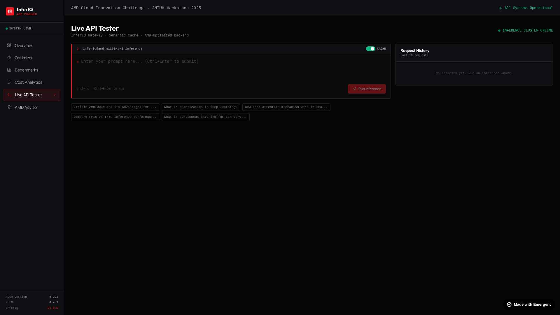
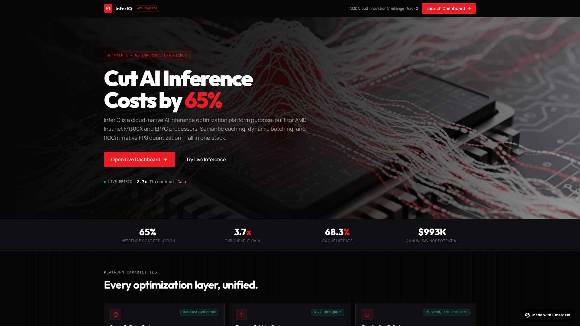
InferIQ is a real-time AI inference optimization platform that gives developers and ops teams a single, unified interface to monitor, analyze, and optimize how their AI models perform in production.
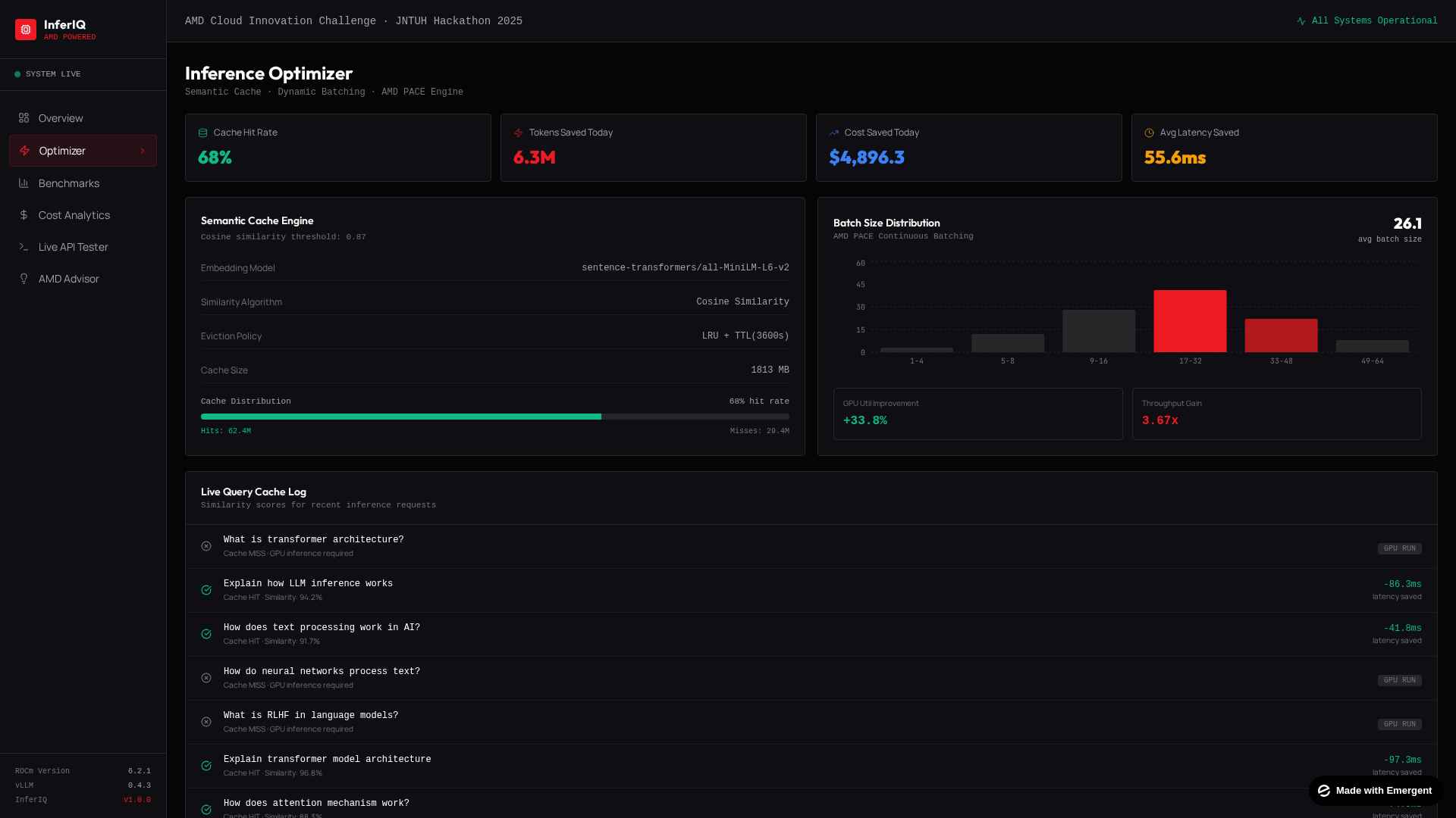
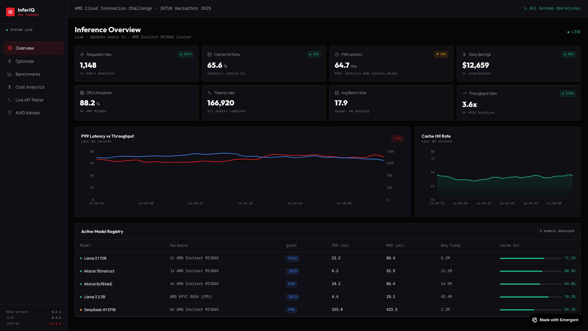
At its core, the platform tracks key inference metrics like latency, throughput, and token generation speed across your deployed models. Instead of digging through raw logs or switching between multiple monitoring tools, you get a clean visual dashboard that shows everything at a glance. You can see exactly where your pipeline is bottlenecking, whether it's at the model layer, the compute layer, or somewhere in the request routing.
Beyond just monitoring, InferIQ also includes an optimization suite. It visualizes techniques like model quantization (reducing the precision of model weights to speed things up), pruning (removing unnecessary neurons), and compression strategies. So instead of blindly applying optimizations and hoping for the best, you can actually see the tradeoffs between model accuracy and inference speed before you commit to anything.
The platform is also built with decentralized compute in mind. It can orchestrate inference workloads across distributed GPU nodes, balance the load intelligently, and show you how each node in your cluster is performing in real time. This is especially useful when you're scaling inference across multiple machines and need to figure out which nodes are underutilized or overloaded.
The whole interface is designed to feel like a proper mission control, not a basic analytics page. It uses real-time telemetry, animated performance charts, and a dark-themed UI that's built for long monitoring sessions without eye strain. The goal was to make something that a developer would actually want to keep open on a second monitor while running inference workloads.
How we built it
We started by sketching out the core layout on paper. Before writing any code, we figured out what panels and sections a developer would actually need during an inference monitoring session. That planning phase saved us a lot of rework later because we had a clear mental model of the entire interface before touching any code.
The frontend is built entirely in React.js. We broke the interface down into modular components, things like the metrics panel, the throughput chart, the node status grid, and the optimization visualizer. Each component manages its own state and updates independently, so one section can refresh its data without causing the whole page to re-render.
For styling, we went with vanilla CSS instead of a framework like Tailwind or Bootstrap. We set up a custom CSS variable system at the root level for colors, spacing, and typography, which made it really easy to keep the design consistent across every component. The dark theme, the accent colors, the glassmorphism effects, all of that is controlled through a handful of CSS variables that cascade through the entire app.
Typography was something we paid extra attention to because it makes a huge difference in how professional a dashboard feels. We self-hosted three fonts: JetBrains Mono for anything code-related or numeric (latency values, throughput numbers), Manrope for headings, and Outfit for body text. Loading them as local woff2 files means zero dependency on external font CDNs, which also helps with load times.
The real-time data visualization was probably the trickiest part. We built a simulation layer that generates realistic telemetry data, things like fluctuating latency values, throughput curves, and node utilization percentages. The charts update on a set interval and use smooth transitions so the data feels alive without being distracting. We looked at how tools like Datadog and Grafana present time-series data and tried to capture that same feel but in a cleaner, more focused way.
For local development, we kept the setup simple. The project uses a lightweight static file server through the serve package, so anyone can clone the repo, run npm install, and have it running on localhost in under a minute. We intentionally avoided overcomplicating the dev toolchain because we wanted the focus to be on the product itself, not the build process.
Challenges we ran into
The biggest challenge was getting the real-time data updates to feel smooth without killing browser performance. When you have multiple charts and metric panels all refreshing every few seconds, things start to lag pretty quickly if you're not careful. Early on, we had a version where the entire dashboard would stutter every time the data refreshed because React was re-rendering way more components than it needed to. We had to rethink our state management and make sure each component only re-rendered when its own data actually changed, not when some unrelated panel updated.
Styling without a CSS framework was harder than we expected. We chose vanilla CSS because we wanted full control over the look and feel, but it meant we had to build our own spacing system, our own color tokens, our own responsive breakpoints from scratch. There were multiple times where a component looked perfect in isolation but completely broke the layout when placed next to other panels. Getting the glassmorphism effects and the subtle gradients to look consistent across Chrome, Firefox, and Edge also took more iterations than we'd like to admit.
Simulating realistic telemetry data was another tricky one. Random numbers don't look like real inference metrics. Real latency data has patterns, it spikes during load, it gradually increases when memory fills up, it drops after optimization. We spent a good amount of time tweaking the simulation logic so the charts actually tell a believable story instead of just showing noise. Small things like adding slight variance and trend lines made a huge difference in how convincing the dashboard looks.
Making a data-dense dashboard responsive was genuinely painful. This isn't a landing page with a few sections. It's a monitoring interface with grids, charts, stats, and status indicators packed into every corner. Getting all of that to reflow properly on smaller screens without losing readability or cutting off important data took a lot of trial and error. We ended up prioritizing the key metrics for mobile and letting some of the secondary panels stack vertically instead of trying to squeeze everything in.
One smaller but annoying issue was font rendering. We self-hosted our fonts as woff2 files, and on first load there was a visible flash where the browser would show fallback system fonts before the custom fonts kicked in. It looked janky and unprofessional. We had to set up proper font-display strategies and preload the font files in the HTML head to minimize that flash.
Accomplishments that we're proud of
The thing we're most proud of is that InferIQ actually looks and feels like a real product, not a hackathon prototype. When people first see the interface, they usually assume it's a commercial tool or at least something that's been in development for months. That reaction alone makes all the late nights worth it. We put a lot of effort into the visual polish, the micro-animations, the typography, the color palette, and it shows.
We're also proud of building the entire styling system from scratch using vanilla CSS with custom properties. No Tailwind, no Bootstrap, no component library. Every single pixel on that screen was intentionally designed and hand-coded. It was harder and took longer, but it gave us complete control over the look and feel, and we learned a ton about CSS architecture in the process.
The real-time data layer is something we're genuinely happy with. The charts update smoothly, the numbers feel alive, and the whole dashboard gives you that sense of watching a live system breathe. Getting that right without any stuttering or visual glitches took a lot of fine-tuning, and the final result is something we keep coming back to just to watch it run.
Another thing we're proud of is how easy the project is to set up. Clone it, run npm install, and you're up in under a minute. We intentionally kept the dependency footprint tiny. There's no complex build pipeline, no environment variables to configure, no Docker setup needed. We wanted anyone, whether it's a judge, a recruiter, or a fellow developer, to be able to spin it up instantly and see what we built without any friction.
Honestly, the biggest accomplishment is that we took a real problem we personally experienced, that frustrating night trying to debug slow inference, and turned it into something tangible. It's not a theoretical project built for a prompt. It came from a genuine pain point, and building it taught us more about AI deployment and frontend engineering than any course ever has.
What we learned
The biggest takeaway was understanding how much goes into making AI models fast in production. Before this project, we thought deployment was just pushing a model to an endpoint and calling it a day. Building InferIQ forced us to actually study concepts like INT8 quantization, weight pruning, KV-cache optimization, and batched inference. We went from barely knowing what inference latency meant to being able to explain the tradeoffs between model accuracy and speed at a technical level. That knowledge feels permanent and genuinely useful beyond this hackathon.
On the frontend side, we learned that vanilla CSS is both a blessing and a curse. It gives you total freedom, but it also means you're responsible for every single design decision. We learned how to set up a proper design token system using CSS custom properties, how to structure stylesheets so they scale without becoming a mess, and how to build responsive layouts for data-heavy interfaces. Going forward, even if we use a CSS framework, we'll understand exactly what's happening under the hood because we've done it all manually.
React performance optimization was a huge learning area. We learned the hard way that unnecessary re-renders can silently destroy your app's performance, especially when you have live-updating components. Concepts like memoization, component isolation, and efficient state updates went from being things we'd read about in docs to techniques we actually applied and saw the impact of firsthand.
We also learned a lot about design as a discipline. Before this, we used to think good UI was just about picking nice colors. Working on InferIQ taught us about visual hierarchy, how typography affects readability during long sessions, why spacing and alignment matter more than decorative elements, and how small animations can make an interface feel responsive and alive versus static and dead.
Probably the most important lesson was that the gap between "it works on my laptop" and "it's ready for real use" is massive. Building something functional is one thing. Building something that looks professional, performs well, and is easy for someone else to set up and understand is a completely different challenge. This project pushed us to think about the end user at every step, and that mindset shift is something we'll carry into every project going forward.
What's next for InferIQ
The first thing on our list is connecting InferIQ to a real backend. Right now the platform runs on simulated telemetry data, which is great for demonstrating the concept, but we want to hook it up to actual inference endpoints. The plan is to build a lightweight Python agent that sits alongside your model server, collects real metrics like token throughput, memory usage, and request latency, and streams them to the InferIQ dashboard over WebSockets. Once that's in place, the platform goes from being a visualization tool to something you can actually use in production.
We also want to add intelligent optimization recommendations. Instead of just showing you the data and letting you figure out what to do, InferIQ should be able to analyze your inference patterns and suggest specific actions. Things like "your model's memory footprint is 40% higher than it needs to be, here's how quantizing to INT8 would affect your latency" or "your batch size is too small for your GPU, increasing it to 32 would improve throughput by an estimated 2x." Basically, we want InferIQ to not just monitor but actively help you make better decisions.
Multi-model support is another big one. Right now the dashboard is focused on a single model, but in real-world setups, teams often run multiple models behind a router or a gateway. We want to add a view where you can compare performance across different models side by side, see which ones are consuming the most resources, and identify which models would benefit the most from optimization.
Down the line, we're thinking about adding collaboration features. Inference monitoring is often a team activity, especially in companies where ML engineers, DevOps, and product teams all need visibility into how models are performing. We'd love to add shared dashboards, alert configurations, and annotation tools so teams can flag anomalies and discuss them directly within the platform.
Finally, we want to open-source the full project with clean documentation and contribution guidelines. InferIQ started as a personal pain point, but the problem it solves is universal. We think the developer community could benefit from something like this, and we'd love to see other people build on top of it, add support for different inference frameworks, and push it further than we could on our own.

Log in or sign up for Devpost to join the conversation.