-
-
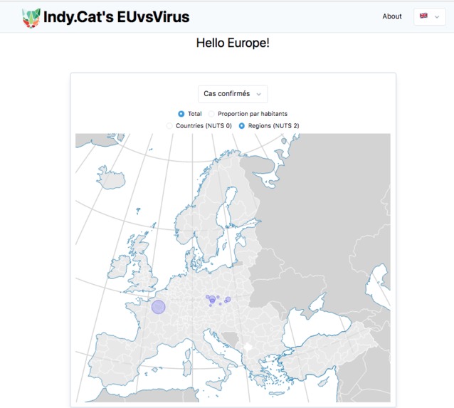
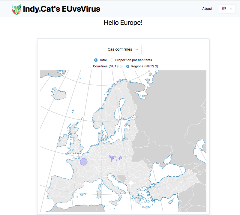
European region visualisation
-
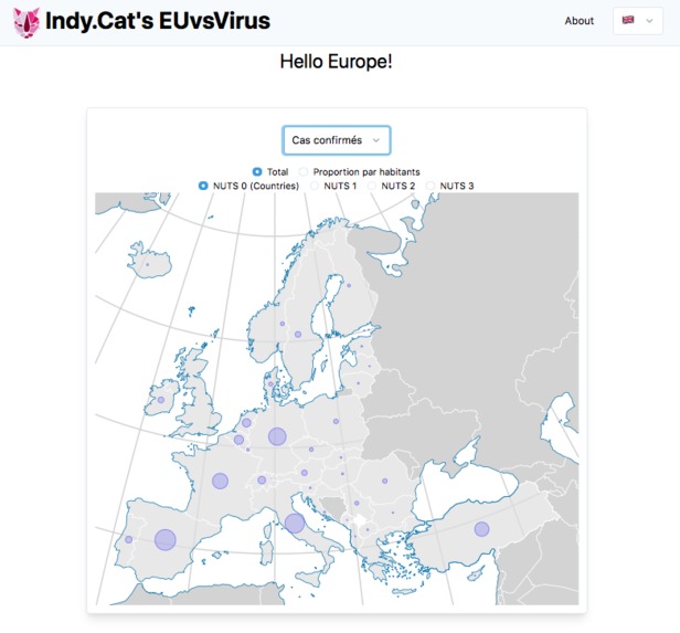
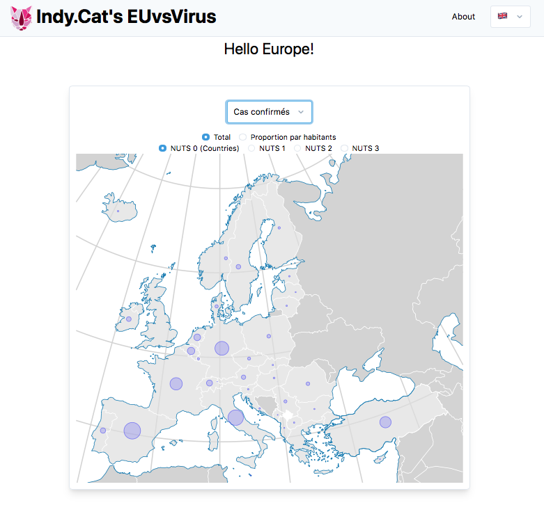
European nation level visualisation
-
-
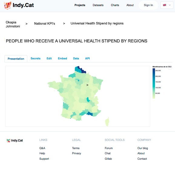
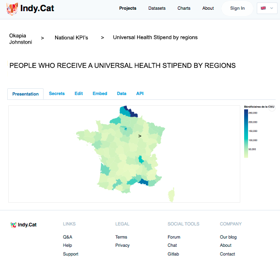
Sample choropleth made with Indy.cat
Let's face it, we have a Huge Data sourcing Problem.
Our leaders are helpless regarding the policy to be adopted in the face of the epidemic and they lack good indicators (KPIs) to evaluate the impact of the measures they put in place. In particular, the question arises as to the containment that has emerged as an indispensable response to the rapid spread of the virus. But containment has a very heavy economic and social impact. It is the ultimate solution when there is no other option, but it cannot be sustained. The question facing all European countries is how we can get out of containment without too much risk, in particular by avoiding having to impose it again. We propose to set up a tool to monitor the different European regions' exit from containment in order to see what are the most effective ways of deconfinement without too much risk. The idea would be to search for data from the regions, but it is currently difficult to find regional data to monitor the epidemic.
We propose an open web platform sourcing confinement data
mixing different kind of indicators efficiently and simply sourced by our tool {Density of population, Population by age group, Weather Data, Average housing surface, Size of family household and Mobility Data}. Our goal is to provide a way that citizen and public policy makers can confront their perspective on KPI's that evaluate the impact of their actions in a DIY fashion, by being able to connect to datasources themselves and compose their indicators. Concretely, for the EuvsVirus Hackathon, our aim is to make a benchmark, by observing the different methods of containment that have been imposed in the different European regions and by monitoring the evolution of the epidemic on a daily basis in these same regions in order to be able to compare them and identify the best solutions to get out of containment: for example, what restrictions on travel, meetings, opening of shops, cafés and restaurants, schools, what obligations to wear respiratory protection masks, what provisions relating to public transport, etc. are imposed?
We have created an interactive map of European regions confinement and covid comparing policy measures by collecting open-data sources from Oxford University, Data.gouv.fr, ECDC
and also limited-access data such as Bing and Google mobility datasets. Our tool allows to mix different kinds of indicators related to lockdown and its impact on health and non-health related issues. There is also a forum component that allows users (citizen, policy makers) to discuss indicators and public-policy KPIs. Ultimately, our prototype platform allows non-technical people to connect to CSVs and APIs, filter and compose datasets, create small visualisations (using Vega-Lite) and export them as widgets in their websites. Our focus is on user simplicity and also on historisation of data, so we can create dynamic visualisations. We use open-source software for the platform (svelte, sapper, tailwind, ...), for our team (matrix/riot, jitsi, gitlab, discourse...) and code on Debian & GNU Tools.

Indy.Cat impact to the crisis
The objective is to make available to all regional level cartographic representations that would present the results of the comparisons as well as the visualization of possible additional parameters useful for the understanding of the spread of the virus, if any are found. This objective can only be achieved if a European community is mobilised on such a project. Our broader goal is to propose to citizens and policy-makers tools to discuss and assess the impact of public policy based on real data. Our ambition is to create a community and a platform were non-tech people can tinker with data and create their own indicators and visualisations.
The necessities in order to continue the project
We need to gather relevant datasets at regional level, something that is currently very hard to do. For instance, the ECDC provides everyday national-level data, but there are hardly any micro-level data (region, city). As a team, we would like to collaborate with other relevant projects from the EuvsVirus hackathon and coming EU Datathon to be able to tackle these issues. In addition, we would like to connect with existing data scientists from Oxford University that develop the Stringency Index and constitute a community of European correspondents who will feed and use the platform. We need help, either from the EU or from other European partners to whom we can offer the French data. Our idea is also to integrate social and economic data to study the links between the development of the epidemic and parameters that have not yet been taken into account but could prove useful. This second aspect of our project is more ambitious. It involves data scientists.
The value of Indy.Cat after the crisis
Our solution will provide value for public-policy leaders and citizens who will be able to better evaluate the impact of policies and discuss the relevance of indicators (KPIs). Our platform intends to be DIY, so non-tech citizen can add their own CSV and API's in a very intuitive way with no coding involved Then they can create an indicator (KPI) by filtering and composing these datasets or modifying other people existing datasets. There is also a public and open forum so people can discuss on the validity of the datasets used, especially when it is done by public authorities such as EU bodies, national or local entities. Finally, the idea is to be able to export these indicators as charts, CSV and APIs to be integrated on reports and websites (e.g. journalists, factchecking).
The URL to the prototype
DEMO: https://euvsvirus.indy.cat
REPO: https://git.en-root.org/indy.cat/euvscovid (Free / Libre Open Source Software)
The URL to the pitchvideo
Built With
- api
- babel
- csv
- d3.js
- eslint
- javascript
- json
- postgresql
- prettier
- rollup
- sapper
- svelte
- tailwindcss
- typescript
- vega-lite


Log in or sign up for Devpost to join the conversation.