-
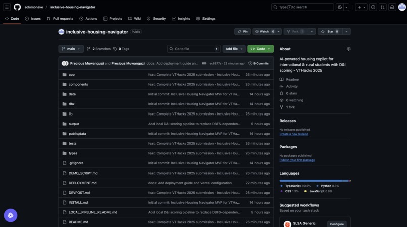
github repo
-
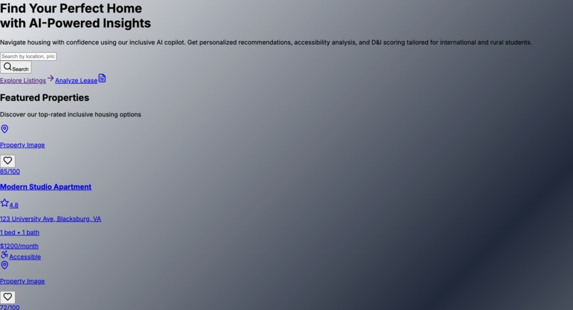
live


As students from rural Uganda and Nepal, we hit the same barriers: “no credit,” confusing leases, hidden fees, and apartments that looked great online but failed basic accessibility. We built a copilot that centers inclusion and explains why a place fits.
What it does
D&I Score for each listing across 5 pillars: Affordability, Accessibility, Safety, Commute, Inclusivity (intl-friendly policies).
Explainability: “Why this score?” breakdown + accessibility checklist (ramp/elevator/doorway width/parking/bathroom).
Lease QA: upload PDF/DOCX/TXT → Gemini summarizes key terms, flags junk fees & risks (non-legal), and drafts polite landlord questions.
Map & results: color-blind-safe markers, subscore chips, favorites & compare drawer.
Multilingual microcopy (EN + early Nepali/Luganda) and WCAG 2.2 AA UX.
How we built it
Frontend: Next.js (App Router) + TypeScript, Tailwind + shadcn/ui, lucide-react, React-Leaflet (Mapbox/OSM), Recharts.
AI: Google Gemini 1.5 for structured lease analysis (mock fallback when API key is missing).
Scoring: deterministic weighted formula 0.35 Affordability + 0.20 Accessibility + 0.20 Safety + 0.15 Commute + 0.10 Inclusivity, with rationales and mild penalties for unknown fields.
Data: Databricks provider when configured; local CSV fallback so the app never shows “0 results.” Filter-relaxation prevents dead-ends.
A11y: skip links, keyboard-first flows, visible focus rings, motion-safe animations, high contrast, and dual encoding (color + icon + text).
Challenges we ran into
Extracting clean text from messy PDF/DOCX and getting LLM outputs into strict, auditable sections.
Many listings lack accessibility data—designing honest defaults and UI that shows “unknown” without hiding gaps.
Keeping map markers keyboard-navigable and color-blind-safe.
Shipping a polished UI within hackathon time while meeting AA contrast and reduced-motion prefs.
Accomplishments we’re proud of
A transparent, explainable D&I score students can trust.
Lease upload → structured QA with red-flag detection and landlord question templates.
A vibrant, color-blind-safe UI that still feels fun.
A resilient data layer (Databricks when available; reliable local fallback when not).
What we learned
Inclusion isn’t a filter—it has to be the objective function.
Prompting for structured JSON + validations beats generic summaries.
Accessibility shifts design decisions early: layout, copy, and even how we encode scores.
What’s next
University & property-manager data partnerships to enrich accessibility fields.
More languages (Arabic, Hindi, Swahili), currency support, SSN-free onboarding tips.
Routine fairness audits and “evidence cards” that cite which fields drive each recommendation.
Mobile-first PWA and saved searches/alerts.
Built With
- databricks
- google-gemini
- lucide-react
- nextjs
- react-leaflet
- recharts
- shadcn/ui
- tailwindcss
- typescript


Log in or sign up for Devpost to join the conversation.