Inspiration
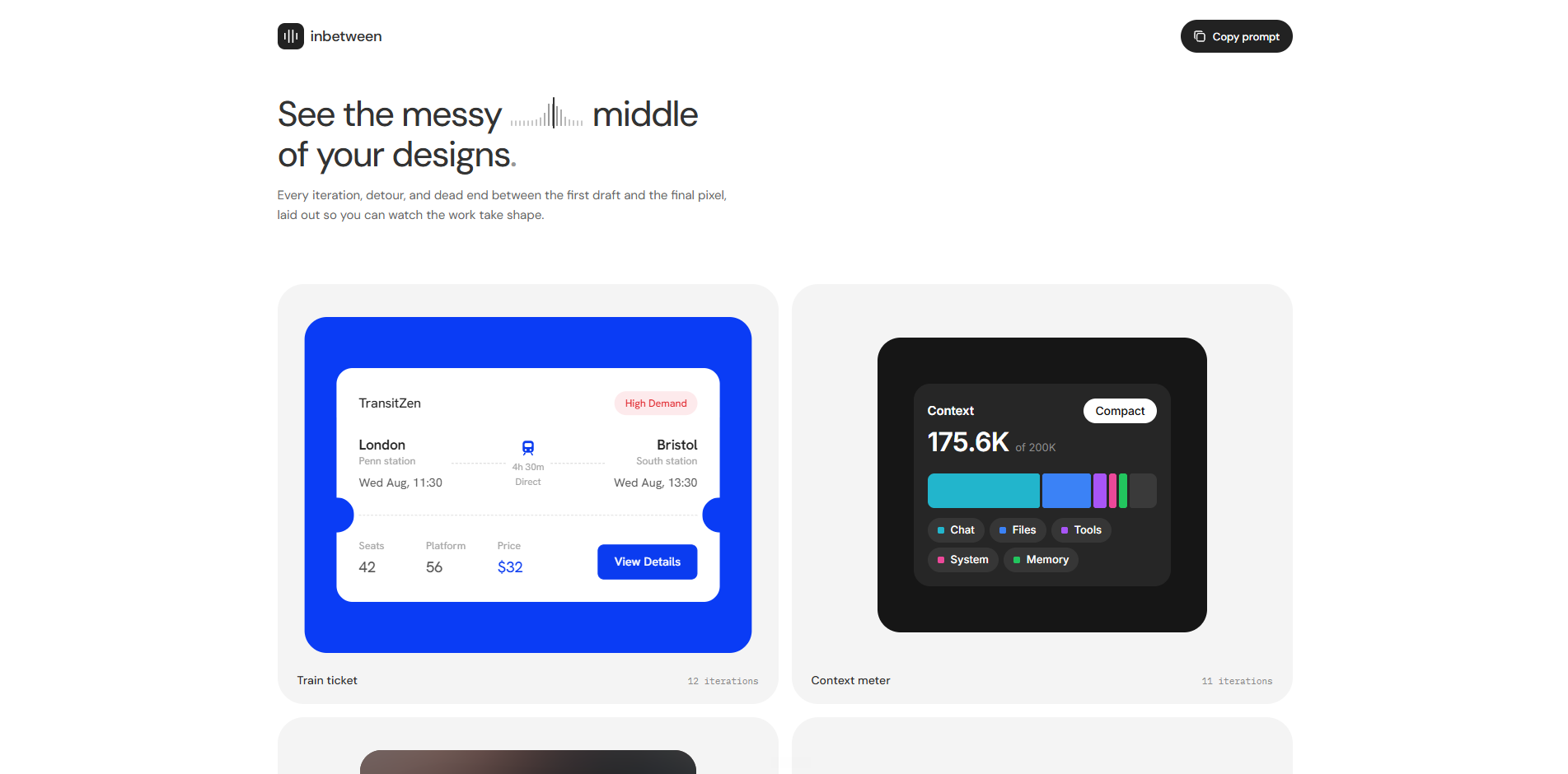
Designers are shipping code now, but there's no good way to see what changed. A diff tells you a radius went from 8 to 12. It doesn't show you how the component actually feels different. So I built inbetween, a visual timeline where you can scrub through a component's history and watch it change over time.
What it does
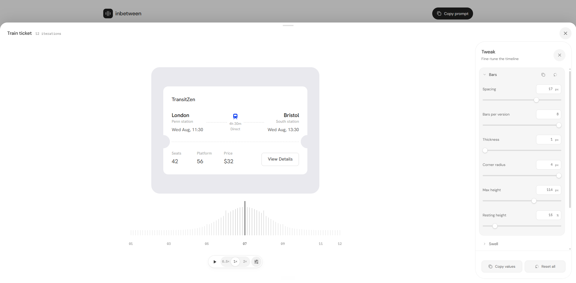
inbetween lets you drag across a timeline and watch one component morph through all its past versions.
- Scrub it, play it like a video, or click one version at a time with the keyboard
- Corners, padding, type, shadows and content change smoothly from one version to the next.
- Works for any component you plug in.
- Right now there are four examples: a project card, a transit ticket, a music player and a context meter
How we built it
I built it with Claude Code, React and Framer Motion. Once the core worked, most of my time went into details: the timeline bars, how the bars swell around the active version, the play/speed control, hover states and small interactions that make scrubbing feel good.
Challenges we ran into
- Making it morph instead of swap. Flipping between screenshots felt dead. So there's one live component that stays on screen, and every value blends between versions as you drag.
- Keeping styles from leaking. The component's CSS and the app's CSS kept interfering with each other. I put each preview in its own Shadow DOM so the component looks exactly like it does on its own.
- Things that appear and disappear. Some versions have a button or a label and some don't. Fading those in and out without the layout jumping took a lot of tuning.
- Small layout jumps. Opening the tweak panel or changing playback speed made parts of the page shift. I removed the extra animations and pinned things in place so the page stays steady.
Accomplishments that we're proud of
We got it working for four very different components, and all of them look good. A ticket, a music player, a card and a meter all morph smoothly through their histories in the same viewer.
What we learned
Every component is built and shaped differently, so there isn't one transition that works for all of them. How something should animate depends on what that element does in the component and how it's changing. A progress bar should grow, a label should fade, and a card should reshape. The transitions have to fit each component.
What's next for inbetween
Packaging it so anyone can npm install it, drop it into their own project or repo, and see how their components have changed over time. The aim is to make visually checking a change as normal as reading a diff.
Built With
- claude
- codex
- motion
- paper
- react
- typescript


