Inspiration
Our team has always been curious about the inner workings of the financial markets. When National Bank presented us with the opportunity to work with their communication data between exchanges, we did not hesitate to take upon this challenge.
What it does
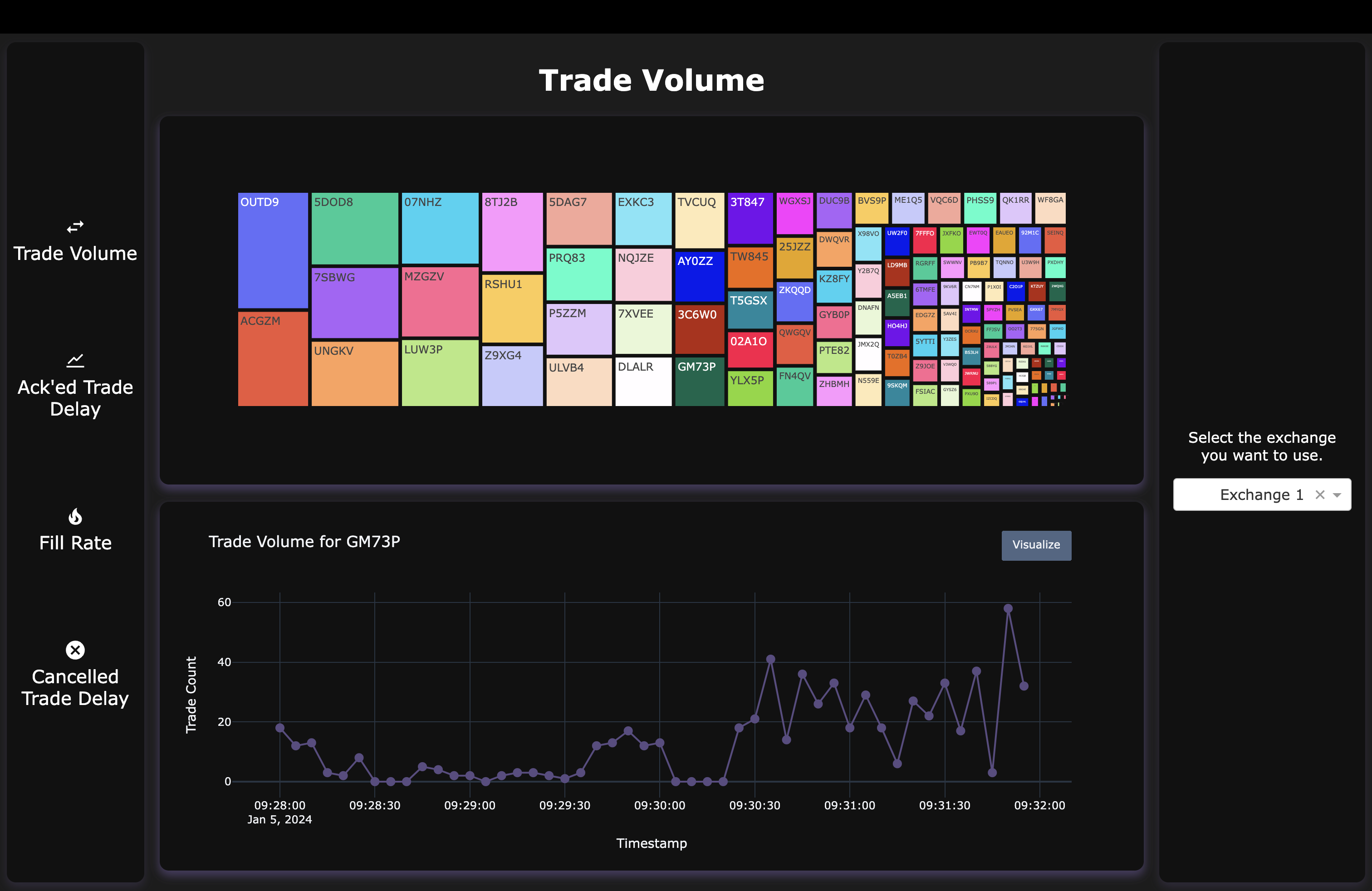
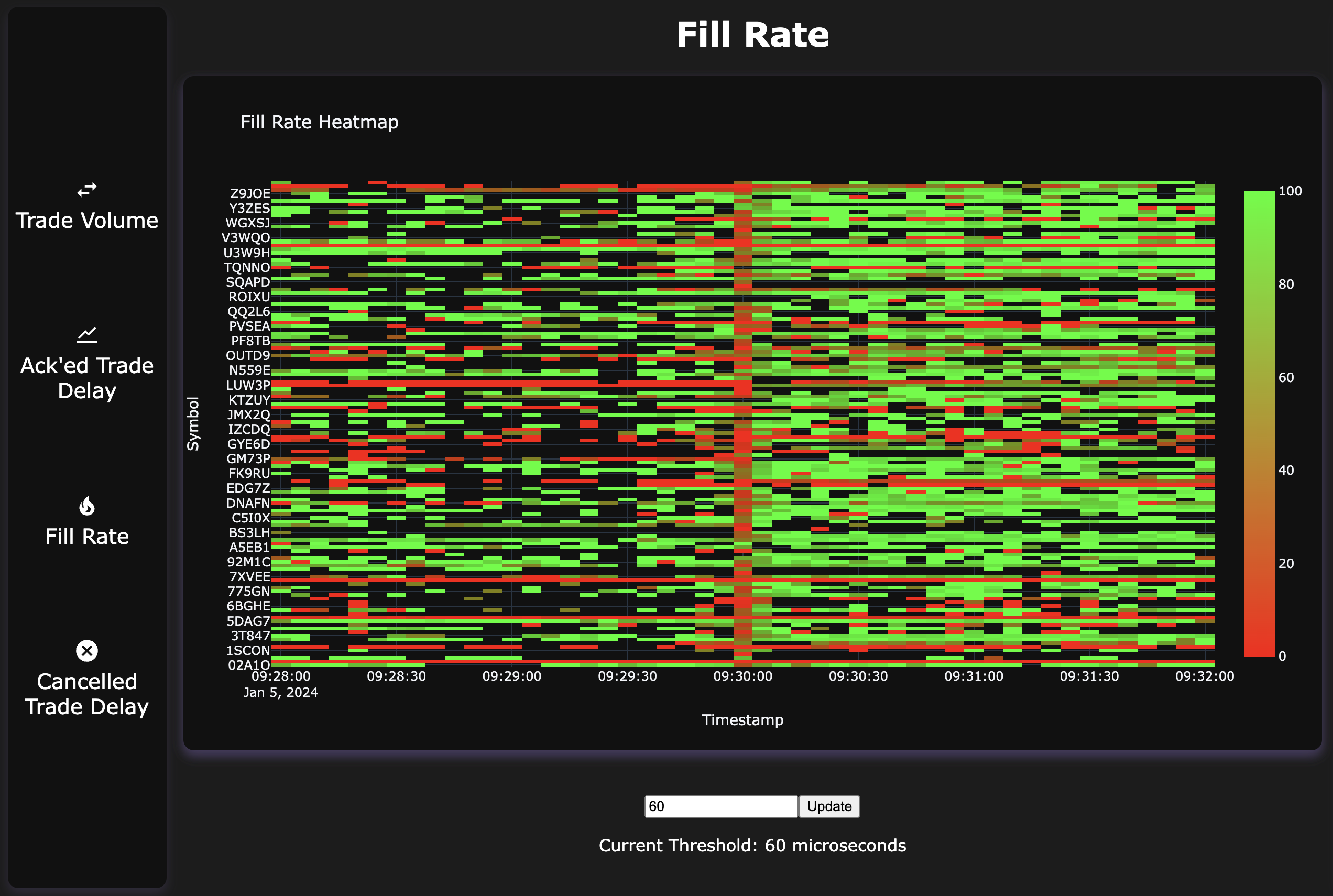
IN$IGHT ingests stock exchange data between National Bank and 3 exchanges, deriving insights and representing data, patterns and outliers in meaningful ways. This data was provided by National Bank Capital Markets. We first consume the data and represent the respective securities within a treemap that scales according to the trade volume. This gives a quick overview of which symbols have the most volume. Upon clicking on a security symbol within the treemap, multiple graphs are updated throughout the page that plot data related to the selected security. In real-time, the security’s specific traded volume is plotted in a line graph that can be simulated by clicking a button. Furthermore, through our rigorous calculations, we can chart the delays in specific trades related to given securities. For example, we present data such as how long it takes for an order to be acknowledged after a request for it has been sent as well as when a cancel request comes in and its acknowledgment delay. Finally, we use a heatmap that displays the fill rate of orders; a metric that shows the percentage of the orders of a given security that were filled within a desired time (specified by the user).
How we built it
The application was built using Plotly/Dash in Python. We used libraries such as Pandas and NumPy to conduct data preprocessing and manipulation.
Challenges we ran into
As we were all relatively new to Plotly/Dash, there was a learning curve when it came to grasping the technology. Figuring out how to extract meaningful insights and outliers from the data was also very challenging. Staying up for 24 hours was particularly hard, and some of our team members were not able to succeed in this as well.
Accomplishments that we're proud of
We are very proud of the various graph types we used as well as the data we were able to display. We believe we showcase meaningful data that cannot be derived purely from reading it and are proud of our application as a whole. We are also proud that we were able to detect anomalies clearly in our graphs by highlighting them in different colors.
What we learned
We learned a lot about data science and data analytics, specifically how to display data. We learned how to derive insights and meaningful patterns from large datasets, as well as how to use Plotly/Dash to graph our findings. We also learned a lot about manipulating data with Pandas, as well as various graph types.

Log in or sign up for Devpost to join the conversation.