Inspiration
We started with a desire to visualize data to help create good in the world. We believe that data is powerful and can be an impactful tool for education, advocacy, and change. At first, we considered doing a data visualization project on anti-human trafficking. However, we realized that many skilled people were already doing the vital work of visualizing open-source data. We decided to turn our attention elsewhere.
We knew the Maryland Department of Health had a Dashboard for the opioid crisis, but it seemed they had not created more dashboards for other essential health issues. When considering the data available from the Maryland Department of Health, we chose to focus on Health Care Access because a person's ability to access health care shapes their health outcomes no matter the illness they face. Thus, we felt that using our skills to advocate for more health access was a way to maximize improved health outcomes in Maryland.
What it does
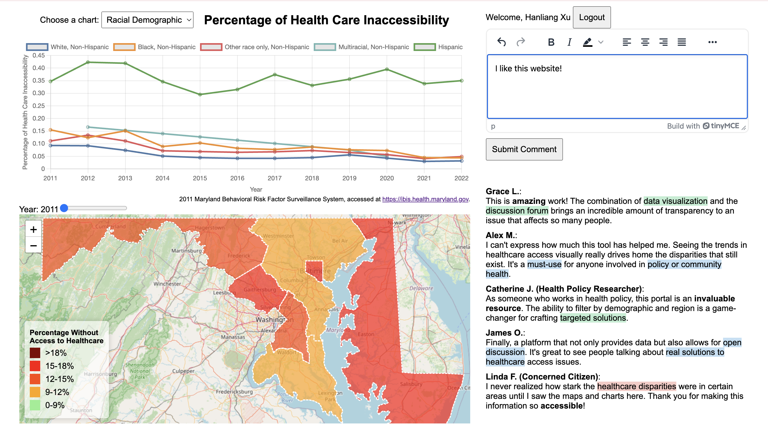
This website allows voters to engage with health care access for their state and interact with each other and legislatures to advance health care access for the least vulnerable. To this end, we have a drop-down menu where users can look at how different demographics impact access to health care. We also have a map to allow people to visually see how access to health care has changed over time, and we have a discussion forum to initiate conversations around this topic. The project aims to foster engagement between voters, policymakers, and other stakeholders. The ultimate goal is to drive positive legislative and community-level action to improve health care access, especially for marginalized populations.
Key Features
- Interactive Map Visualization
- The core feature of Untitled is its interactive map that visualizes health care access across Maryland's regions.
- Users can view changes in health care access over time (from 2011 to 2022), observing trends and patterns in access disparity.
- Each region is color-coded based on access levels, with darker colors indicating worse access and lighter colors representing better access.
- The core feature of Untitled is its interactive map that visualizes health care access across Maryland's regions.
- Demographic Filters
- The platform allows users to explore health care access data based on various demographic categories, such as:
- Race
- Gender
- Size of Metro
- These filters provide insights into how different populations experience health care access, highlighting disparities such as the significant gap among Hispanic communities and gender-based differences.
- The platform allows users to explore health care access data based on various demographic categories, such as:
- Discussion Forum
- The website includes a discussion forum where users can:
- Post comments, suggestions, or personal stories related to health care access.
- Engage in constructive dialogue with policymakers, community leaders, and the public about health care challenges and propose solutions.
- The website includes a discussion forum where users can:
How We Built It
We got the data from the Maryland Department of Health Query System (link). We wrote code to clean the data we downloaded from the site and then integrated it into the website.
- Frontend
- The frontend of "Improving Health Care Access For All" is built using React, leveraging the Leaflet.js library for map visualizations.
- TinyMCE is integrated into the discussion forum to provide rich text formatting options for users posting comments or suggestions.
- Auth0 is used for the login functionality, ensuring secure authentication for users accessing the forum and other parts of the platform.
- The frontend of "Improving Health Care Access For All" is built using React, leveraging the Leaflet.js library for map visualizations.
- Backend:
- The backend, powered by Node.js and Express, handles the retrieval and processing of data.
- The MongoDB database stores the data and discussion posts from the forum, designed to scale as the user base grows.
- The backend API provides endpoints for dynamically retrieving data by region, year, and demographic category, enabling the frontend to make real-time requests as users interact with the website.
Challenges we ran into
Data Acquisition and Processing
- The Maryland Health query system was not optimal for finding the data, but we made it work! The queries were limited to drop-downs, so there was a lot of pre and post-processing to have easily visualizable data.
Data Visualization Complexity
- Visualizing large amounts of data, especially across different demographic filters and time periods, presented challenges in performance and rendering.
- Ensuring smooth map interactions, particularly when switching between years or demographics, required optimizations in how data was loaded and displayed on the frontend.
- Handling missing or inconsistent data (e.g., "N/A" or "**" entries) was another challenge that was addressed through robust error handling and default visual states.
- Visualizing large amounts of data, especially across different demographic filters and time periods, presented challenges in performance and rendering.
Community Engagement
- Engaging a wide range of users, from everyday voters to policymakers, required the creation of a platform that balanced simplicity with depth.
- Ensuring that data was accessible to non-experts while still providing valuable insights to policymakers was a key design consideration.
- Engaging a wide range of users, from everyday voters to policymakers, required the creation of a platform that balanced simplicity with depth.
Accomplishments that we're proud of
- High-Impact Visualizations
- The map visualization is not only aesthetically pleasing but also provides users with immediate insights into health care access disparities.
- The ability to filter by year and demographic category adds significant value, allowing users to dig deeper into the data.
- The map visualization is not only aesthetically pleasing but also provides users with immediate insights into health care access disparities.
- Actionable Insights
- Through data analysis, the team uncovered key disparities, such as:
- Higher rates of health care inaccessibility among Hispanic populations and men.
- These insights can serve as focal points for future policy efforts.
- Through data analysis, the team uncovered key disparities, such as:
- Scalable Data Infrastructure
- The backend is built to handle additional data types and visualizations, meaning the platform can grow to include more health indicators and regions over time.
Future Plans
Expanding Data Sources
- The data presented is just a sampling of the available data. Our code for cleaning and analyzing data can be re-run to allow viewers to examine the problem of health care access from more angles.
- The platform currently visualizes health care access, but there are many other health indicators that could be included in the future.
- Additional data sources could also be incorporated, such as socioeconomic factors, housing, or education data, to explore the intersections of health and other societal issues.
Advanced Analytics Tools
- Future iterations could include predictive modeling tools, allowing users to visualize potential future scenarios based on current trends.
- Advanced filters could be introduced, giving users more granular control over the data they want to explore (e.g., filtering by county, income level, or proximity to health care facilities).
Community Building Features
- The discussion forum could be expanded to include upvoting, topic tagging, and the ability to share discussion threads on social media, creating more avenues for community engagement.
- Collaborations with policymakers could be fostered by creating specialized dashboards tailored to legislative needs, helping inform public policy decisions.
Conclusion
"Improving Health Care Access For All" is more than just a visualization tool—it’s a platform designed to drive change. By making health care access data accessible and understandable, the project hopes to empower citizens and lawmakers alike to take action. With a focus on inclusivity, data accuracy, and community involvement, "Improving Health Care Access For All" aims to highlight health disparities and advocate for a more equitable health care system in Maryland. The team is excited about the platform's potential and is committed to continuing to build on its foundation to inspire advocacy and policy change.


Log in or sign up for Devpost to join the conversation.