Inspiration
We were inspired to go with this heat map because of our desire to consolidate more metrics than the ones we were initially given in order to better consider the many factors that go into a decision as complex as determining where to invest in another medical facility.
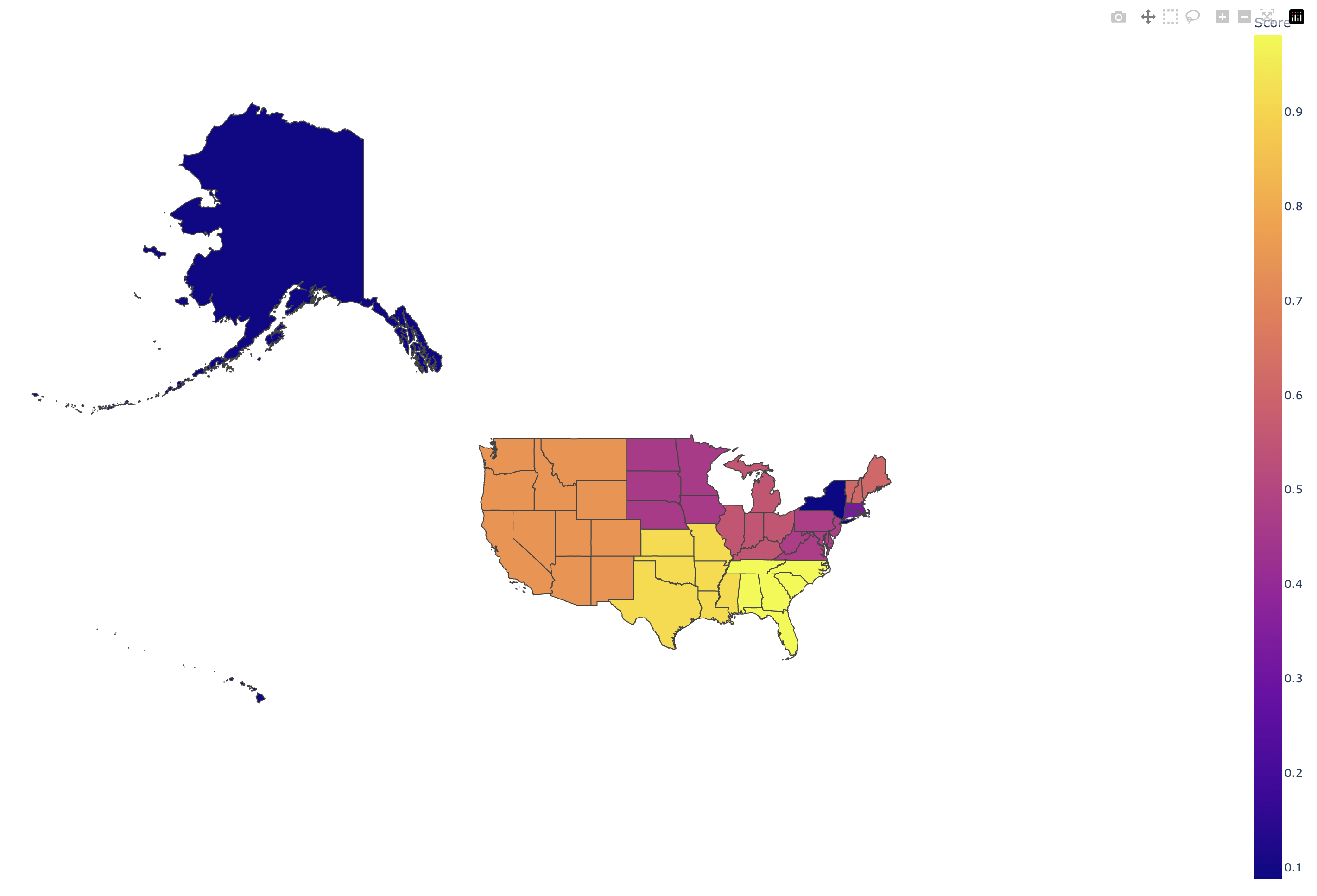
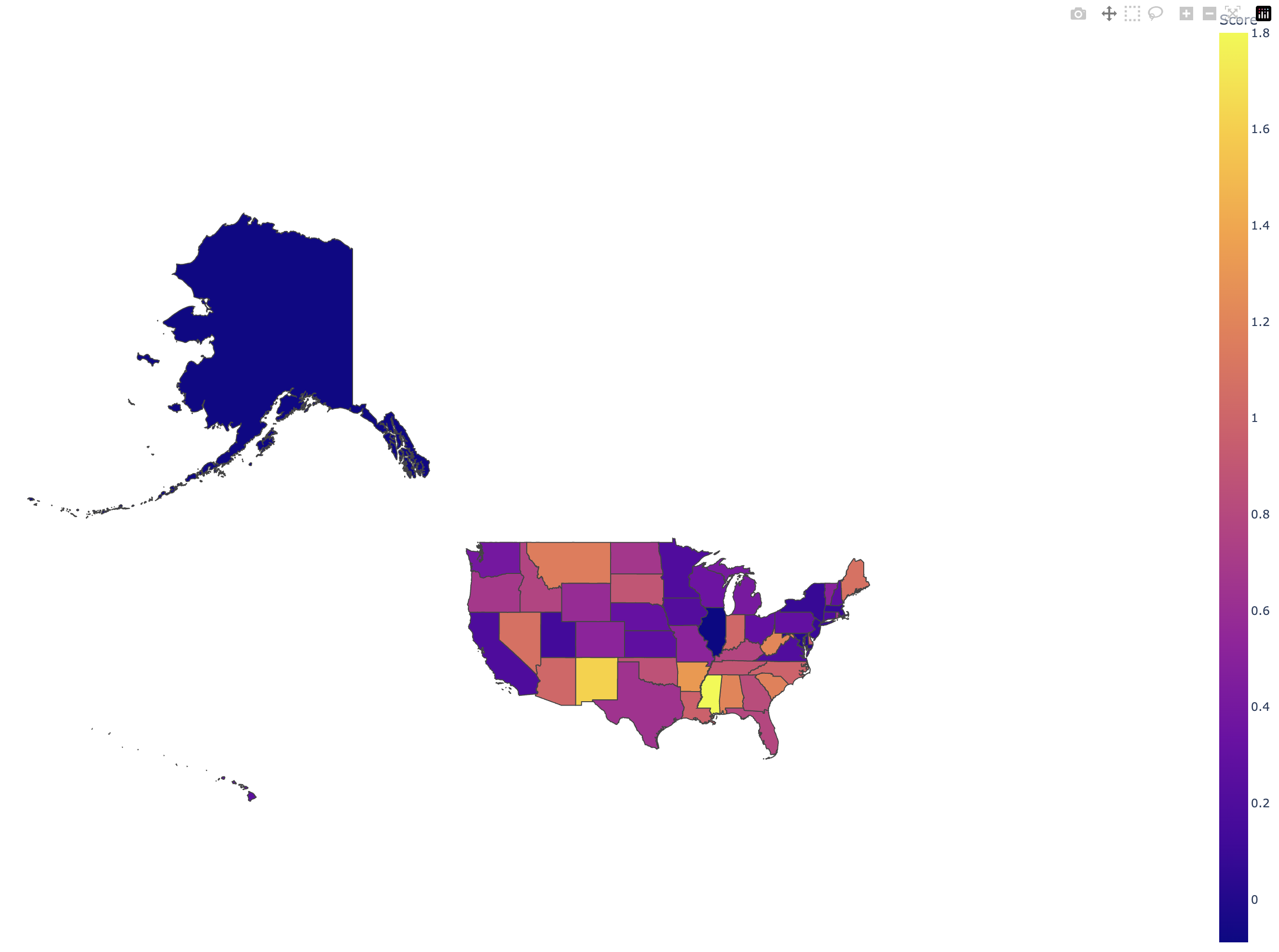
What it does
It shows which states should be prioritized in terms of funds allocation. Under the clustered view, we showed which regions of the United States in general had a higher priority for funding.
How we built it
We built it via compiling several external datasets that contained the data that we were interested in, in addition to the two databases we were provided as part of the prompt.
Challenges we ran into
We ran into many challenges over the course of conducting this Datathon - notably syntax with Pandas and developing an accurate and comprehensive metric to rate each of the states by. The initial efforts to finish the mapping via counties was rendered unsuccessful due to the very slow lookup times on the online API we initially sought to use. The relative importances assigned to the factors we considered - e.g. population growth, number of pre-existing certified centers, etc, were particularly difficult to develop and scale properly.
Accomplishments that we're proud of
We are very proud of how much we've learned over the course of this Datathon. We also were proud of the many degrees of complexity we covered in our final score metric. Many factors go into making a states an underrepresented one in terms of mammogram facilities, and we wanted to make sure that the funds we sought to allocate ended up where they were supposed to.
What we learned
We learned a lot about modern data science tools like Juypter and Pandas. Learning how to use various tools to visualize the data i.e. choropleth given geojson shape data also made for a very entertaining and useful learning experience.
What's next for Improving Early Detection in Every Direction: Mammograms.
There are a number of things we could do to improve the model - shrink the lower bound of our analysis, for one. If we could extend it to a county heat map, as we had originally intended, we would be able to provide a more specific advice on where to locate the new facilities.
Built With
- https://github.com/rxu183/datathon2023


Log in or sign up for Devpost to join the conversation.