-
-
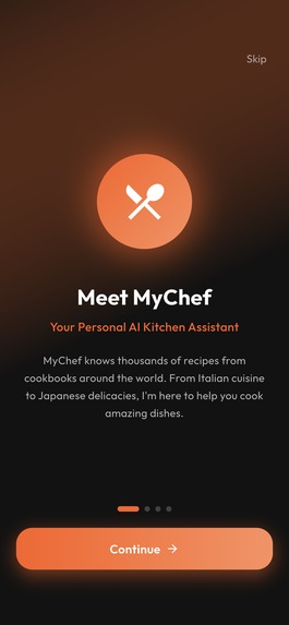
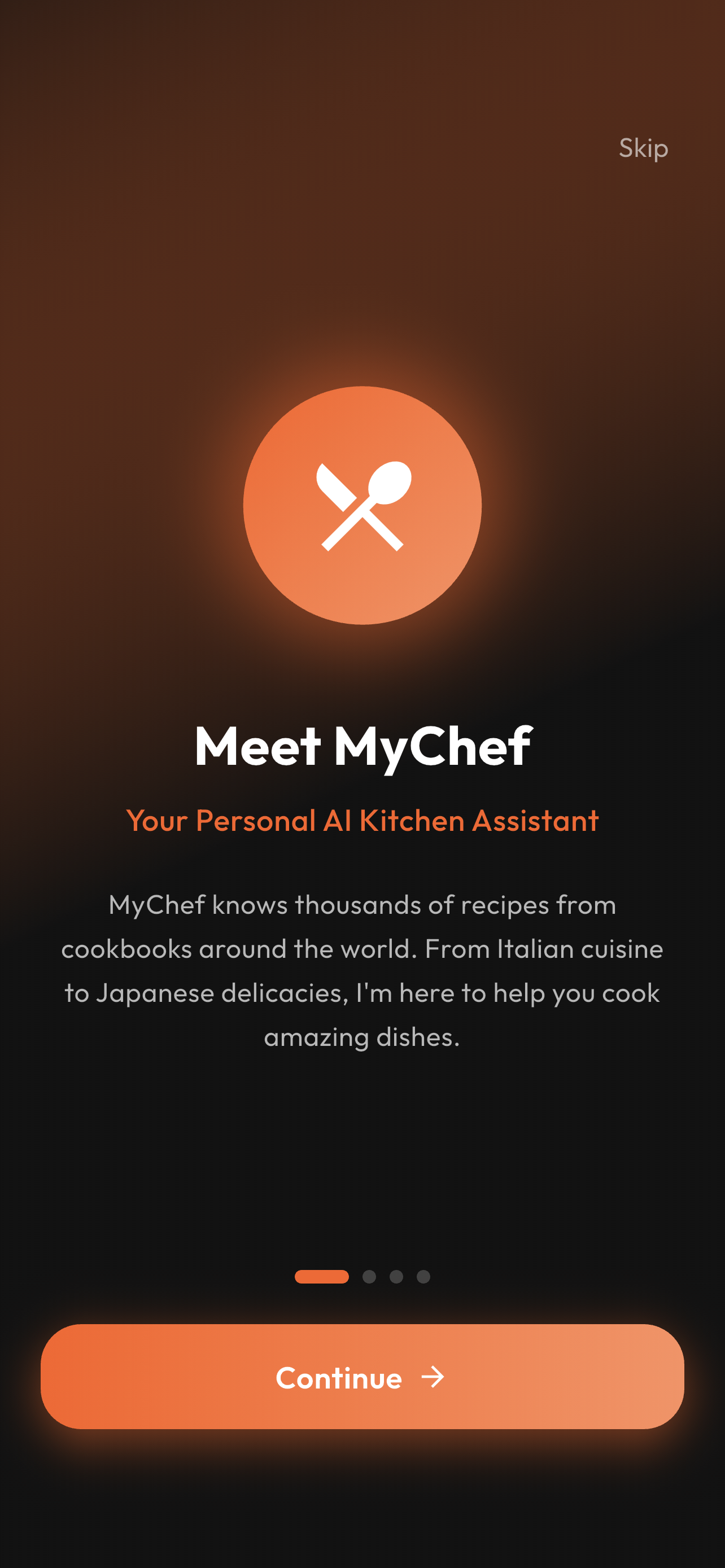
Splash > Intro
-
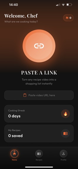
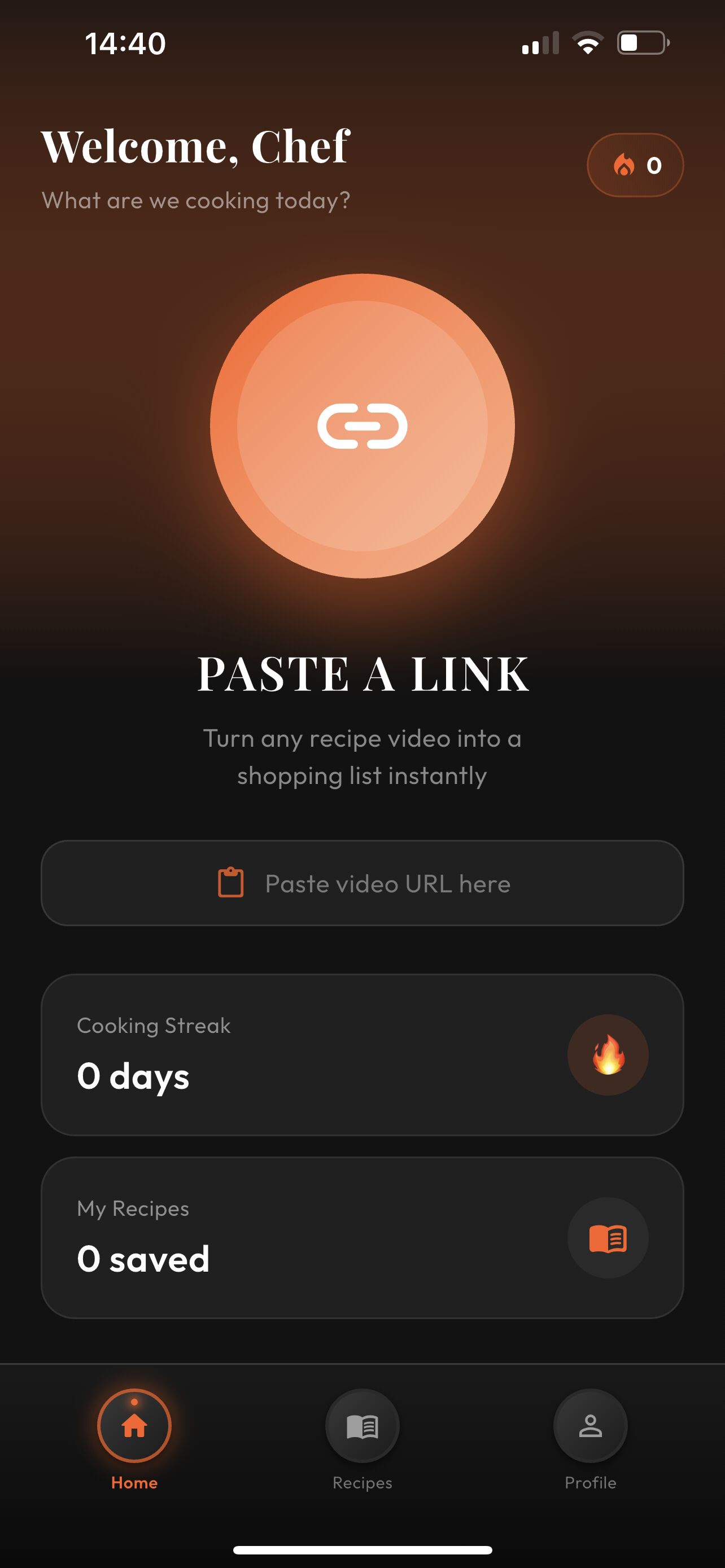
Home Page
-
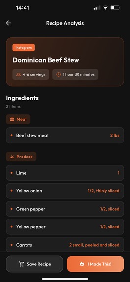
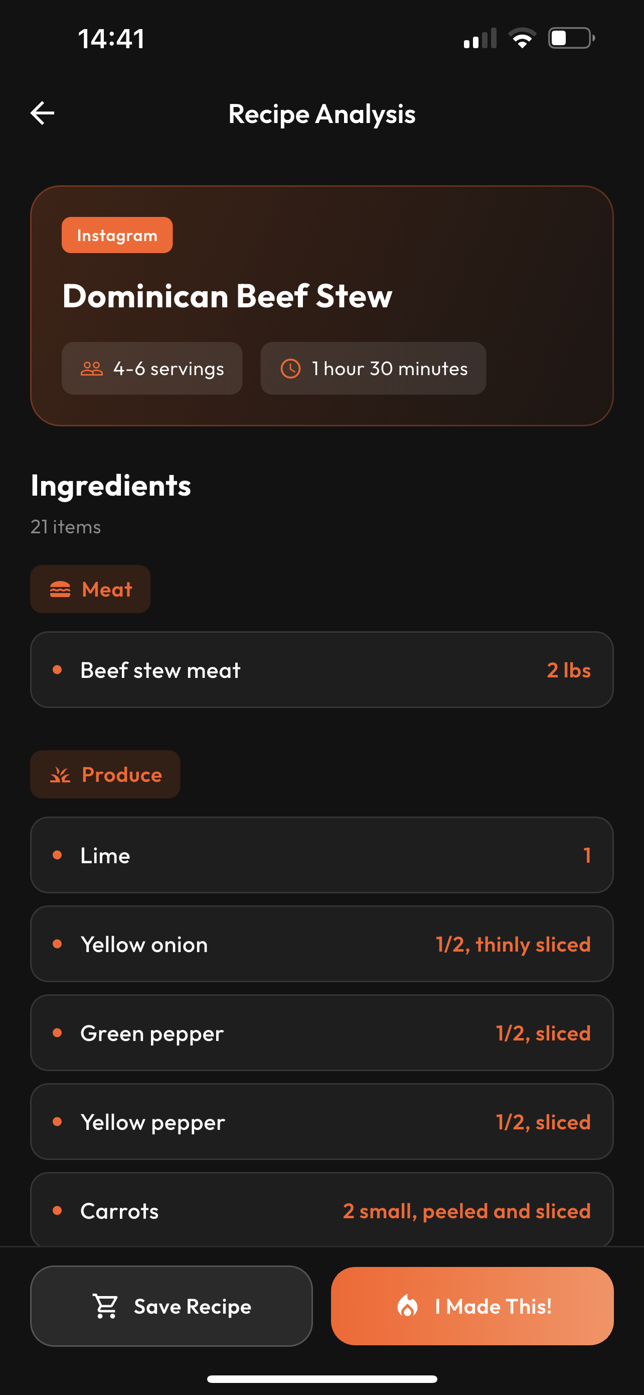
Recipe Analysis & Ingredients
-
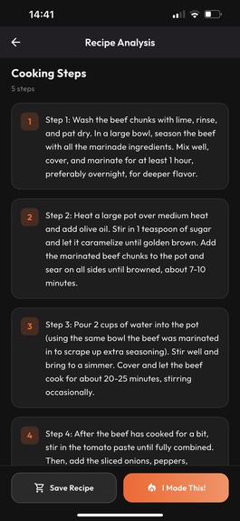
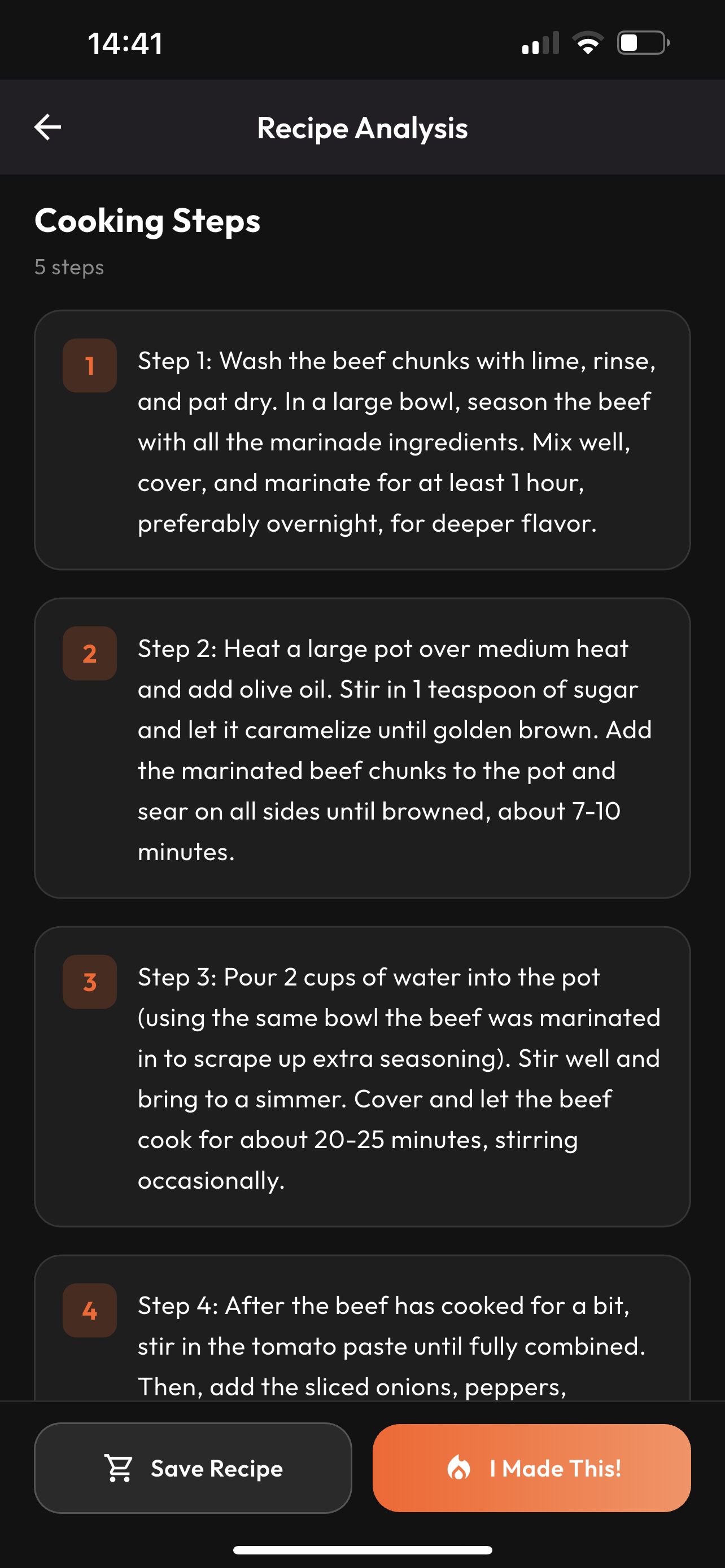
Cooking Steps
-
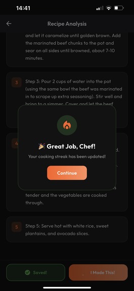
I made this & +1 Streak
-

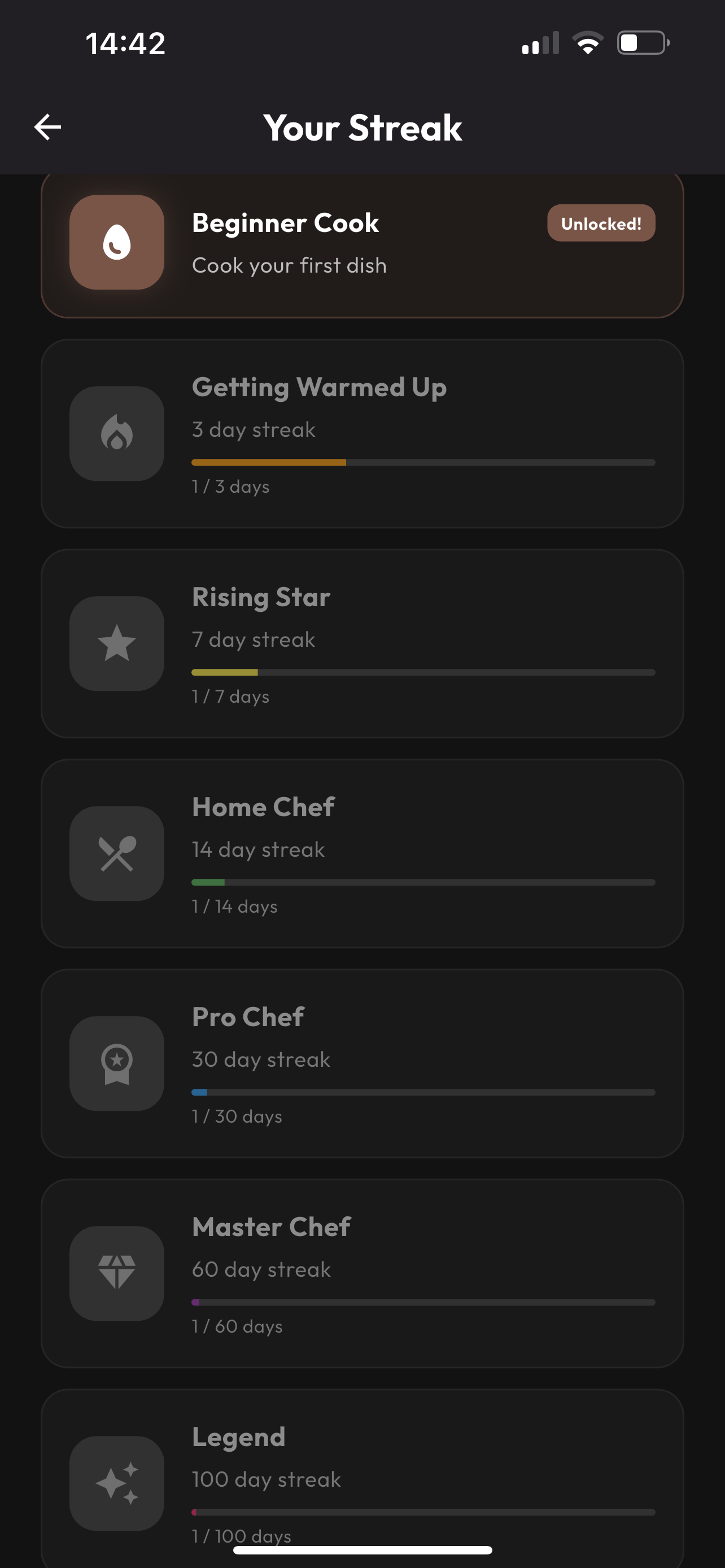
Streak List
-

How Streaks Work
-

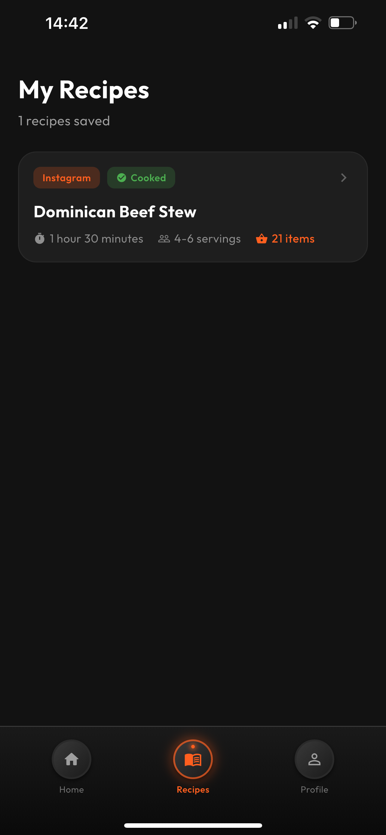
Recipes Page
-

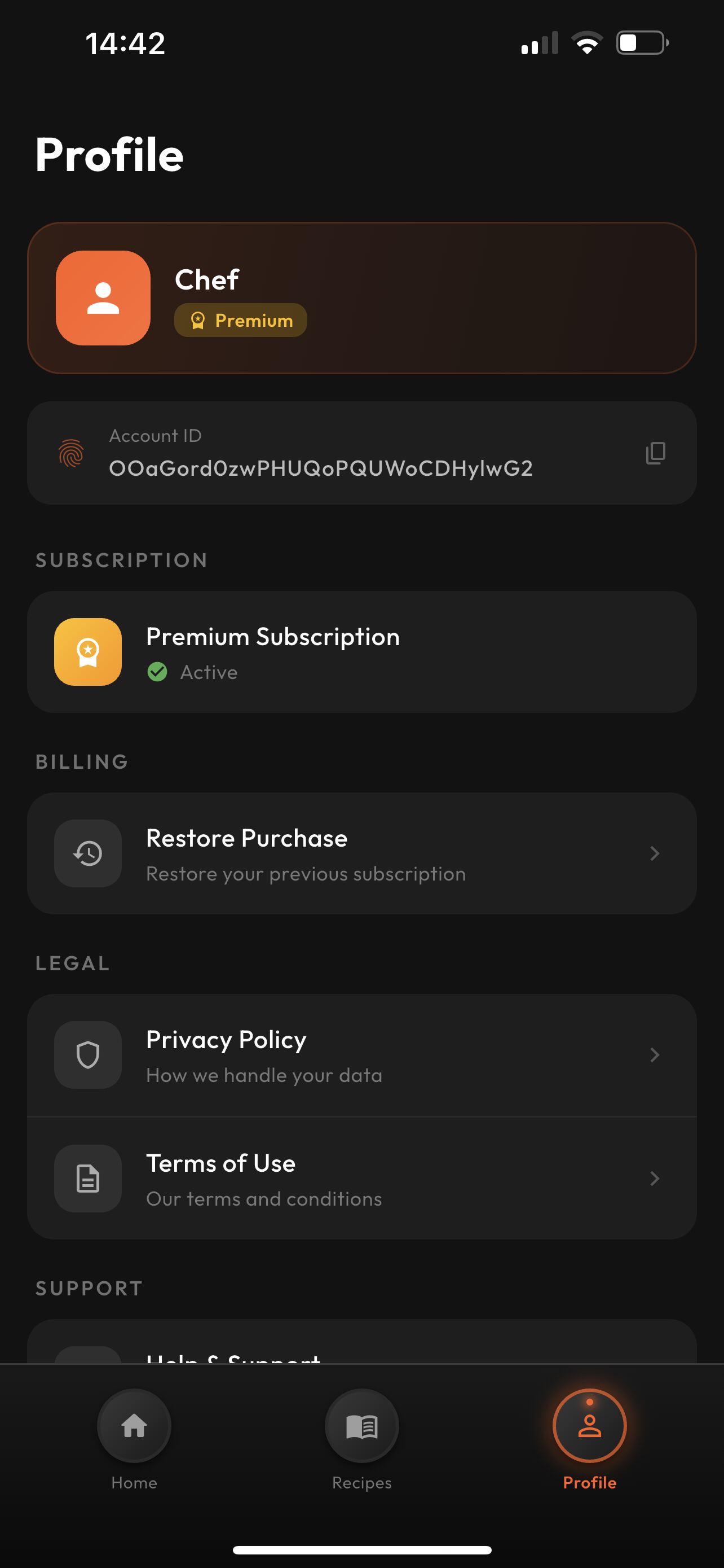
Profile Page


Inspiration
When I listened to the brief published by Eitan, I immediately understood that the product I needed to build had to solve a time problem. He wanted a product where he could simply see the ingredients and preparation steps of a dish he saw on social media. That was it.
Instead of building something complex with unnecessary, mind-confusing features, I realized this product needed a clean and elegant design with a clear purpose.
What it does
MyChef allows users to quickly understand and recreate meals they see online. The goal is to deliver value instantly, without forcing users through complicated flows or overwhelming them with too many features at once. It focuses on clarity, speed, and usefulness.
How I built it
The Shipping Container email reached me a bit late, and when it did, the code inside wasn’t working. So I decided to move forward using my own methods.
Whenever I build a product, I start with the monetization strategy. I designed a freemium model where the product proves its value before asking users to pay.
The app first explains its value through intro screens, then personalizes the experience with onboarding. At the end of onboarding, we clearly communicate the benefit the user will gain in their daily life. Right after that, I placed the paywall, because one of the moments when users have the highest purchase intent is right after receiving a personalized experience.
For subscriptions, I chose yearly and weekly plans. I believe yearly subscriptions are key for scaling the app long term and minimizing churn. Since users already receive two free uses that prove the app’s value, I found it reasonable to implement a hard paywall after that.
This program asked for an MVP, and I delivered a properly functioning MVP. I believe that presenting 4–5 features at once in an MVP makes users feel lost, like “I have no idea what this app does.” So I kept the experience focused.
For the visual identity, I chose a black and orange color palette. To increase user retention, I added a streak system to introduce gamification, encouraging users to think twice before deleting the app.
After the Shipping Container didn’t work, I decided to solve everything my usual way. I wrote a detailed PRD for Figma AI, generated the design I wanted, exported it, and used Claude Code to turn it into a Flutter mobile app, which I then developed further in VS Code & Xcode.
I intentionally did not add a traditional login/sign-up system because I believe it creates unnecessary friction. This is not a social network, users just want a solution immediately. However, I still integrated Firebase Authentication in the background and connected RevenueCat for monetization.
I also designed an eye-catching, curiosity-driven app logo using Canva.
I’m proud that I was able to complete all of this on my own under challenging conditions, and it proved to me once again what I’m capable of.
As a small but meaningful design detail, I added an oven-like glow effect in the bottom tab bar: when a user taps the icon, an orange light appears as if an oven has turned on. With details like this, I aimed to create an app that serves its audience through both design and user experience.
Challenges we ran into
One of the biggest challenges was that the provided Shipping Container solution didn’t work, which meant I had to rebuild the workflow entirely with my own tools and systems. Time constraints and working solo under pressure also made the process more demanding, but I adapted quickly and continued building.
Accomplishments that I'm proud of
I’m proud that I delivered a fully working MVP that stays true to the brief without overcomplicating the product.
I’m also proud of:
- Designing a clear monetization system from day one
- Building the entire product solo
- Creating a clean and elegant UI/UX
- Implementing gamification for retention
- Completing design, development, and branding by myself
Most importantly, I proved to myself again that I can take an idea and turn it into a real, functioning product under tough conditions.
What we learned
This project reinforced how powerful simplicity is. Users don’t need dozens of features — they need one strong value proposition delivered clearly and quickly.
I also once again saw how important it is to think about monetization, retention, and user psychology from the very beginning, not after the product is finished.
What's next for MyChef - AI Cooking Assistant
Eitan has strong social reach, and I’ve already prepared marketing strategies around that.
Next, I plan to localize the app into 8–9 languages, including app metadata and App Store screenshots.
After collaborating with Eitan and starting to bring in the target audience, we can begin testing new features. For example, a “scan your fridge” feature could be added. This would help reduce churn because it signals that the app is alive, evolving, and constantly delivering exciting new functionality, giving users a reason to keep their subscription active.
Last but not least, I’d like to thank the RevenueCat team for this opportunity,
Regardless of the outcome, this was an experience I will remember in the future.
Best Regards, Onur INEYICI


Log in or sign up for Devpost to join the conversation.