-
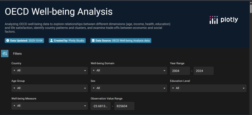
Main starting page containing filters for each filed.
-
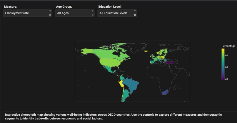
Using choropleth for Well-being division indicators across OECD countries.
-
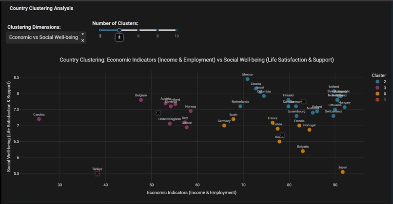
Cluster analysis of Trade-offs between economic and social factors.
-
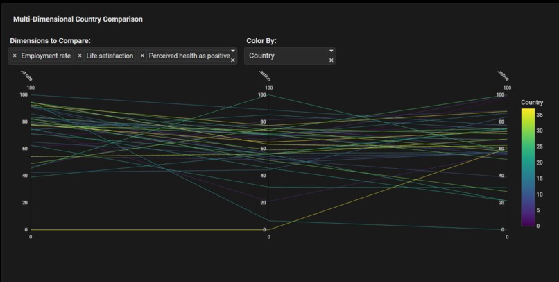
Using parallel coordinates to compare OECD countries across multiple well-being dimensions


Project Story
Inspiration
It all began with a simple question that quickly grew complex: "What does it mean for a country to be 'doing well'?" GDP and economic statistics felt like a cold, one-dimensional answer. I was drawn to the OECD's "How's Life?" initiative, which paints a richer picture of well-being through dimensions like health, education, income, and life satisfaction. The dataset was a treasure trove, but its sheer density was overwhelming. How could anyone easily see the forest for the trees? This challenge sparked my project's core mission: to transform this complex, multi-faceted data into an intuitive, visual story.
What it does
The final product is an interactive web application that invites users to explore the nuanced story of global well-being. It’s not just about presenting data; it's about providing a lens to understand it. Users can compare countries, identify trade-offs (e.g., strong economy vs. environmental quality), and discover unexpected similarities between nations. The app empowers anyone—from a student to a policymaker—to move beyond abstract numbers and engage with the human side of the data.
How we built it
My goal was to build more than just a dashboard; I wanted to create a discovery tool. I decided to use Plotly for its power and interactivity, but I consciously avoided standard, simplistic charts. The complexity of well-being couldn't be captured by bar graphs alone. My process focused on choosing the right visualization for the right question:
- Revealing Relationships: Scatter plots with trend lines showed correlations between factors like income and life satisfaction.
- Profiling Nations: Radar charts created unique "well-being footprints" for each country.
- Uncovering Hidden Patterns: Heatmaps revealed clusters and outliers instantly.
- Grouping Similar Countries: Clustered visuals grouped nations with similar well-being profiles for deeper comparison.
Challenges we ran into
The dataset was dense and multi-dimensional, which made it difficult to present in a way that was both accurate and intuitive. Choosing the right visualization for each insight required experimentation, and balancing interactivity with usability was an ongoing challenge.
Accomplishments that we're proud of
We successfully transformed a sprawling, complex dataset into a tool that allows anyone to explore and understand global well-being. Users can now uncover hidden relationships, compare countries holistically, and engage with the human side of the data in ways that simple tables or static charts could never convey.
What we learned
We learned that effective data storytelling is as much about asking the right questions as it is about technical skill. Choosing the right visual for the insight you want to reveal can make the difference between confusion and clarity.
What's next for HYENA
Future plans include integrating more real-time data, adding predictive analytics, and expanding the app to allow for user-driven scenario comparisons, making it an even more powerful tool for discovery and decision-making.

Log in or sign up for Devpost to join the conversation.