-
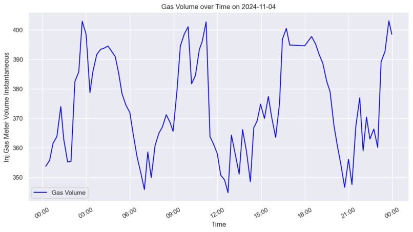
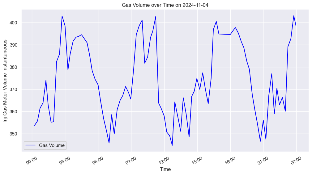
graph show gas meter volume over a day
-

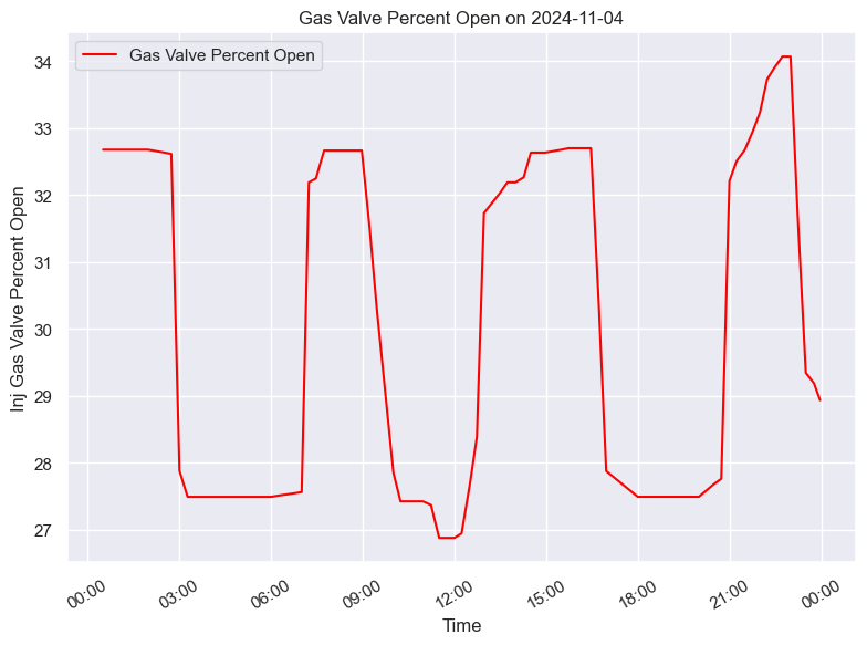
graph showing percentages over a day
-
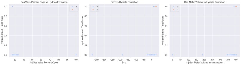
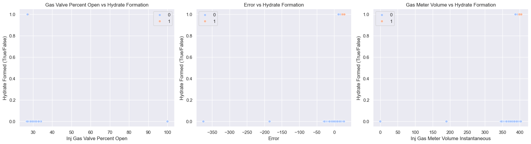
logistic regression showing hydrate occurences based on each predictor
Inspiration
Inspired by interactive data visualizations we see for time-series data online, made for the user to customize.
What it does
Our app takes in a dataset from the user of the time, gas meter volume instantaneous and set-point values, and the percentage gas valve opened, and will make it ready to be trained and displayed in a line graph. Users have the option to feed in a specific day they wish to see, and the gas meter volume change over that particular day will be displayed. Then, using this dataset, our logistic regression model trains the data to predict under what conditions hydrates form, and displays that on screen as a regression plot of binary outcome, whether hydrates will form or not.
How we built it
For the backend, we utilized python's pandas to clean up the data, seaborn and matplotlib to create visualizations (over one day), and sklearn libraries to train and predict a logistic regression model on the given data (overall).
For the frontend, we utilized React, JavaScript, and CSS. We also used Figma and its Dev Mode to help organize our design.
Challenges we ran into
Making sure that our program works the same across multiple datasets, that have the same columns but very different values.
What's next for Hydrate Solutions
We look forward to integrating an interactive dashboard for users to feed their own data and be able to toggle various features that help them gain further insights into their data, in real-time.
Built With
- css
- javascript
- node.js
- python
- react.js
- sambanova


Log in or sign up for Devpost to join the conversation.