Inspiration: Because this hackathon is Halloween-themed, I was thinking of ideas related to something spooky, and I thought of skeletons. I thought this idea would be good because it teaches people about our own bodies.
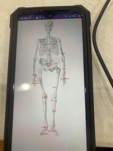
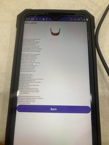
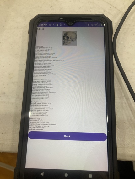
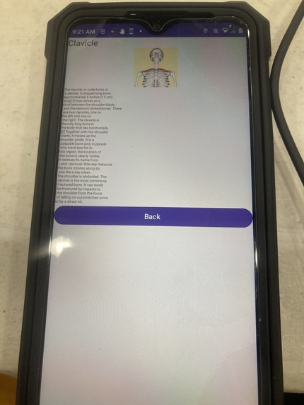
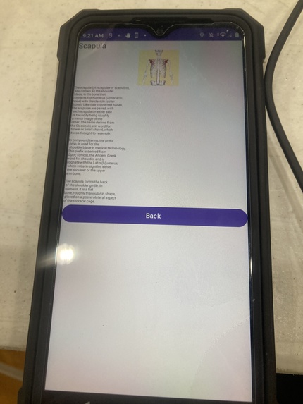
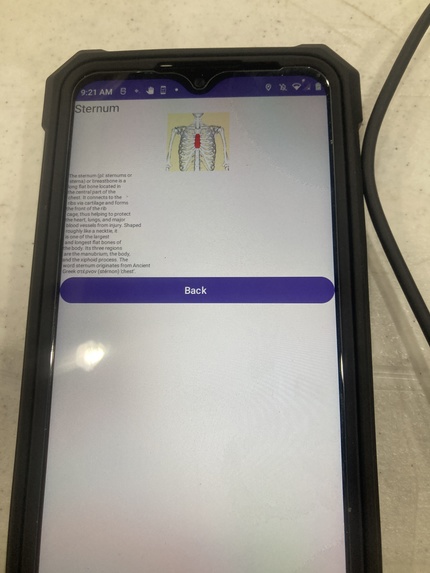
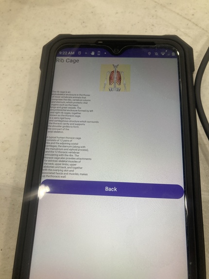
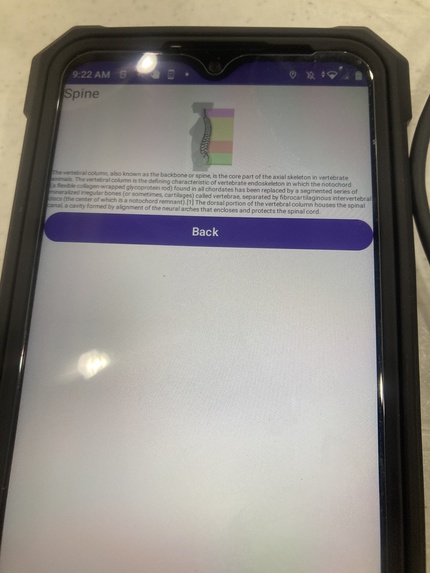
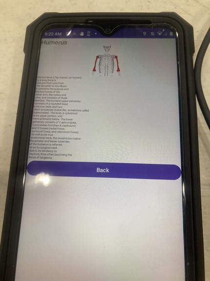
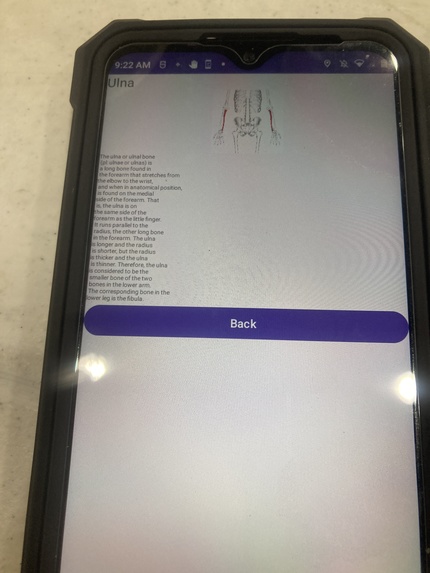
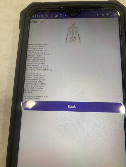
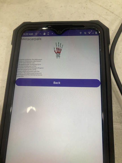
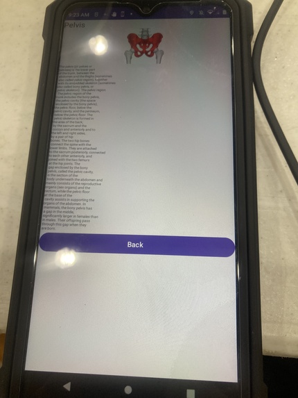
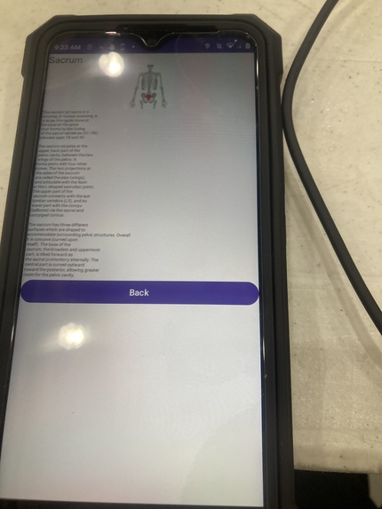
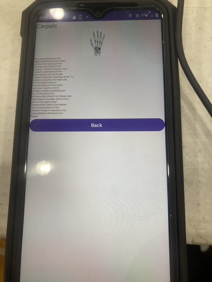
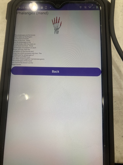
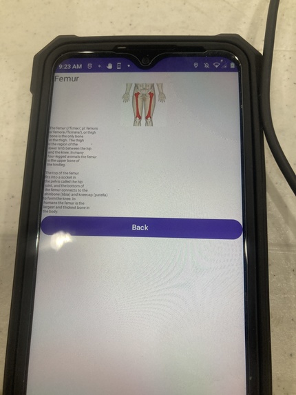
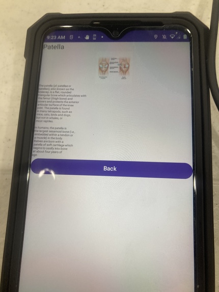
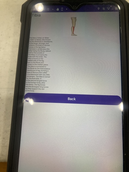
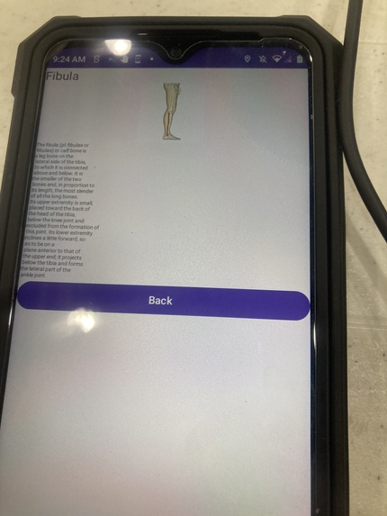
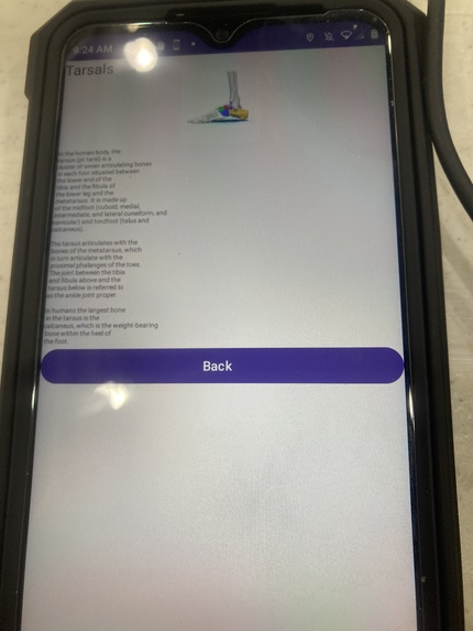
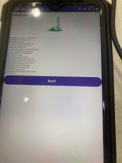
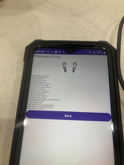
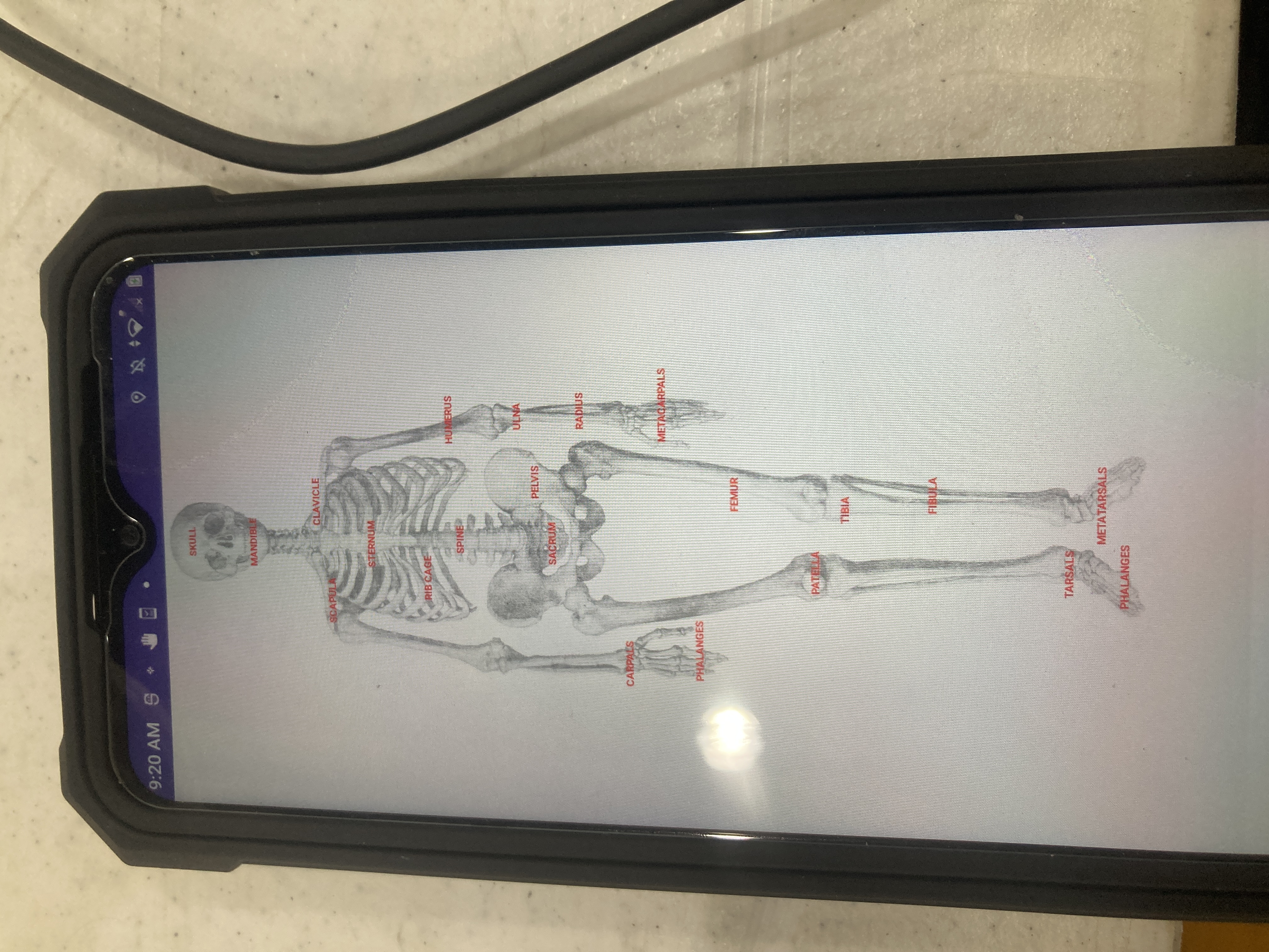
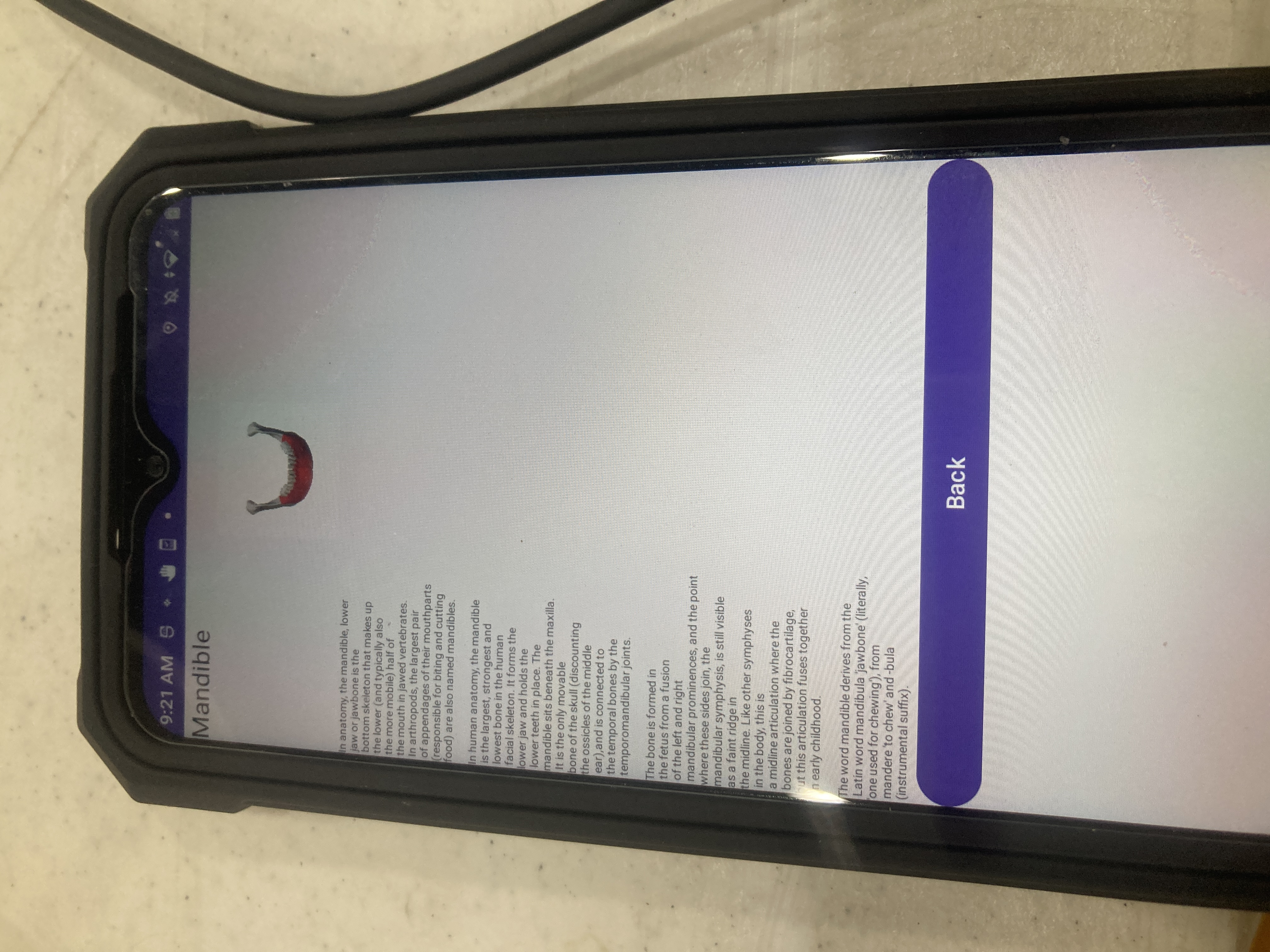
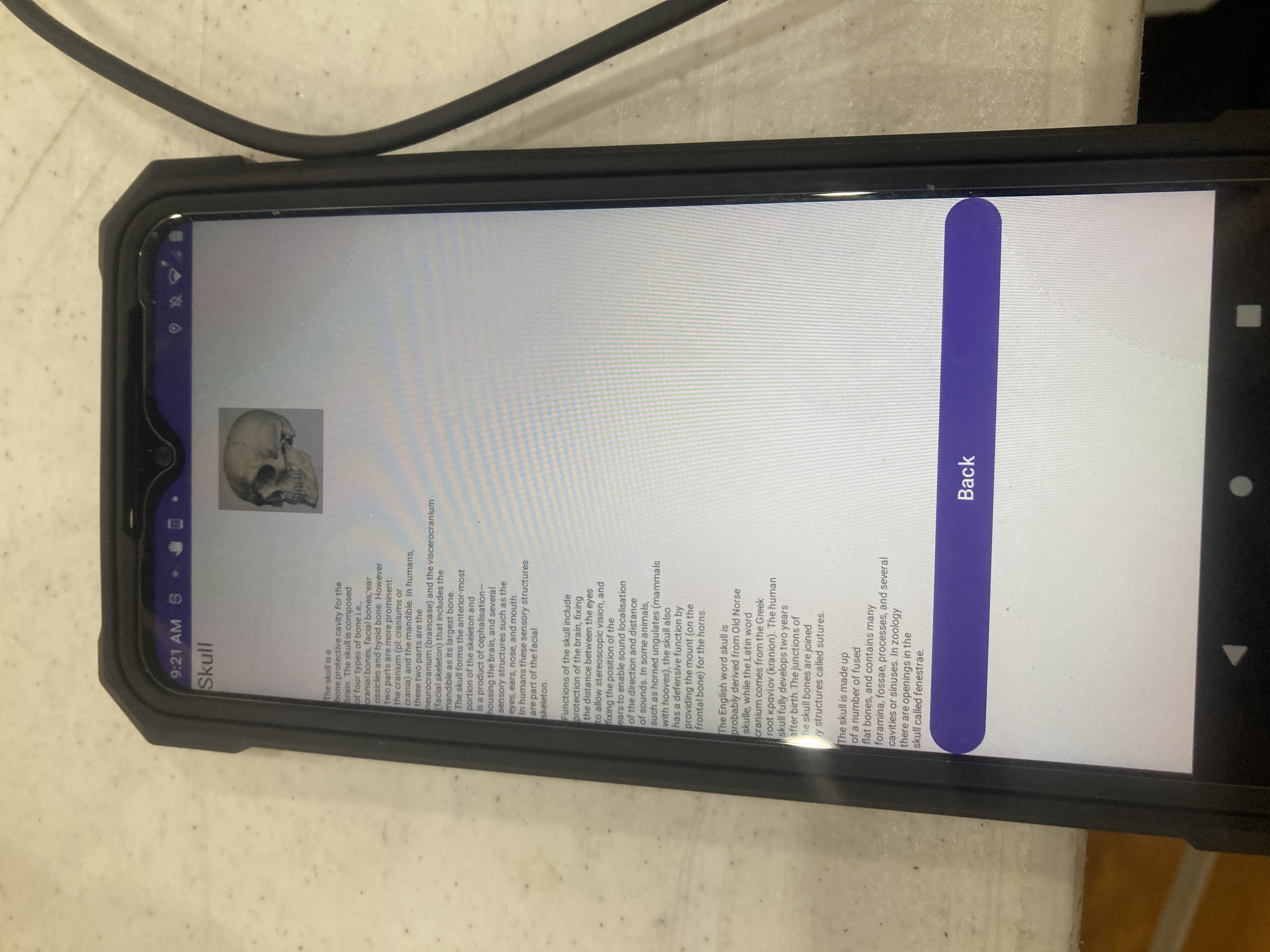
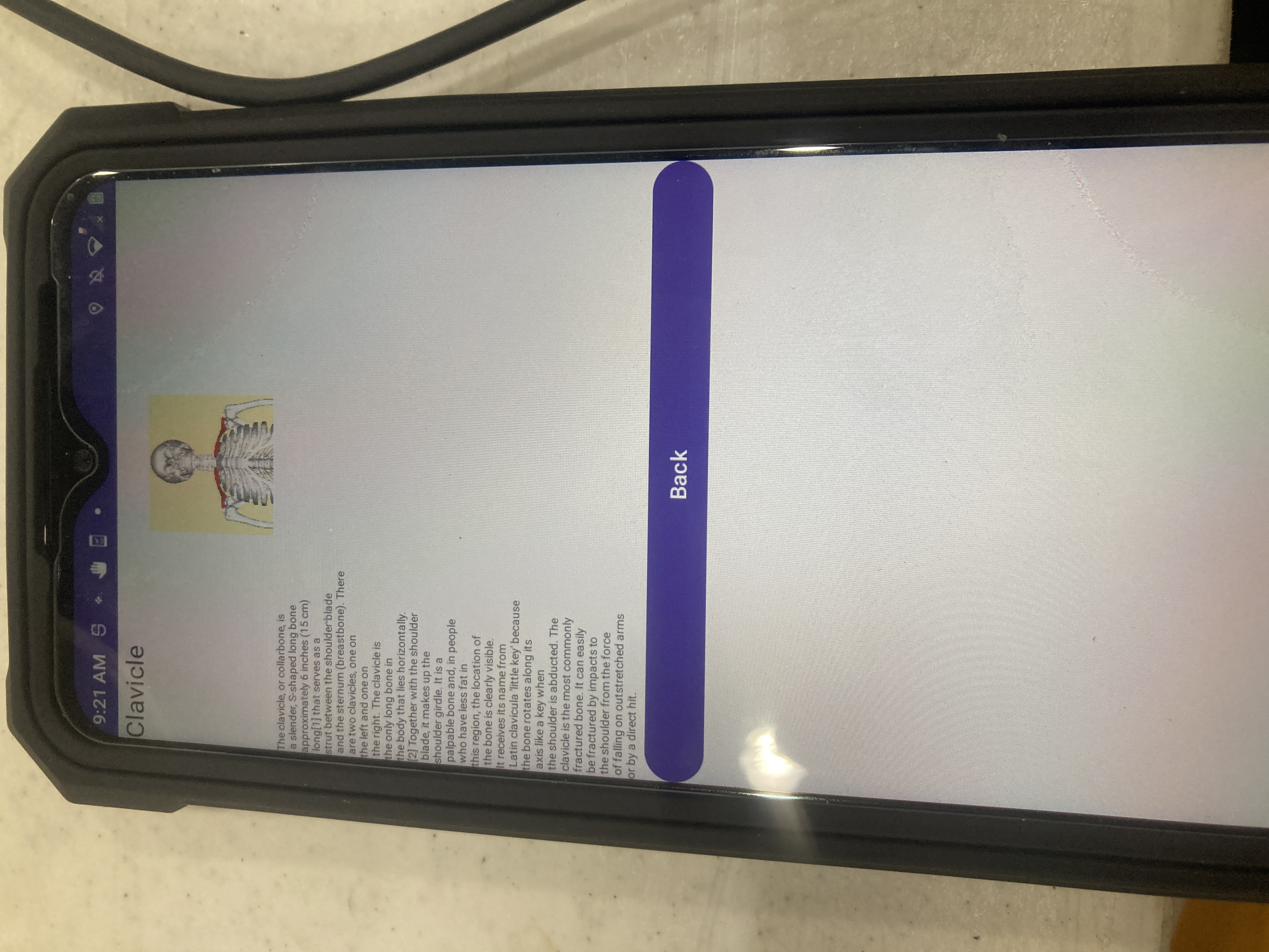
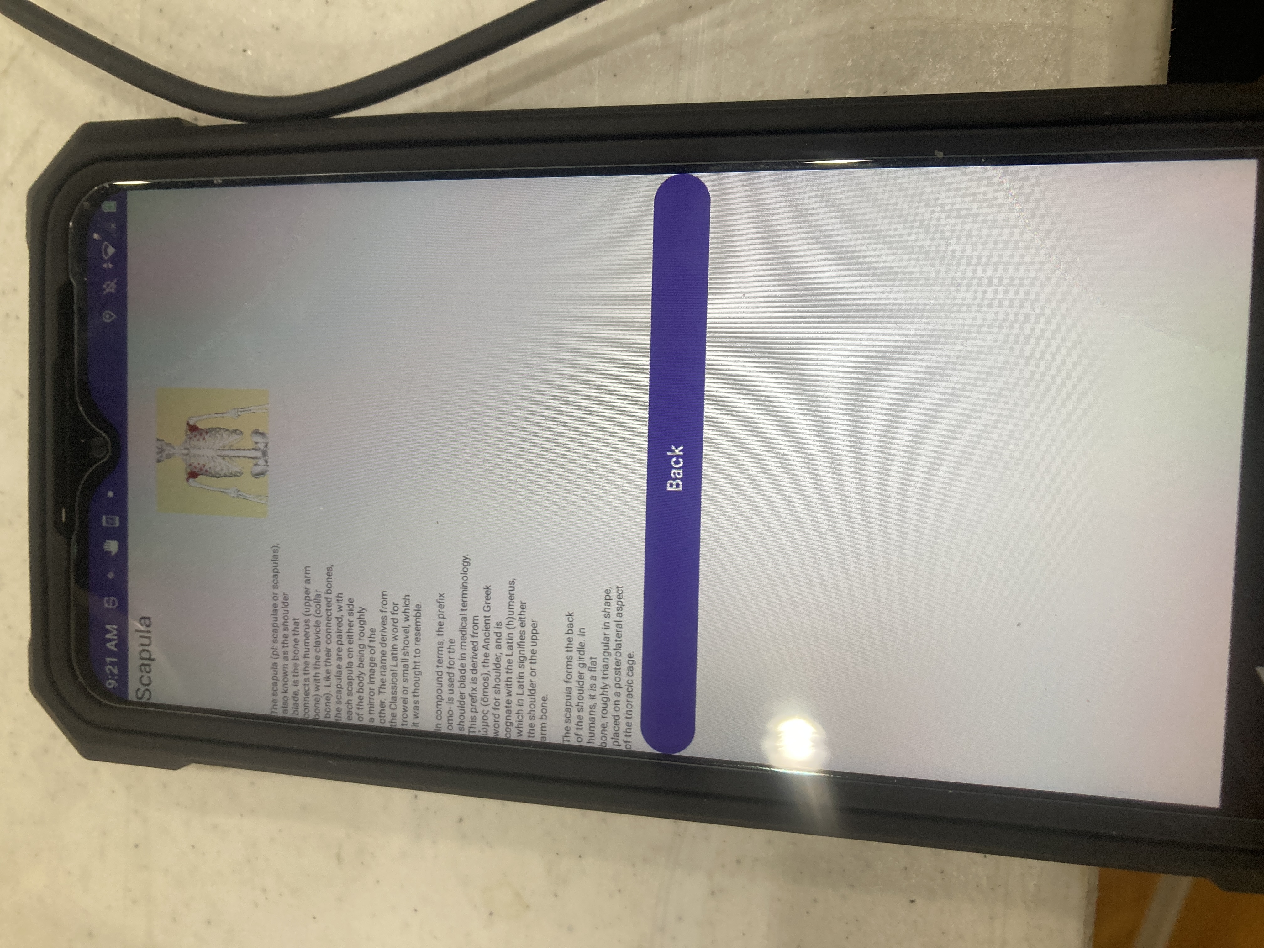
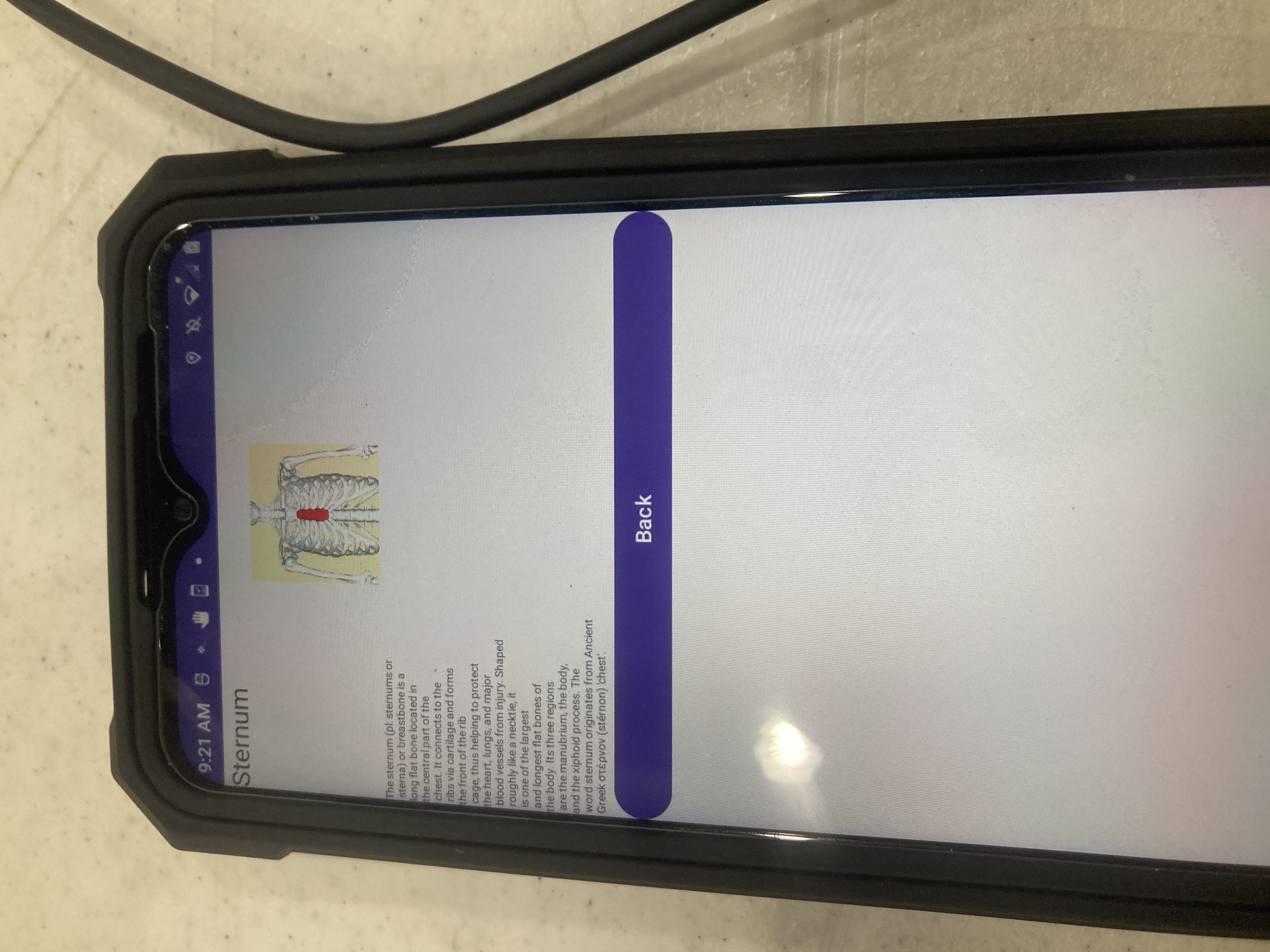
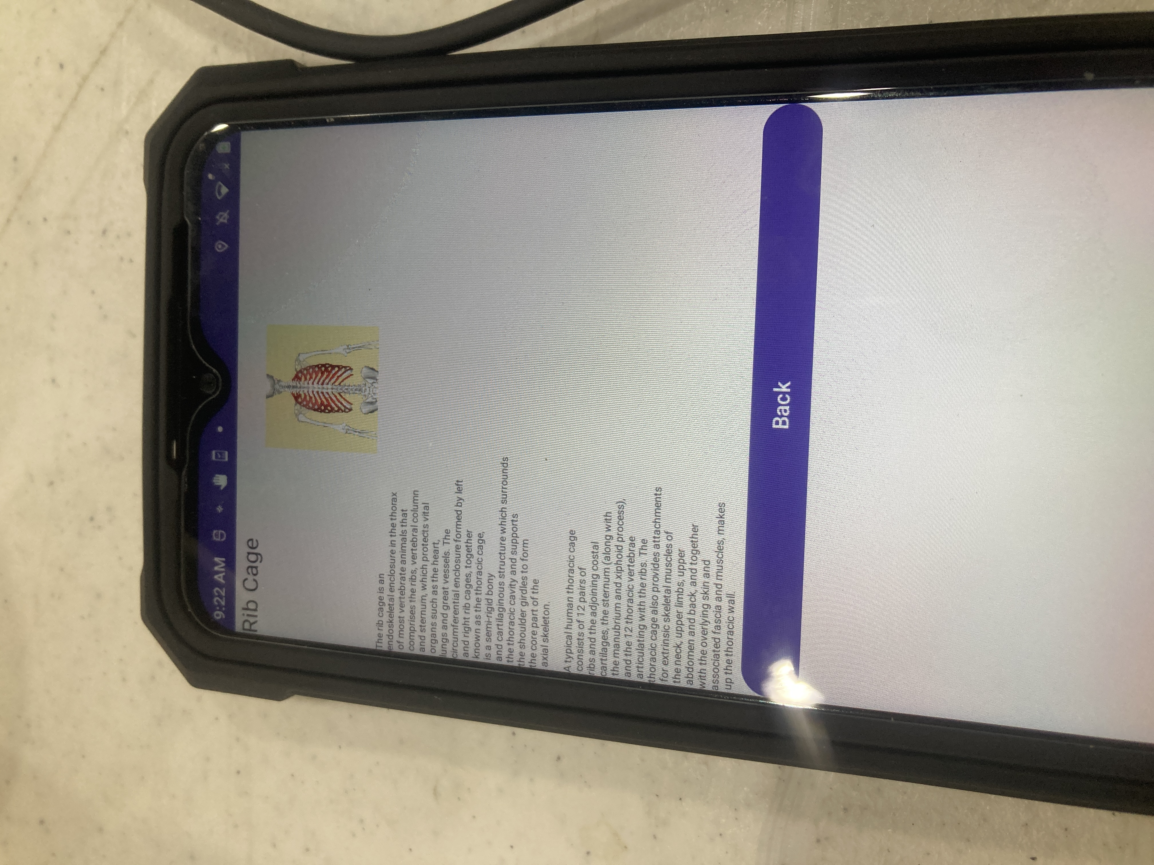
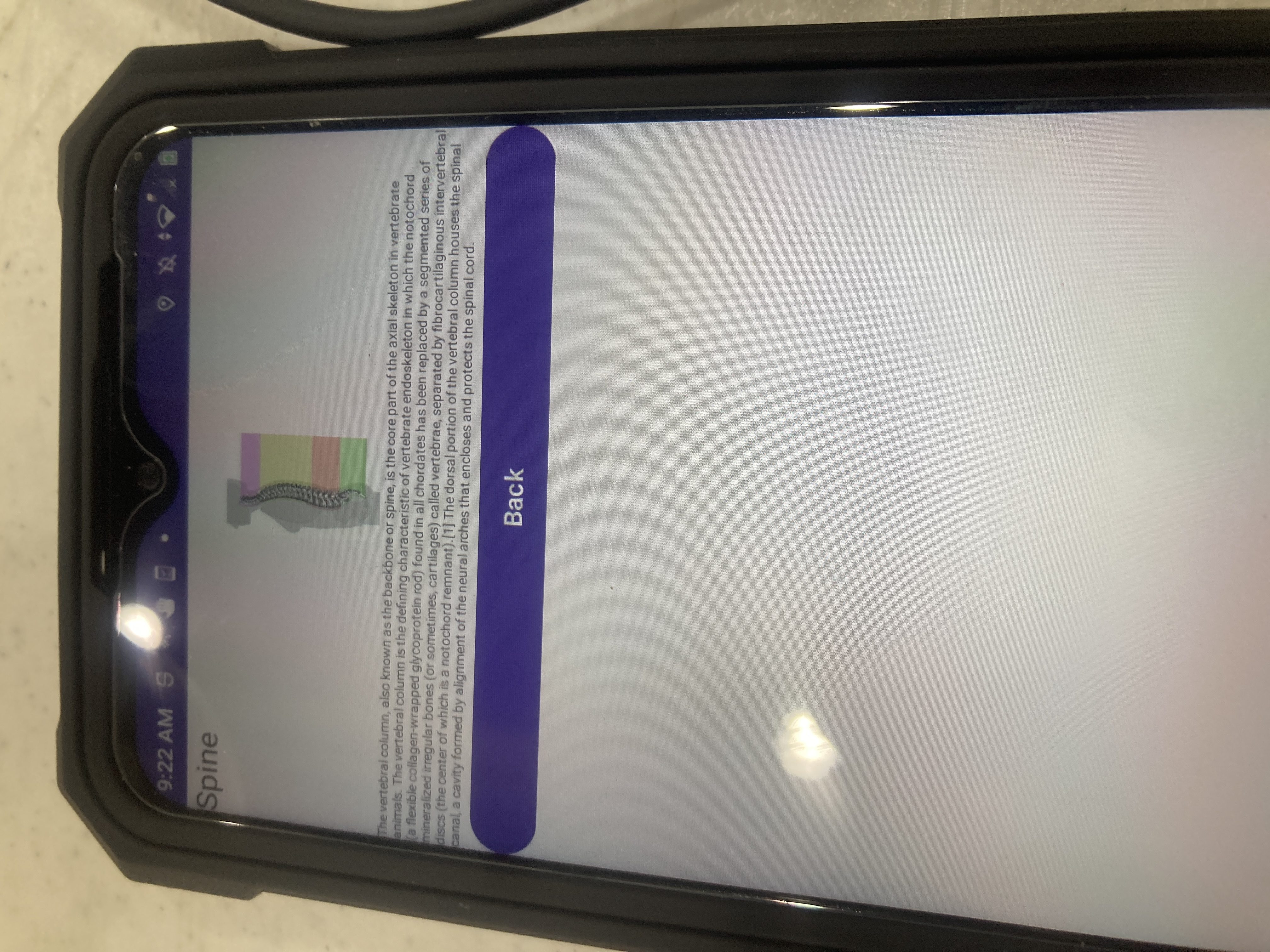
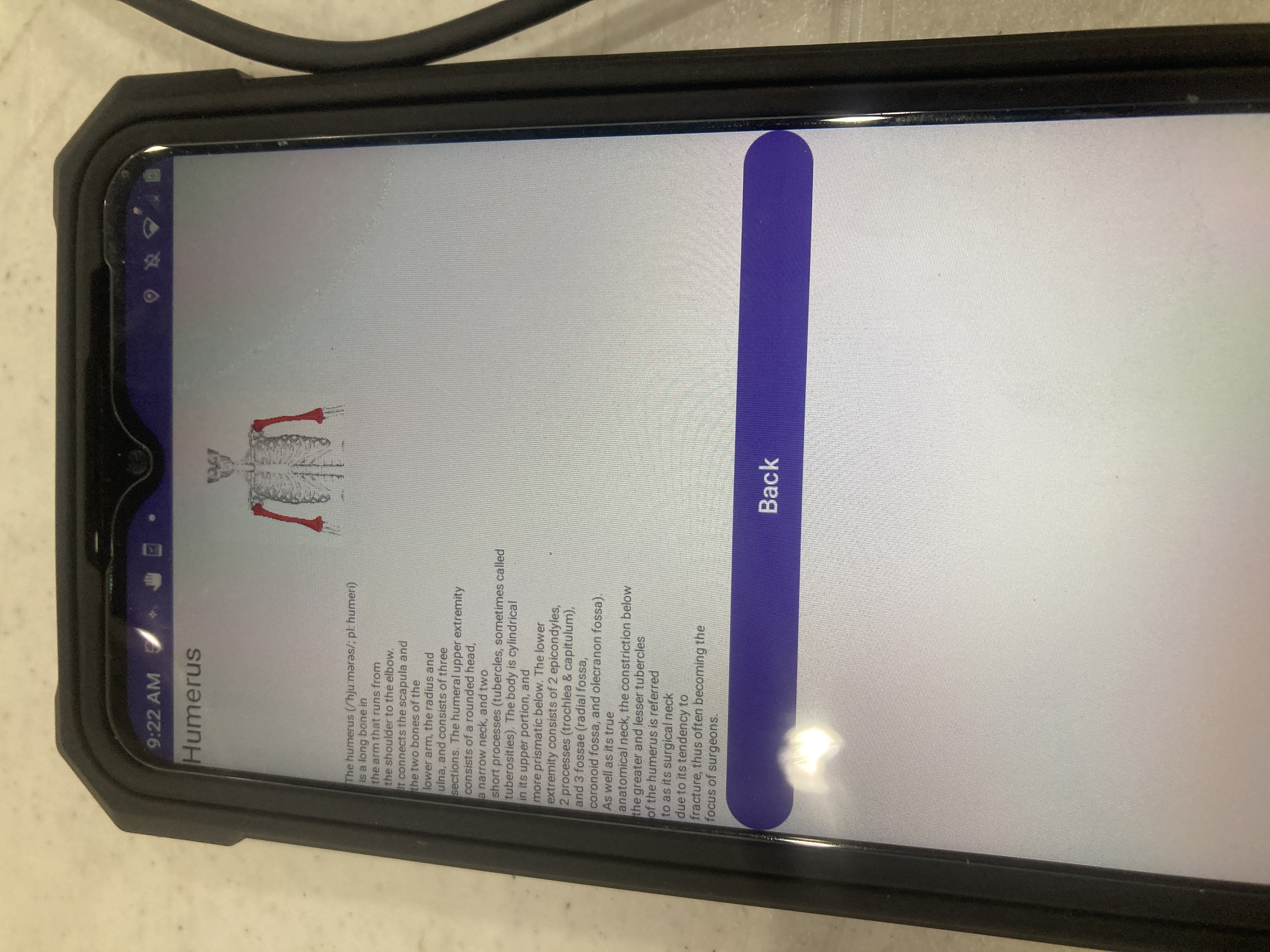
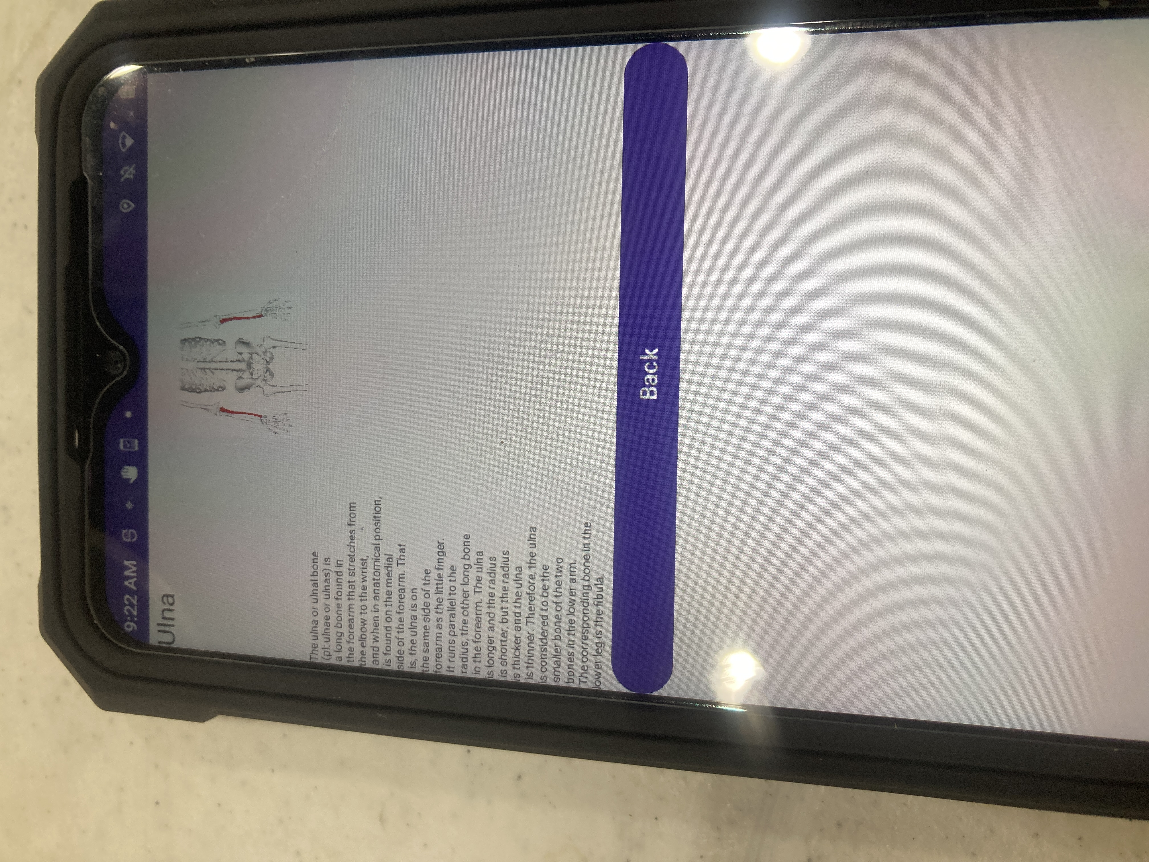
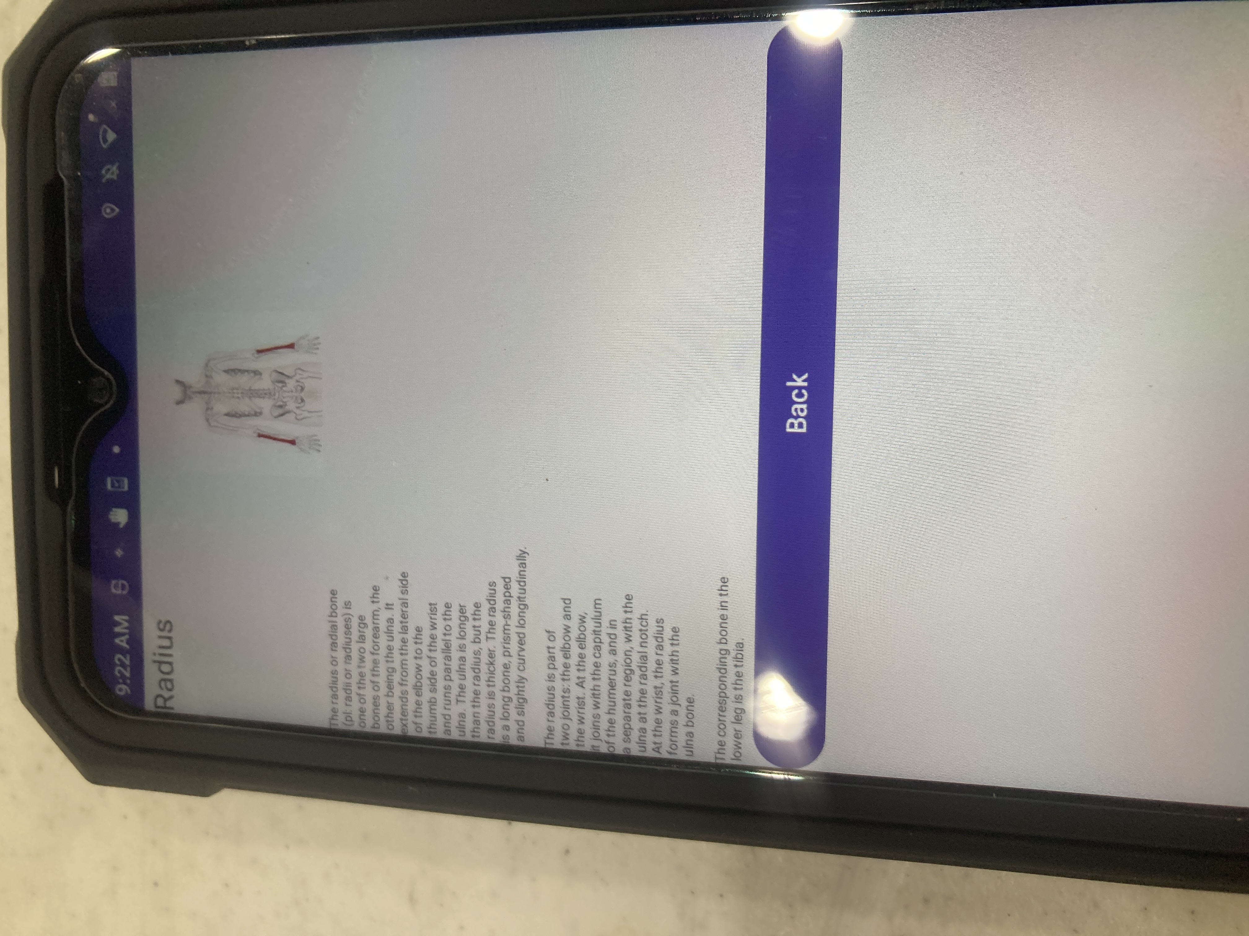
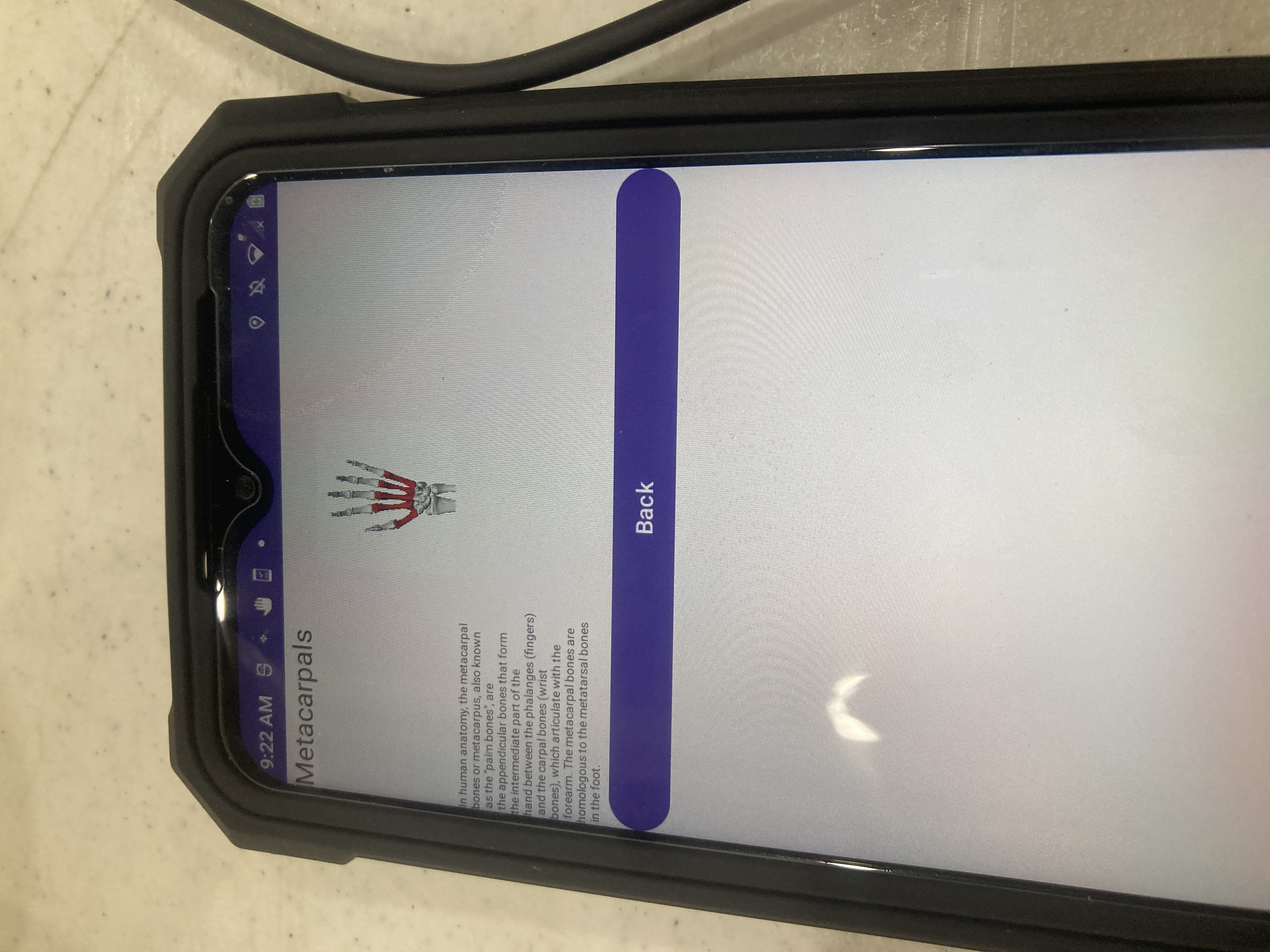
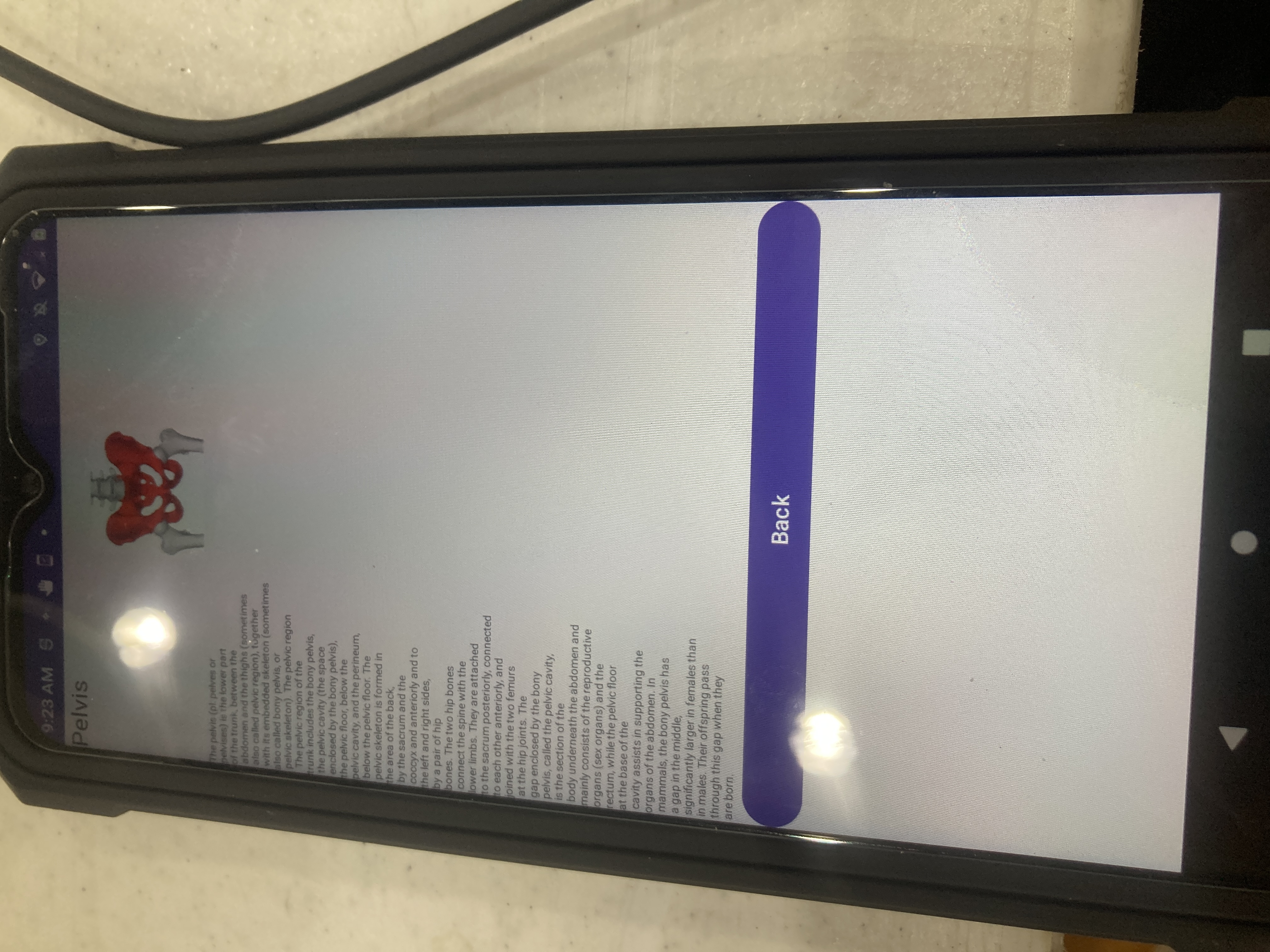
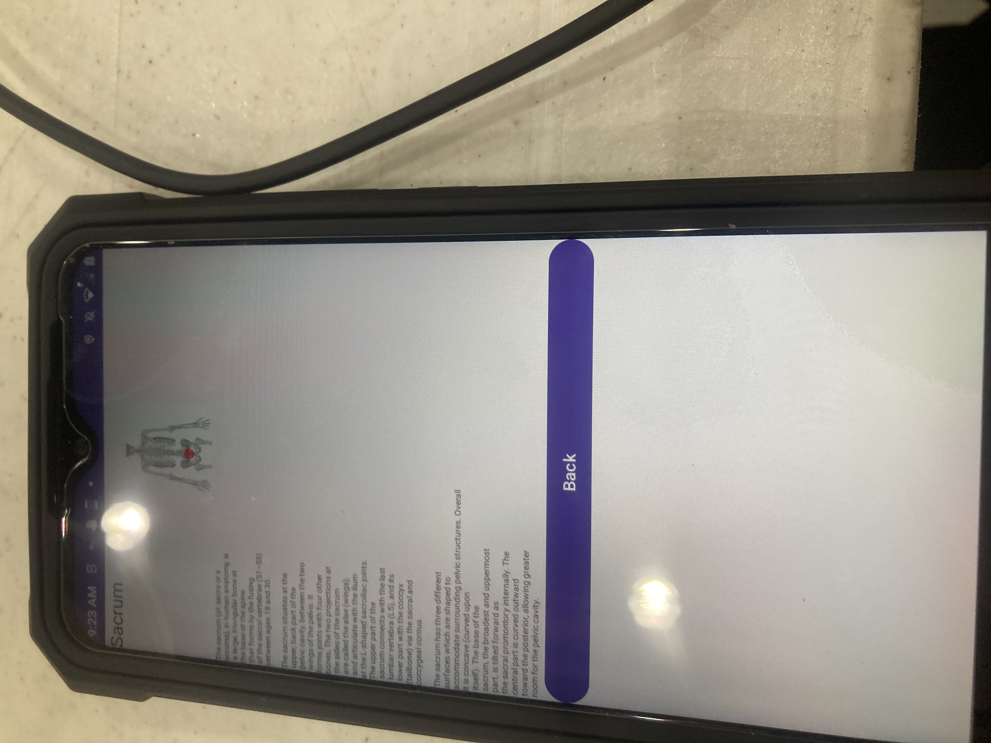
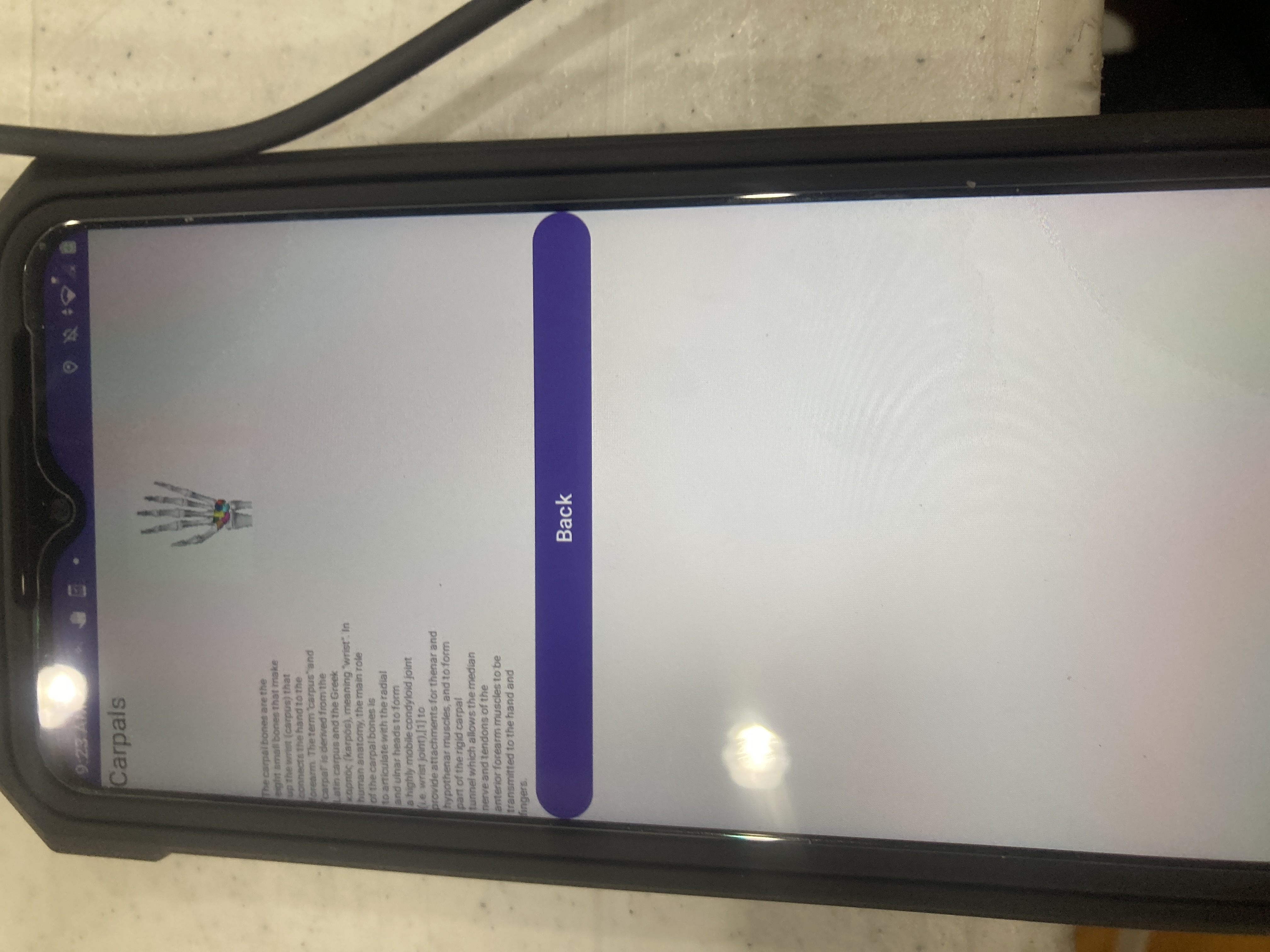
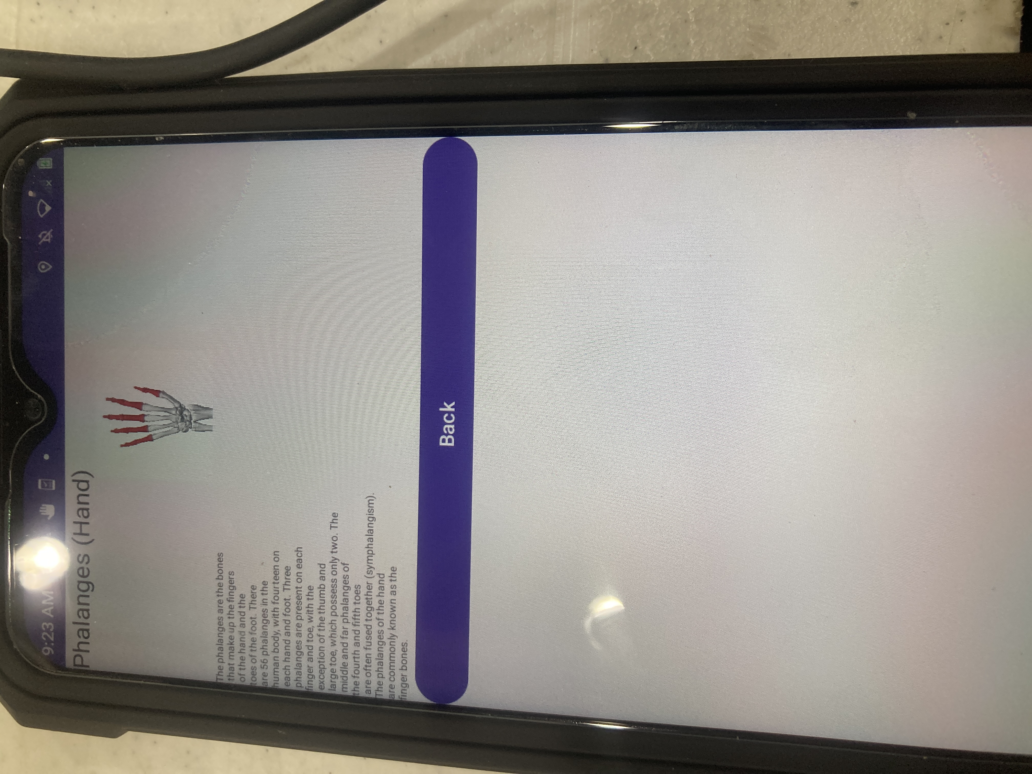
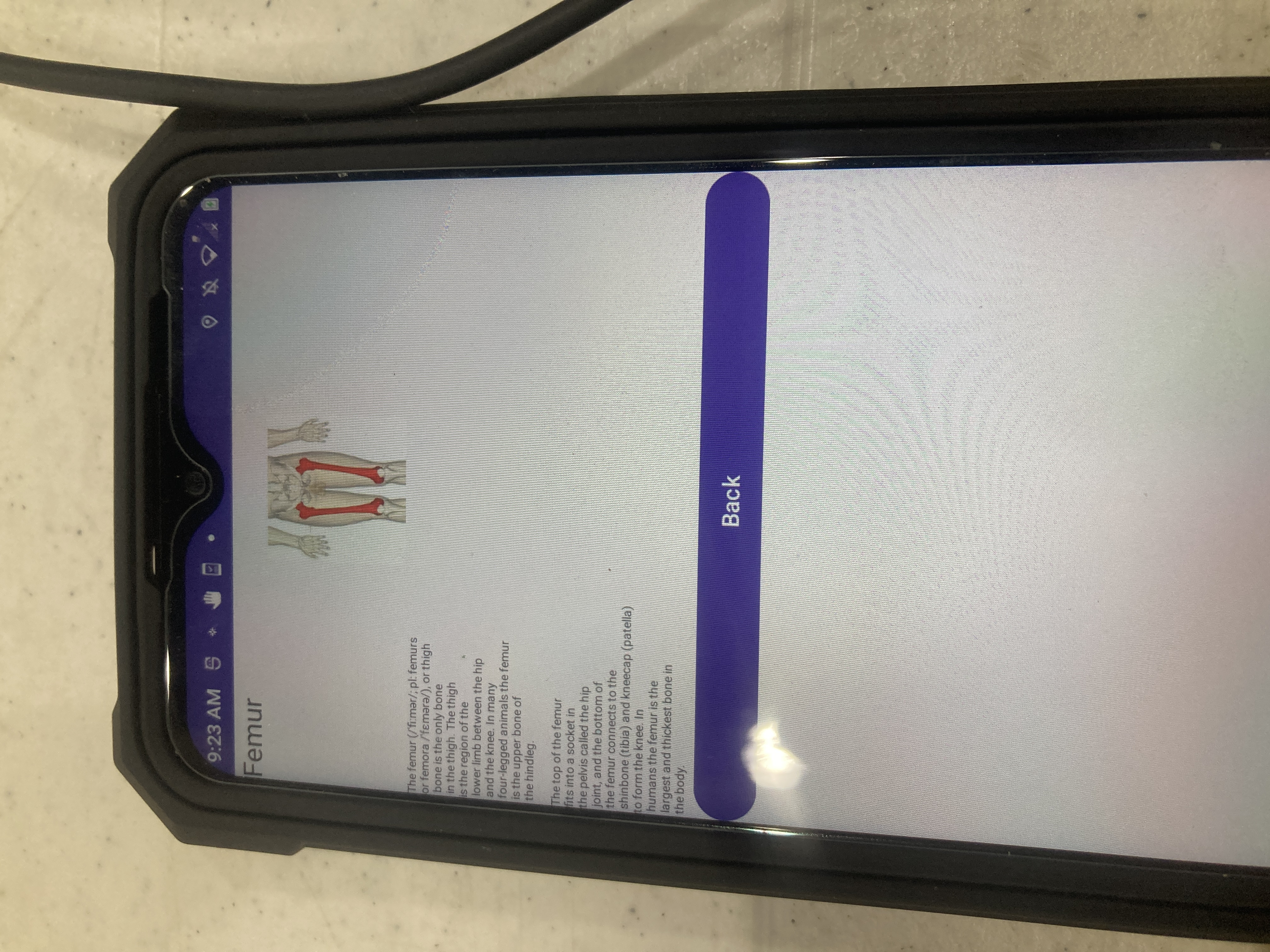
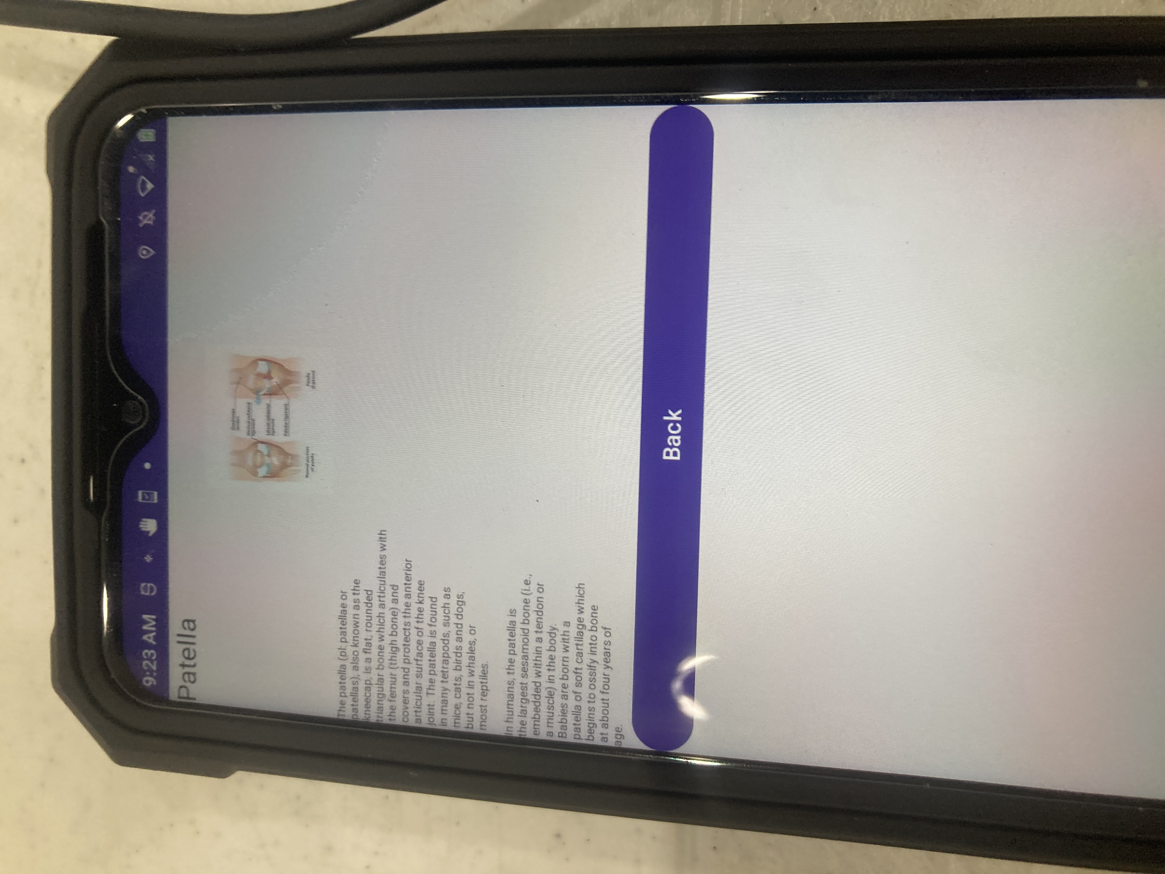
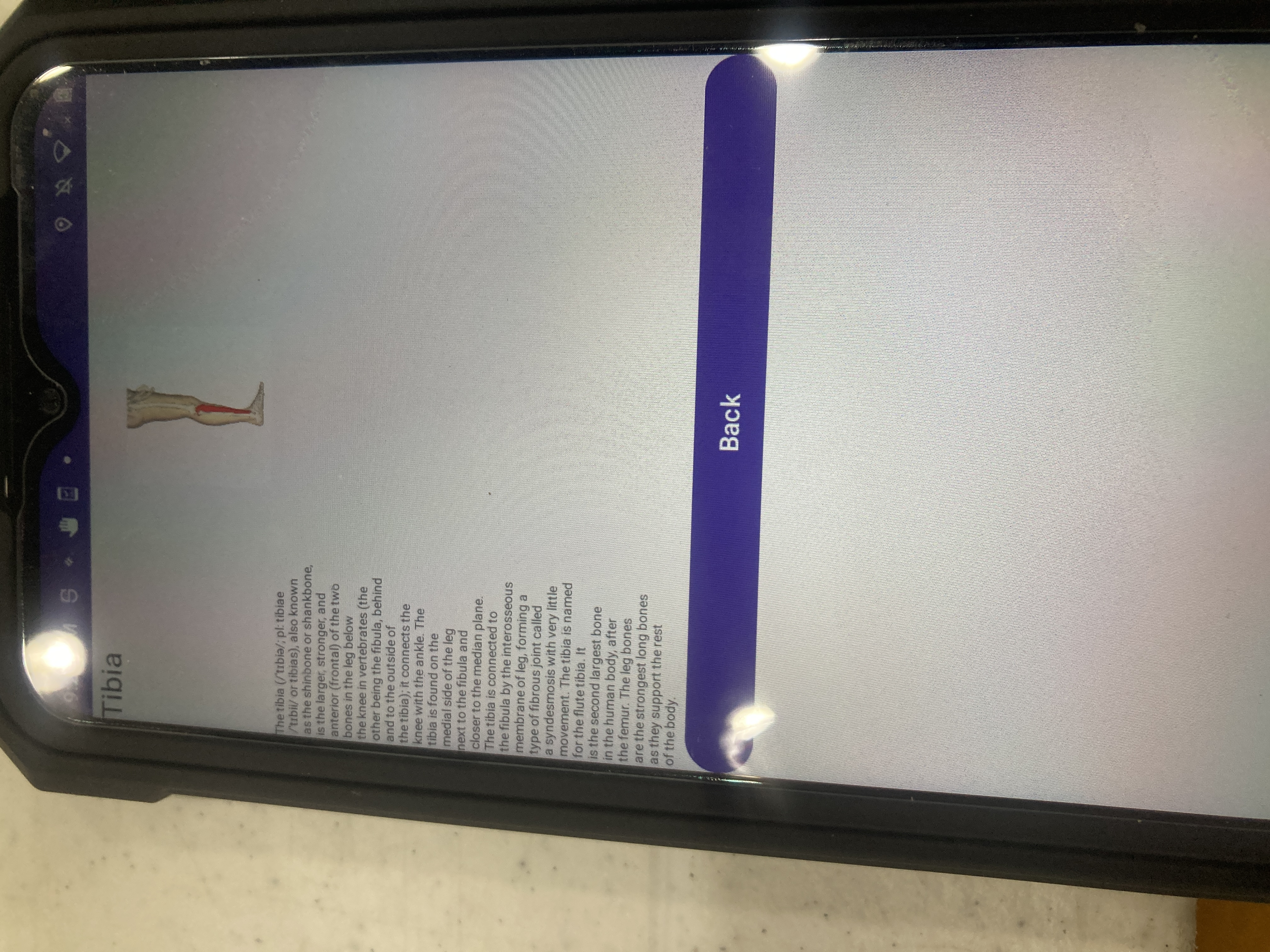
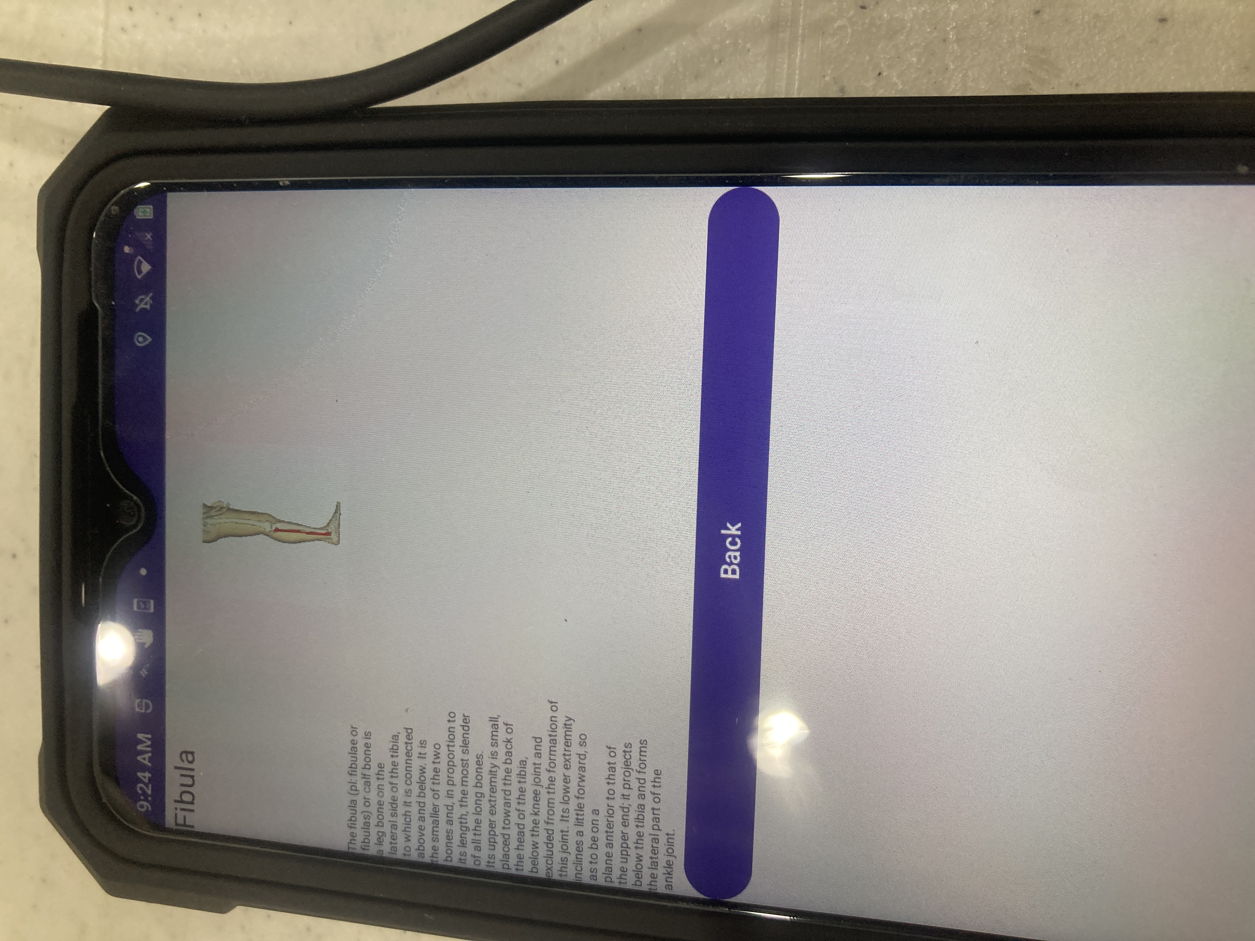
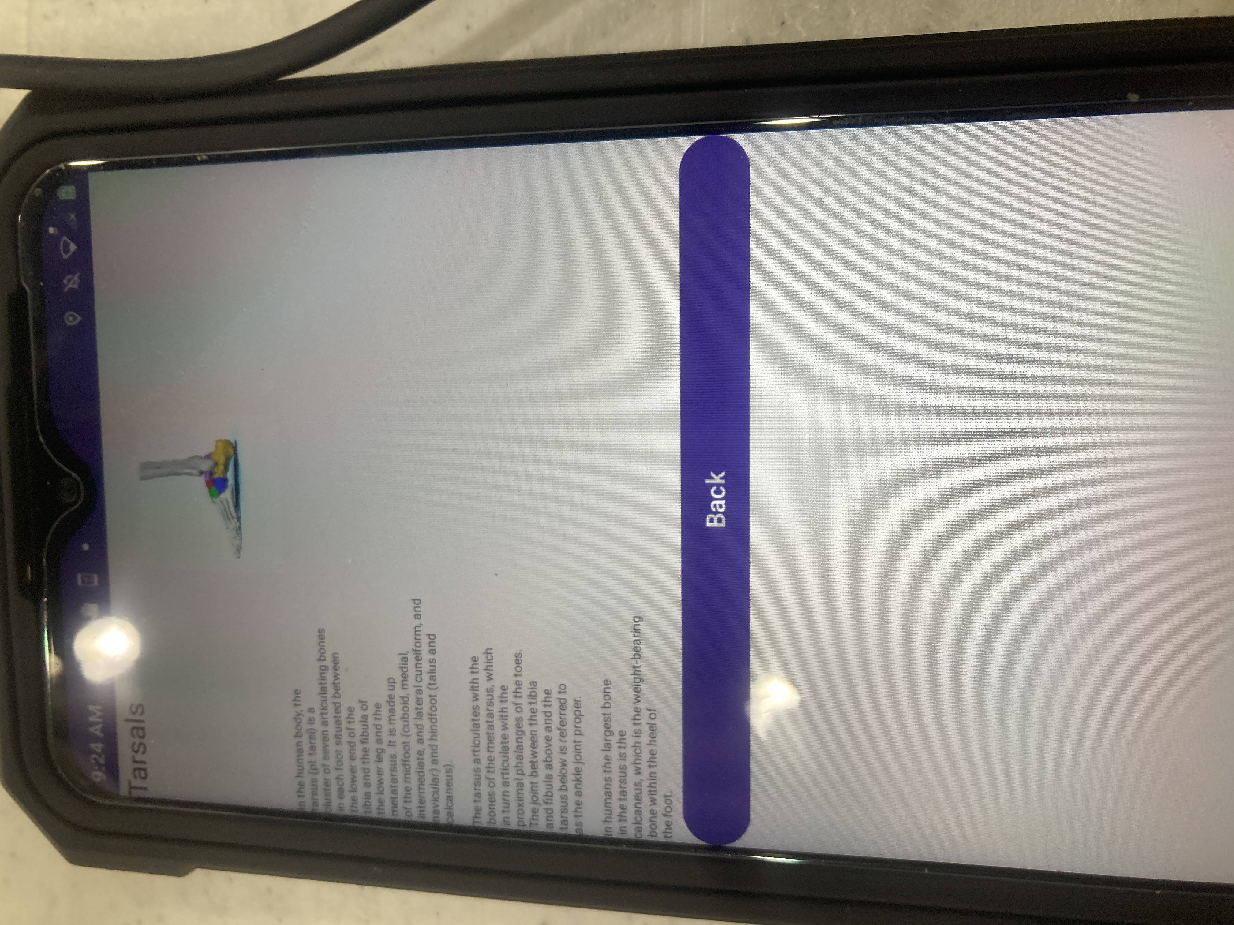
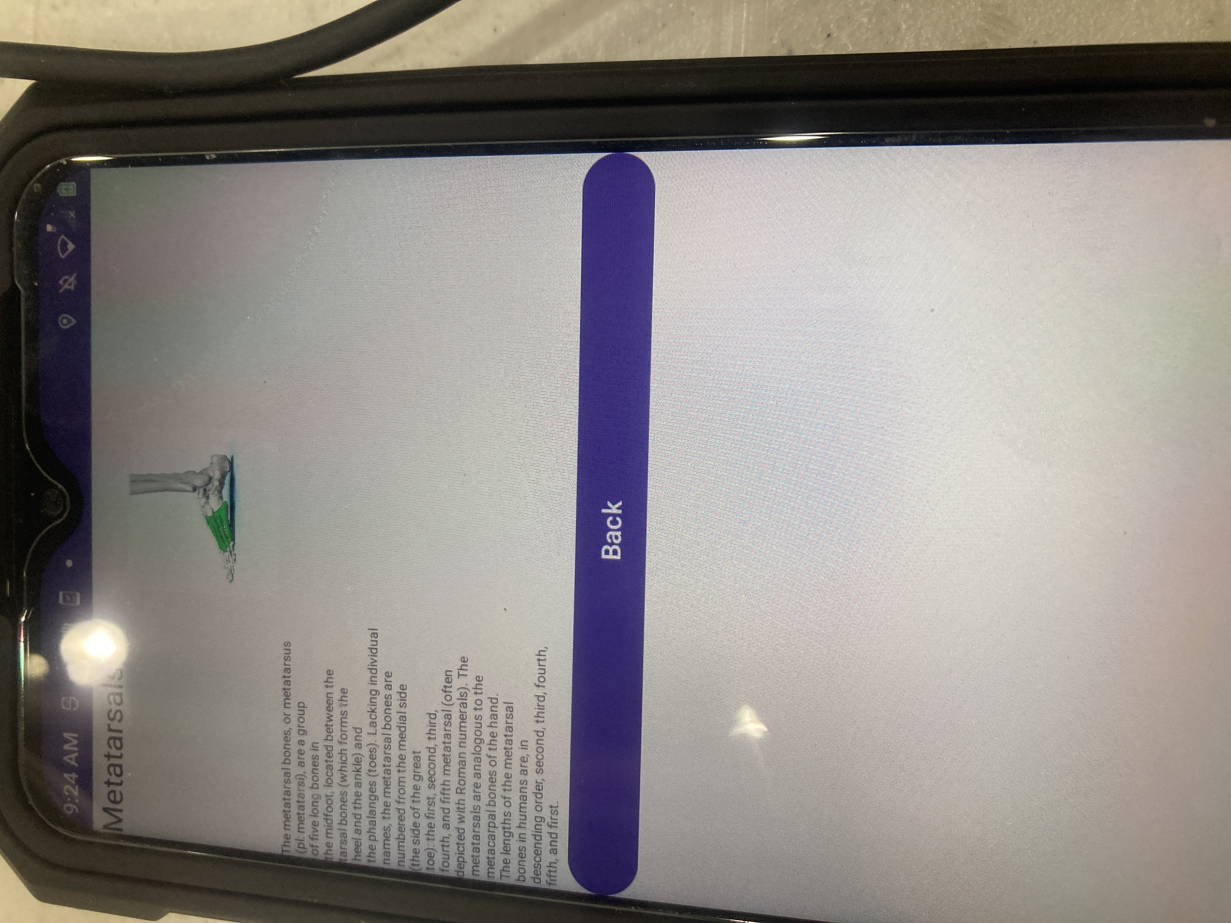
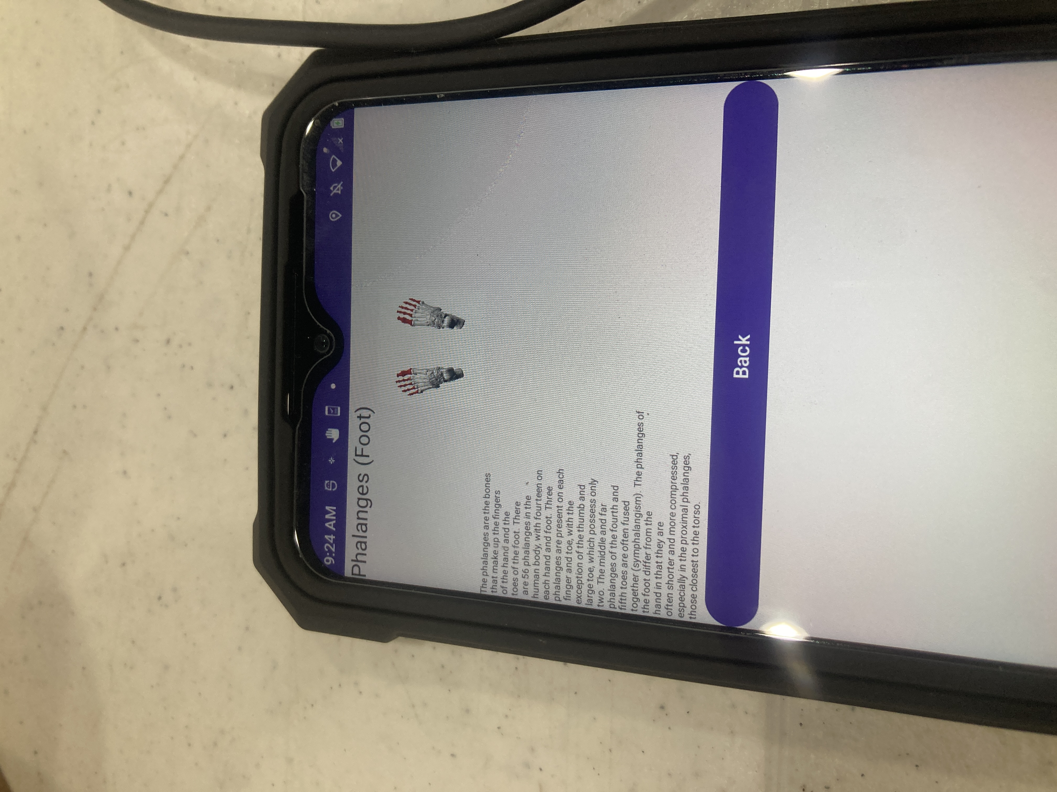
What it does: Upon opening the application, there is a picture of a human skeleton with labels of various bones. Each label is clickable and takes you to a page that has a picture showing the bone and its location in more detail, and some basic Wikipedia information about it.
How we built it: I used Android Studio and created an empty views app. Then, I created the main layout using a FrameLayout with clickable TextViews at various coordinates, with an ImageView in the middle taking up most of the screen. Each TextView specifies the bone name, image, and hard-coded information that is sent to an intent that goes to a new view which is a LinearLayout. The information from the intent is loaded in, and below that there is a back button to go back to the skeleton.
Challenges we ran into: I am mostly used to working in ConstraintLayout, LinearLayout, and ScrollView, and I tried ConstraintLayout but that made all of my text go to the top left corner even with specified coordinates which apparently only work in the preview. I also originally had my skeleton image around 75% of the size it is in the final version, and this caused issues because all of my clickable TextViews were overlapping(I tried making the clickable area just the text, but that was too small and 48dp x 48dp is a huge area that does not leave enough room for bones that are close together).
Accomplishments that we're proud of: I am proud that I got it to a reasonable working state in 1 day.
What we learned: I learned how to use a FrameLayout in Android Studio, how to make TextViews clickable, and how to pass data through an intent to a new layout.
What's next for Human Skeleton Education App: There are plenty of things that could be done to improve this. First, the clickable areas still have some overlap, especially in the torso area, which could possibly be improved with some time-consuming trial-and-error to move them around. Second, the formatting of the informational text is terrible, with text that is quite small and only takes up the left half of the screen (I had to hard-code the newline characters, and there was simply not enough time for me to go back and change it). Third, right now I just have information from the overviews of the Wikipedia pages, but in the future I could do some research and create custom information, and also I probably need to display sources on the app itself but for now they are in the readme of the GitHub repository. I could also possibly add links from each bone to adjacent bones, and possibly other human body systems such as the muscular, digestive, cardiovascular, nervous, and other systems if I am really ambitious. Also within this improvement would include possibly finding better images for certain bones and possibly paying for that because what I was able to find that is usable for free was very limited. Finally, the back buttons right now are in the default purple oval buttons which do not go very well with my application, but I am not very familiar with button formatting and there is simply not enough time for me to look at more documentation and still submit this on time.

Log in or sign up for Devpost to join the conversation.