Inspiration?
The inspiration for this project came from the rising importance of data-driven decision-making in HR. With companies striving to reduce attrition and improve employee satisfaction, I aimed to create a dashboard that provides actionable insights to help HR teams understand workforce dynamics and address retention challenges effectively.
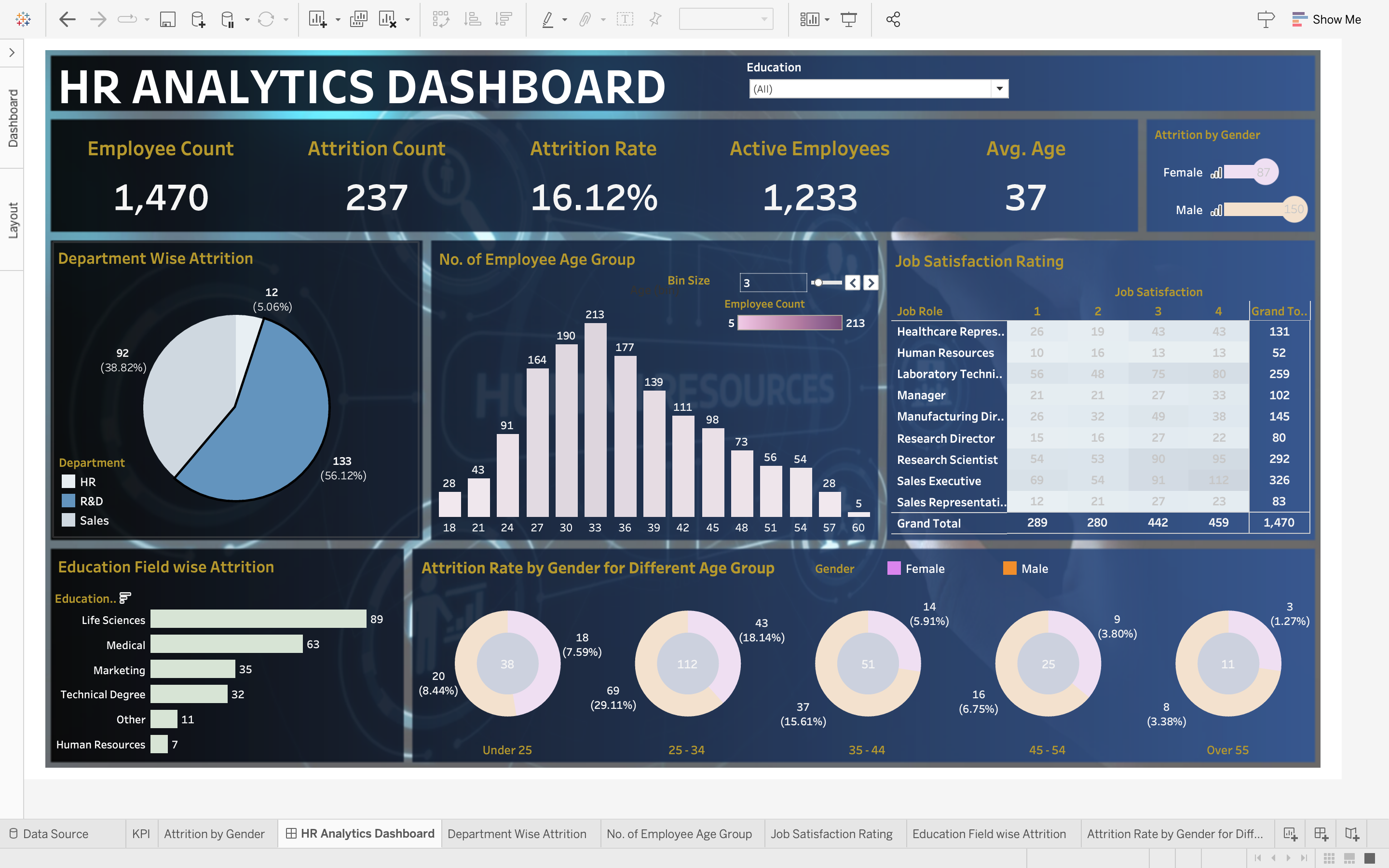
What it does?
The HR Analytics Dashboard visualizes key workforce metrics, including employee count, attrition rates, job satisfaction, and demographic insights. It helps HR teams identify patterns, such as department-wise and age-based attrition, education field trends, and satisfaction levels across job roles. This empowers organizations to make informed decisions to improve employee engagement and retention strategies.
How we built it?
The dashboard was built by following a structured data analysis and visualization process:
Data Exploration: Cleaned and examined the dataset to identify key metrics such as attrition rates, job roles, education fields, and employee demographics. Data Visualization: Used Tableau to design an interactive dashboard with KPIs, pie charts, bar graphs, and heatmaps to visualize trends effectively. Dashboard Design: Placed key metrics like attrition rate and employee count at the top for quick insights. Segmented data by department, gender, and age for deeper analysis. Iterative Refinement: Enhanced visual clarity and functionality based on stakeholder feedback to ensure actionable insights were easily accessible.
Challenges we ran into?
Data Inconsistencies: Dealing with missing or incorrect data values required thorough cleaning and validation. Visual Complexity: Balancing detailed insights with a user-friendly design without overwhelming stakeholders was a creative challenge. Filtering and Segmentation: Ensuring that filters for age groups, departments, and gender worked seamlessly for interactive analysis took careful configuration. Stakeholder Alignment: Iterating on visualizations to match HR questions and concerns required frequent feedback and adjustments.
Accomplishments that we're proud of?
Insightful Visualizations: Successfully created a clear and interactive dashboard that highlights key workforce trends and attrition insights. Data-Driven Storytelling: Enabled HR teams to easily understand complex patterns, such as education and department-based attrition rates. Effective Filtering: Implemented smooth filters for age, gender, and departments, making analysis intuitive and customizable. Actionable Insights: Delivered a tool that empowers organizations to make informed decisions to enhance employee engagement and retention strategies.
What we learned?
Data Cleaning Importance: Properly cleaning and validating data is crucial for meaningful and accurate analysis. Effective Visualization: Simplifying complex data through intuitive visuals helps communicate insights clearly to stakeholders. HR Insights: Gained a deeper understanding of workforce dynamics, attrition patterns, and factors affecting employee satisfaction. Iterative Design: Continuous feedback and iterations improve dashboard functionality and usability.
What's next for HR Data Analytics?
Predictive Analytics: Incorporate machine learning models to predict employee attrition and identify key risk factors. Enhanced Metrics: Add more KPIs such as absenteeism rates, training impact, and performance scores. Real-Time Monitoring: Integrate dynamic data sources for live updates and real-time decision-making. Employee Sentiment Analysis: Analyze qualitative feedback using NLP to understand employee sentiments and engagement levels. Customization Options: Provide tailored dashboards for different stakeholders, such as managers and HR executives.


Log in or sign up for Devpost to join the conversation.