-
-
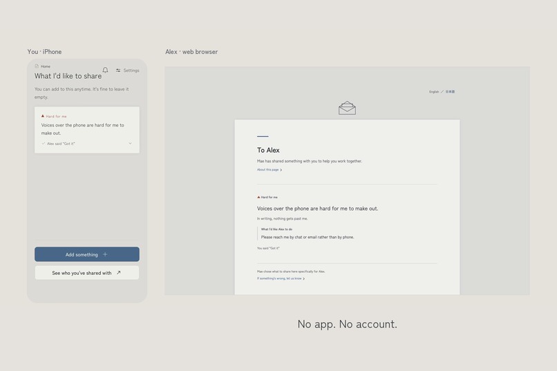
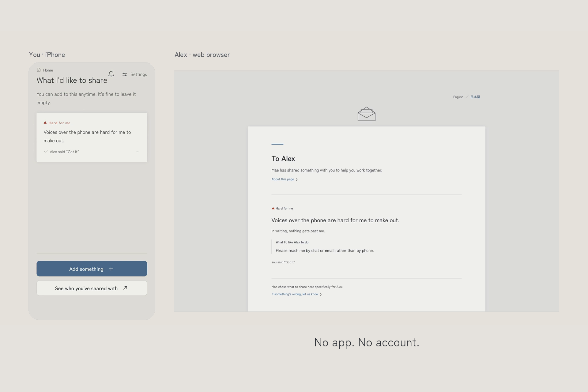
Your side in the app, their side in a browser. They open it with no app or account.
-
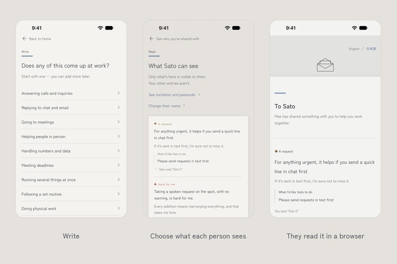
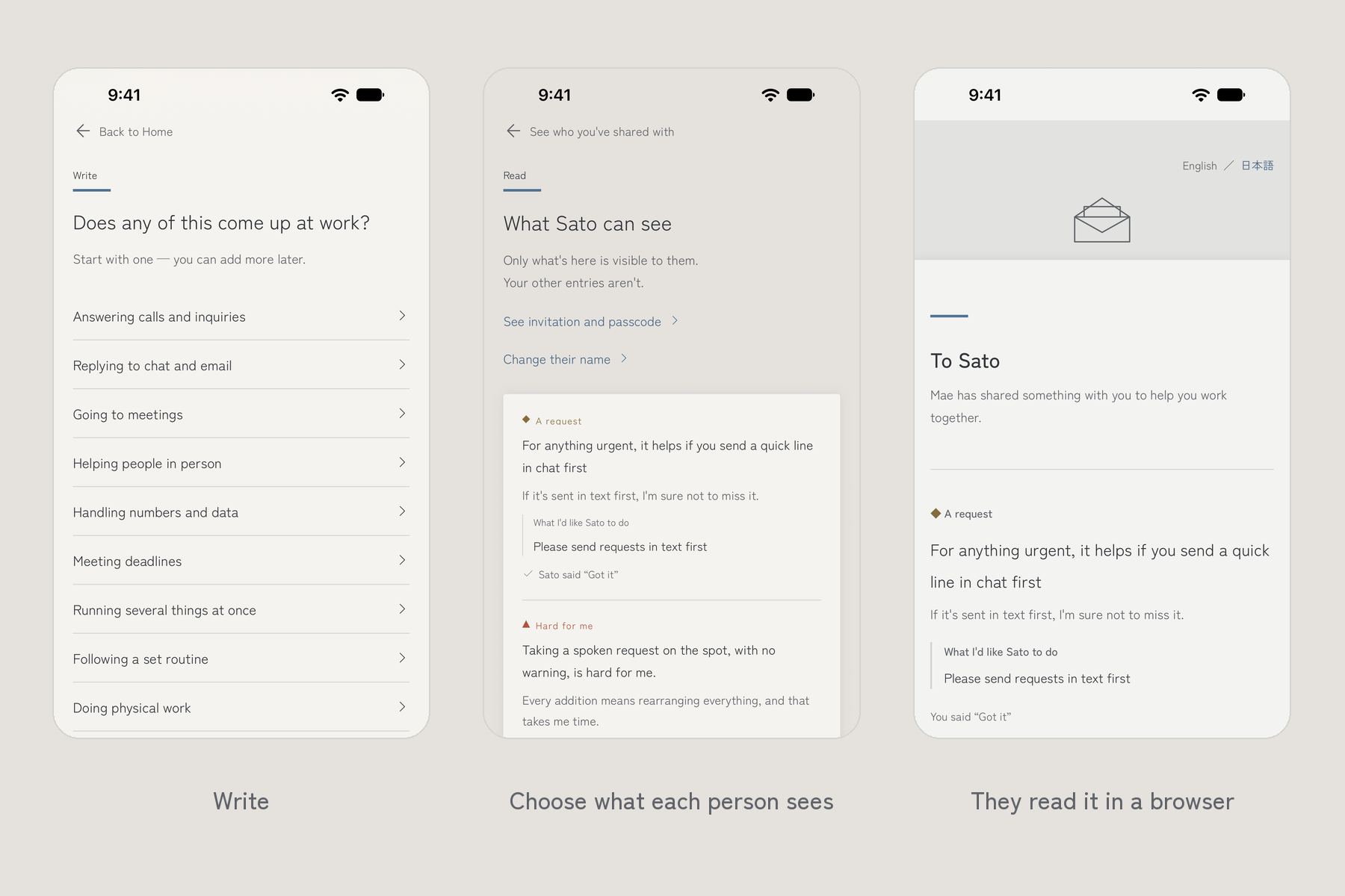
Write → Choose what each person sees → They read it in a browser
-
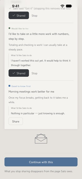
Screenshot (no device frame): for each person, you choose which entries they see.
-
App icon (1024×1024): the handshake. Work goes better when the connection between two people does.
How We Work lets you write what helps you at work and share only what you choose, so a hard conversation can stay an ordinary one.
Inspiration
In Japan, reasonable accommodation is now written into law, but at work it rarely feels like anything has changed. Managers don't know how to ask. People who need something don't know how to say it, so they stay quiet until they hit a limit, or it comes out too personal and too heavy for anyone to hold. What was missing wasn't goodwill. It was an ordinary way to bring it up. When my health goes up and down, explaining it from scratch every time was heavy.
What it does
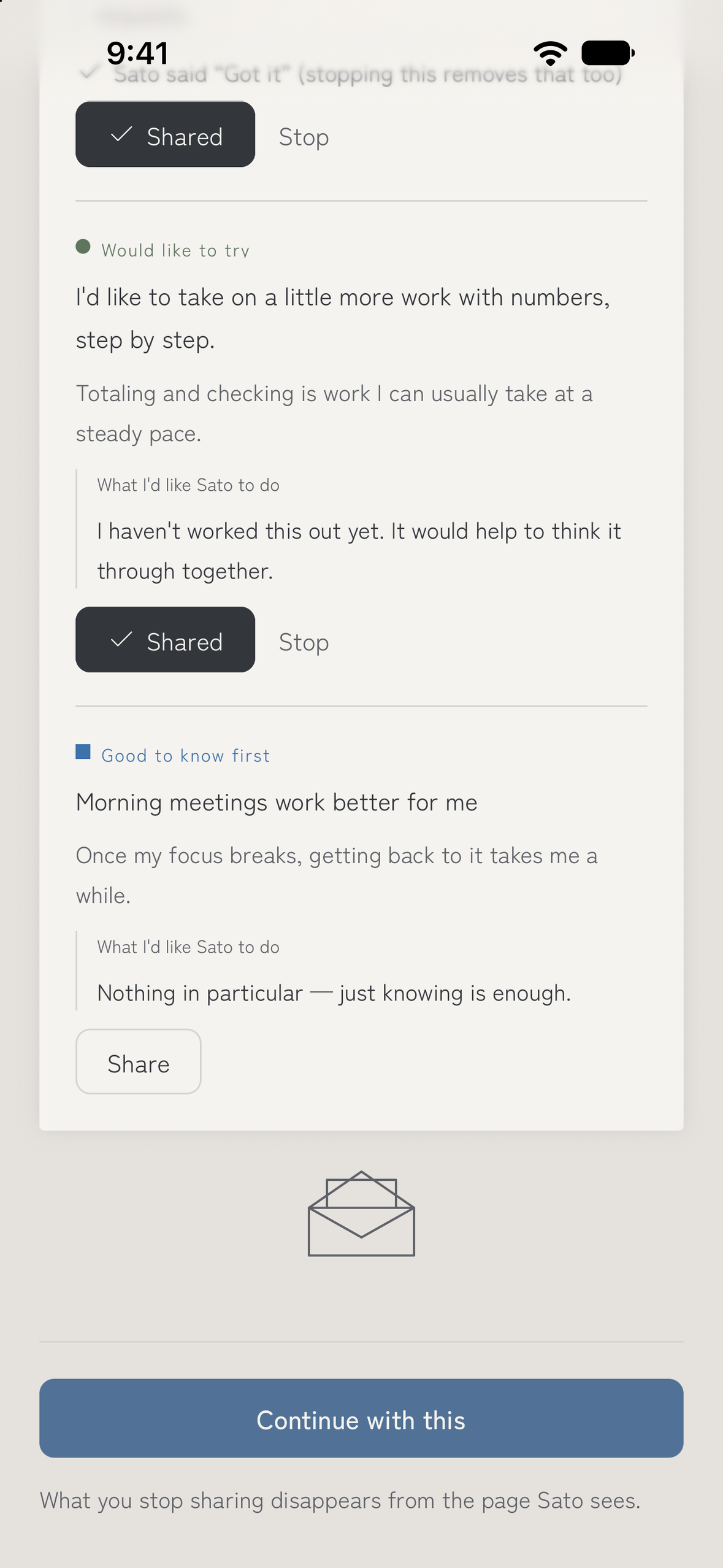
You write short entries: Good to know first, Hard for me, Would like to try, A request, and Where I stand. You can start from templates adapted from casebooks published by Japan's Ministry of Health, Labour and Welfare. For each person, you choose which entries they see and share a link. They open it in a browser, with no app or account, and press "Got it." Your side then shows: Alex said "Got it." Every feature is free.
What I chose not to add
The app is tuned to one temperature: not a business form, not a confession. It never asks for a diagnosis. The shared page reads as a letter from one person to another, not a document to process. Some templates cover the other side, too, like "I'd like to keep doing what I can myself." Even the spacing is held steady, because a broken margin can read as instability.
What changed after I shared it
Sharing in public made it safe to ask: any reaction, even criticism, helped. At events, people often said "It's for people who need accommodations, right?" and the conversation stopped. That reaction is the problem itself: people read it as not their topic. So I brought childcare and family care forward in the plan. The landing page already says it's for those situations too, and the templates come next. Then I sent my share link to people I work with. They said it didn't feel like special treatment. One didn't know what the page was for, so I added a line at the top saying what it is. Another then said knowing the purpose lowered the mental load. One thing I chose not to fix: after "Got it," you can't tell how warmly it landed. That felt uneasy, but smoothing it over would drift away from how real workplaces work, so I left it. "Got it" already shows it was read, and how soon. Adding comments would blur how far each side should go.
How I built it
I designed the experience in Figma first and built it alone, with AI writing the Figma files, docs, and code inside rules I set. At first I still tried to think through everything myself, down to every margin. When I shared the process, people kept asking how I was keeping up, and I realized it wouldn't last. So I changed how I worked. AI now keeps the kanban board and turns progress into short reports I can check at a glance. For layout, AI pulls patterns from real apps through a design-inspiration library over MCP, instead of me inventing each spacing from scratch. For English, I run the AI translations through a service that makes them read naturally, then correct them myself. App Store rules get sorted by AI, too. That left me the part only I can do: deciding what to emphasize and what comes first. For example, scripts audited 62 screens and 407 icons. The machine found the differences, but I decided which ones could stay, like a handshake line I chose not to redraw. Working this way is sustainable, so I can keep building it after launch.
What's next
After launch, I'll keep watching how people react when they first open a shared page. The handshake in the app became the theme: work goes better when the connection between two people does.
Entered for: RevenueCat Peace Prize, RevenueCat Design Award, #BuildInPublic Award, HAMM Award.
Built With
- claude-code
- cloudflare-workers
- expo-router
- expo.io
- figma
- i18next
- nextjs
- pnpm
- postgresql
- react-native
- react-native-svg
- revenuecat
- supabase
- typescript
- vitest

Log in or sign up for Devpost to join the conversation.