Inspiration
When I thought about the meaningful thing that I can do in 24 hours (with breaks in between), I thought that what matters is the information I want to convey, not necessarily doing big tech things. Trying to go with this idea, I ended up doing interactive visualizations.
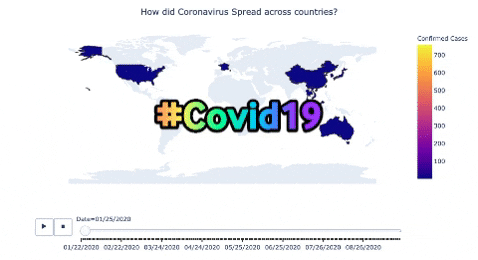
What it does
The project shows how the Coronavirus Pandemic has spread to the rest of the world using an interactive map, showing the increase of the cases every day in different countries.
How I built it
Using Novel Coronavirus data found on Kaggle, I used the open package for data visualization called Plotly to create an interactive map.
Challenges I ran into
I honestly wanted to do a great project perhaps in Machine learning, specifically in computer vision but timing challenged me to think about something else that can make sense (which is a great thing to think about anyways). Also, I got challenged to find a team that we could work on data science projects.
Accomplishments that I'm proud of
I am proud of being part of the people who made it to submit the projects. Also, I am proud of being part of this hackathon.
What I learned
I learned data visualization, and a bit of Google Cloud (from the session provided during the event by Google cloud experts)
What's next for How did Coronavirus Spread across countries?
I am looking to make a real-time interactive dashboard which will, in turn, make it easy to see how the coronavirus cases increase or decrease in a given country.
Also, I want to do more health projects in Machine Learning.


Log in or sign up for Devpost to join the conversation.