-
-
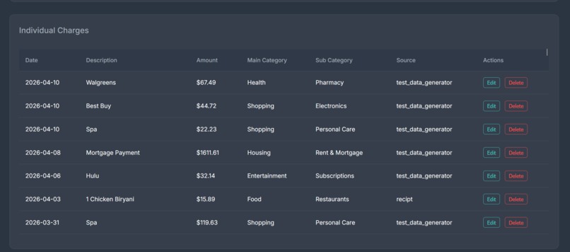
editing individual charges
-
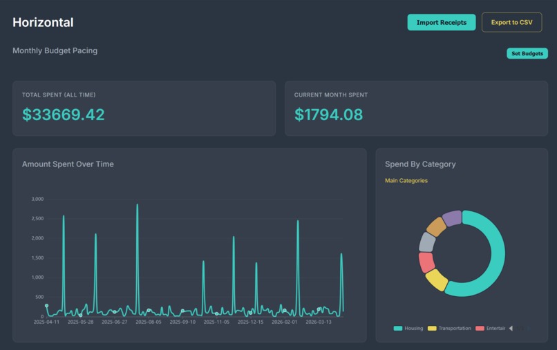
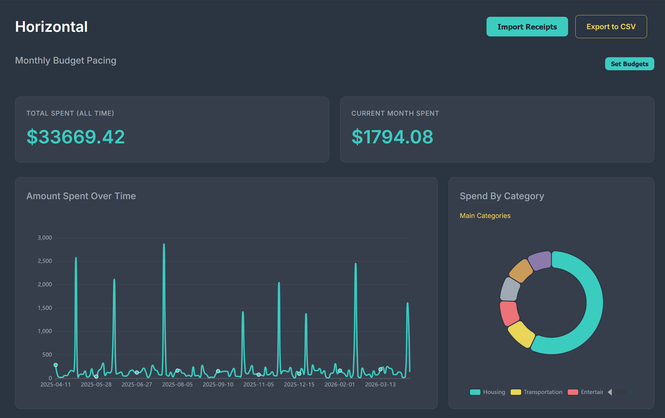
the line graph and pie chart
-
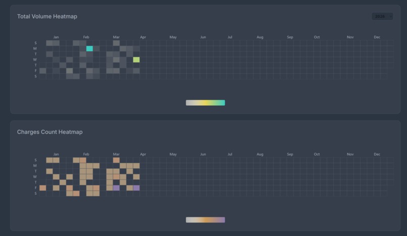
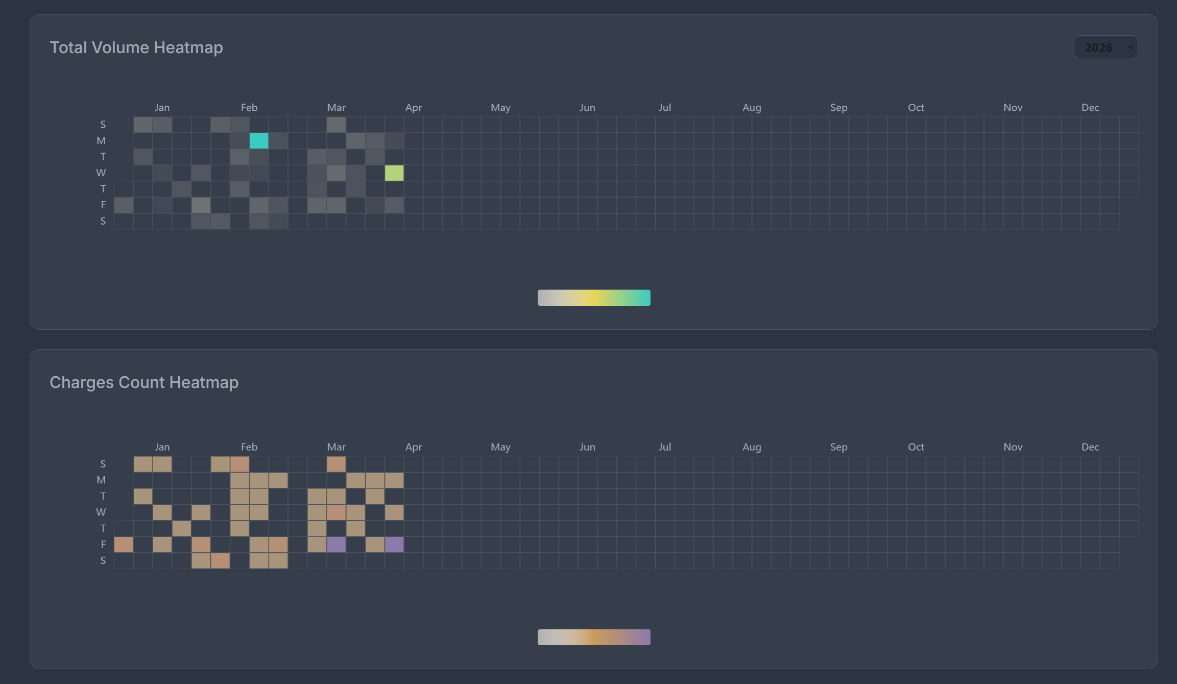
heatmaps
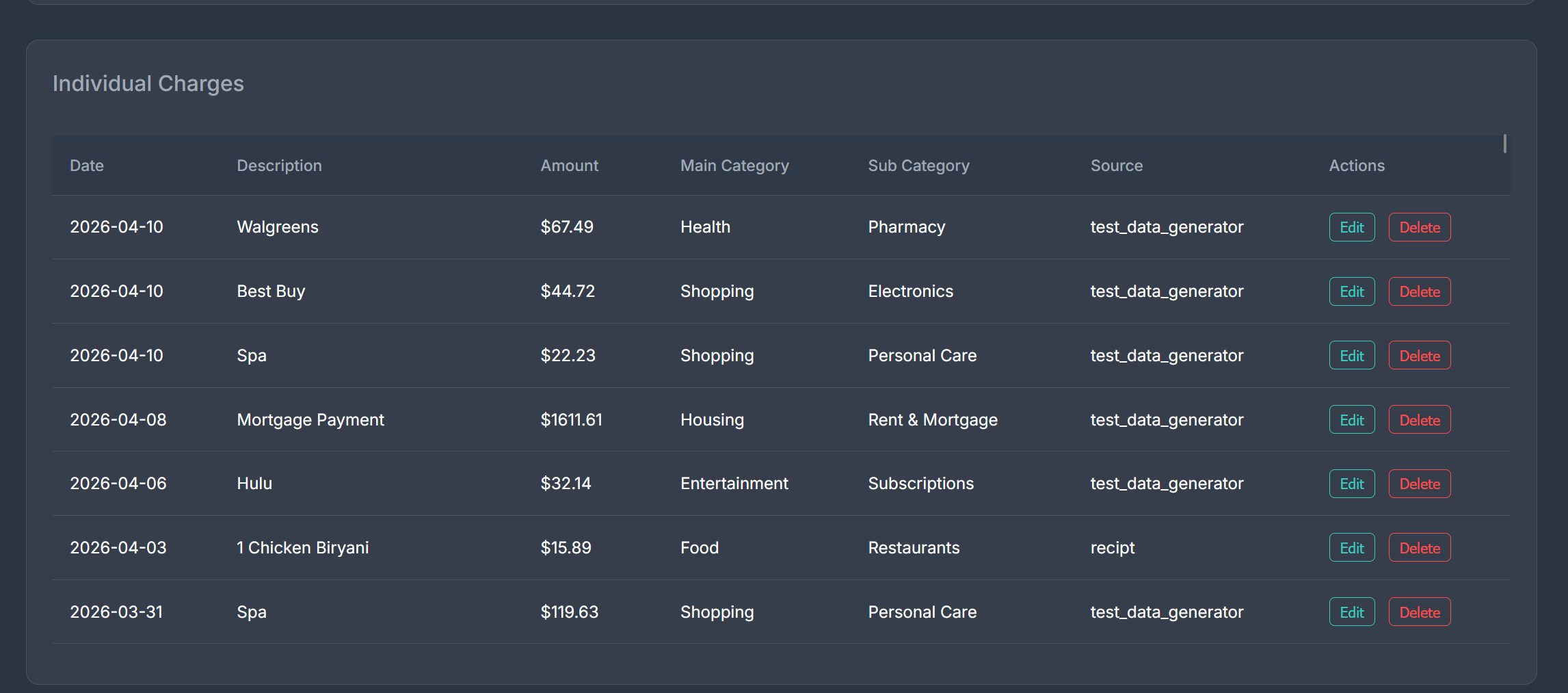
Project Description
Horizontal is a locally hosted solution that lets you import pictures of receipts or bills and displays them in easy-to-understand graphs. It requires no extra account linkage, meaning that the database is kept client side, allowing you to control your data
It displays each charge or expense in four different graphs, a line graph showing amount spent over time, a telescoping pie chart that organizes your spending by category, and two heatmaps to show both frequency and amount of spending.
It features a bulk import of receipts or bills, so you can just take a bunch of pictures of your receipts and bring them all into the database. If it makes a mistake (which is rare), you can easily edit and delete entries without accessing the database yourself.
Inspiration
Our data visualization was inspired by GitHub, with how you can track your commits and contributions to certain repositories. We also wanted to make something that we could actually use in our personal lives.
Learning / Challenges
Through doing this project, we got better at deciding how to visualize financial data so that it is understandable and clear for viewers. One of our greatest challenges was figuring out how to visualize this data. To that end, we sampled a multitude of different graphs and brainstormed different ways to best display and compare each entry, such as costs over time, or cumulative categorical expenses.
It was also our first time doing a task using OCR. We initially were trying to use a locally hosted LLM (ollama) to extract charges from the receipts, and eventually tried a few different methods, but eventually pivoted to using Gemini 1.5 Flash.
Building Process
This project was mainly done by supervising AI code creation tools. Our methodology was to come up with smaller modules, use AI to create them, then to link them.
We started with the receipt extraction, first using ollama, then eventually pivoted to Gemini 1.5 Flash as mentioned above. This task involved a lot of manual debugging, as the AI created code had bugs and didn’t select the proper tools for the project. This initially outputted a CSV file, which was really easy to read for debugging.
After completing that, we created a module to convert the CSV files into an sqlite database. This was pretty easy.
Next, we completed the frontend by first deciding upon the graphs that we wanted to display, then using code creation tools to generate the Flask code, HTML, and CSS. We first looked around the internet for different inspirations of data visualizations, trying to find things that would look cool. We decided on the heatmap here, which fit well with our github inspiration. After settling on a style, we uploaded images and described colors to AI tools which generated the CSS for this styling.


Log in or sign up for Devpost to join the conversation.