-
-
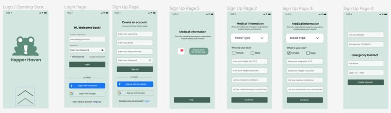
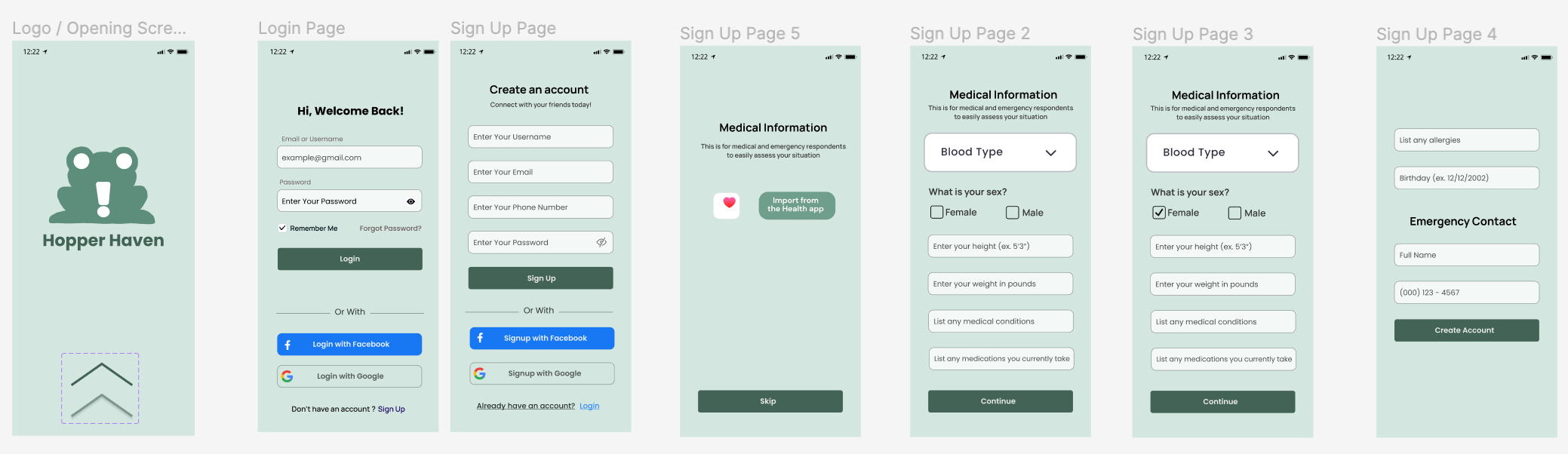
Login Screen and Sign up
-

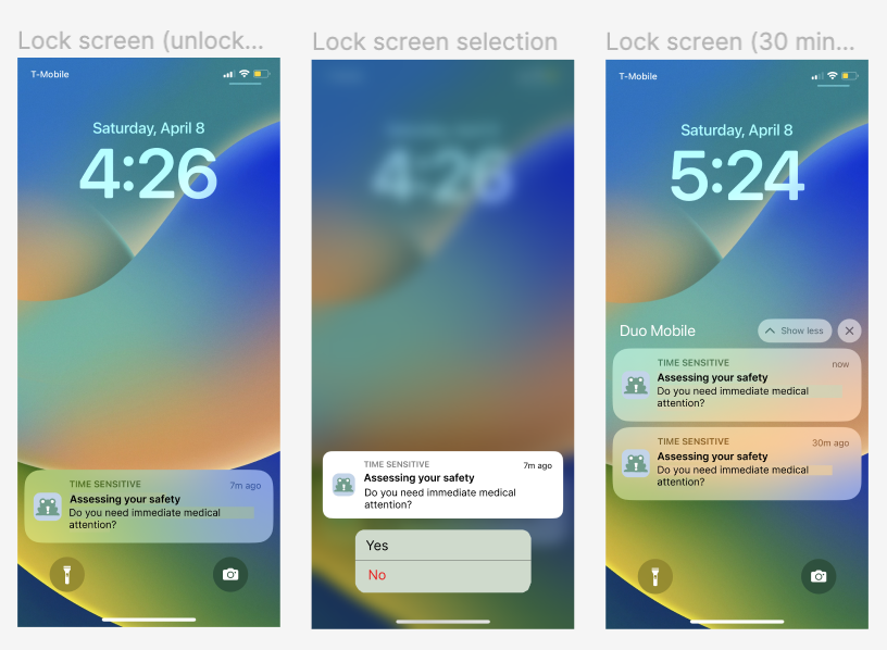
Lock Screen
-

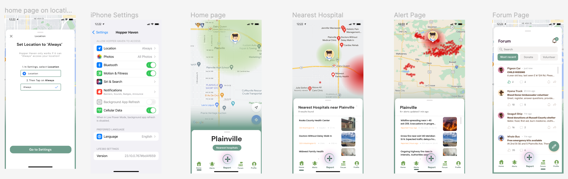
Navigation Bar
-
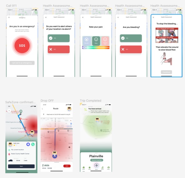
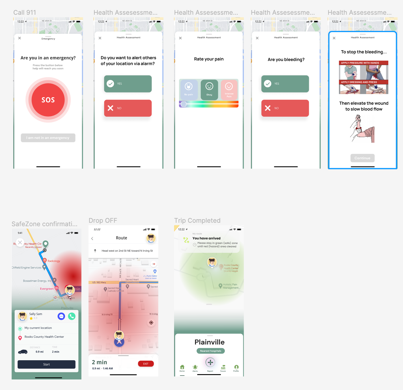
Emergency Response
Inspiration
We noticed that current phone notifications do not provide enough information to help users during the event of danger. We wanted a way for users to know where to go and what to do in case of an emergency, feel safe, and get them help quickly and efficiently.
What it does
If a natural disaster occurs near the user, Hopper Haven will alert them if they are in a danger zone. The app will ask the user if they need immediate medical attention. Based on their responses, they will be provided with help as appropriately needed.
How we built it
We used Figma to imitate a phone interface and simulate our app. We mapped out the main functions we wanted our app to have, and worked to connect them all together with a cohesive and clean GUI.
Challenges we ran into
- Agreeing on implementation decisions and visual details
- Mapping out the flow of our app
- Considering which scenarios and audiences we should focus on and could accomodate for
Accomplishments that we're proud of
- The look and feel of our app
- Our development so far, considering how much time we had
What we learned
When designing a user interface, especially for sensitive situations such as natural disasters, you have to put thought into every little detail. The color of the fonts, the location, and the flow, are all crucial to our app's function.
What's next for Hopper Haven
There are still many features that we wanted to implement, but did not have time for. Features such as, a recurring notification every 5 minutes when a user is in a danger zone to ensure that they are not in need of medical attention. With more time, we will flesh out and prototype more features and adaptations in order for Hopper Haven to feel more intuitive, and have more functionality.
Built With
- figma

Log in or sign up for Devpost to join the conversation.