-
-
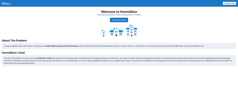
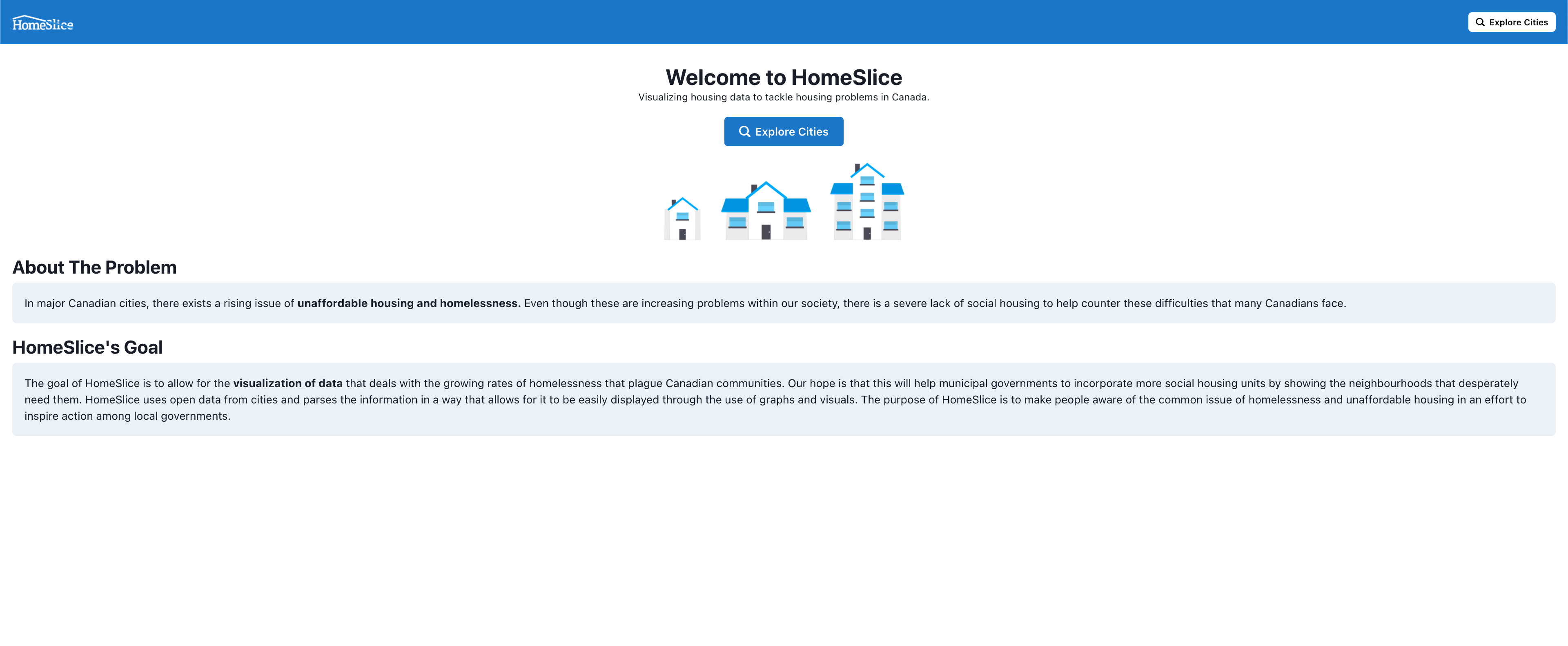
HomePage
-

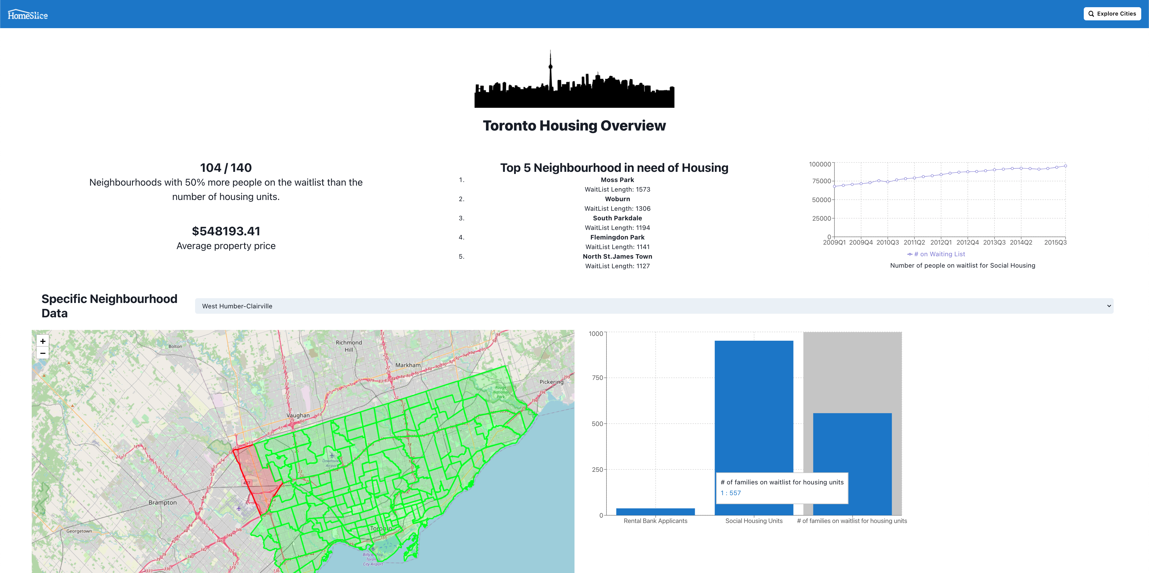
TorontoDataPage
HomeSlice
Inspiration
The inspiration for HomeSlice was the growing unaffordability of homes every year, and the lack of social housing units to try to reduce this social-economic issue. There are many major cities with neighborhoods plagued with poverty and unaffordable housing and the municipalities may not know which areas are affected most. This is why HomeSlice was created, to help people realize through easily understood data graphics, that the communities that surround them may be in desperate need of government assistance and intervention.
What it does
HomeSlice uses open data from cities and parses the information in a way that allows for it to be easily displayed through the use of graphs and visuals. The purpose of HomeSlice is to make people aware of the common issue of homelessness and unaffordable housing in an effort to inspire action among local governments. Through this visualization, we hope that it will aid in the planning future affordable housing especially in places that really need it.
How we built it
This was build using React and data visualization libraries such as ReCharts and React-Leaflets. The data/JSON was obtained from the Open Source data from the City of Toronto and City of Vancouver. We additionally parsed the data creating our own data to be displayed using ReCharts bar graphs and line graphs. In addition to the Toronto data, we were able to obtain map data that allowed us to also create map visualization associated with different neighborhoods.
Challenges we ran into
A few members of our group have never worked on a front-end project before, so it was a difficult learning curve to overcome before real progress started to be made. It was also a puzzling task to graph the data effectively with the parameters we were trying to emphasize most. This was our first time using the ReCharts and React-Leaflet libraries to create the visualization. We also had to figure out to parse the data provided into a way where we could use and manipulate it.
Accomplishments that we're proud of
The UI/UX design of our website is very user-friendly and pleasant to view. We are also proud of the front-end development that our group has managed to accomplished such as the map and the graphs. The data parsing we were able to accomplish with the data was exciting once we were able to take the raw data and visualize it onto the maps and graphs.
What we learned
We learned a lot in JavaScript and web development. We also learned how to use a data graphing library called ReCharts as well as a UI library called Chakra UI. We also discovered how to use Leaflet to create an interactive map.
What's next for HomeSlice
In the future, we would like to allow users to enter the data of their own cities to be parsed and visualized so they can also be active in the battle the societal-economic issues of poverty, homelessness, and unaffordable housing. Expanding to other cities would also allow us to visualize more cities and hopefully help future planning and development of affordable housing in places of need.


Log in or sign up for Devpost to join the conversation.