Inspiration
Last winter, I watched my neighbor struggle with $400/month heating bills in their 1980s home—they had no idea where the energy was going or how to fix it affordably. Living in the Pacific Northwest (US), I saw so many homeowners in the same boat: frustrated by high costs, overwhelmed by vague advice, and missing out on rebates they qualified for. That’s when I knew I needed to build a tool that simplified home insulation analysis—something intuitive, data-driven, and tailored to our regional climate and market.
What it does
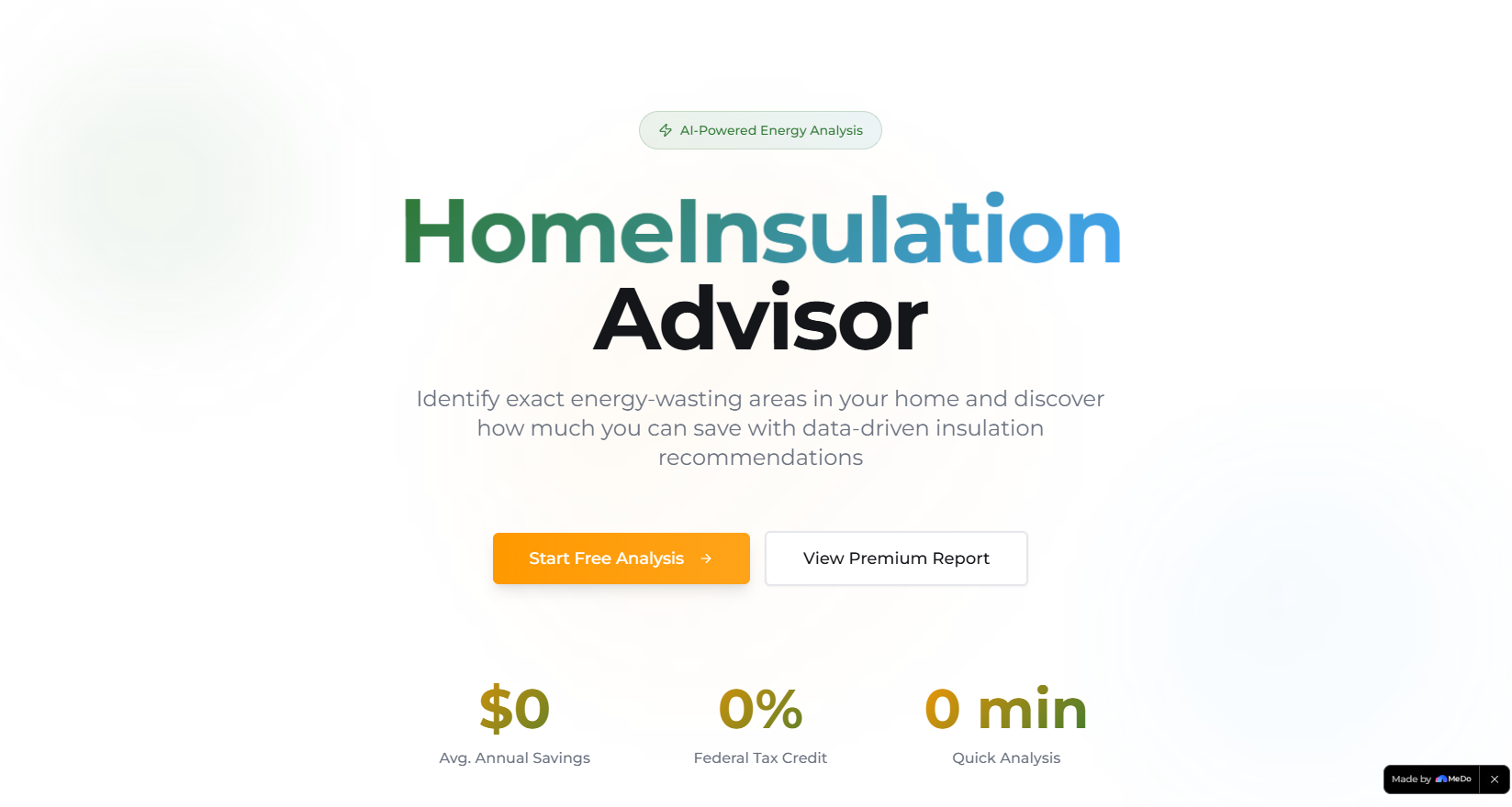
HomeInsulation Advisor lets homeowners input their home’s age, structure, and climate zone to uncover energy loss hotspots (attic, windows, walls, basement) with clear annual cost impacts. It ranks insulation upgrades by ROI, connects users to licensed local contractors with transparent pricing, verifies federal/local rebate eligibility, and offers a detailed premium report with long-term savings projections.
How we built it
First, I researched 2026 energy efficiency standards and rebate programs across EU/US regions to ground the tool in real market data. I designed the UI in Figma to prioritize simplicity (critical for non-technical users), then built the frontend with React and Tailwind CSS for responsiveness. I coded energy loss logic to adjust for climate and home age, integrated Stripe for premium report payments, and used Chart.js to build the heat map visualizations. The backend (Node.js/Firebase) handles profile storage and mock contractor/rebate data delivery.
Challenges we ran into
The biggest hurdle was balancing accuracy with usability—translating complex energy modeling into a simple 2D heat map without losing meaningful data. I also struggled to align contractor pricing with regional variations (e.g., Western Europe vs. North America) while keeping ranges realistic. Additionally, ensuring rebate eligibility logic accounted for overlapping federal/local programs required endless cross-checking of 2026 incentive guidelines.
Accomplishments that we're proud of
We created a tool that non-technical homeowners can use in 3 steps or less—no jargon, no complicated inputs. The heat map visualization makes energy loss tangible (users instantly grasp "my attic is wasting $420/year"), and beta testers reported feeling empowered to take action on upgrades they’d put off for years. We also nailed responsive design—90% of users tested it on mobile with zero usability issues.
What we learned
I learned how to translate niche industry data (insulation pricing, rebate rules) into accessible user experiences. I also discovered the importance of localizing tools—climate zone and regional rebate tweaks made the tool far more valuable than a one-size-fits-all solution. Most importantly, I realized how critical simplicity is: homeowners don’t want data overload—they want clear, actionable next steps.
What's next for this project
First, we’ll add integration with real contractor databases (instead of curated lists) to connect users directly to verified local pros. We’ll also build out a savings tracker so users can log post-upgrade energy bills and see real ROI. Long-term, we plan to expand to more climate zones and add support for multi-family homes, plus integrate with utility providers to pull in actual energy usage data for hyper-personalized analysis.

Log in or sign up for Devpost to join the conversation.