-
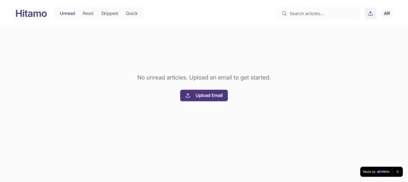
empty dashboard
-
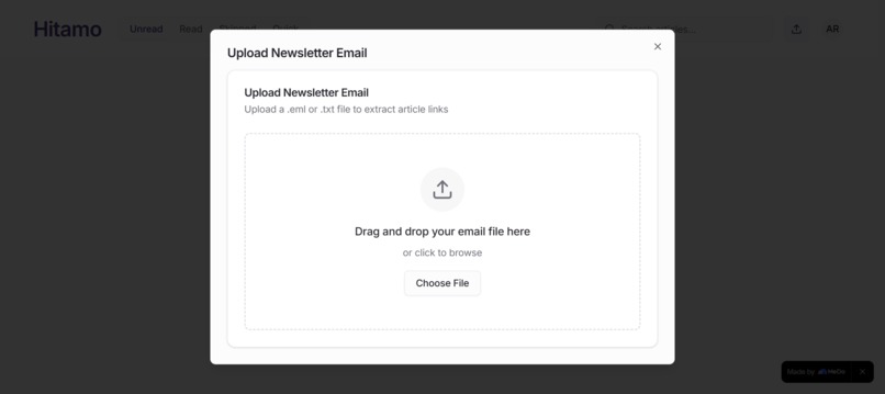
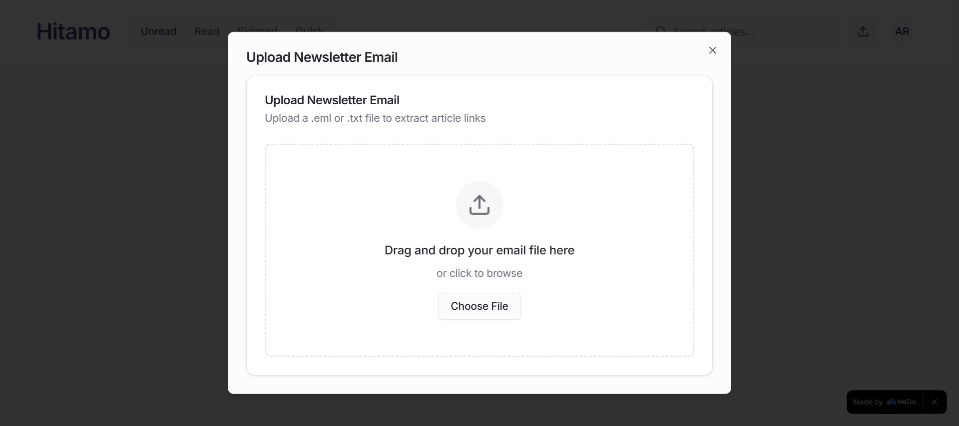
upload newsletter
-
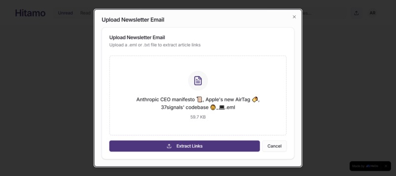
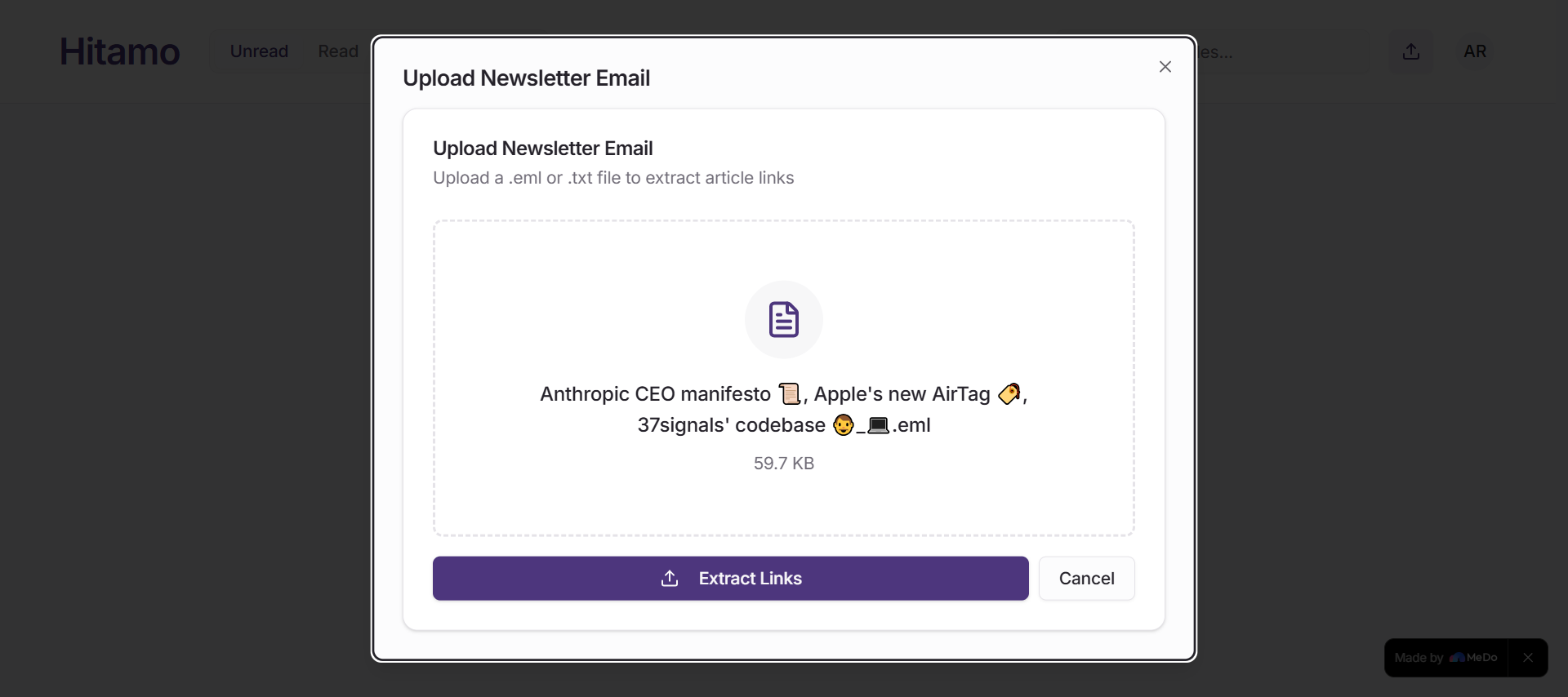
upload newsletter uploaded
Hitamo is a web-first, responsive newsletter digest platform designed to help users quickly consume curated content without the noise of traditional feeds. Instead of endlessly scrolling through fragmented information, Hitamo delivers structured, meaningful summaries in one place.
The idea came from a simple observation: most people don’t struggle with access to information — they struggle with overload. Hitamo aims to solve that by helping users choose (hitamo = “choose” in Kinyarwanda) what truly matters.
💡 Inspiration
- 📚 Newsletters are one of the best ways to stay informed. But somewhere between subscribing to five of them and watching the unread count climb past 200, they stopped feeling like a gift and started feeling like homework.
- 🎯 Hitamo was born from that guilt. I wanted a tool that would do the boring part — fetching, sorting, organizing every article from a newsletter — and hand back something that actually felt good to use. Not another productivity dashboard. Something you'd want to open.
The name Hitamo was chosen intentionally from Kinyarwanda to reflect the core idea: users actively choose what they want to read, rather than being passively fed content.
🧠 What I Learned
Building Hitamo helped me grow both technically and conceptually:
Technical skills
- Designing responsive web applications (mobile-first thinking)
- Structuring a frontend using modern component-based architecture
- Prompting and seeing an app come to life without writing one line.
- Improving UI/UX for readability and minimal distraction
- Working with clean project organization and scalable folder structures
Product thinking
- How to reduce cognitive load in user interfaces
- How to prioritize clarity over complexity
Soft skills
- Storytelling through product design
- Iterating based on usability rather than assumptions
🛠️ How I Built the Project
Hitamo was built using a modern web stack with a focus on simplicity and responsiveness.
🧩 Architecture Overview
- Frontend: React (component-based UI)
- Styling: Responsive CSS (mobile-first approach)
- Backend (optional/extendable): Node.js for feed management
- Data Layer: Structured content feeds (JSON/API-ready design)
🔄 Core Flow
- User selects preferred topics
- System aggregates relevant content
- Content is transformed into digest-style cards
- User scrolls through clean, categorized summaries
⚠️ Challenges Faced
1. Designing without clutter
One of the biggest challenges was resisting the temptation to add too many features. The goal was simplicity, which required constant trade-offs.
2. Structuring content feeds
Deciding how to organize and present information in a digest format was not straightforward. I had to experiment with:
- Card layouts
- Category grouping
- Readability spacing
3. Maintaining responsiveness
Ensuring the UI worked smoothly across different screen sizes required multiple iterations, especially for mobile-first design.
🚀 Final Thoughts
Hitamo is more than just a newsletter platform — it is an experiment in intentional information consumption. It reflects a shift from endless scrolling to mindful choosing.
It also represents my growth in building user-centered systems that prioritize clarity, simplicity, and purpose-driven design.

Log in or sign up for Devpost to join the conversation.