Inspiration
A screen reader hits an undescribed chart in Slack and says one word: "image." No trend, no numbers, no story. Nobody chose that. The chart just went out the way charts always go out.
Here's the number that hooked me: a peer-reviewed study of 1.09 million image posts found only 0.1% shipped with a description (Nature Communications, 2020). Two years later, Twitter's own accessibility team put it at 0.06%. It wasn't getting better. Slack already has alt-text fields and reminders. The gap isn't capability, it's follow-through. And follow-through never improves while the failure is silent and unmeasured. So I built the missing piece: the meter.
What it does
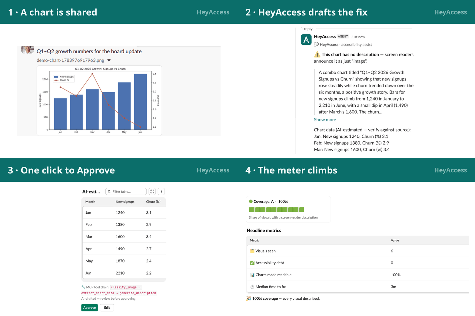
HeyAccess is the accessibility-debt meter for Slack. Share a chart and within seconds a draft description lands in its thread, with the chart's underlying data extracted into the message's top-level text (the one field a screen reader reads by default), labeled "AI-estimated — verify against source." One click on Approve (or Edit; no AI acts alone) and the message is readable to everyone.
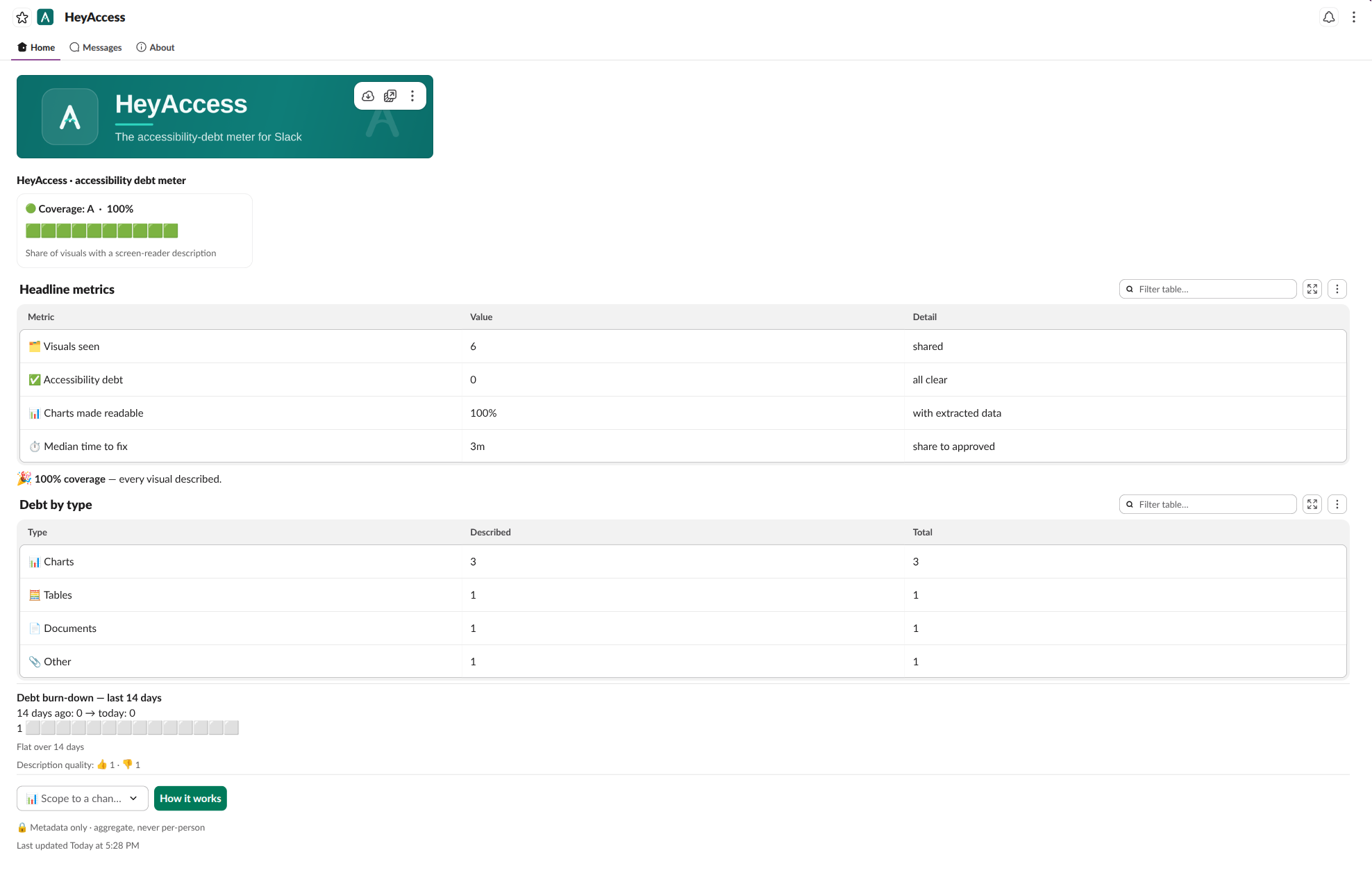
The App Home dashboard proves it's working: coverage rate, debt backlog, time-to-fix, and a 14-day burn-down. All of it aggregate, never per-person, and built from metadata only ({id, channel, ts, type, covered}; no message text or pixels ever touch disk). Photos, tables, GIFs, and visual-heavy PDFs run the same loop, and you can ask the built-in Assistant or @HeyAccess for a snapshot anywhere.
How we built it
TypeScript + Bolt v4 over Socket Mode, split like any full-stack app: the App Home dashboard and the Block Kit surfaces are the frontend, and the backend is an event-driven agent built around a custom MCP server exposing six vision tools (classify_image, extract_chart_data, generate_description, classify_document, describe_document, get_debt_metrics), and the agent chains them differently per input: photos run classify then describe, charts add a data-extraction step, PDFs pass an "is the meaning visual?" gate first. That's reasoning, not a hardcoded if.
Vision is Claude with schema-constrained outputs; the store is better-sqlite3, one metadata row per visual. The native Assistant (Slack's Agents & AI Apps capability) runs a two-tool loop where the LLM decides when to show the dashboard and deterministic code decides what it looks like. All of it verified against the real workspace: integration tests on the exact blocks Slack received and unit tests. Then, I listened to the output on a real screen reader.
Challenges we ran into
- Slack's own chart block has no alt text. The native
data_visualizationblock is rejected on App Home and accepted on messages, where VoiceOver reads "X axis undefined, Y axis undefined" and none of the data. I only know this because I probed every block against the live validator; the docs don't say it. So Home draws its burn-down as an emoji bar chart a screen reader can actually hear, and the snapshots you get from pinging the agent ship the native chart plus every value mirrored in the text. The platform demonstrated the exact gap we fill. - Slack's TOS: never store message content. The fix is physical: the schema can't hold text or pixels, and history is rebuilt from timestamp pairs. Harder to build, but the meter is trustworthy because it can't read your messages back.
- Not building what Slack ships next. On-demand description is native now, alt-text reminders have already shipped, File Summaries are in production. HeyAccess stays in the one lane Slack isn't in - continuous measurement plus human-approved fixes - and defers everywhere else on purpose (text-native PDFs skipped, "read aloud" stays on the roadmap instead of racing native TTS).
Accomplishments that we're proud of
One real number, measured on submission day: four undescribed visuals (chart, photo, table, PDF), coverage 0% to 100% in one sitting, median fix ~4 minutes, fastest 32 seconds, because a teammate saw the draft and just clicked Approve. Sandbox scale, honestly labeled. But that loop - detect, draft, approve, prove it went up - is the product, and it passed its own test: the output reads correctly on VoiceOver, end to end. And no metric ever names a person; a test fails if a user ID leaks into the meter.
What we learned
- The distance between possible and done is where impact lives. Auto-description existed for years, but adoption never followed.
- In accessibility, the fallback is the feature: top-level text is the only guaranteed-perceivable path in a Slack message. Everything visual is enhancement, never substitute.
- Human-in-the-loop isn't a compromise. Make approval one click and fixes start happening on their own (a complement to alt-text reminders).
What's next for HeyAccess
Per-channel coverage goals and a weekly accessible report first, turning a helpful bot into an accessibility program a team actually runs. Then, only once usage is real: audit-ready compliance exports and org-wide dashboards. The compounding asset is the longitudinal coverage record: what became accessible, when, and how fast. It only accrues to whoever starts measuring first.

Log in or sign up for Devpost to join the conversation.