-
-

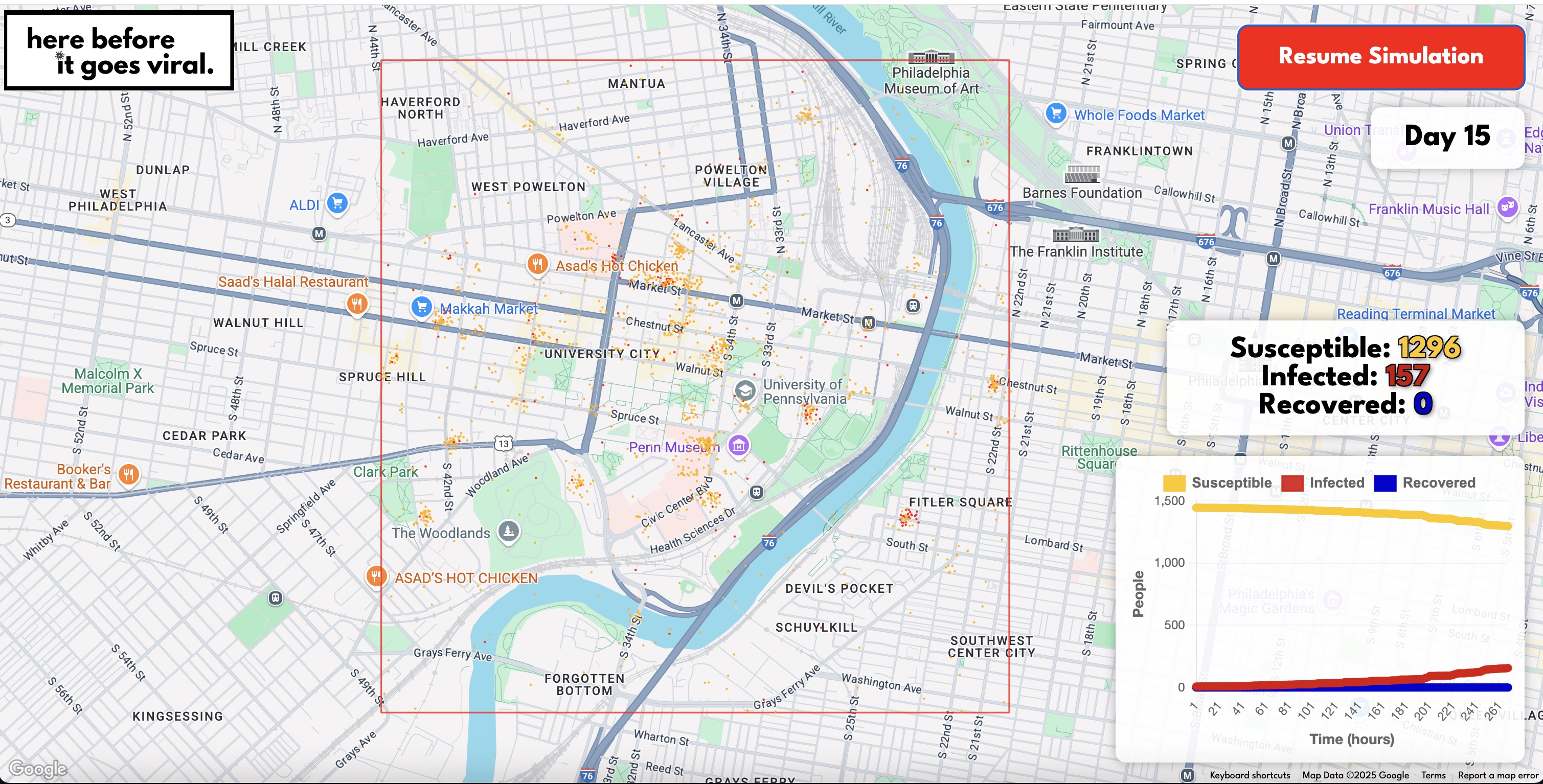
Highlights areas of interest on the map.
-
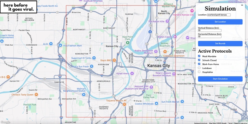
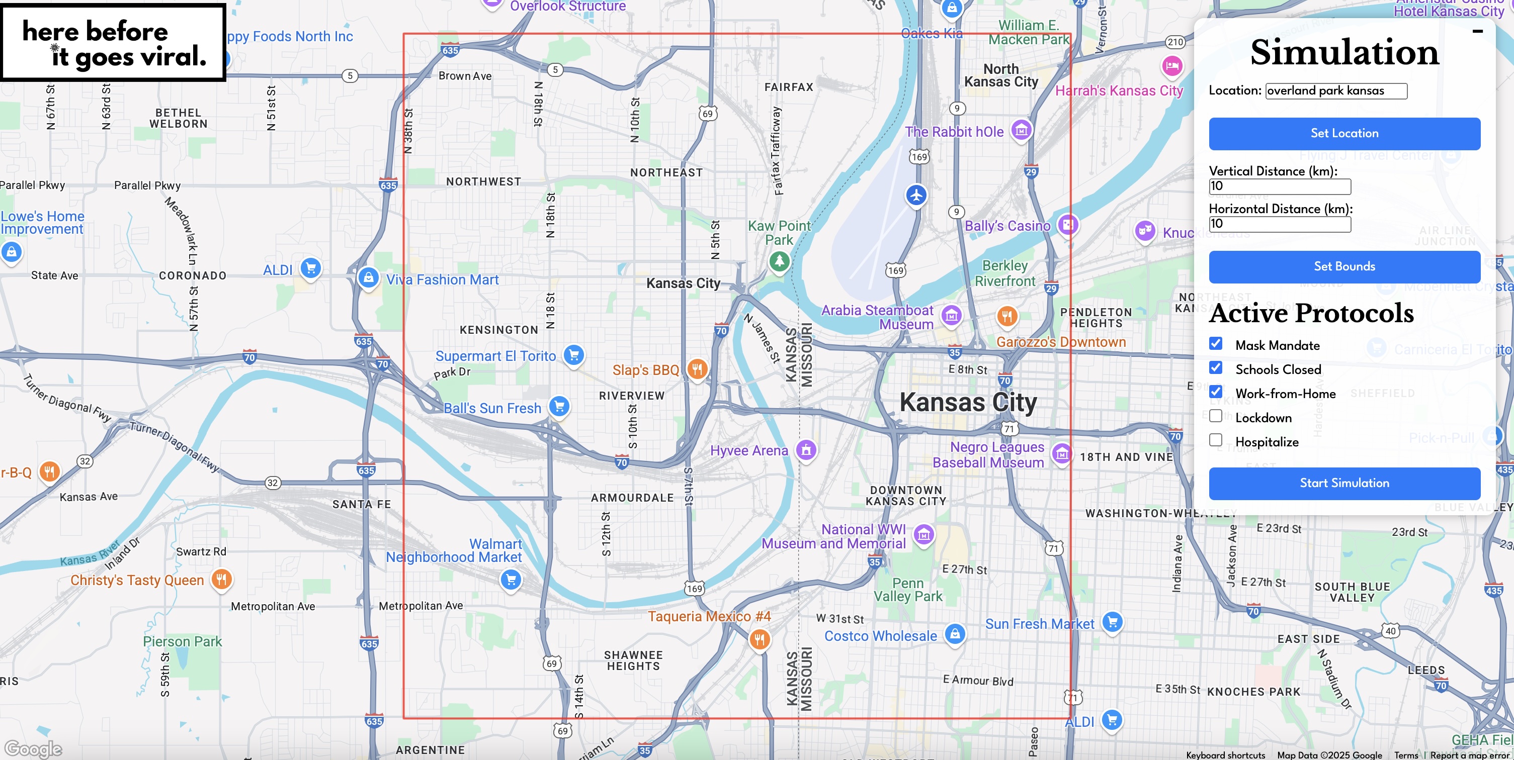
Interactive menu.
-
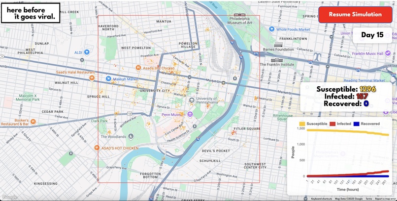
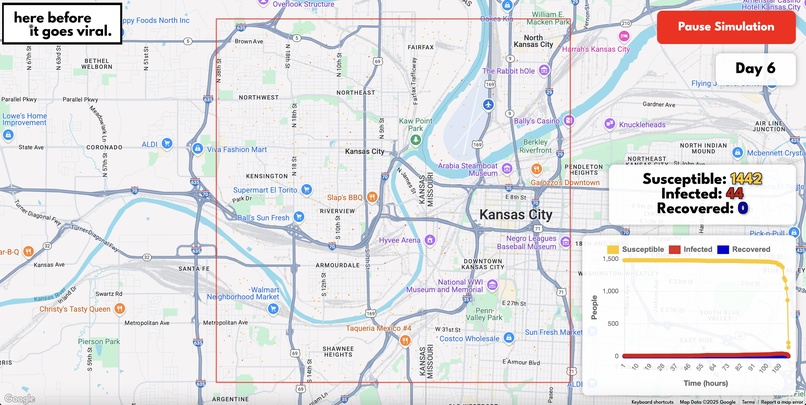
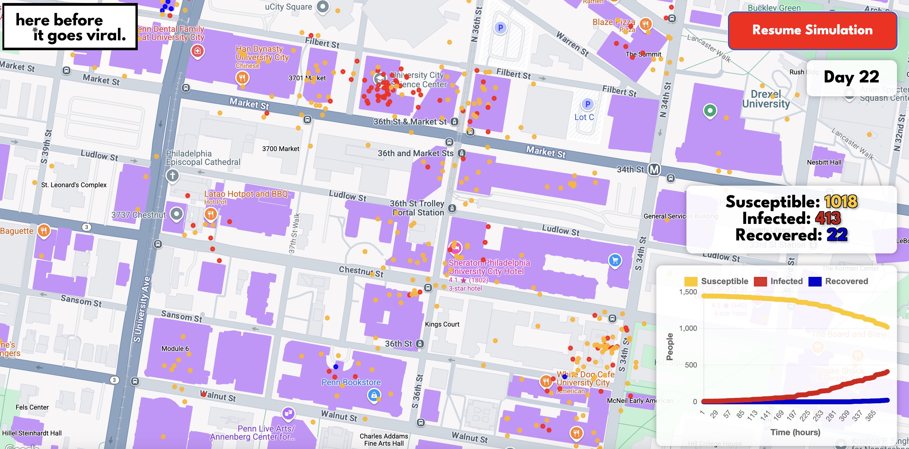
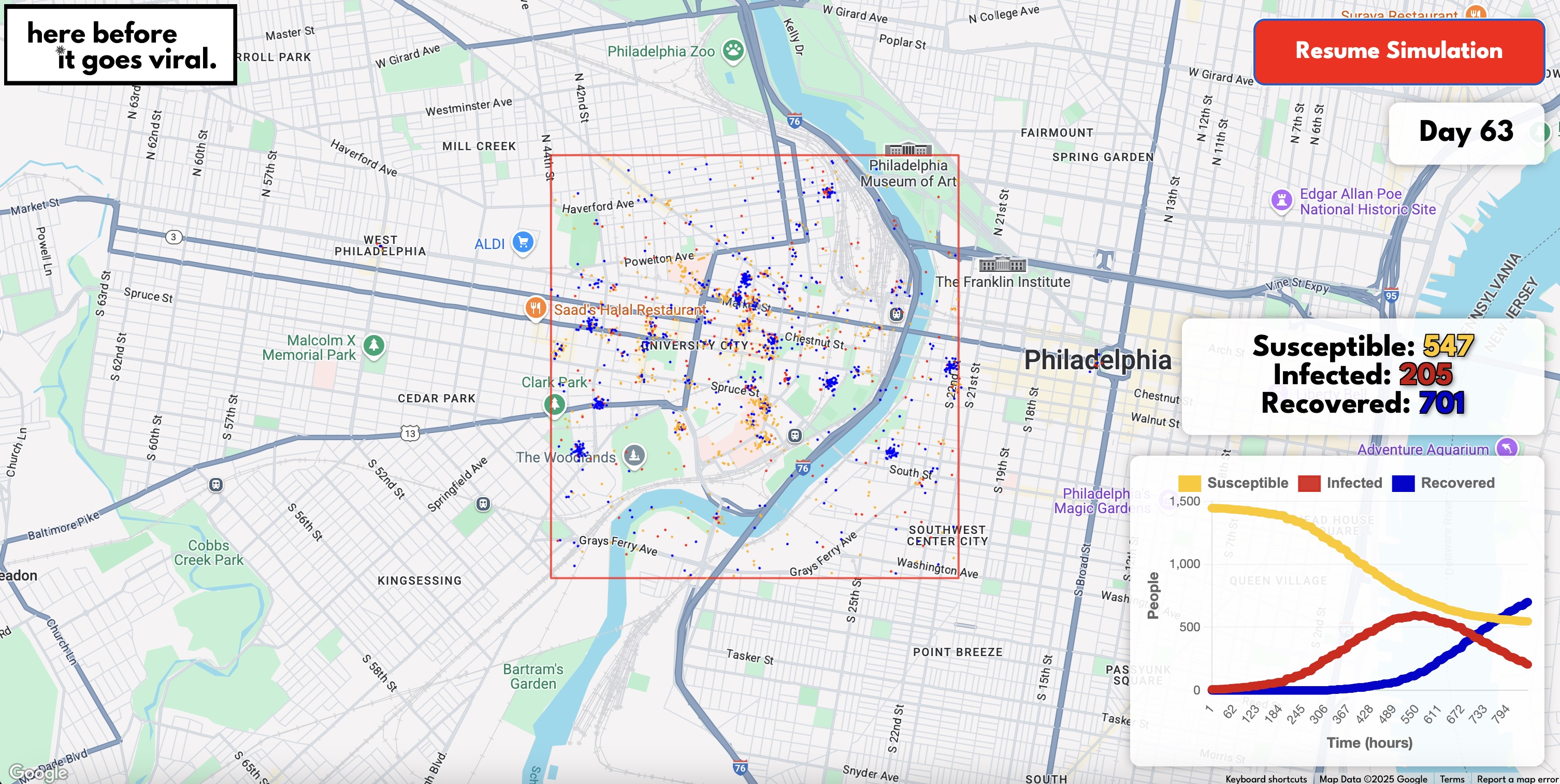
Real time informative graphics.
-
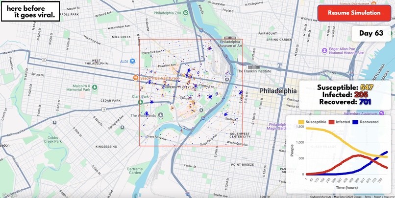
Real time informative graphics.
-
Supports multiple locations.
-

Logo


Inspiration
Building upon our memories as high school upperclassmen, we vividly remember experiencing our high schools years throughout the pandemic. We saw around us the informational asymmetry and fear. Now as college students ready to enter the workforce, we wanted to use what we've learned to make a difference and give back to the local governments that make the key decisions for us to stay safe and instill the confidence in us to keep going.
What it does
Our project is an interactive web-based pandemic simulation tool that models the spread of infections within a city environment. Users can input a central location and define geographic bounds to analyze how different public health protocols, like mask mandates, school closures, and lockdowns, would impact infection rates. The system tracks susceptible, infected, and recovered populations over time and provides real-time statistical updates and graphical representations.
How we built it
We built our project using a combination of JavaScript, HTML, and CSS for the frontend, and Python for the backend. We leveraged FastAPI to connect the two, enabling efficient communication between the user interface and the simulation engine. The frontend utilizes Google Maps to dynamically visualize city layouts, building locations, and population movements, providing an intuitive and interactive experience. On the backend, FastAPI handles the core logic that processes simulations with predefined city dynamics and infection parameters. The system efficiently tracks the number of susceptible, infected, and recovered individuals over time, delivering real-time updates and insightful graphical representations.
Challenges we ran into
One of the biggest challenges we faced was integrating real-time data visualization with complex backend simulations while maintaining performance and responsiveness. Ensuring seamless communication between the frontend and backend using FastAPI required careful optimization. We also encountered difficulties in fine-tuning the simulation parameters to accurately reflect real-world epidemiological trends. Additionally, working with the Google Maps API posed challenges in dynamically rendering location-based data within customizable boundaries. We overcame these hurdles as a team, finding solutions through iterative testing and effective team collaboration.
Accomplishments that we're proud of
One of our biggest goals was ensuring that our ratios between susceptible, infected, and recovered patients followed the SIR model found in longitudinal epidemiological studies. Having added a feature no other study has done, individual probabilistic decisions, we were actually able to accurately get a near perfect SIR curve. This means that our model is representative of what we know to be scientifically accurate as of January of 2025.
What we learned
Our team learned so much. Not only did we explore full-stack development and public health concepts, but we dived deep into the powerful intersection of the two and how crucial it is to bring our generation's scientific advancements to the modern stage. This project showed us how technology can bridge gaps in public health by transforming complex epidemiological data into accessible, actionable insights through intuitive digital platforms. We gained a deeper appreciation for the role of data visualization, backend processing, and real-time analytics in understanding and predicting health outcomes.
What's next for herebeforeitgoesviral.org
We got in touch with the Department of Biostatistics, Epidemiology, and Informatics at our University's School of Medicine (Perelman SOM). We have meetings arranged this coming week to discuss how we can move this into a tool accessible for patients learning about flu safety. Further, we plan on developing a more intricate version using network graph algorithms to scale this up to the state-wide scale, where we can simulate (and hopefully prevent) the spread of pathogens from city to rural areas.


Log in or sign up for Devpost to join the conversation.