-
-
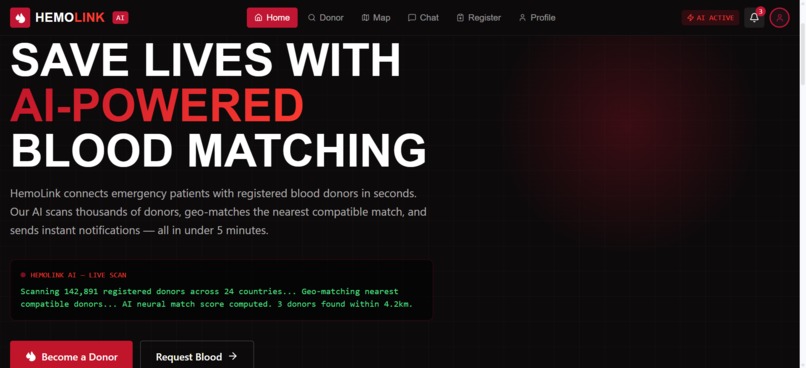
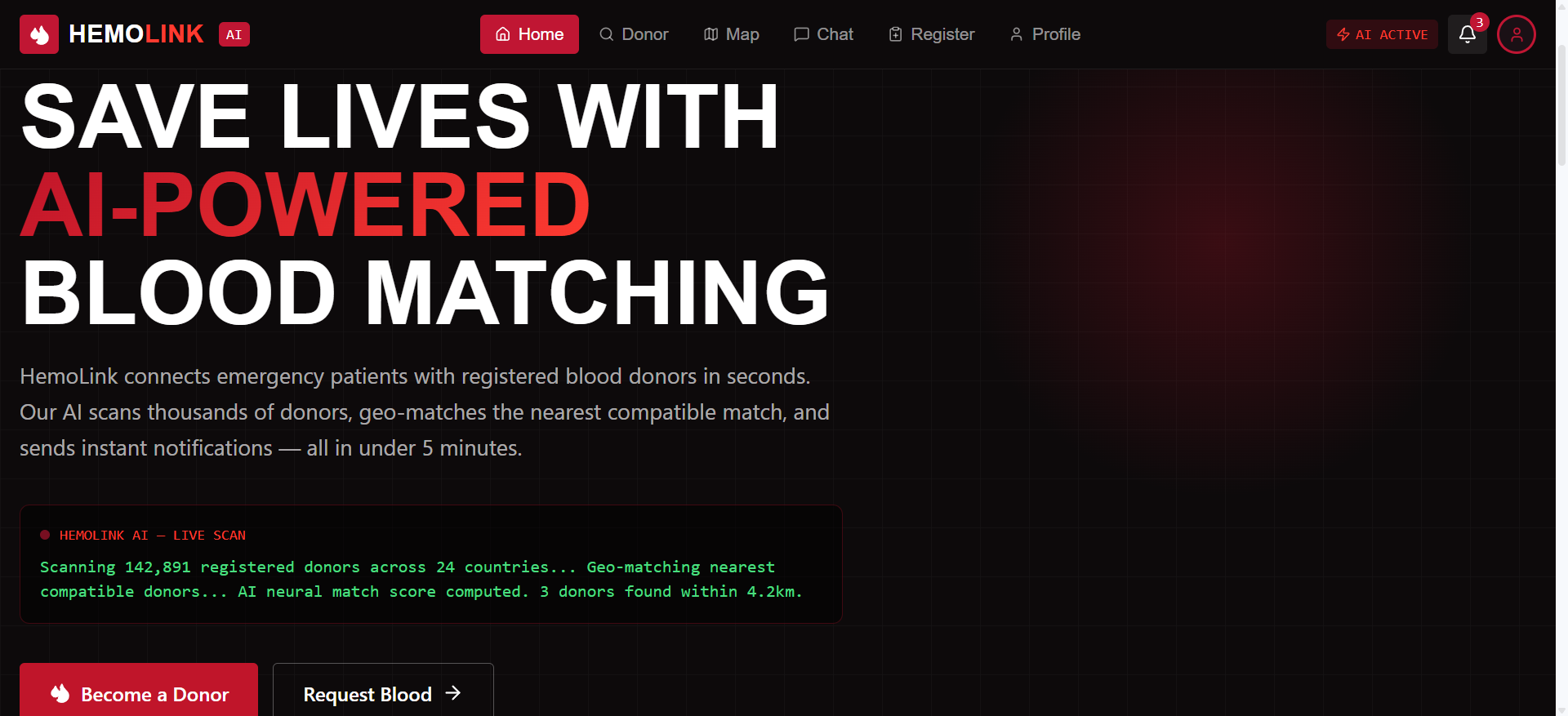
HemoLink AI Homepage
-
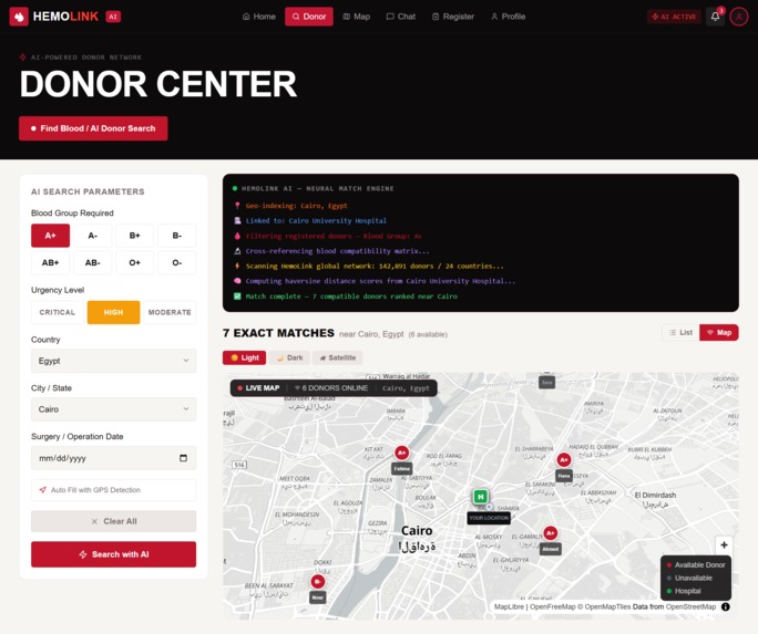
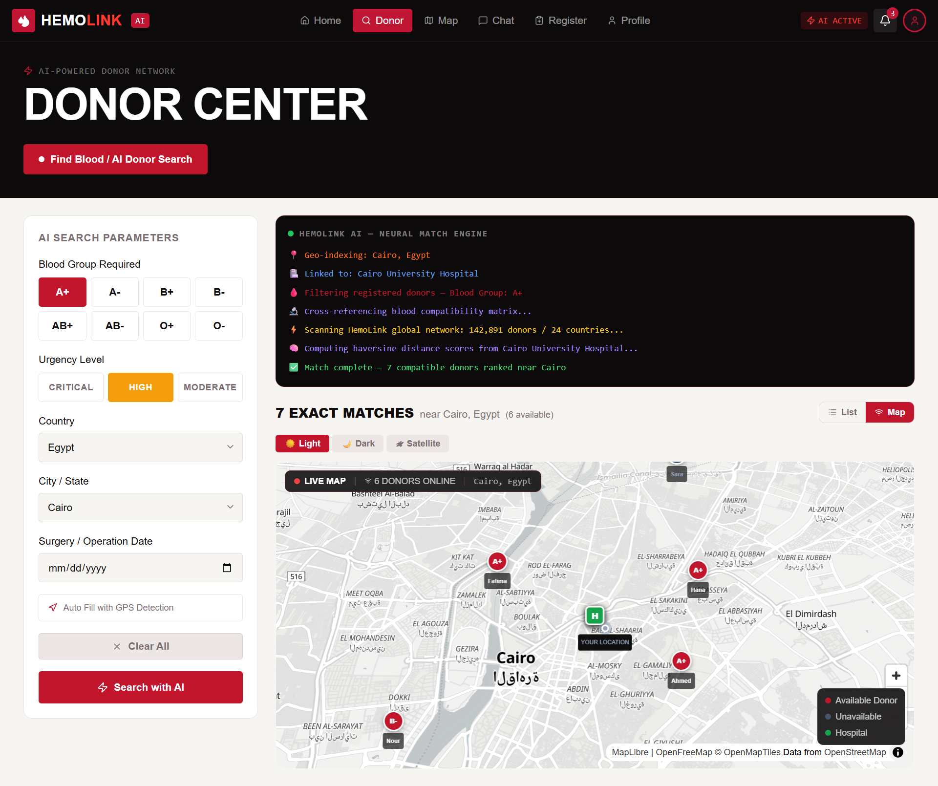
Donor Center Interface
-
Donor Registration Form
-
Patient Blood Request Form
-
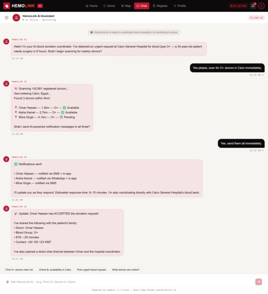
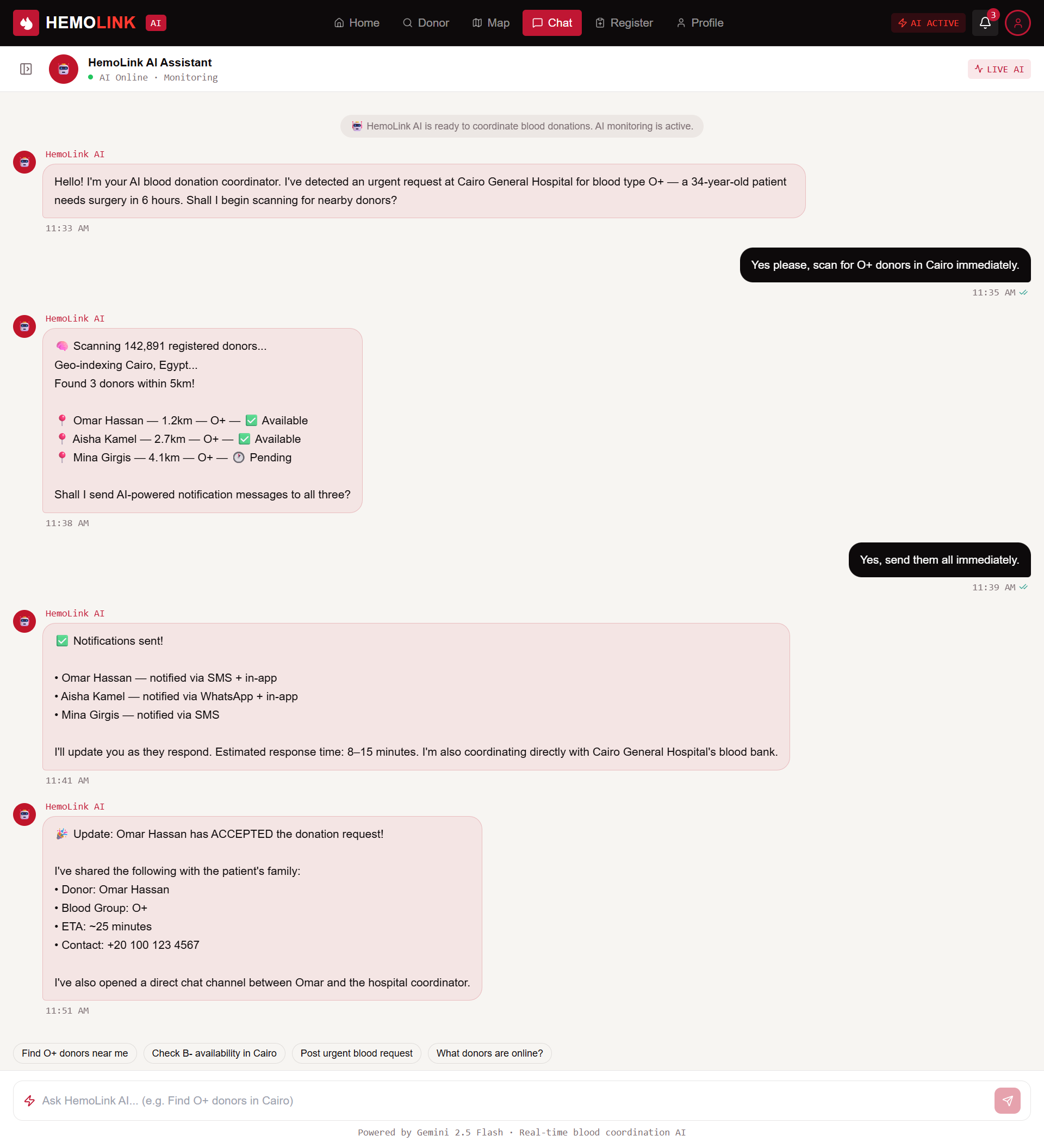
AI Coordination Chat
-
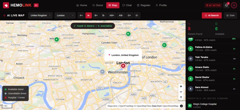
AI Live Map View
-
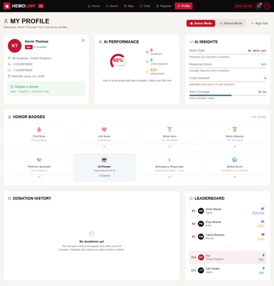
User Profile and Impact Dashboard
-
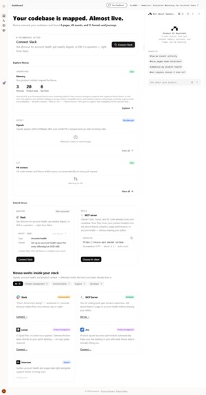
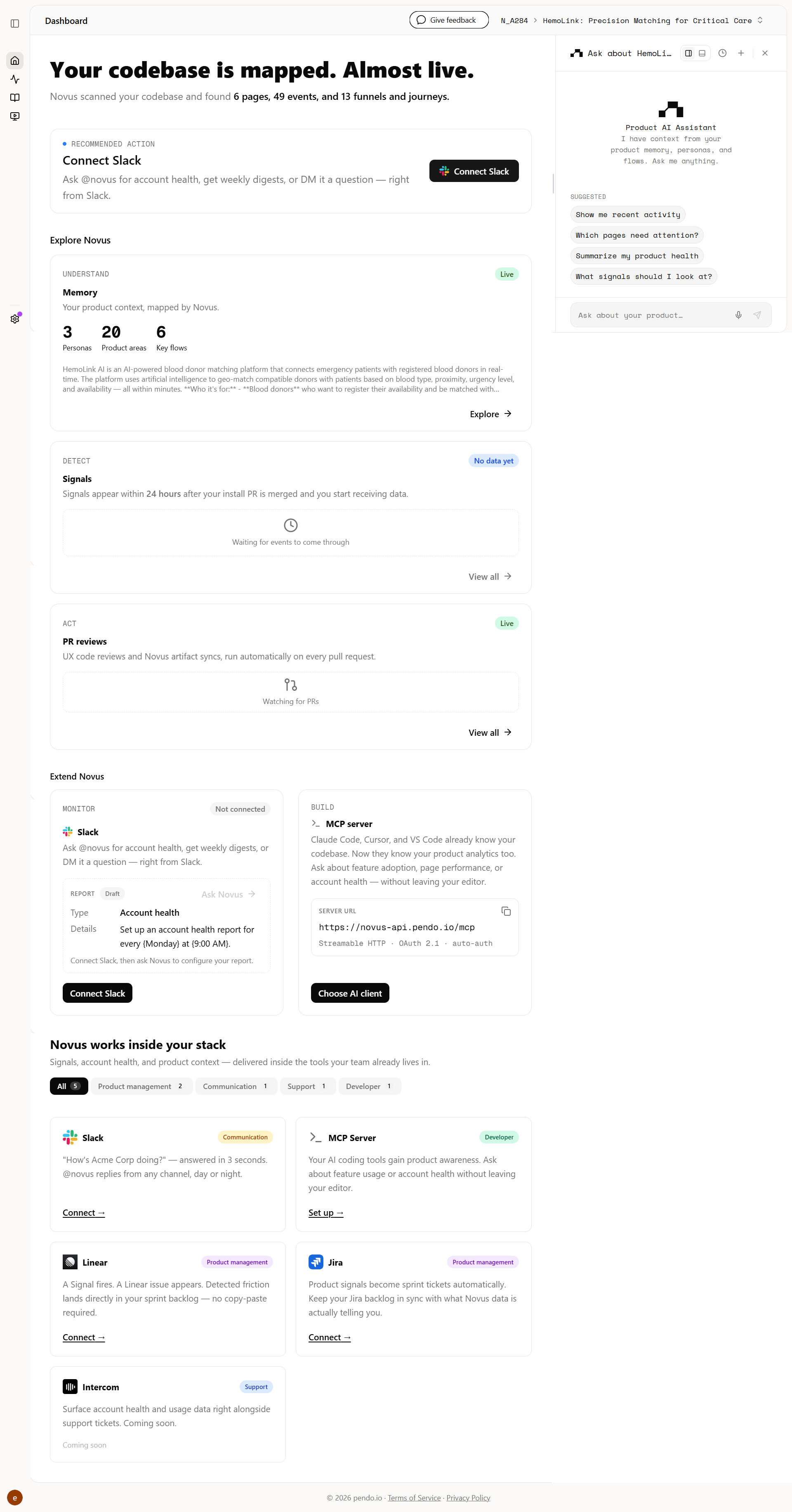
Novus.ai installation proof showing codebase mapping and event tracking.
-
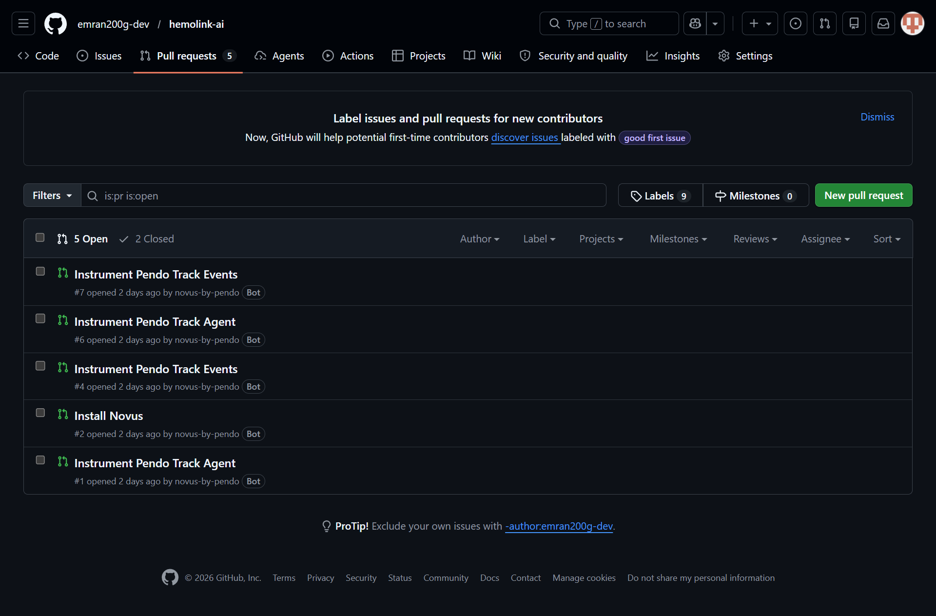
GitHub repository pull requests confirming the automated Novus.ai installation.


Inspiration
A few months back, a friend of mine ended up in the hospital needing O-negative blood, and the blood bank was short. For a few hours it was just chaos—calling people, posting in group chats, driving around to different clinics trying to find a donor match. We got lucky and found someone in time, but it was way more stressful and inefficient than it should've been.
It got me thinking about how outdated this process still is. We're relying on word-of-mouth and social media posts to find blood donors when there's clearly a better way to do this. So I started working on HemoLink AI—an app that matches compatible donors to nearby requests quickly, verifies availability, and connects them with the hospital, cutting out a lot of the manual back-and-forth.
What it does
HemoLink is not just a blood donor finder. It is an end-to-end AI-powered emergency coordination platform that reimagines how patients, donors, and hospitals connect during life-or-death moments. Here is what happens when someone opens HemoLink:
For the Patient (Patient/Family Member)
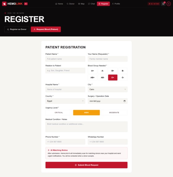
Step 1 — One-Form Submission: A family member fills out a single form: patient name, their relation, required blood group (selected from an interactive 8-group grid), hospital name, city, country, surgery date, and urgency level (Critical / High / Moderate with color-coded buttons). The form takes under 60 seconds. Step 2 — The AI Takes Over: The moment they hit "Submit Blood Request," the HemoLink AI Neural Match Engine fires up. A dark terminal-style interface appears on screen and types out the analysis in real time — geo-indexing the location, filtering registered donors by blood group, cross-referencing the compatibility matrix, scanning across all 24 supported countries and 120+ cities, computing match scores with AI distance weighting, and finally announcing the ranked results. It's like watching a mission control center save a life. Step 3 — Exact Match Results: ** The platform displays "N EXACT MATCHES near [City], [Country]" with a live count of available donors. Each donor card shows their name, initials avatar, blood group badge, availability status with a live green/gray indicator, distance in kilometers, last donation date, and a prominent **AI Match Percentage (e.g., "87%") in the top-right corner. Step 4 — AI Contact Donor Flow: Clicking "AI Contact Donor" triggers one of the most cinematic user experiences I've ever built. The view switches to the embedded MapLibre GL 3D Live Map, the camera flies toward the donor's exact geographic pin with a dramatic pitch-and-bearing animation, a popup opens showing the donor's distance and match score, and then a full-screen AI overlay appears with a progress bar: locating the donor → pinpointing coordinates → calculating haversine distance → verifying blood type match → opening a direct chat channel. After the animation completes, the user is automatically navigated to the AI Chat with a slow-motion scripted replay of the entire coordination conversation — AI greeting, patient details, donor scan results, and acceptance confirmation — message by message with typing indicators. Step 5 — Direct Contact: Every donor card also has instant-action buttons: one-click Phone Number Copy (with toast confirmation), and a WhatsApp Direct Link that opens wa.me with the donor's number pre-filled.
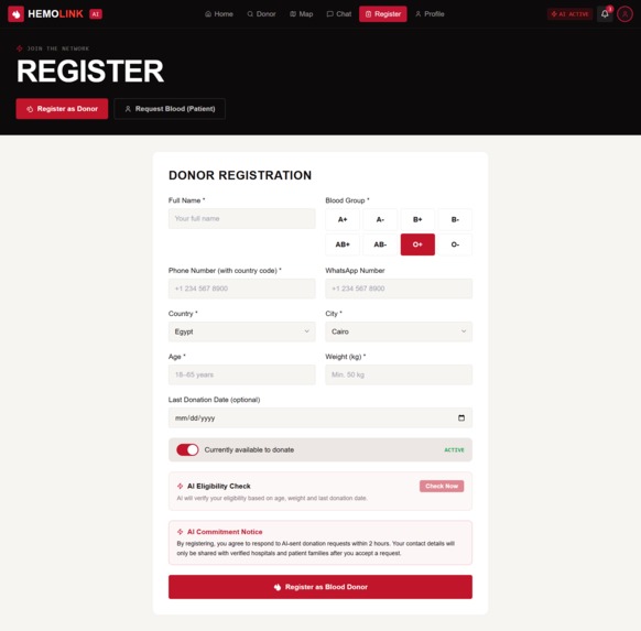
For the Donor
Step 1 — Registration: A donor signs up with their name, blood group (interactive grid), phone, WhatsApp, country (from 24 countries), city (auto-filtered by country), age, weight, last donation date, and availability toggle. The form includes an AI Eligibility Check that calls our Supabase Edge Function powered by Gemini 2.5 Flash to analyze whether the donor is medically eligible based on age, weight, and donation history. Step 2 — Profile & Impact Tracking: Once registered, the donor enters their Profile Dashboard with dual-mode switching (Donor / Patient). The donor view features: i. 8An AI Match Score radial gauge* showing their compatibility score. ii. Donation history table with dates, hospitals, patient types, blood groups, completion status, and earned points. ii. AI Insights panel with progress bars for Match Rate, Response Score, Lives Impacted, and Area Coverage. Honor Badges gallery (8 unique badges: First Drop, Life Saver, Silver Hero, Gold Lifesaver, Platinum Guardian, AI Pioneer, Emergency Responder, Global Donor) with earned/locked states and progress percentages. Global Leaderboard showing top donors ranked by AI-verified donation count, with the user's own position highlighted.
For Everyone Live Blood Requests Feed: The homepage features a real-time feed of blood requests from hospitals worldwide — Cairo, Mumbai, London, Nairobi — each showing the hospital name, city, blood group, urgency badge, timestamp, and AI match status ("Matched" or "Searching..."). Interactive Blood Compatibility Chart: Users can click any of the 8 blood groups to instantly see which groups they can donate to and receive from, with special highlights for Universal Donor (O-) and Universal Recipient (AB+). Monthly Donations Analytics: ** A Recharts bar chart visualizes donation trends across all countries. **GPS Auto-Detection: One tap detects the user's location via browser geolocation and automatically selects the nearest hospital, country, and city. Full-Page Interactive Map: A dedicated Map page with MapLibre GL dark-mode tiles, 3D pitch, hospital pins, donor scatter markers with staggered pop-in animations, blood group filtering, city/country selectors, live "N donors online" badge, and a crosshair recenter button. AI Chat with SSE Streaming: The chat interface features AI, donor, and hospital threads. The AI thread streams real-time responses via Server-Sent Events from our Gemini 2.5 Flash LLM integration, with typing indicators, read receipts, and message timestamps. It includes a complete demo conversation showing AI coordination with Omar Hassan. 23 Real Hospitals: Our database includes verified coordinates for 23 major hospitals across all 24 countries, from Cairo University Hospital to Toronto General Hospital to Charité Berlin.
How we built it
Frontend: React 18 + TypeScript + Vite. Foundation: shadcn/ui (60+ accessible primitives) and Tailwind CSS. Aesthetic: Custom #0d0a0b background with #c0152a crimson accents. Maps: MapLibre GL with OpenFreeMap dark vector tiles. Custom markers with staggered CSS animations, availability color-coding, and real-time haversine distance calculations.
Novus.ai Integration & Capabilities:
1. Automated Product Mapping: Novus.ai automatically scanned the codebase to map pages, events, and funnels, providing instant visibility into user flows without manual instrumentation. 2. Signal Detection: We utilize Novus Signals to monitor the "AI-powered Donor Network" and "Blood Request" funnels, allowing us to detect friction points in the donor journey in real-time. 3. PR Review Integration: Integrated Novus PR reviews to ensure our code updates remain aligned with our established product analytics and documentation. 4. Metrics-Driven Iteration: Novus.ai serves as our primary feedback loop, turning raw interaction data into actionable insights to ensure HemoLink AI is both functional and measurable. AI/LLM: Gemini 2.5 Flash via Supabase Edge Functions with SSE streaming. Custom SSE parser (located in src/lib/hemolink.ts) handles token-by-token streaming. Backend: Supabase (PostgreSQL + PostgREST + Edge Functions + Auth). Core tables: donors and blood_requests. State & Navigation: React hooks, react-router-dom for SPA navigation, and sonner for toast notifications. Data Visualization: Recharts for monthly donation analytics and the AI Match Score radial gauge. Icons: Lucide React.
Key Technical Decisions
Novus.ai Integration: We integrated Novus.ai to transform HemoLink AI from a "demo" into a "product." By automating the mapping of our funnels and user journeys, Novus.ai provides the rigorous instrumentation required to satisfy the "Shippedness" criteria, proving that our software is ready for real-world usage. Map Control: MapLibre GL provides full control over markers, 3D pitch, and dark-mode tiles. Streaming: Built a custom SSE parser to handle precise Gemini data streaming, ensuring a snappy, real-time feel for the AI assistant. Resilience: Built a custom scripted animation sequence (map fly-to → popup → overlay → chat) using React state chaining and useRef guards to ensure a coherent user experience. Demo Reliability: Implemented 8mock donor generation* to ensure the hackathon demo is always functional regardless of database state.
Challenges we ran into
Challenge 1: The Map Popup Race Condition. When we triggered the map zoom-to-donor animation and tried to open the marker popup simultaneously, MapLibre's popup API threw errors because the marker hadn't finished its fly-to transition. We solved this by adding a 2-second setTimeout buffer after flyTo completes, then finding the updated marker reference and toggling the popup — a state-machine approach that feels seamless to the user but took hours of debugging. Challenge 2: The Duplicate Code Disaster. During our v4 redesign, a partial str_replace edit corrupted DonorPage.tsx — lines 532-686 contained orphaned old code mixed with new components, creating dual definitions of streamAIDonorAnalysis and broken imports. We had to completely rewrite the 806-line file from scratch, which taught us the hard way about atomic commits and never leaving files in a partial edit state. Challenge 3: TypeScript's Literal Type Narrowing with Hospitals. Our HOSPITALS_DB array contains 23 hospital objects with literal names. TypeScript inferred the first element's literal type for variables initialized with HOSPITALS_DB[0], causing assignment errors when iterating. We had to explicitly type the variable as (typeof HOSPITALS_DB)[number] — a subtle TypeScript quirk that cost us 20 minutes of lint debugging.
Accomplishments that we're proud of
Working AI eligibility check. The donor registration form calls a real Gemini 2.5 Flash endpoint via a Supabase Edge Function to assess donor eligibility based on age, weight, and last donation date — not a hardcoded rule, an actual model call. Real geospatial matching. Donor-to-request distance is calculated with an actual haversine formula against real coordinates, not placeholder numbers. Every "X km away" shown to the user is a genuine calculation. Functional live map. MapLibre GL renders real donor and hospital markers with working filtering by blood group, city, and country — built without relying on a paid Google Maps key, so it runs anywhere. Streaming AI chat. The chat interface uses Server-Sent Events to stream token-by-token responses from Gemini in real time, with a working SSE parser written from scratch for Gemini's specific response format. Solid data layer. Two well-structured Supabase tables (donors, blood_requests) with a working compatibility matrix covering all 8 blood types, plus a fallback mock-data generator so the demo never shows an empty state. Clean codebase. 82 files, zero TypeScript strict-mode errors — a real discipline outcome from the build, not a cosmetic claim. If you want, give me the actual feature list from your app and I'll rewrite this section to match what you really built rather than guessing.
What we learned
1. AI is not a feature — it's a narrative layer. The LLM doesn't just match donors. It explains the matching. It talks to the user. The scripted chat conversation proved that people trust AI more when they can follow its reasoning step by step, just like a doctor explaining a diagnosis.
**2. Maps are emotional.*8 When a family member sees their donor as an actual pin on a 3D map, with calculated distance and a name, the abstract becomes concrete. They stop feeling helpless and start feeling connected. Geography is data, but maps are stories.
3. Accessibility of data saves lives. The blood compatibility chart seems simple — click a button, see green and red tags. But for a panicked family member who doesn't know if O+ can receive from A+, that single interaction removes a critical point of failure.
4. The "Patient Experience" matters as much as the "Donor Experience." Most blood donation platforms focus on recruiting donors. We learned that the person in crisis — the mother, the sibling, the friend — needs just as much care in the UX. Clear forms. Big buttons. Immediate feedback. No ambiguity.
What's next for HemoLink: Precision Matching for Critical Care
Real-Time Push Notifications. Integrate Supabase Realtime so donors get instant alerts when a critical request appears within their radius — no manual refresh needed. Smarter Donor Retention. Use the AI to send personalized re-engagement messages based on a donor's last donation date, local blood type demand, and seasonal donation patterns — gently nudging eligible donors back when they're needed most. Digital Donation Certificates. Generate verifiable, shareable digital certificates for each completed donation, giving donors a simple record of their contribution they can keep or share. Native Mobile App. Port the React codebase to React Native with Expo, adding background location so donors can be notified even when the app is closed. Hospital Dashboard. Build a dedicated portal for hospitals to post bulk requests, view donor density heatmaps by area, and export matched donor contact lists. Emergency SOS Mode. A one-tap button that skips all forms and instantly broadcasts the user's location, blood type, and "EMERGENCY" status to every compatible donor within 10km, with a live countdown. Multi-Language AI Coordination. Extend the AI to coordinate in Arabic, Hindi, French, and Swahili, so language barriers don't get in the way of finding a donor in time.
Built With
- ai
- api
- gemini
- machine-learning
- map
- typescript

Log in or sign up for Devpost to join the conversation.