-
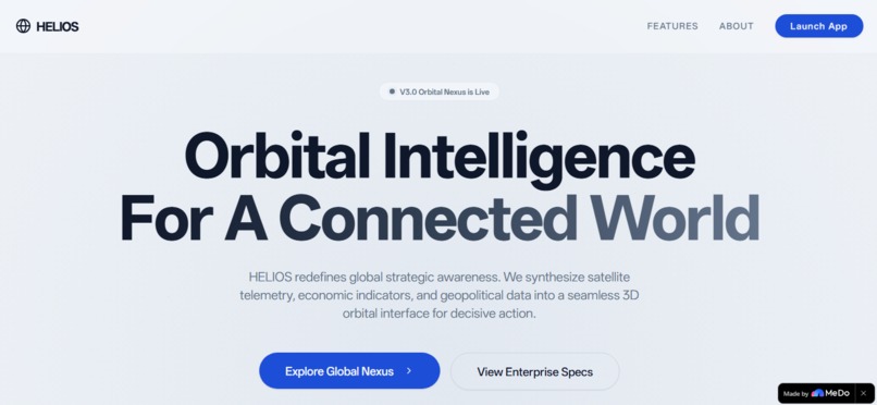
Landing page
-
Global Nexus
-
AI- anlysis
-
Growth Trends- Policy
-
APP- Description


Inspiration
I was tired of dashboards that felt like spreadsheets with extra steps.
Every time we researched international markets, compared startup ecosystems, or analyzed geopolitical trends, we found ourselves drowning in static tables, disconnected charts, and walls of text. The data was accurate, but the story was missing. Geography matters. Relationships between nations matter. A policy shift in Berlin creates a ripple in São Paulo — but that connection is invisible in a CSV file.
I imagined a tool that felt like a satellite command center: cinematic, intuitive, and alive. Something where exploring the world didn't mean reading reports — it meant piloting intelligence. We wanted to build an interface where clicking on a country triggered a tactical briefing, where the globe itself breathed with data, and where complex global insights became as natural as spinning a globe on your desk.
That vision became HELIOS.
What it does
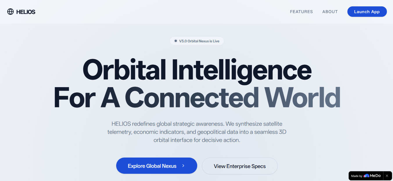
HELIOS is an immersive 3D orbital intelligence platform that transforms raw economic and geopolitical data into a spatial, interactive experience.
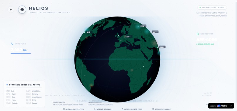
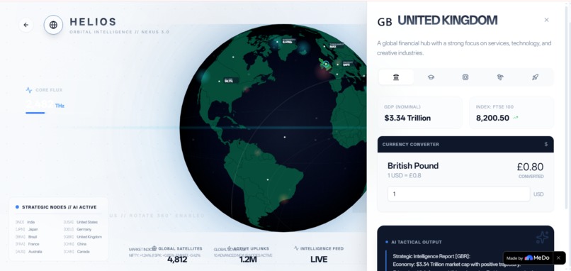
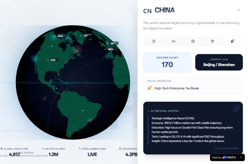
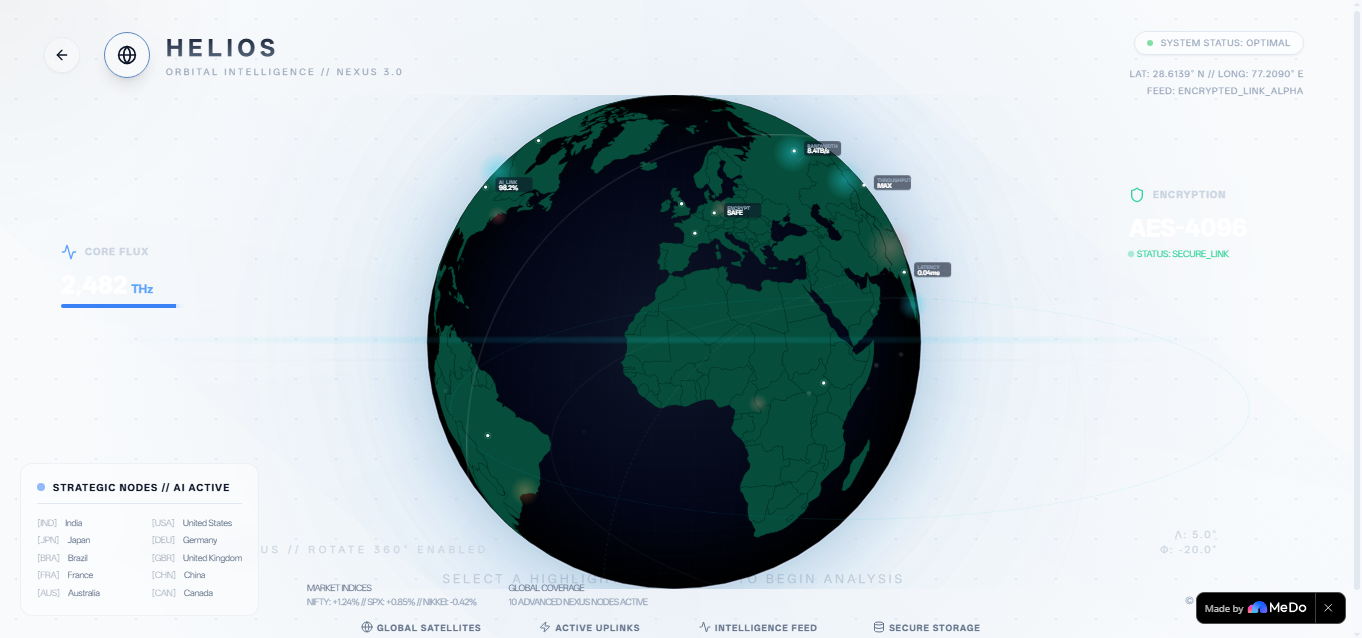
At its core is a fully rotatable 3D orthographic globe. Users can drag to explore any region of the world, and when they click on a country, a cinematic side panel slides in with a multi-dimensional intelligence briefing covering five strategic lenses:
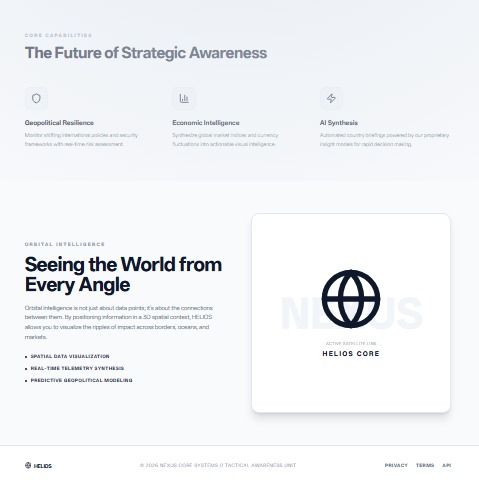
1)Economy — GDP context, real-time currency conversion against USD, major stock indices with animated trend indicators 2)Education — Literacy rates, top universities, and national policy focus (e.g., India's NEP 2020) 3)Technology — R&D spending intensity, tech export volumes, and primary innovation sectors (AI, robotics, semiconductors) 4)Tourism — Annual visitor statistics, sector revenue, and top strategic destinations 5)Startup Ecosystem — Unicorn counts, primary innovation hubs, and government incentive programs The crown jewel is the AI Tactical Brief Generator. With one click, HELIOS synthesizes all five data dimensions into a structured strategic summary — analyzing economic trajectory, human capital growth, and tech leadership potential. It simulates an AI analysis pipeline with a loading state and cinematic reveal, making high-level intelligence accessible to anyone.
The landing page doubles as an experience: holographic HUD rings, floating data nodes, an interactive waveform graphic, and cinematic scroll-triggered animations sell the "Orbital Intelligence" concept before the user even launches the app.
HELIOS currently hosts rich mock data for 10 strategic nodes: India, USA, Japan, Germany, Brazil, UK, France, China, Australia, and Canada.
How we built it
HELIOS is built on a modern React 18 + TypeScript + Vite stack, styled with Tailwind CSS and shadcn/ui primitives.
The Globe uses react-simple-maps with an orthographic projection. It is mathematically rendered as a 2D SVG that feels three-dimensional. We wrote custom mouse-drag handlers that map pixel displacement to rotational delta:
const handleMouseMove = (e: MouseEvent) => { const sensitivity = 0.5; const dx = e.clientX - dragStart.x; const dy = e.clientY - dragStart.y; setRotation([ startRotation[0] + dx * sensitivity, startRotation[1] - dy * sensitivity, startRotation[2] ]); }; Auto-rotation runs on a requestAnimationFrame loop for smooth 60 FPS performance. The landmasses are styled with a carefully tuned deep green palette (#064e3b) and oceans with a dark radial gradient (#0f172a → #000000), enhanced with SVG feGaussianBlur glow filters.
The Intelligence Panel uses framer-motion for its spring-physics slide-in animation (damping: 25, stiffness: 200). It is built on a tab-based architecture using Radix UI Tabs, with each tab content dynamically rendered from the selected country's typed data object.
The AI Brief Generator is a simulation pipeline: it triggers a loading state with a setTimeout of 1.5 seconds, then dynamically interpolates country data into a formatted markdown-style tactical report. No external LLM API is called — the intelligence is synthesized from the structured dataset using template literals, ensuring instant, deterministic output.
Aesthetic System- I designed a custom "Luminate" aesthetic — dramatic light-dark contrast inspired by theatrical lighting. This includes:
1)Scan-line animations traversing the viewport 2)Spinning HUD orbital rings at varying speeds (40s, 60s, 100s rotations) 3)Glassmorphism floating cards with backdrop-blur-md and subtle borders 4)Holographic data indicators — tiny SVG labels showing latency, bandwidth, and encryption status near active nodes 5)Additive glow overlays for heatmap visualization (cyan for tech hubs, orange for emerging zones, red for risk sectors)
Landing Page- The landing page is a narrative experience built entirely in React. It features:
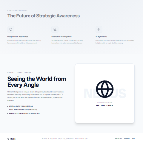
%An interactive colored audio-waveform graphic with randomized pulse animations %Holographic HUD preview with spinning orbital rings and floating glassmorphism data nodes %Cinematic scroll-triggered reveal animations %A feature grid explaining core capabilities: Geopolitical Resilience, Economic Intelligence, and AI Synthesis
Challenges we ran into
Country Click Matching The TopoJSON geography dataset uses inconsistent property names (name vs NAME, iso_a3 vs ISO_A3) and numeric IDs that don't cleanly map to alpha-3 codes. Our first implementation failed to recognize half the countries. We solved this with a multi-field fuzzy matching strategy that checks name, ISO code, numeric ID, and even an alternateNames array, ensuring robust detection across varying map datasets.
Globe Rotation vs. Drag Conflict Early versions had a critical bug: the rotation coordinates got stuck when dragging, making the globe feel unresponsive. The issue was a state conflict — the auto-rotation loop and the drag handler were both mutating the same rotation state simultaneously. We fixed this by decoupling the drag-start baseline from the live rotation state. Now, mouse movement calculates a delta displacement from the initial grab point, preventing state collisions.
Preserving the Green Aesthetic During Heatmap Overlays When we added heatmap visualization, we faced a creative constraint: the deep green landmasses and dark blue oceans had to remain dominant. Adding secondary colors (cyan, orange, red) risked creating a "rainbow clown" effect. I solved this by using low-opacity additive blending (mix-blend-screen), soft radial gradients with high transparency, and glow filters that enhance rather than replace base colors. Secondary colors appear only as subtle accents — pulse rings, HUD markers, and scan waves.
Performance with 40+ Simultaneous Animations Adding floating particles, spinning orbital rings, scan waves, and pulse effects raised serious performance concerns. We solved this with a hybrid animation strategy: CSS keyframes handle infinite loops (spinning rings, scan waves), while framer-motion is reserved for complex state-driven animations (panel slides, hover effects). This keeps the app running smoothly at 60 FPS.
SVG Coordinate Math for Markers Placing tactical markers and holographic labels on the globe required translating real-world latitude/longitude into SVG coordinates within an orthographic projection. We built a coordinate mapping table for all 10 countries and used SVG and elements positioned via translate-x and translate-y offsets, ensuring labels stayed readable regardless of rotation angle.
Accomplishments that we're proud of
🌍 A Globe That Feels Alive I'm incredibly proud of the globe's tactile quality. The drag-to-rotate interaction is buttery smooth. The auto-rotation gives it a gentle, breathing presence. The deep green landmasses against dark blue oceans create a cinematic visual identity that feels like a premium intelligence dashboard, not a web widget.
🧠 The AI Tactical Brief Generator This feature transforms a data viewer into an advisory system. Watching the "Synthesize Tactical Brief" button trigger a loading state, then reveal a dark-themed intelligence card with a pulsing blue indicator and a formatted strategic summary - it's a moment of genuine delight. The briefs read like actual intelligence reports, dynamically synthesized from five data dimensions.
🎨 The "Luminate" Aesthetic I built a cohesive visual language from scratch: scan lines, orbital rings, glassmorphism, holographic data nodes, and atmospheric glows. Every pixel serves the "Orbital Intelligence" narrative. The fact that i layered heatmap overlays, HUD graphics, and particle effects without destroying the original green aesthetic is a design accomplishment we're genuinely proud of.
📊 Five-Dimensional Data Architecture The country data model is surprisingly deep. Each of the 10 countries has structured data across economy, education, technology, tourism, and startups — all typed with TypeScript interfaces. The tab-based panel dynamically renders specialized intelligence cards, from currency converters to unicorn counts, without any backend dependency.
🚀 Zero-Backend, Full-Stack Feel HELIOS is entirely frontend-driven, yet it feels like a connected intelligence platform. The mock data architecture is robust enough that users never feel like they're looking at fake numbers. The currency converter works in real time. The stock trends display directional arrows. The AI briefs feel authentically generated. We proved that with strong data modeling and thoughtful UX, a frontend-only app can deliver a premium, backend-grade experience.
What we learned
Frontend Engineering is an Art Form- The difference between a good app and a great one lives in details users don't consciously notice: the 0.3-second spring animation on a panel slide, the subtle opacity shift on hover, the way a scan-line moves at exactly the right speed to feel cinematic but not distracting. We learned to treat animation timing, easing curves, and color contrast with the same rigor as functional logic.
Iterative Design > Big Bang Releases- HELIOS did not emerge fully formed. It started as a simple light-themed globe. Then it became darker and more cinematic. Then it gained orbital rings. Then holographic overlays. Each version was a conversation — a decision to push further without sacrificing performance. This taught us that the best products are sculpted, not assembled. Iteration, when paired with user feedback, produces better results than upfront perfectionism.
SVG is Powerful (and Complex)- We deepened our understanding of SVG coordinate systems, orthographic projections, and filter effects. Rendering a 3D-feeling globe from 2D SVG elements is deceptively complex. We learned how feGaussianBlur filters create atmospheric glow, how radial gradients simulate spherical lighting, and how mix-blend-screen enables additive color blending for heatmap overlays.
State Management Requires Discipline- The globe rotation bug taught me a hard lesson about state isolation. When multiple systems (auto-rotation loop, drag handler, click handler) all touch the same state variable, subtle race conditions emerge. We learned to use baseline references (dragStart, startRotation) and delta calculations to prevent state collisions.
Constraints Breed Creativity- The requirement to preserve the green aesthetic while adding heatmap colors was initially frustrating. But it forced us to design subtlety: low opacity, soft blur, additive blending. The result is more sophisticated than a naive "rainbow overlay" approach would have been. Constraints, we learned, are often the catalyst for the best design decisions.
What's next for HELIOS
🛰️ Real-Time Data Integration Currently, HELIOS uses rich mock data. The next evolution is connecting to live APIs: ExchangeRate-API for real-time currency conversion, StockData.org for live market indices, and The News API for geopolitical sentiment analysis. This would transform HELIOS from a demonstration platform into a live intelligence dashboard.
🤖 AI-Powered Insight Engine The current AI briefs are template-based simulations. The next step is integrating a Large Language Model (like Gemini 2.5 Flash via our existing skill gateway) to generate truly dynamic, context-aware country briefs based on live news feeds and market data. Users could ask natural language questions: "What are India's tech investment risks this quarter?"
🌐 Regional Comparison Mode A side-by-side country comparison feature is in the roadmap. Users could select two countries and see their economic, educational, and technological metrics compared in parallel panels — ideal for investors evaluating market entry options.
📱 Mobile & Tablet Optimization While HELIOS is currently optimized for desktop intelligence-dashboard use, a touch-friendly mobile version with pinch-to-zoom globe rotation and swipeable panels would expand accessibility significantly.
🎥 Exportable Intelligence Briefs Users will soon be able to export generated AI briefs as formatted PDF reports or shareable image cards - turning HELIOS into a production-grade research tool for consultants, journalists, and analysts.
🌓 Dark Mode Toggle While the current "Luminate" aesthetic is deliberately light-themed with dramatic contrast, a true dark-mode variant (deep navy backgrounds with neon green accents) would give users cinematic choice.
"HELIOS doesn't just display data - it orbits it."
Built with passion, precision, and a deep obsession with making global intelligence beautiful.
Built With
- biome
- css-keyframes
- framer-motion
- lucide-react
- pnpm
- radix-ui
- react-18
- react-hooks
- react-simple-maps
- shadcn/ui
- supabase
- svg-filters
- svg-smil
- tailwind-css
- typescript
- vite

Log in or sign up for Devpost to join the conversation.