-
-
Heatshield
HeatShield 26
Inspiration
Houston is preparing for increasingly large events while extreme heat remains a serious challenge for people moving through stadium districts, parking areas, transit stops, and surrounding neighborhoods.
The problem we noticed was not simply a lack of data. Houston already has information about heat, tree canopy, health and social vulnerability, cooling centers, transit, and infrastructure. The harder problem is that these datasets exist separately, making it difficult to answer a practical planning question:
Where should Houston invest limited resources to protect the most people from extreme heat during a major event?
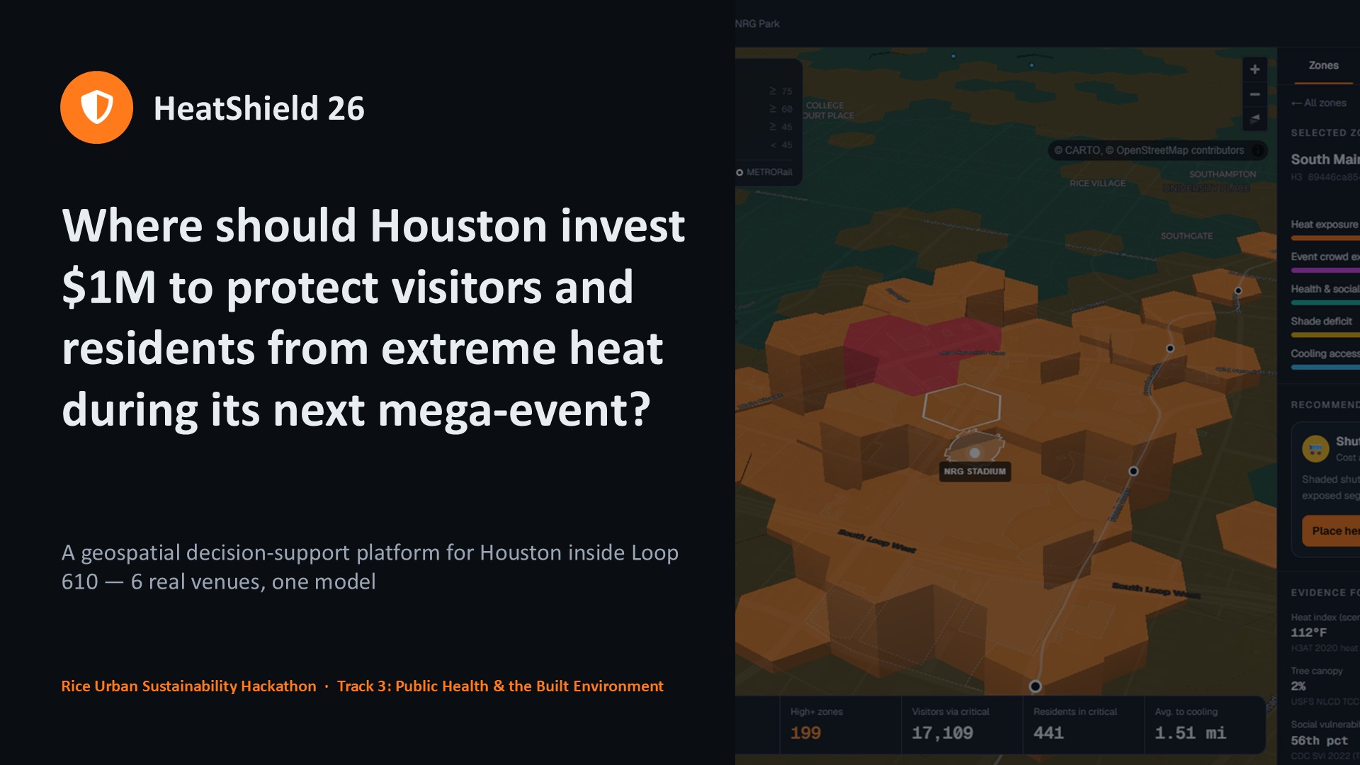
That question inspired HeatShield 26, a geospatial decision-support platform that combines heat exposure, event crowds, vulnerability, shade, and cooling access into one interactive planning system.
Instead of only showing where Houston is hot, HeatShield 26 helps planners explore what they can do about it.
What it does
HeatShield 26 divides Houston inside Loop 610 into roughly 3,400 H3 hexagonal cells, each covering approximately 0.1 km².
For each cell, we calculate a transparent Heat Event Risk Index:
$$ R = 0.40H + 0.25C + 0.20V + 0.10S + 0.05A $$
where:
- $H$ = heat exposure
- $C$ = event crowd exposure
- $V$ = health and social vulnerability
- $S$ = shade deficit
- $A$ = cooling-access deficit
Water and misting interventions can then apply an additional protective factor to the resulting risk.
Rather than treating this score as a medical prediction, we use it as a decision-support composite. Every component is normalized to a 0–100 scale, and the assumptions and weights are exposed to the user.
Users can choose among six Houston venues:
- NRG Stadium
- Daikin Park
- Toyota Center
- Shell Energy Stadium
- TDECU Stadium
- Rice Stadium
They can then modify attendance, temperature, humidity, time of day, transportation patterns, and tailgating assumptions to simulate different event conditions.
HeatShield 26 recalculates risk and displays the results through an interactive 2D or 3D geospatial map.
But identifying risk is only the first half of the problem.
Users can simulate interventions such as:
- cooling hubs
- shade installations
- water and misting stations
- shuttle changes
The platform compares conditions before and after those interventions and estimates changes in critical zones, visitors routed through high-risk areas, affected residents, and access to cooling.
A budget optimizer can then take a limited budget and generate a cost-effective portfolio of interventions.
For example, under our default NRG Stadium scenario, the $1 million optimizer selects a combination of interventions totaling approximately $990,000, reducing modeled critical zones from 3 to 0 and modeled visitors routed through critical zones from 17,109 to 0, under the project's stated scenario assumptions.
How we built it
HeatShield 26 combines multiple open datasets into a single geospatial pipeline.
Our data sources include:
- HARC / ForUsTree HTX modeled heat measurements
- CDC/ATSDR Social Vulnerability Index
- CDC PLACES health indicators
- U.S. Forest Service tree-canopy data
- City of Houston cooling-center information
- METRO rail infrastructure
- H-GAC transportation data
- OpenStreetMap
- City of Houston Super Neighborhoods
- published venue information
A Node.js data pipeline retrieves, cleans, normalizes, spatially joins, and converts these sources into H3 cells.
The processed dataset is shipped directly with the application as compact JSON.
The frontend is built with Next.js and TypeScript, while MapLibre GL powers the interactive geospatial visualization.
Risk scoring and intervention simulation run directly in the browser. This keeps interactions fast: evaluating the full grid takes only a few milliseconds in our tests, while a typical $1 million optimization scenario completes in roughly 100 milliseconds.
We also integrated Google Gemini, with a Groq fallback, for one carefully scoped AI feature: explaining why a particular intervention is being recommended.
Importantly, AI does not calculate the Heat Event Risk Index or determine the underlying simulation results. Those calculations remain deterministic and inspectable. The model receives the computed facts and turns them into a concise planning explanation.
Challenges we faced Combining incompatible datasets
The biggest challenge was not building the map. It was making datasets collected at different geographic scales, resolutions, years, and formats work together responsibly.
Heat measurements, census tracts, tree canopy, transit infrastructure, venue locations, parking areas, and health indicators do not naturally line up.
H3 became our common spatial framework, allowing us to associate these different sources with consistent geographic cells.
Handling incomplete heat measurements
Heat data did not provide perfect coverage.
Rather than silently filling missing values, we evaluated interpolation against simpler median filling using spatial cross-validation and only used interpolation where it performed better.
We also discovered that the 2020 and 2024 heat campaigns disagree substantially in areas where they overlap. Because of that, we chose not to blend them as though they represented identical measurements. The 2020 dataset remains primary, while 2024 helps fill missing coverage.
Modeling crowds without pretending to know exact human movement
Event crowd behavior is inherently uncertain.
Instead of presenting our routing as observed human movement, HeatShield 26 treats crowd movement as a scenario model based on venue entrances, nearby parking, rail stations, transportation assumptions, attendance, and event characteristics.
This distinction became an important part of the project: **assumptions should be visible rather than hidden behind a polished visualization.
Turning risk into decisions
A heat map alone does not tell a planner what to build.
We therefore had to move from:
Where is risk high? to: What intervention should go there, what could it change, and how should a limited budget be allocated?
That led to the intervention simulator, cost-effectiveness calculations, priority rankings, and budget optimizer.
What we learned The biggest lesson from HeatShield 26 was that useful civic technology requires more than adding AI to a dataset.
We learned how to combine geospatial datasets with different resolutions and limitations, build H3-based spatial models, model event-specific crowd exposure, perform spatial validation, create interactive MapLibre visualizations, and translate optimization results into an interface that nontechnical users can explore.
We also learned the importance of separating measured data, modeled estimates, and scenario assumptions.
A sophisticated visualization can create a false sense of certainty if those distinctions are hidden. We therefore made methodology, component scores, assumptions, evidence, and limitations visible throughout the application.
What's next
HeatShield 26 currently uses major Houston venues as its primary event scenarios, but the underlying idea is broader.
The same planning layer could support:
- stadium events
- festivals
- marathons
- outdoor concerts
- emergency cooling operations
- neighborhood heat-resilience investments
Future versions could incorporate live weather forecasts, pedestrian mobility information, additional event types, improved optimization methods, real intervention cost data, and post-event observations for validating predictions.
Our long-term goal is to move from simply asking:
Where is Houston hottest?
to asking:
Given a limited budget and an upcoming event, where can Houston act now to reduce the greatest amount of heat exposure?
HeatShield 26 turns fragmented urban data into an actionable planning tool for building a safer, more heat-resilient city.

Log in or sign up for Devpost to join the conversation.