-
-

Website
-
Website
-
Website
-
Website
-
Canvas Blocks
Inspiration
Extreme heat is one of the deadliest weather hazards in the United States, but most people still think about it only in terms of temperature. We wanted to ask a better question: can we identify which counties are most likely to face dangerous heat conditions before a heat emergency happens by combining forecast weather, air quality, community vulnerability, and historical event patterns into one system?
What it does
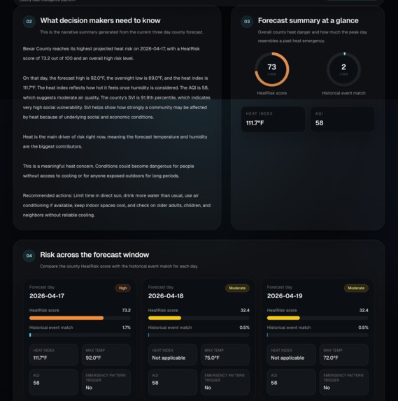
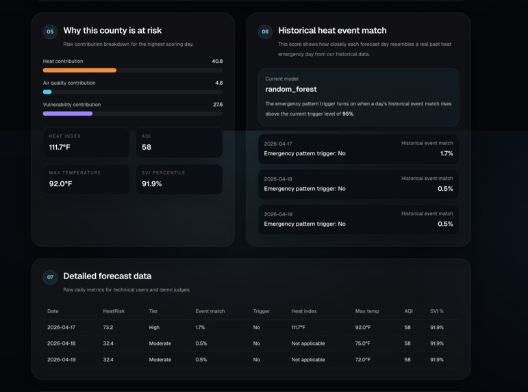
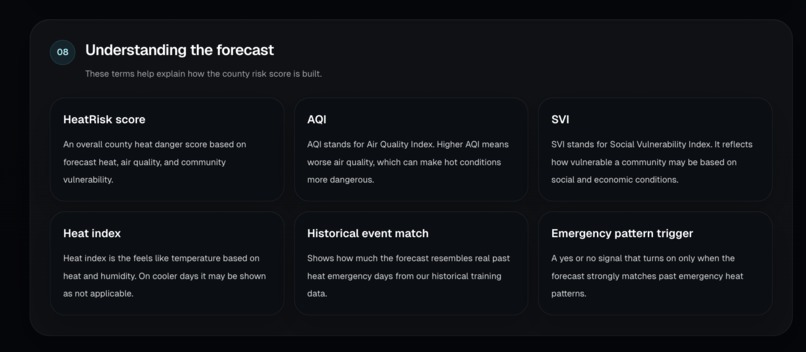
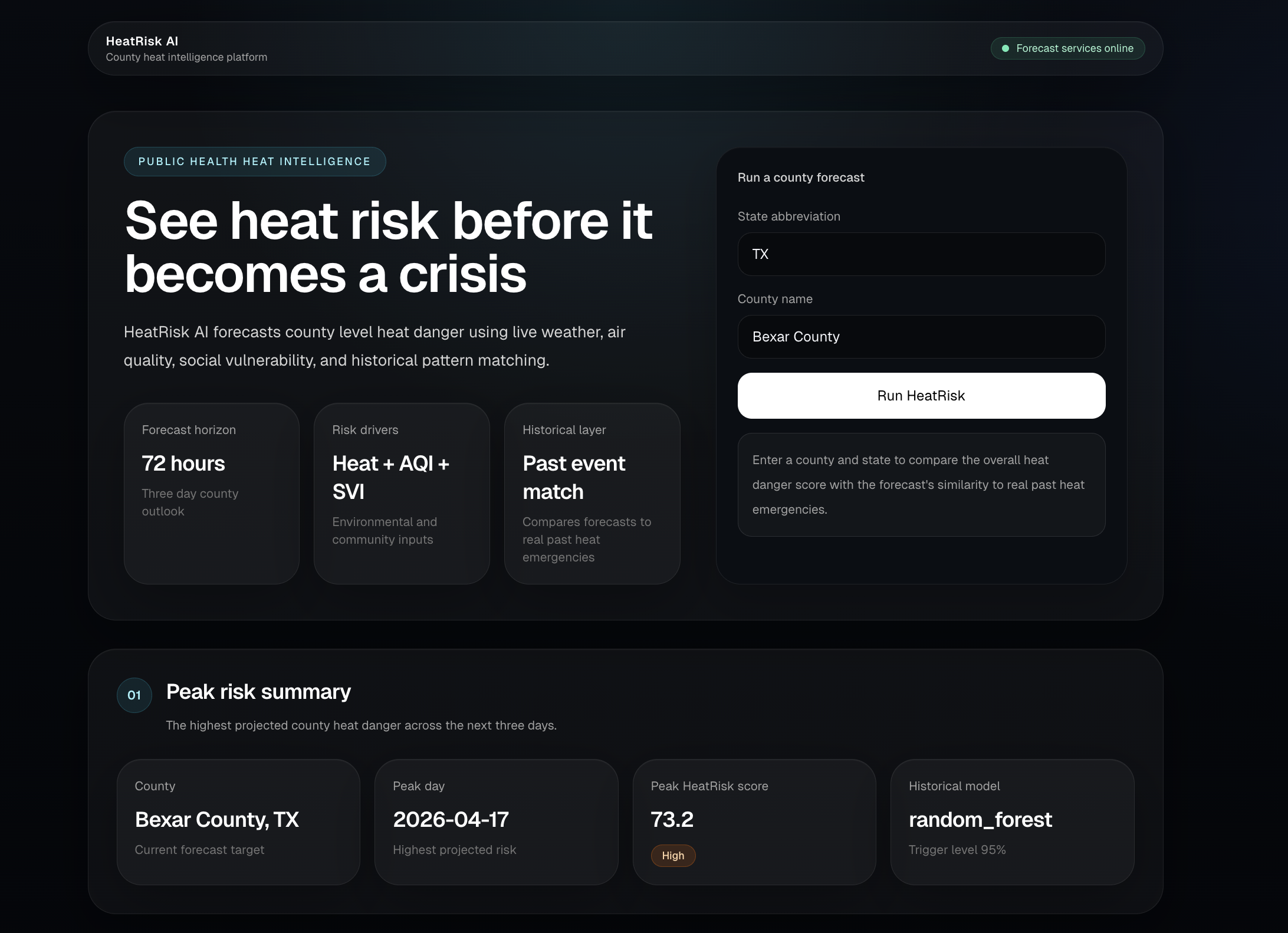
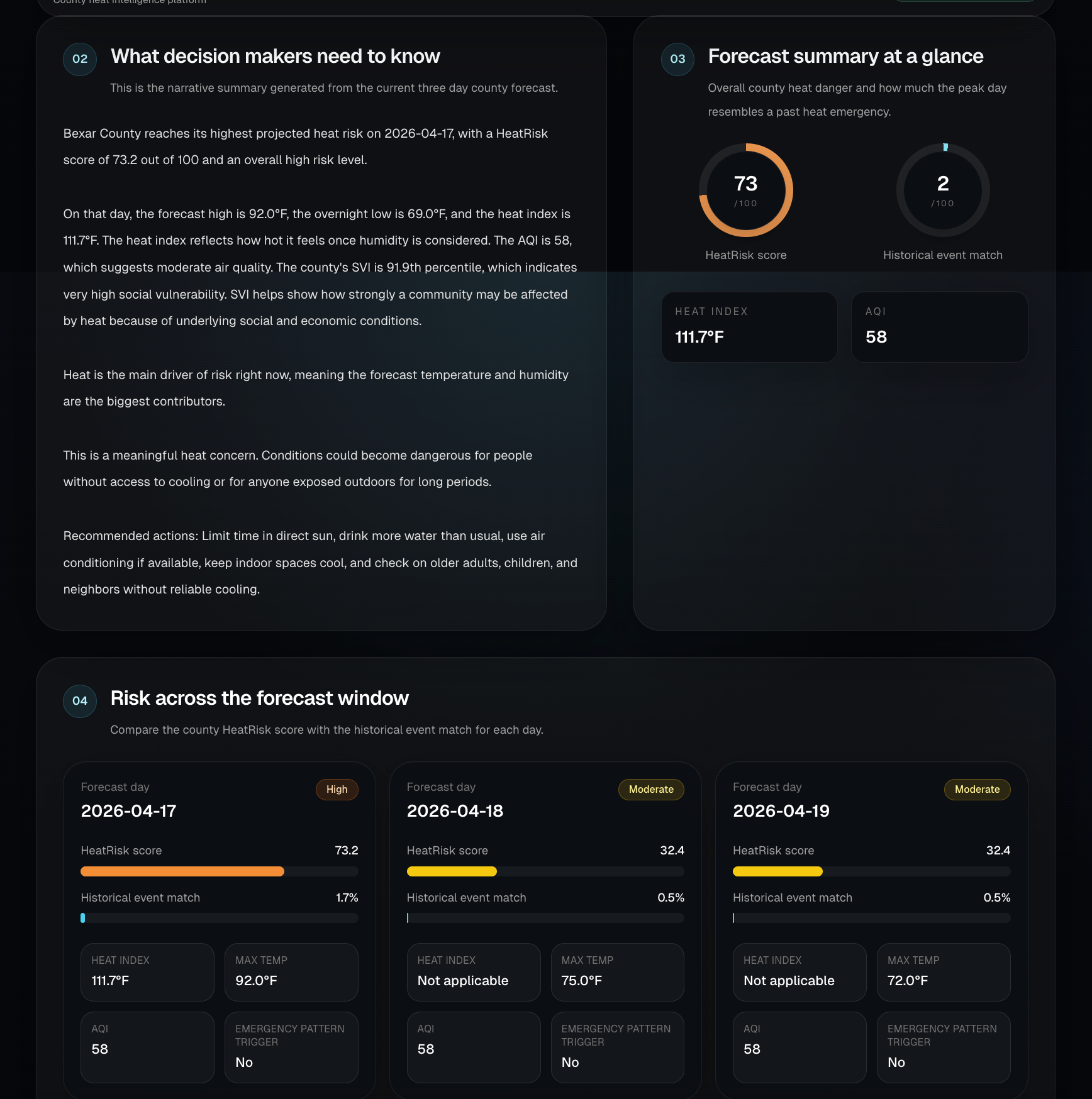
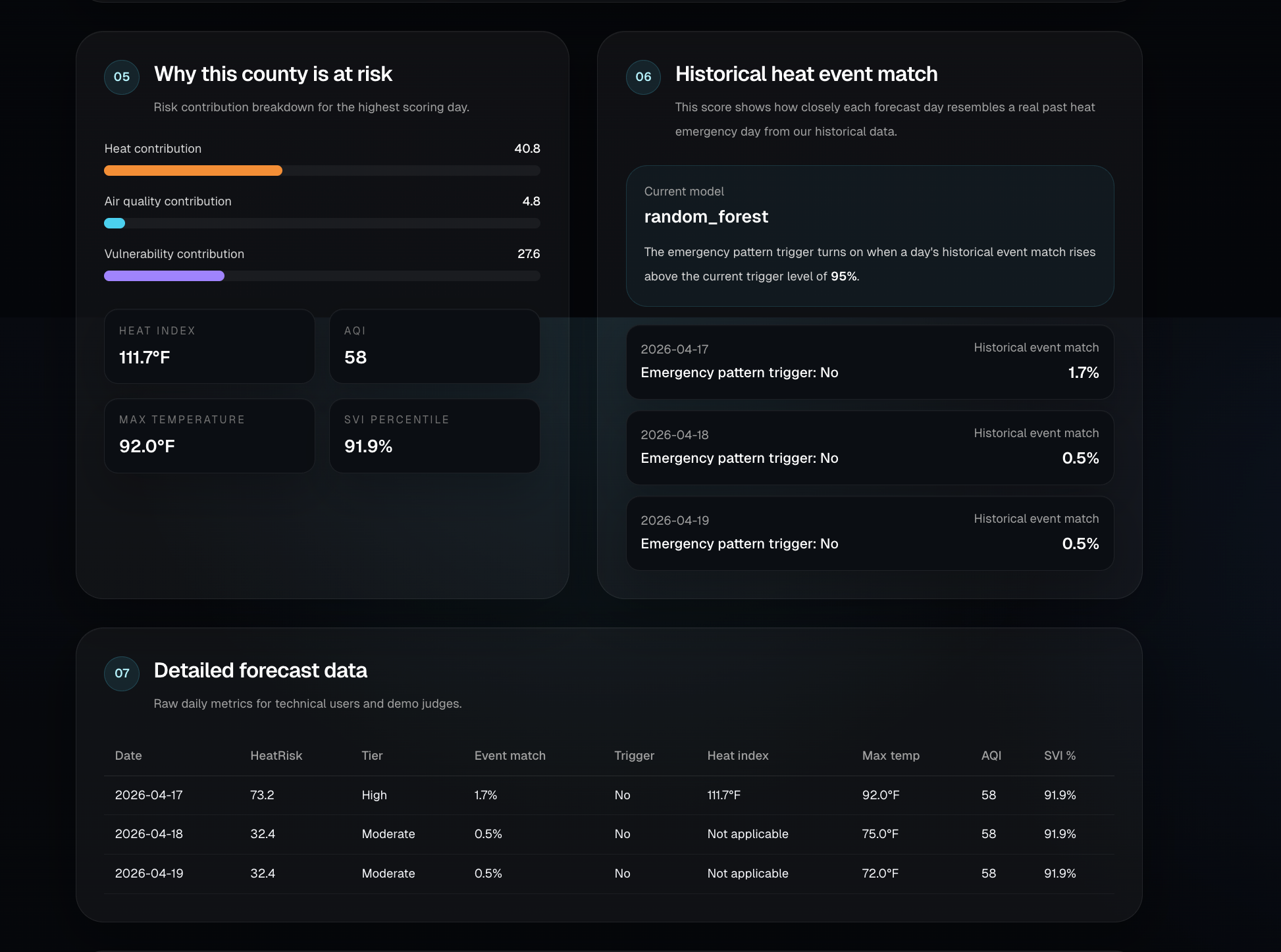
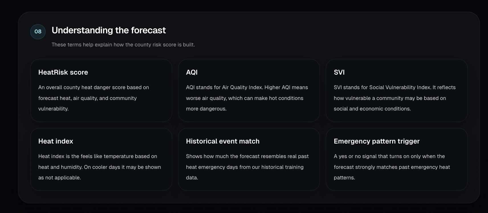
HeatRisk AI forecasts county level heat danger for the next 72 hours. A user enters a county and state, and the system combines live weather forecast data, air quality, and CDC Social Vulnerability Index data to generate a HeatRisk score, severity tier, and executive briefing. It also includes a historical event match model that estimates how closely each forecast day resembles a real past heat emergency day.
Project summary
What question did we ask?
Can we predict which U.S. counties are most at risk of a heat emergency before the worst conditions arrive by combining forecast weather, AQI, social vulnerability, and historical event patterns?
What did we find?
We found that heat risk becomes much more useful when it is treated as a public health problem instead of just a temperature problem. Weather, air quality, and social vulnerability each explain part of the story, and a trained model helps identify forecast days that resemble real historical heat emergency conditions. Our final system uses both a transparent HeatRisk score for overall county danger and a learned historical event match signal for stricter emergency pattern detection.
Why does it matter?
This matters because the same heat forecast does not affect every county the same way. Air quality, overnight heat, and community vulnerability can make similar temperatures much more dangerous in one place than another. HeatRisk AI gives emergency managers, public health teams, and local communities earlier and more actionable insight so they can prepare resources, target outreach, and respond before conditions become severe.
How we built it
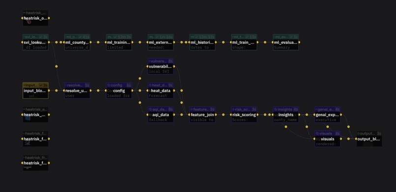
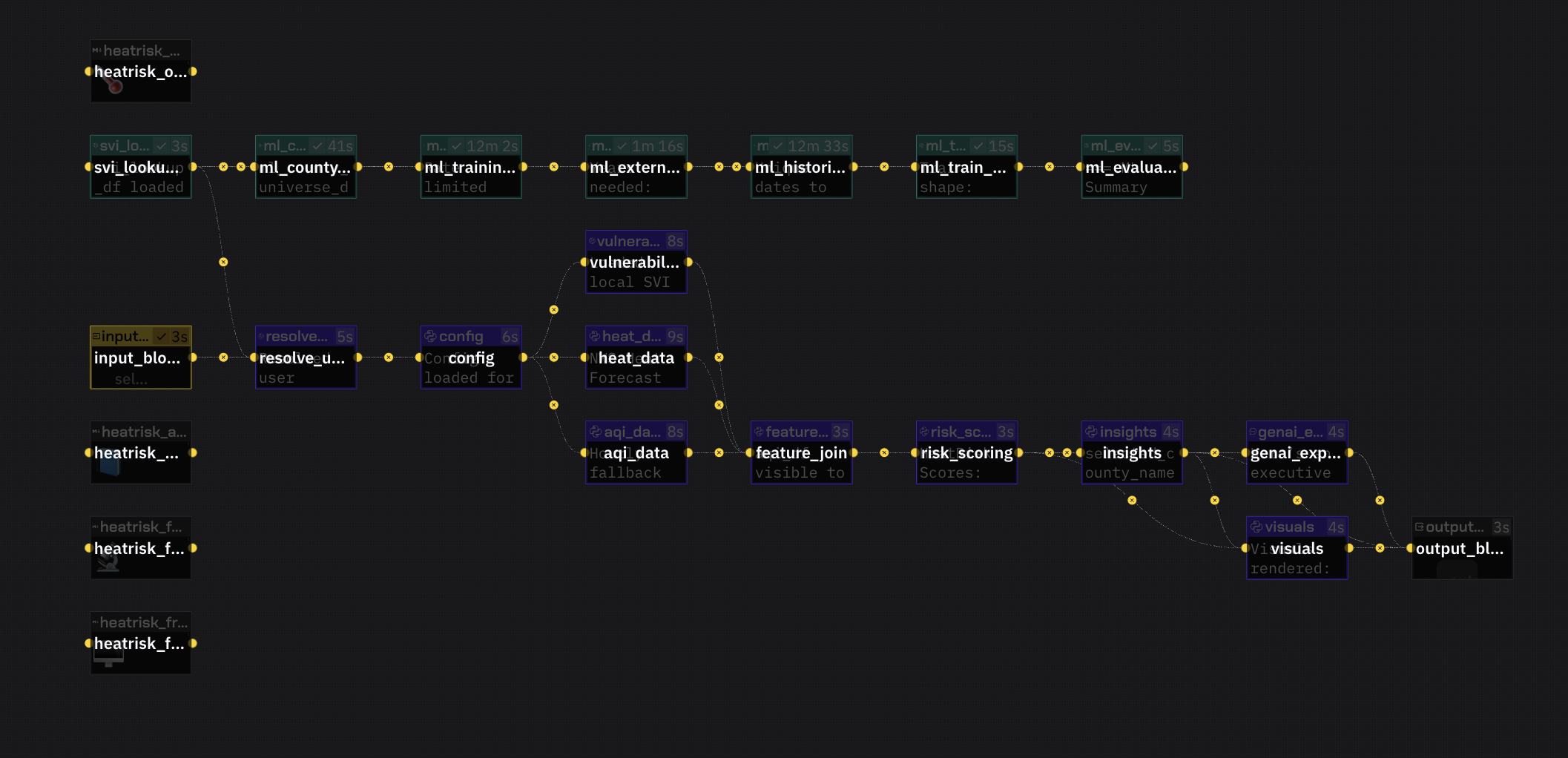
We built the backend in Python with FastAPI and created endpoints for county scoring, forecast data, AQI lookup, vulnerability lookup, and health checks. We resolved counties dynamically using FIPS and Census county centroids, then pulled live forecast data from the National Weather Service, AQI data from AirNow, and county vulnerability features from the CDC SVI dataset.
For the machine learning pipeline, we built a historical county day training dataset, labeled it against NOAA Storm Events heat and excessive heat events, engineered weather, AQI, vulnerability, and interaction features, and trained both logistic regression and random forest models. We then integrated the final model into the live API so the app returns both a HeatRisk score and a historical event match signal. The frontend was built in Next.js and TypeScript as an interactive county level dashboard.
Challenges we ran into
One of the biggest challenges was building a training dataset that was large enough and realistic enough to generalize well. Early versions looked strong on smaller data but did not hold up once we expanded county coverage and labels. We improved this by increasing historical label coverage, adding historical AQI features, and tuning the model threshold for a more useful precision recall tradeoff.
We also had to solve several infrastructure and product issues, including API rate limits, county resolution, CORS and frontend backend integration, feature alignment between training and live inference, and explaining machine learning outputs in a way that makes sense for nontechnical users.
Accomplishments that we're proud of
We built an end to end county level heat intelligence system that combines live environmental data with public health vulnerability context and machine learning. We expanded the historical training pipeline to 29,376 labeled county day rows with 468 real historical heat event positives, and added historical AQI coverage to almost the full dataset.
Our current random forest model achieved 0.9854 ROC AUC and 0.7348 average precision on held out evaluation. At the selected threshold, it reached 71.3 percent precision, 66.0 percent recall, and 0.685 F1, which was a major improvement over the broader rule based baseline.
What we learned
We learned that data quality and label quality matter just as much as model choice. We also learned that users need both interpretability and predictive power. That is why we kept the transparent HeatRisk score and the historical event match model together instead of replacing one with the other.
What's next for HeatRisk AI
Next, we want to expand county coverage further, improve historical label diversity across more regions, refine the executive briefing and public facing explanations, and continue improving the dashboard with stronger alerting, visualizations, and decision support features for emergency managers and local communities.
Built With
- cdc-social-vulnerability-index
- epa-airnow
- fastapi
- next.js
- noaa
- noaa-national-weather-service-api
- numpy
- pandas
- python
- react
- requests
- scikit-learn
- storm
- tailwind-css
- typescript
- u.s.-census-tigerweb
- zerve


Log in or sign up for Devpost to join the conversation.