-
-
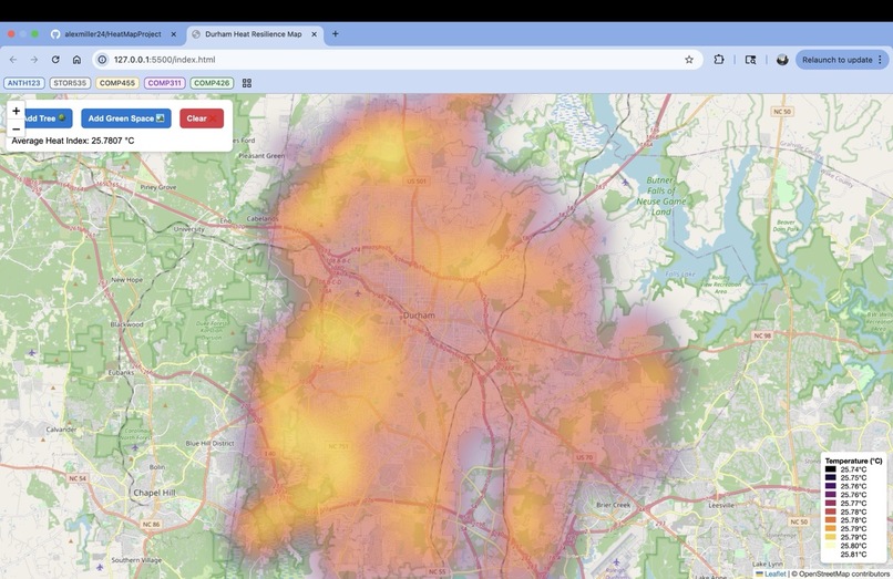
1x zoom
-
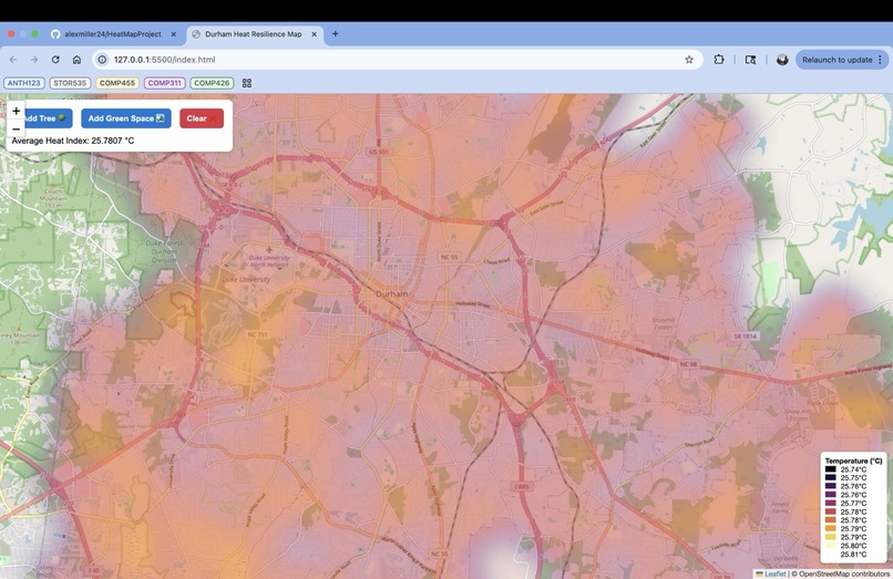
2x zoom
-
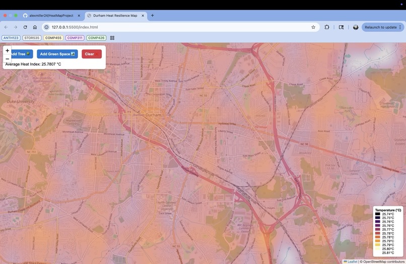
4x zoom
-
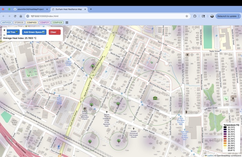
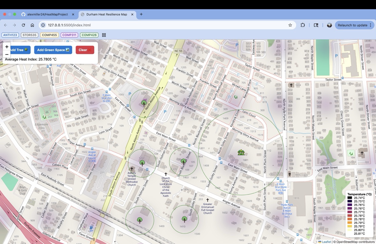
8x zoom with trees and green spaces added


Inspiration
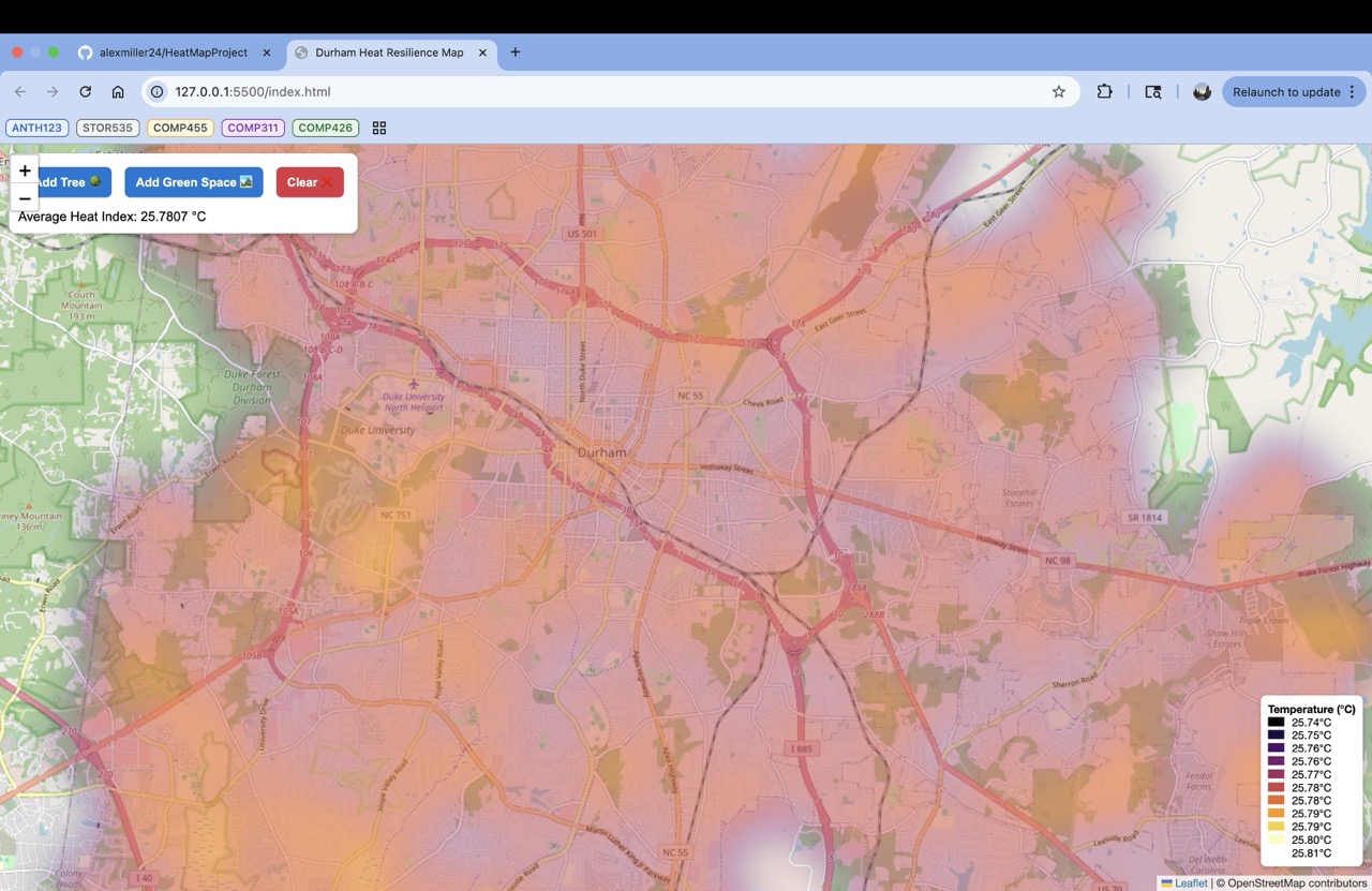
While scrolling through the HackNC tracks, the Data-Driven EnviroLab × School of Data Science & Society: Climate Action in North Carolina challenge immediately caught our attention. We started this project after learning that in Durham, some neighborhoods can be 7 degrees hotter than others all because they have fewer trees and more pavement. So we asked, "what if people could see that difference and fix it themselves?" That's how we came up with the idea to create an interactive map where you can add trees or parks and instantly see how they help cool down the surrounding area.
What it does
Our project visualizes how heat impacts different parts of Durham, NC. The map lets users see real temperature data and experiment by adding trees or parks to simulate how those green spaces could cool nearby areas. There is also a legend that helps visualize how hot or cold some of these areas are as well as an average heat index of the entire city.
How we built it
Firstly, we cleaned the data that was provided in order to save space for storage and converted it into a CSV file. Then, we created an HTML file with the CSS styling and JavaScript functionality all in one file. We used Leaflet.js for the interactive map, Leaflet.heat for the live heatmap, PapaParse to load and process the temperature data. We also normalized the intensity of each heat point as well as calculated the actual temperature drop of adding a tree or a green space.
Challenges we ran into
Some challenges we ran into was gradient used for the heat map, which originally was blue to yellow. This was hard to see, especially since the map background was green. We were able to fix this by using an inferno gradient which is very common for showing heat across an area. Another problem we ran into was that the temperatures were so close to each other, it was hard to differentiate the temperatures. The way we fixed this was that we messed with the percentiles in order to change how sensitive the colors were to temperature values.
Accomplishments that we're proud of
We are both proud of being able to build an entire interactive simulator in one self-contained HTML file. As well as being able to create a simple but powerful way to communicate climate action visually. Also, we are proud that this is our first ever hackathon submission.
What we learned
We learned how to implement scripts into HTML to create functionality. We learned how to build an interactive data app without a framework. We also learned how small tweaks in visualization can completely change what people understand from a dataset.
What's next for HeatMap Project
Next, we will add a way to see live weather data using an API. Then, we can add larger sized green projects for users to add in such as a community garden or park. Later in the project, we can expand to more than just the city of Durham and go to a whole county. Lastly, our plan is to deploy it online using Vercel so anyone can explore and learn how green spaces can make cities cooler.


Log in or sign up for Devpost to join the conversation.