Inspiration
My primary motivation for starting this project is to land a job at Google.
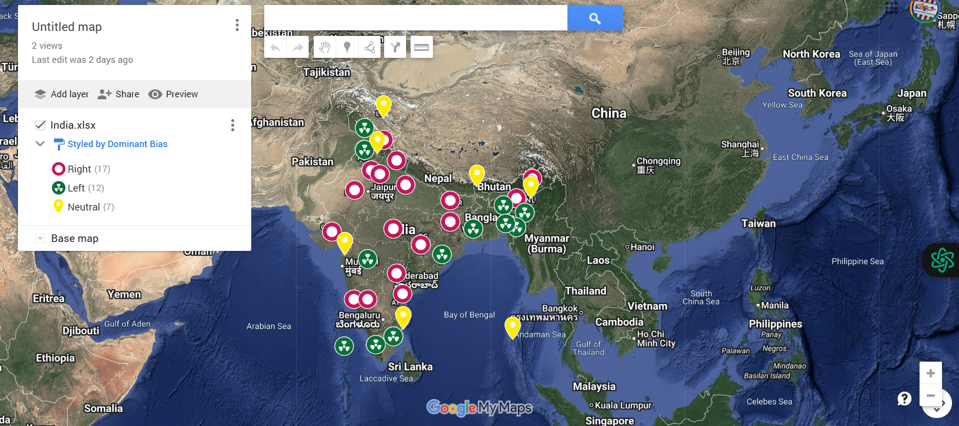
What it does
This project helps people gain an overview of the political bias of each state based on the day's news.
How we built it
Information Gathering From reliable news sources, we collected daily news articles about every Indian state. To ascertain whether the sentiment represented a left-leaning (negative) or right-leaning (positive) political bias, the content was processed using natural language processing (NLP) techniques.
The Structure of Data The following crucial columns were included in the structured CSV/Excel file that contained the sentiment results:
State: The Indian state's name Dominant Bias: The political bias identified for the day, such as "Left-Leaning," "Right-Leaning," or "Neutral."
Summary: Optional extra details or noteworthy news
Using Google My Maps to Visualize Maps With Google My Maps, we
The CSV file was imported. Each state was mapped using the "State" column as the geographic reference.
The map pins were labeled and color-coded using the "Dominant Bias" column.
This made it possible to create a state-by-state interactive visual depiction of political sentiment in India.
Personalization
Based on bias, we gave the pins different colors ( Blue for left, Red for right, Gray for neutral).
added headlines and summaries to provide users with background information on the reasons behind a state's classification.
Challenges we ran into
Data Consistency: It was challenging to make sure that the location names in the CSV matched the names of places that Google Maps recognized. Some placemarks did not appear correctly due to misspellings or variations.
Geocoding Limitations: Google Maps sometimes struggled with ambiguous or less common locations, leading to incorrect or missing pins on the map.
Data Formatting: Preparing the CSV with the correct columns and formatting so that Google Maps could import and interpret the data properly required careful attention.
Large Dataset Performance: Importing very large datasets caused slow map rendering or occasional timeouts, necessitating data chunking or simplification.
Accomplishments that we're proud of
Accurate Mapping: Using CSV data, the placement of geographic markers was successfully automated, simplifying the visualization of complex location data.
Clear Data Visualization: Made it possible for easily understood, labeled map pins that quickly highlight important information, improving data comprehension.
User-Friendly Process: A simple import workflow was developed that saves time and minimizes errors by requiring little manual input.
Scalability: created a technique that preserves map performance and clarity even when dealing with datasets of different sizes.
What we learned
We learned the importance of clean, accurate location data for effective mapping, how to use Google Maps for visualizing data, and how to balance map detail with performance for the best user experience.
What's next for Heat Maps
We plan to enhance the heat maps by integrating real-time data updates, adding customizable filters for deeper analysis, and improving interactivity to help users explore patterns more easily.
Built With
- cloud.
- csv
- data
- databases:
- files
- geocoding
- location
- mapping
- pinning
- visualization


Log in or sign up for Devpost to join the conversation.