Inspiration
California is getting hotter, and it is getting hotter faster than it used to. Statewide average temperatures have risen about 2.5°F since 1895, and nine of the ten warmest years on record have come since 2014. Summers have warmed about 3°F since 1896, and more than half of that has happened since the early 1970s. Nights are warming faster than days, which gives people and neighborhoods less time to recover from the heat.
But a statewide average hides who actually feels it. On the same afternoon, a block with mature street trees can be dramatically cooler than a block of bare asphalt and dark rooftops a mile away. Concrete and asphalt soak up heat and give it back after sunset, so the hottest neighborhoods tend to stay hot. Many households, especially lower-income ones, can't afford to cool their homes enough to stay safe.
We kept coming back to one question: if a city can only plant so many trees this year, where should they go? Most people can't see their own street's heat, and city planners rarely get a simple tool that ranks blocks by who needs relief the most. We built Heat Block to make that gap visible and to turn it into a plan.
What it does
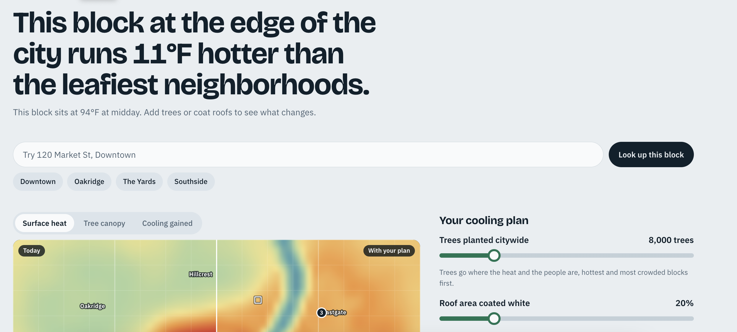
Heat Block lets you pick a block and see how much hotter it runs than the leafiest neighborhoods in town. Then you build a cooling plan and watch the map change.
- Look up a block by address or by clicking the map. The headline updates with the gap, for example: "Downtown runs 25°F hotter than the leafiest neighborhoods."
- Build a plan with sliders for trees planted and roof area coated white. A "what if we planted here" slider lets you plant on a single block.
- Compare today against your plan by dragging a handle across the map.
- See the city-wide effect: average temperature, the hottest 10% of blocks, residents living in 100°F+ zones, and an estimated cost.
- Get a ranked list of the five blocks where action matters most.
- Switch layers between surface heat, tree canopy, and cooling gained.
How we built it
Heat Block is a single self-contained web app built with HTML, CSS, and vanilla JavaScript. The map is drawn with the HTML Canvas API. The city is a 64 × 42 grid of 100-meter blocks, rendered at low resolution and smoothed when scaled up so it reads like a thermal image.
Trees and roof coatings are allocated greedily from the top of that list, so the hottest and most crowded blocks get cooled first. The demo city is generated with layered value noise, so every neighborhood has natural variation.
Challenges we ran into
- No live data in the demo. The hosted page can't call outside services, so we couldn't pull real satellite temperatures or look up real addresses. We built a fictional city with a simple, transparent model instead, and the page says so.
- A map that feels alive. Recomputing and redrawing every block on each slider move, plus the before-and-after compare handle, had to stay smooth.
Accomplishments that we're proud of
- A map you can explore and cool in seconds, with results that update as you drag.
- A ranking method that puts people first, not just temperature.
- Being upfront about what is simulated and what a real version would use.
What we learned
- How the urban heat island effect works, and how much tree canopy and roof color change surface temperature.
- How to generate a believable city with procedural noise and draw it on canvas so it looks continuous.
- How to design around one question, "where do we start?", instead of a wall of data.
Built With
- css
- google-fonts-(bricolage-grotesque
- html5
- javascript

Log in or sign up for Devpost to join the conversation.