-
-
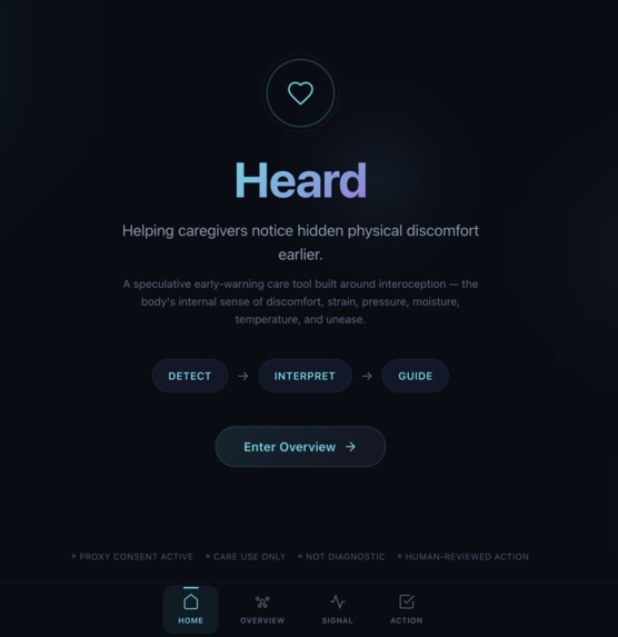
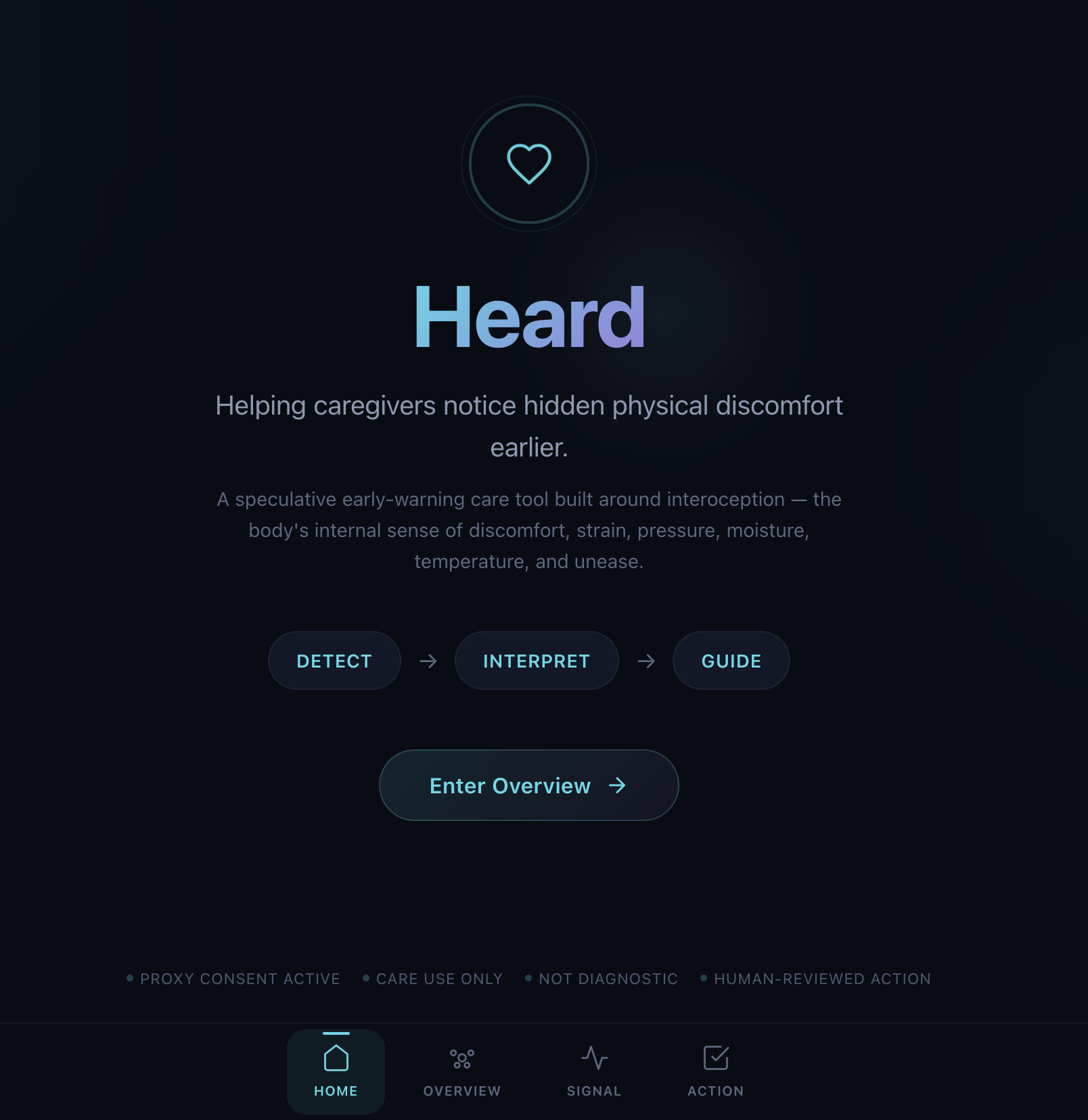
Homepage
-
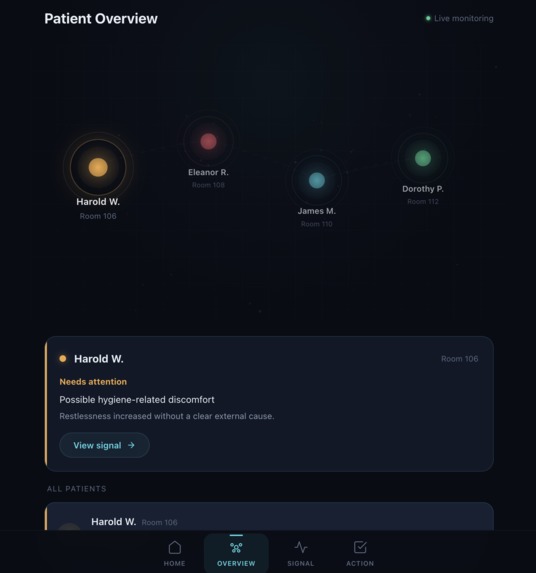
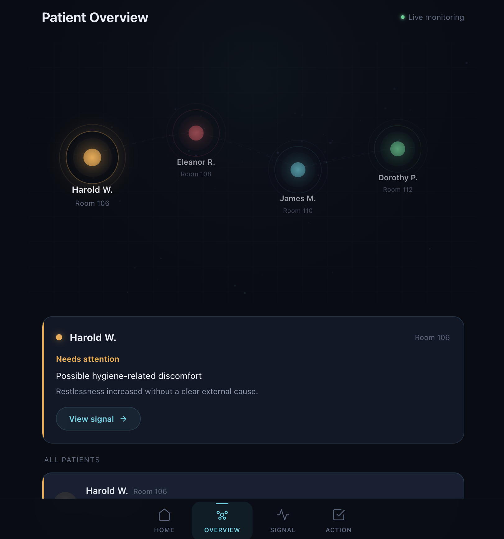
Patient Overview
-
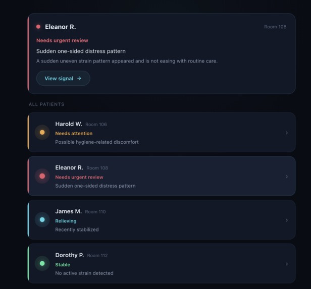
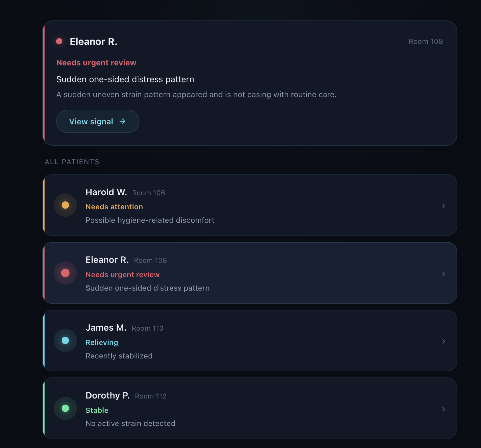
Patient Overview Scrolled Down
-
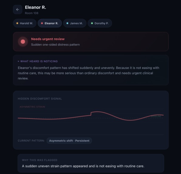
Patient Summary with Action Summary
-
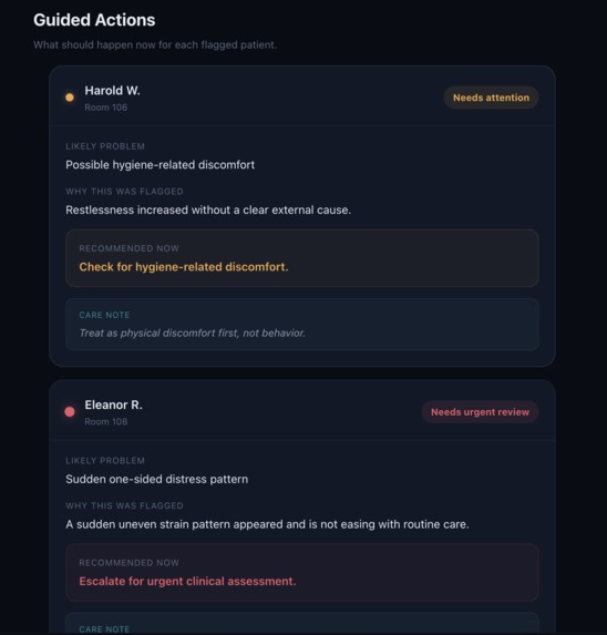
Action Summary

Inspiration
We started with a simple problem: some patients are in real physical discomfort before it becomes obvious, and before they can clearly say what’s wrong.
In long-term care, dementia care, and post-stroke recovery, caregivers often have to rely on visible distress or spoken complaints. But hidden discomfort does not always show up that way. We wanted to imagine a tool that helps caregivers notice those quieter signals earlier.
What it does
Heard is a speculative early-warning interoception tool for nurses and doctors. It helps caregivers notice hidden physical discomfort earlier, even when patients cannot clearly say what is wrong.
It helps caregivers:
- see who needs attention
- understand what may be happening
- see why a case was flagged
- know what to do next
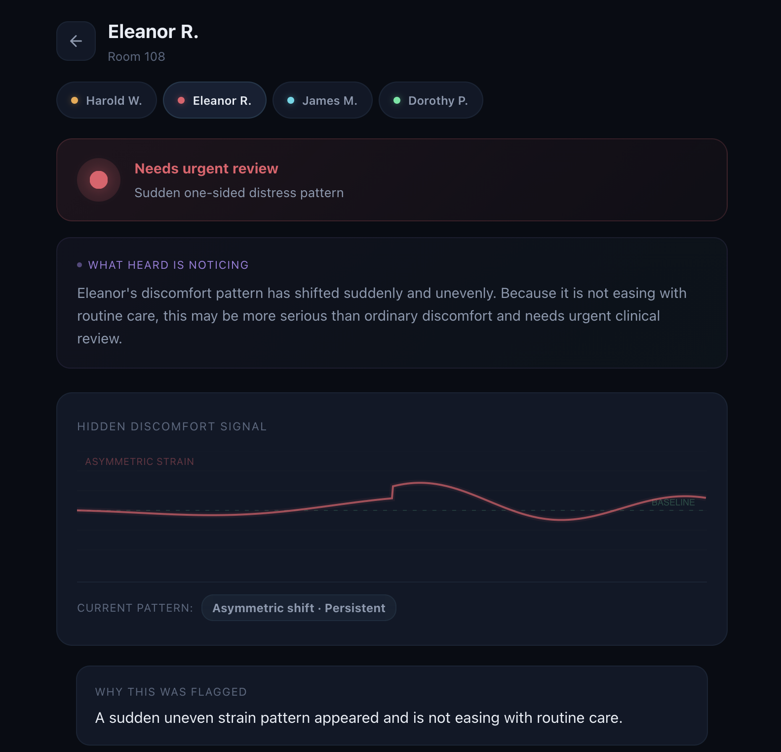
In our demo, Heard supports four patient stories:
- Harold: possible hygiene-related discomfort
- Eleanor: sudden one-sided distress pattern needing urgent review
- James: discomfort easing back toward baseline
- Dorothy: stable, no action needed
How we built it
We built Heard in the Figma ecosystem as a speculative software application and presented it through Figma Slides.
We kept the product flow simple:
- Overview shows who needs attention
- Signal explains what Heard is noticing
- Action shows what the caregiver should do next
We designed it to reduce overload. Instead of showing a lot of raw data, Heard focuses on four questions:
- Who needs attention?
- What does Heard think is happening?
- Why was it flagged?
- What should happen next?
Challenges we ran into
Our biggest challenge was balancing a strong concept with clear language.
At first, some of our labels were too technical. They made sense to us, but not to a normal person seeing the project for the first time. We had to rewrite a lot so the product felt smart without being confusing.
Another challenge was making sure Heard did not sound like a diagnosis tool. We wanted it to flag hidden discomfort patterns early without overclaiming what the system knows.
We also spent a lot of time making the UI feel both beautiful and useful.
Accomplishments that we're proud of
We’re proud that Heard feels original but still grounded in a real human need.
We’re especially proud of:
- building the concept around interoception
- keeping the interface simple and easy to follow
- creating four patient stories that show different types of use
- using plain language instead of hiding behind jargon
- designing the product with safeguards and restraint
We’re also proud that Heard is not just about urgent alerts. It can also show when care is working or when no action is needed.
What we learned
We learned that a good speculative product still has to be easy to understand.
We also learned that language matters a lot. Some of our biggest improvements came from replacing technical phrases with plain-English explanations.
Another big lesson was that strong UX usually comes from doing less, not more. We did not need more screens or more features. We needed a clearer flow and better prioritization.
What's next for Heard
Next, we would expand Heard in a few ways.
We would explore more patient cases, more care settings, and more ways the system could support caregivers without adding overload.
We would also look at other surfaces beyond a single app screen, like bedside displays or ambient care signals.
Most importantly, we would keep refining the ethics and safeguards around consent, visibility, and misuse.
The goal stays the same: help caregivers notice hidden discomfort sooner and support more dignified care.
Built With
- figma
- figmamake
- react
- recharts
- tailwindcss
- typescript

")


Log in or sign up for Devpost to join the conversation.