-
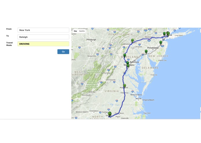
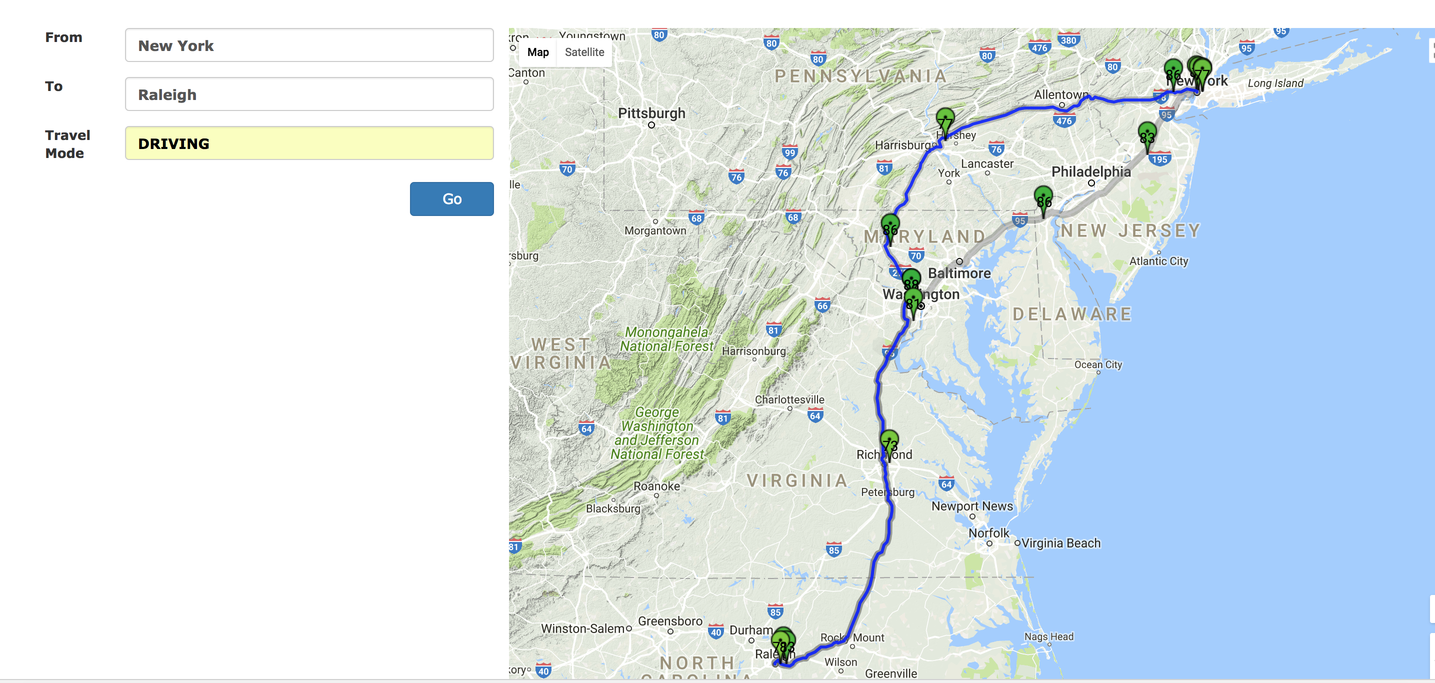
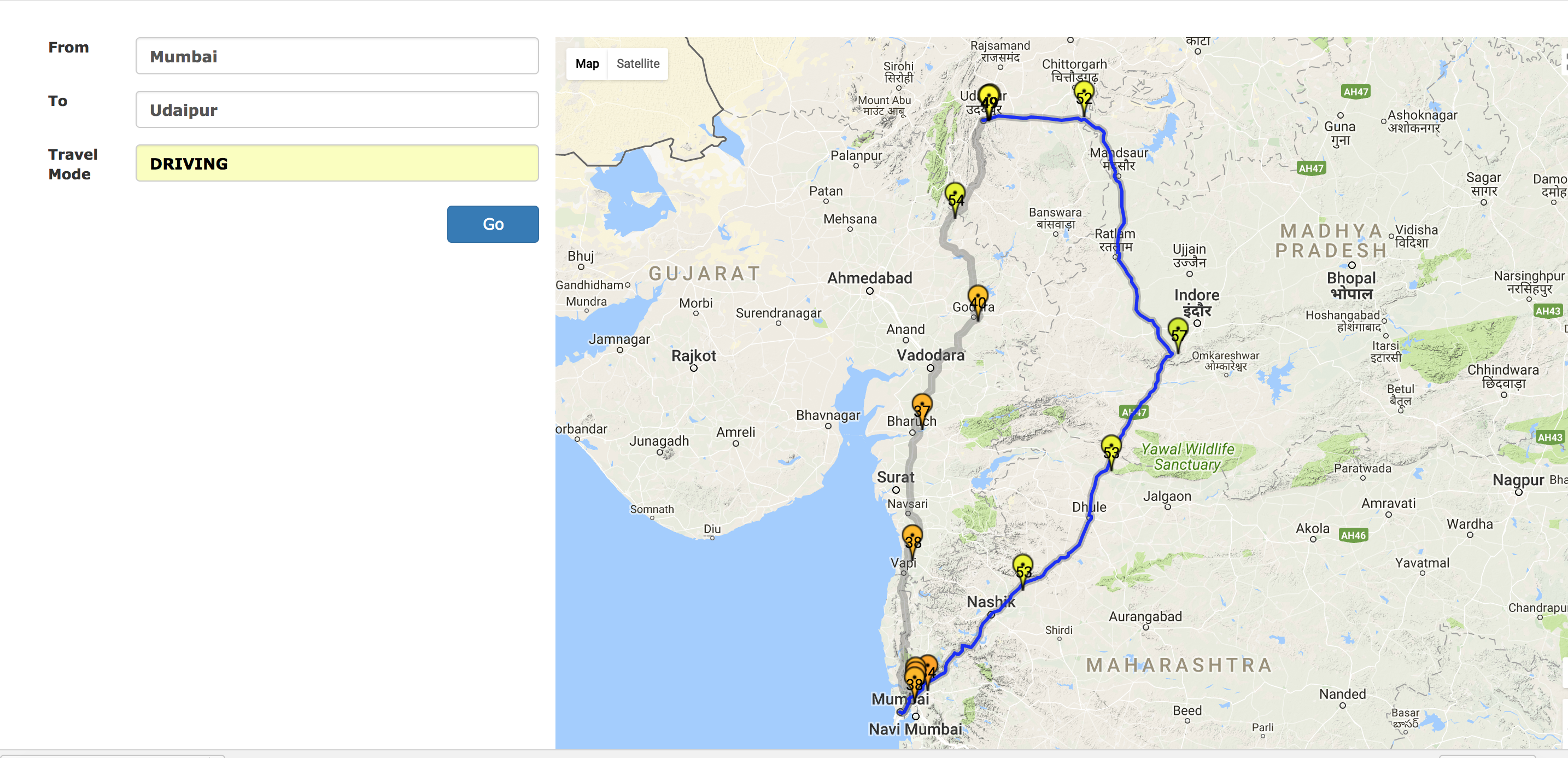
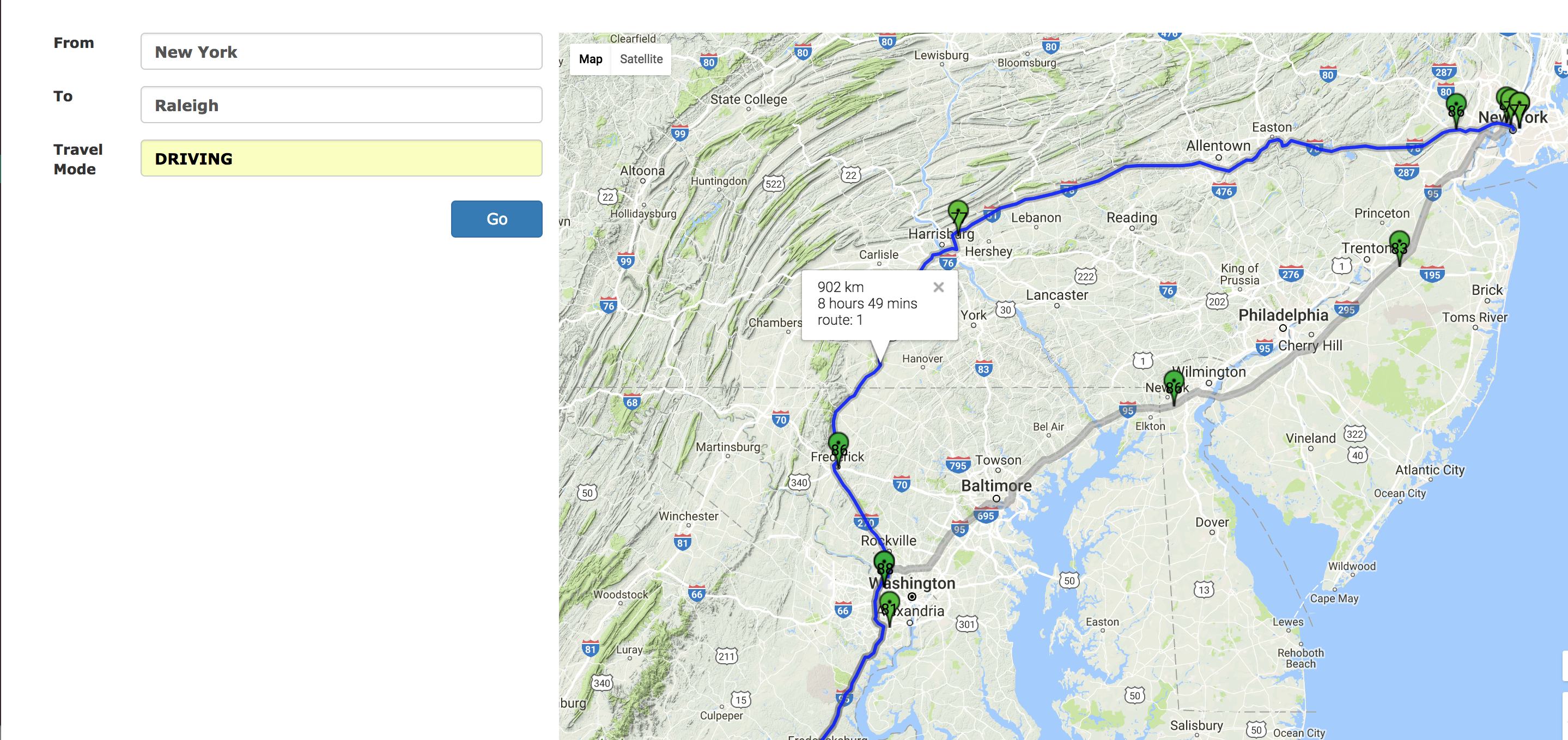
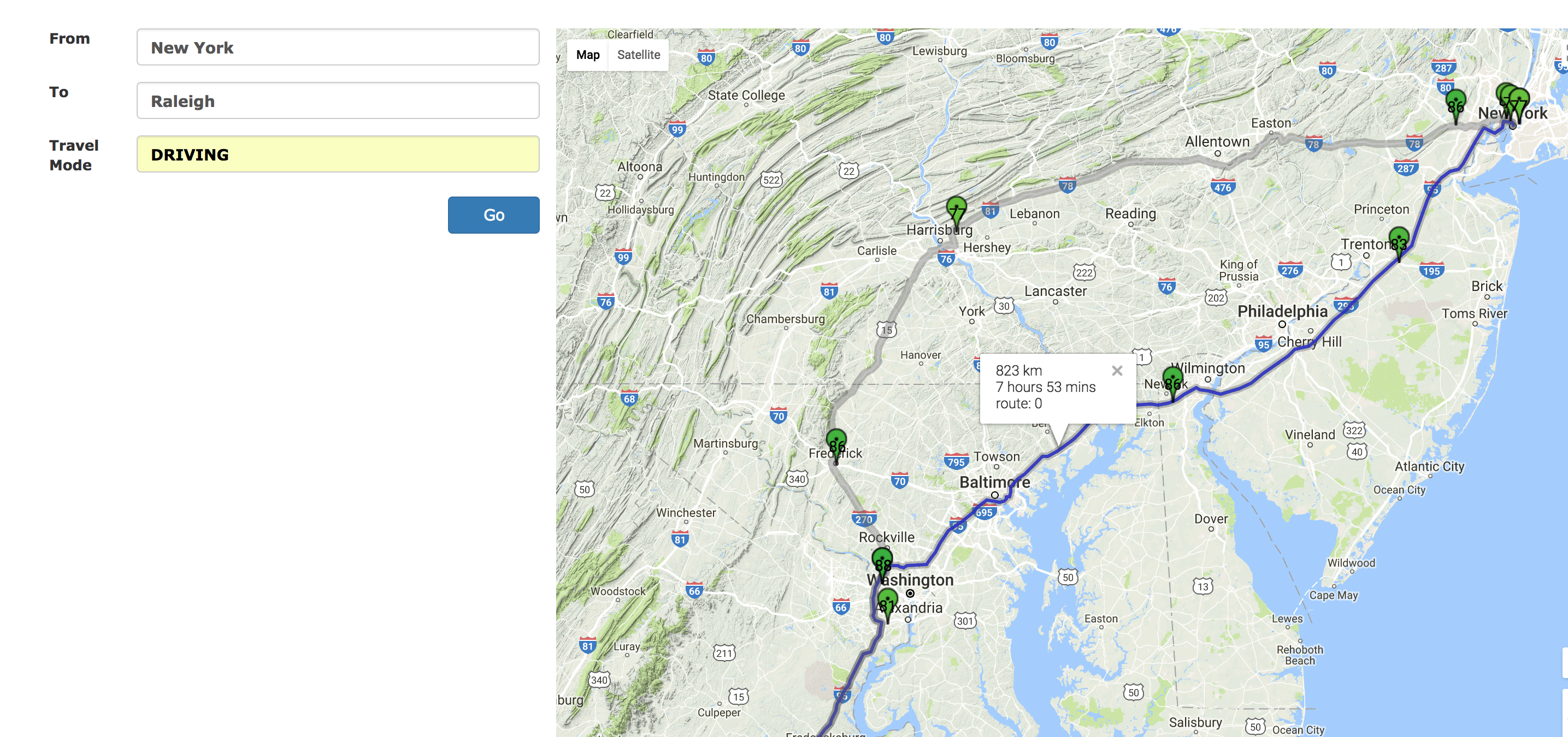
Higher AQI takes precedence over reaching early.
-
Suggesting a route with higher overall AQI.
-
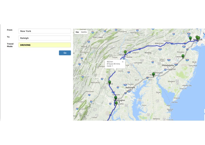
Route suggested takes a bit longer but gives better air to breathe.
-
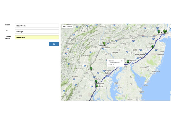
Shorter route with bad AQI not suggested.
-
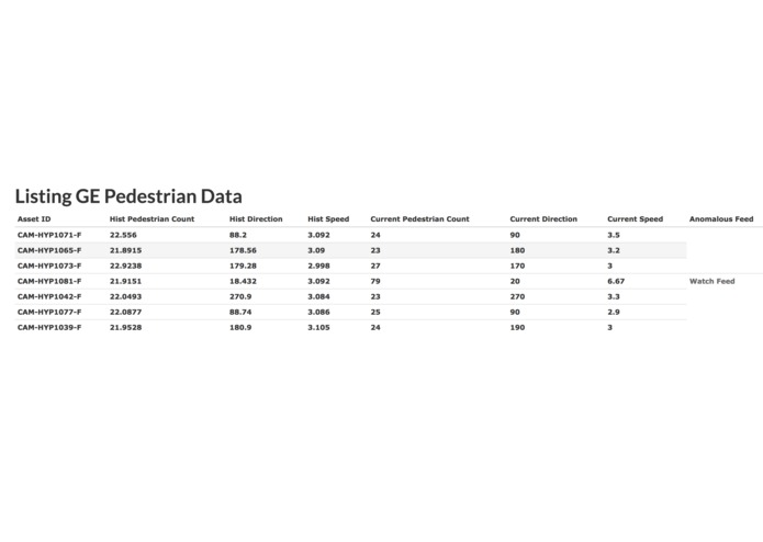
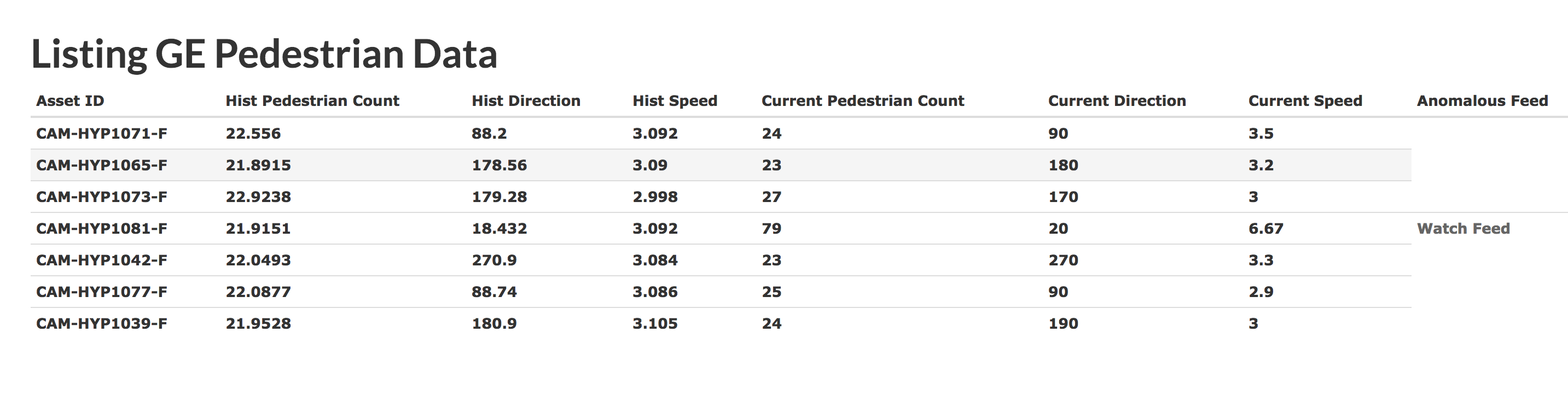
GE CityIQ API integration - As seen asset no. 4 in list is giving out anomalous data and a watch feed link appears next to it.
-
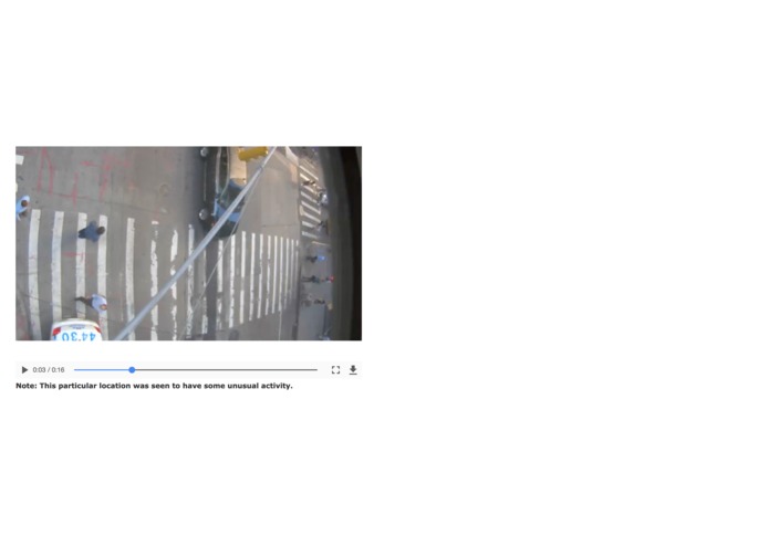
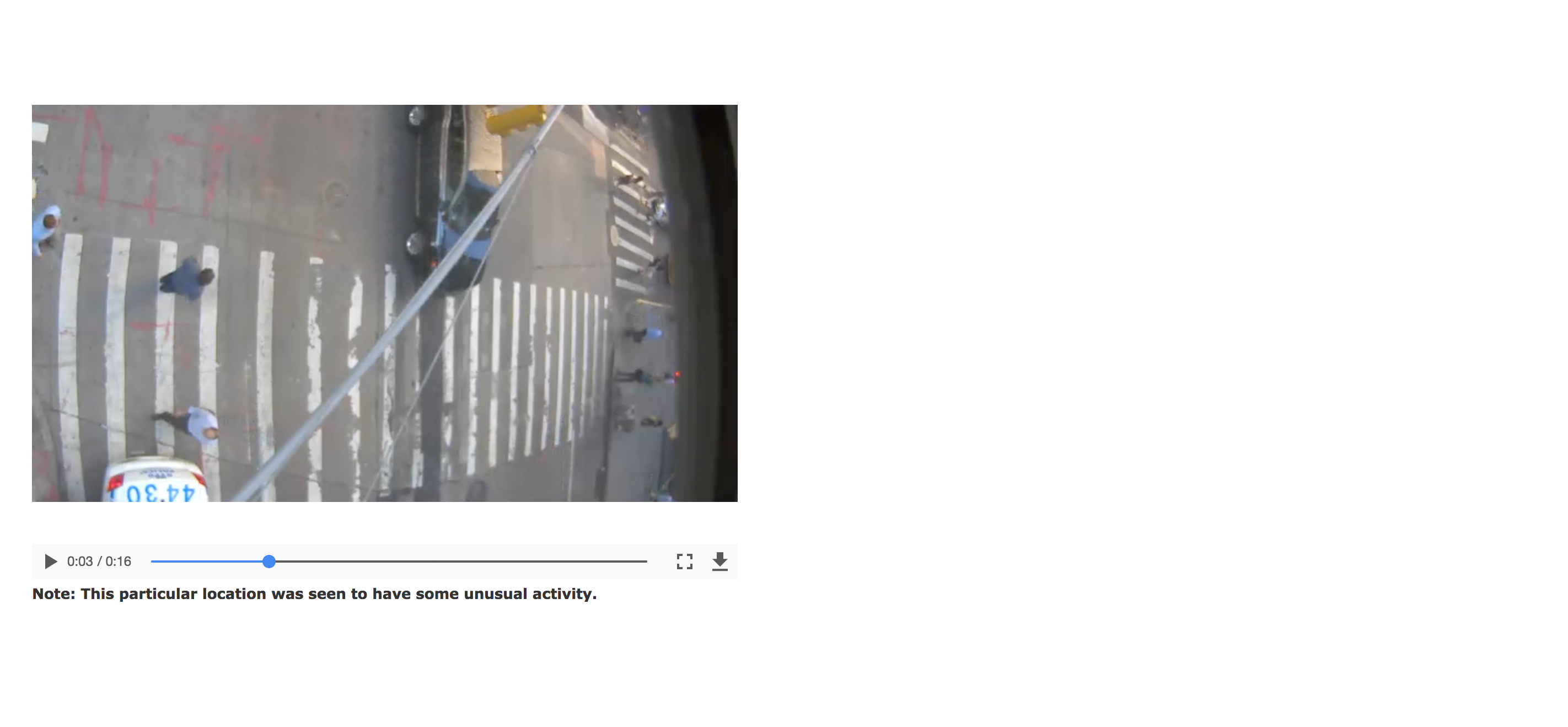
A live feed from a place with unusual activity.
Inspiration
- Due to exponentially increasing pollution in our world, breathing healthy air is as important as drinking water.
- So, why not use google maps to acheive it.
- As google maps doesn’t provide us with the most healthiest route, we decided to do it.
What it does
- Based on the route suggestions provided by the google maps api between two points, we suggest the route with the highest air quality throughout the journey.
How we built it
- We built a web application on Rails framework. It can be easily extended for mobile devices as well.
- We use Google maps API coupled with Breezometer’s API to suggest a route with the least density of pollutants.
- The density of pollutants is averaged over each possible route from source to destination and the minimum density route is returned.
- We use AQI(Air quality index) to determine the goodness of the air present in the area.
- More the AQI, better is the quality of air.
Challenges we ran into
- Posting the response from the google maps api to rails server and evaluation of every waypoint on breezometer api really tested our patience.
Accomplishments that we're proud of
- We are happy to finish with a product that can be put to use right away.
What we learned
- Always specify proper content-type when making ajax calls to rails controller.
What's next for Healthy Route
- Currently, the breezometer API’s response time is slow. Improving the response time was a constant endeavor.
- Implementing multithreading solutions to increase the response time will be the next step.
- Tracking the user’s location history to analyze the environment he/she has been in.
- A doctor can know the amount of time/levels a particular patient has been exposed to certain pollutants.
Miscellaneous
- Incorporated the GE's Intelligent Cities APIs for chaos/ruckus detection at a particular location.
- Can be used to send a live feed to the nearest police station for them to respond early in case of an emergency.
- We collected the historical data for every asset at a particular location to find the average activity rate at a given point in time. We then constantly poll the CityIQ APIs to check if some location/asset is giving out data that is anomalous/outlier in comparison to the historical data collected.
- A Watch feed button appears next to an anomalous feed for now.


Log in or sign up for Devpost to join the conversation.